
Working with advanced options
The advanced edit mode offers further tools for customizing your sheet, as well as alternative options for working with sheets.
If you have used previous versions of Qlik Sense, you will recognize Advanced options as the previous sheet editor. The advanced edit mode contains all the features and properties previously available when editing sheets.
Unlike standard options, the advanced edit mode offers a grid on which you can drag and drop visualizations and extensions. You can then resize the visualizations to fit the preferred number of grid squares. The advanced edit mode also supports touch-only devices, unlike standard mode.
Sheet in the advanced edit mode.

Click Advanced options to switch between standard and advanced options. This allows you to develop a hybrid approach for your sheets. If you change the layout settings in the advanced edit mode, the sheet will be locked in the standard edit mode for layout editing.
The following tasks can be done in the advanced edit mode:
-
Edit the sheet properties, such as title, description, and thumbnail.
-
Add a background color or image to a sheet.
-
Change visualization properties, such as sorting and styling.
-
Copying and pasting visualizations or visualization styling.
-
Adding multiple expressions as dimensions or measures in a visualization.
-
Add custom objects to a sheet.
-
Setting show conditions for sheets.
-
Adjust grid size and layout of a sheet.
-
Add actions to a sheet.
Some visualizations can only be added in the advanced edit mode:
-
Button
-
Text & Image
-
Container
-
Analyses
-
Custom objects, such as extensions from the Dashboard bundle or Visualization bundle.
You can perform many of the same actions in advanced edit mode as you can in the standard edit mode, although there are some differences. Some of the same actions are applied in different ways. For example, visualizations are added to sheets by dragging and dropping them onto a grid in the advanced edit mode. Some actions, like filters, can only be applied in standard mode. Some sheet properties can only be set in advanced mode.
Creating a new sheet
You can create a new sheet from the application overview or from the assets panel.
次の手順を実行します。
- From the application overview, click
 to view the sheets.
 - Click
 or Create new sheet.
 - Give your sheet a title and add a description.
- Click outside the text area to save the title and description.
A new sheet is created. Your sheets are private until you make them public. For more information, see シート、シート グループ、ブックマーク、ストーリーへのアクセス権の付与.
Setting sheet properties
You have a wide range of ways to style your sheet and change sheet behavior in advanced mode. For more information, see the following:
Creating visualizations
次の手順を実行します。
-
In edit mode, drag the visualization from the assets panel onto the sheet or double-click the visualization.
-
Add dimensions and measures to the visualization.
You can add dimensions and measures using the buttons on the visualization. You can also drag a field from the Fields tab of the assets panel and then select it to use it as a dimension or measure The number of dimensions and measures that are required depends on which visualization you select.
If you want to add expressions as dimensions or measures, click in the properties panel, under Data, click add and then click
 .
. -
Adjust the presentation: for example: sorting, coloring, or labeling.
For more information, see ビジュアライゼーションの外観の変更.
Custom objects are added in a similar manner. You start creating a visualization by dragging a visualization extension onto the sheet. For more information, see カスタム オブジェクトを使用したビジュアライゼーションの作成.
You can use tab containers to save space on your dashboard, by quickly switching between tabs with different visualizations. For more information, see タブ コンテナ.
The types of data you have in your tables and fields impacts whether they can be used as dimensions or measures.
- 軸によって、ビジュアライゼーションでデータをグループ化する方法が決まります。例: 国ごとの売上高合計、またはサプライヤーごとの製品の数 For more information, see 軸を使用したデータのグループ化.
- Measures are calculations used in visualizations, typically represented on the y-axis of a bar chart or a column in a table. メジャーは、Sum または Max などの集計関数に 1 つまたは複数の項目を組み合わせた数式から作成されます。 For more information, see メジャー.
Creating visualizations with analyses
Analyses allow you to build visualizations by starting with a type of analysis. You then select data for the analysis to use and then the analysis generates a chart. You can then adjust analysis-specific properties and style the visualization.
In analysis mode, analyses are identical to other visualizations.
Analyses are available from Analyses in the assets panel. For more information, see 分析を作成および編集する.
Creating visualizations with chart suggestions
Chart suggestions functions similarly to the autochart in the standard edit mode. You can turn on chart suggestions in the properties panel. When turned on, as you add or remove fields, the suggested visualization adjusts itself based on your changes. You can customize a suggested visualization with a focused set of properties.
For more information, see Insight Advisor 推奨チャートを使用したビジュアライゼーションの作成.
Moving visualizations
次の手順を実行します。
-
Click and drag visualizations to reposition them on the grid.
Copying visualizations
In advanced options, you can copy and paste visualizations in the following ways:
- Using the edit bar on the sheet (
 ,
,  , and
, and  ).
). - By right-clicking and selecting Cut, Copy and Paste.
- With the keyboard shortcuts Ctrl+C, Ctrl+X and Ctrl+V.
Depending on what situation you are in, different things will happen when you paste a copied visualization on a sheet while using advanced options:
- If a visualization is selected, then the selected visualization will be replaced.
- If no visualization is selected, then the pasted visualization will be placed in the largest empty space.
- If there is no empty space, then the largest visualization on the sheet will be split in half to make space for the pasted visualization.
For more information about copying and pasting visualizations, see 既存のビジュアライゼーションからのビジュアライゼーションのコピー.
Copying and pasting visualization styling
If you have applied custom styling to a visualization, you can copy its styling properties and paste them onto another visualization. For more information, see ビジュアライゼーションのスタイルをコピーして貼り付ける.
Converting visualizations
You can convert visualizations by clicking and dragging them onto another visualization.
次の手順を実行します。
-
While editing a sheet, drag a new chart from the assets panel onto the visualization that you want to convert.
ショートカット メニューが開きます。
-
Select the conversion option.
背景色または画像の追加
シートの背景をカスタマイズできます。特定の背景色を選択したり、数式ごとに色分けしたりできます。メディア ライブラリの画像はどれも背景として設定できます。画像が全体の背景に合わない場合は、配置とサイズを変更できます。
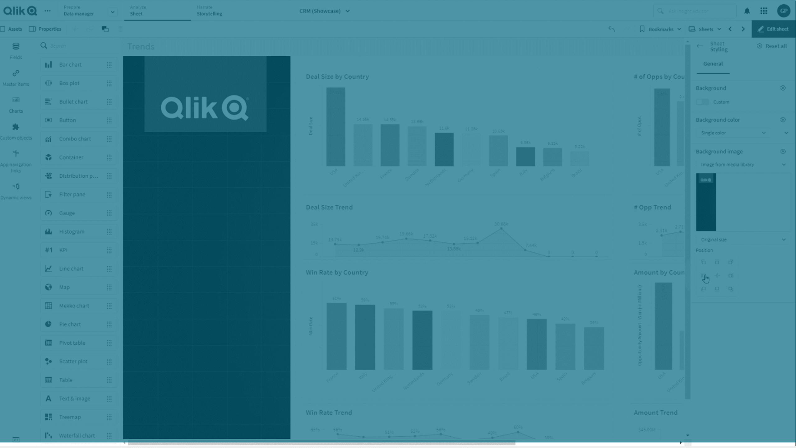
.png、.jpg、.jpeg、.gif の形式がサポートされています。.gif を使用する場合は、動画にも静止画にもできます。
Qlik Cloud Government はシート内の背景画像や色をサポートしていません。
次の手順を実行します。
- 編集モードでシートを開きます。
- [シート プロパティ] で、[スタイリング] をクリックします。
- [背景] を [カスタム] に設定します。デフォルトでは [自動] になっています。
-
背景色:
-
単色: 色選択ツールを使用して色を選択します。
-
数式を使用: ユーザー定義の数式を使用する色を設定します。詳細は、数式による色分けをご覧ください。
-
- 背景画像: メディア ライブラリから画像を選択します。既定では [なし] になっています。
-
デフォルトのサムネイル上にある
 をクリックします。
[メディア ライブラリ] が開きます。
-
使用する画像を選択し、[挿入] をクリックします。
必要な画像がメディア ライブラリにない場合は、 [新しいアップロード] をクリックして画像を追加します。
- ドロップ ダウンで画像のサイズを変更します:
- 元のサイズ
- 常に適合
- 幅に合わせる
- 高さに合わせる
- 縮小/拡大して合わせる
- 常にページ幅に合わせる
- [位置] で、画像の配置を変更できます。例えば、画像をシートの中央や右上隅にできます。
選択した画像と背景色がシートに表示されるようになります。
[編集] モードのシート、左に設定された背景画像
