
Working with advanced options
The advanced edit mode offers further tools for customizing your sheet, as well as alternative options for working with sheets.
If you have used previous versions of Qlik Sense, you will recognize Advanced options as the previous sheet editor. The advanced edit mode contains all the features and properties previously available when editing sheets.
Unlike standard options, the advanced edit mode offers a grid on which you can drag and drop visualizations and extensions. You can then resize the visualizations to fit the preferred number of grid squares. The advanced edit mode also supports touch-only devices, unlike standard mode.
Sheet in the advanced edit mode.

Click Advanced options to switch between standard and advanced options. This allows you to develop a hybrid approach for your sheets. If you change the layout settings in the advanced edit mode, the sheet will be locked in the standard edit mode for layout editing.
The following tasks can be done in the advanced edit mode:
-
Edit the sheet properties, such as title, description, and thumbnail.
-
Add a background color or image to a sheet.
-
Change visualization properties, such as sorting and styling.
-
Copying and pasting visualizations or visualization styling.
-
Adding multiple expressions as dimensions or measures in a visualization.
-
Add custom objects to a sheet.
-
Setting show conditions for sheets.
-
Adjust grid size and layout of a sheet.
-
Add actions to a sheet.
Some visualizations can only be added in the advanced edit mode:
-
Button
-
Text & Image
-
Container
-
Analyses
-
Custom objects, such as extensions from the Dashboard bundle or Visualization bundle.
You can perform many of the same actions in advanced edit mode as you can in the standard edit mode, although there are some differences. Some of the same actions are applied in different ways. For example, visualizations are added to sheets by dragging and dropping them onto a grid in the advanced edit mode. Some actions, like filters, can only be applied in standard mode. Some sheet properties can only be set in advanced mode.
Creating a new sheet
You can create a new sheet from the application overview or from the assets panel.
請執行下列動作:
- From the application overview, click
 to view the sheets.
 - Click
 or Create new sheet.
 - Give your sheet a title and add a description.
- Click outside the text area to save the title and description.
A new sheet is created. Your sheets are private until you make them public. For more information, see 授予工作表、工作表群組、書籤和故事的存取權限.
Setting sheet properties
You have a wide range of ways to style your sheet and change sheet behavior in advanced mode. For more information, see the following:
Creating visualizations
請執行下列動作:
-
In edit mode, drag the visualization from the assets panel onto the sheet or double-click the visualization.
-
Add dimensions and measures to the visualization.
You can add dimensions and measures using the buttons on the visualization. You can also drag a field from the Fields tab of the assets panel and then select it to use it as a dimension or measure The number of dimensions and measures that are required depends on which visualization you select.
If you want to add expressions as dimensions or measures, click in the properties panel, under Data, click add and then click
 .
. -
Adjust the presentation: for example: sorting, coloring, or labeling.
For more information, see 變更視覺化外觀.
Custom objects are added in a similar manner. You start creating a visualization by dragging a visualization extension onto the sheet. For more information, see 使用自訂物件建立視覺化.
You can use tab containers to save space on your dashboard, by quickly switching between tabs with different visualizations. For more information, see 索引標籤容器.
The types of data you have in your tables and fields impacts whether they can be used as dimensions or measures.
- 維度會判定如何分組視覺化中的資料。例如:每個國家的銷售總計或每個供應商的產品數量。 For more information, see 使用維度進行資料分組.
- Measures are calculations used in visualizations, typically represented on the y-axis of a bar chart or a column in a table. 量值是從彙總函數 (例如 Sum 或 Max) 組成的運算式並結合一個或數個欄位建立的。 For more information, see 量值.
Creating visualizations with analyses
Analyses allow you to build visualizations by starting with a type of analysis. You then select data for the analysis to use and then the analysis generates a chart. You can then adjust analysis-specific properties and style the visualization.
In analysis mode, analyses are identical to other visualizations.
Analyses are available from Analyses in the assets panel. For more information, see 建立和編輯分析.
Creating visualizations with chart suggestions
Chart suggestions functions similarly to the autochart in the standard edit mode. You can turn on chart suggestions in the properties panel. When turned on, as you add or remove fields, the suggested visualization adjusts itself based on your changes. You can customize a suggested visualization with a focused set of properties.
For more information, see 使用 Insight Advisor 圖表建議建立視覺化.
Moving visualizations
請執行下列動作:
-
Click and drag visualizations to reposition them on the grid.
Copying visualizations
In advanced options, you can copy and paste visualizations in the following ways:
- Using the edit bar on the sheet (
 ,
,  , and
, and  ).
). - By right-clicking and selecting Cut, Copy and Paste.
- With the keyboard shortcuts Ctrl+C, Ctrl+X and Ctrl+V.
Depending on what situation you are in, different things will happen when you paste a copied visualization on a sheet while using advanced options:
- If a visualization is selected, then the selected visualization will be replaced.
- If no visualization is selected, then the pasted visualization will be placed in the largest empty space.
- If there is no empty space, then the largest visualization on the sheet will be split in half to make space for the pasted visualization.
For more information about copying and pasting visualizations, see 從現有的視覺化複製視覺化.
Copying and pasting visualization styling
If you have applied custom styling to a visualization, you can copy its styling properties and paste them onto another visualization. For more information, see 複製並貼上視覺化樣式.
Converting visualizations
You can convert visualizations by clicking and dragging them onto another visualization.
請執行下列動作:
-
While editing a sheet, drag a new chart from the assets panel onto the visualization that you want to convert.
即會開啟快速鍵功能表。
-
Select the conversion option.
新增背景色彩或影像
您可以自訂工作表的背景。您可以選擇特定背景色彩,或依運算式顯示色彩。媒體庫中的任何影像都可設為背景。可放置影像並重新調整大小,就不會填滿整個背景。
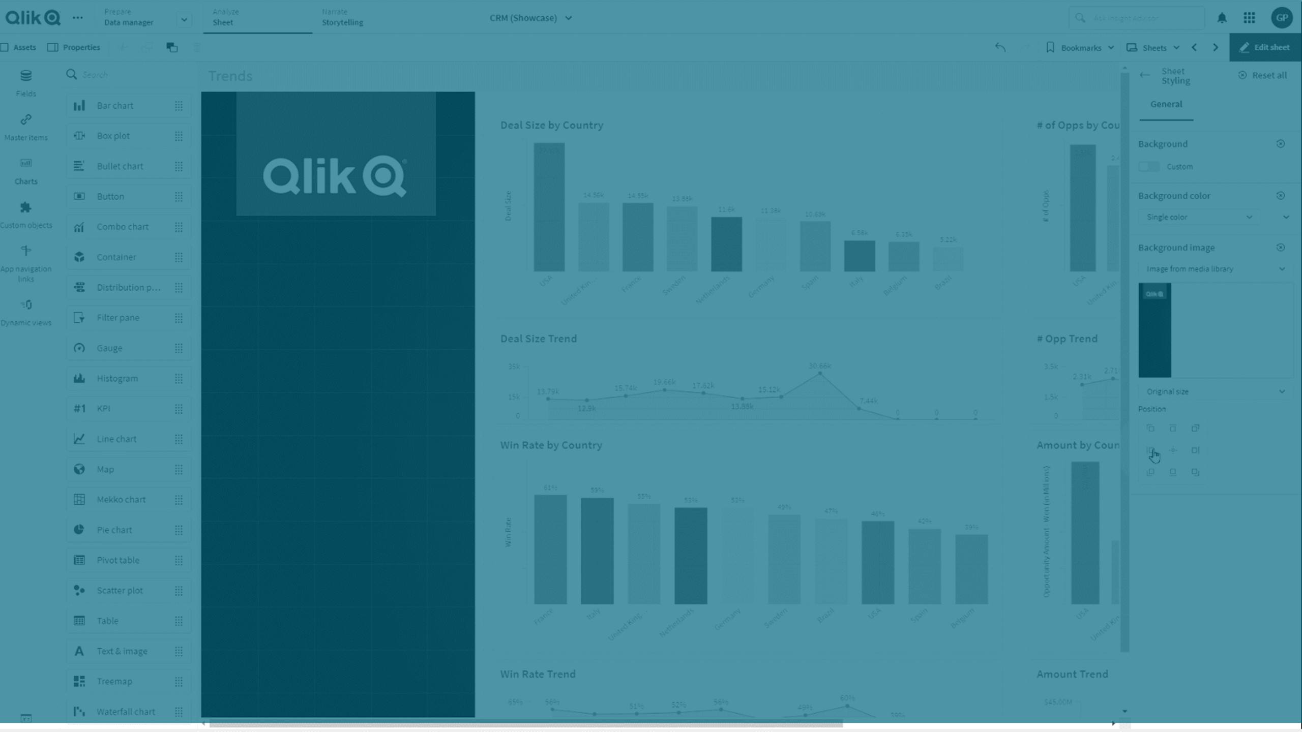
支援以下格式:.png、.jpg、.jpeg 和 .gif。若您使用 .gif,可以是動畫或靜態。
Qlik Cloud Government 不支援工作表中的背景影像或色彩。
請執行下列動作:
- 在編輯模式中開啟工作表。
- 在工作表屬性之下,按一下樣式。
- 將背景設為自訂。預設為自動。
-
背景顏色:
-
單一色彩:使用色彩選取器選擇一種色彩。
-
依運算式:使用使用者定義的運算式設定色彩。如需詳細資訊,請參閱 按運算式著色。
-
- 背景影像:選取來自媒體庫的影像。預設為無。
-
在預設縮圖上按一下
 。
。即會開啟媒體庫。
-
選擇您想使用的影像,並按一下插入。
如果您想要的影像尚未在媒體庫中,請按一下新上傳並新增該影像。
- 使用下拉式清單變更影像大小:
- 原始大小
- 永遠調整成適當大小
- 符合寬度
- 符合高度
- 適當延展調整
- 永遠填滿
- 在位置之下,您可以變更影像對齊。例如,影像可在工作表置中,或置於右上角。
您選取的影像和背景色彩現在可見於工作表。
編輯模式下的工作表,背景影像設定位於左側
