
Working with advanced options
The advanced edit mode offers further tools for customizing your sheet, as well as alternative options for working with sheets.
If you have used previous versions of Qlik Sense, you will recognize Advanced options as the previous sheet editor. The advanced edit mode contains all the features and properties previously available when editing sheets.
Unlike standard options, the advanced edit mode offers a grid on which you can drag and drop visualizations and extensions. You can then resize the visualizations to fit the preferred number of grid squares. The advanced edit mode also supports touch-only devices, unlike standard mode.
Sheet in the advanced edit mode.

Click Advanced options to switch between standard and advanced options. This allows you to develop a hybrid approach for your sheets. If you change the layout settings in the advanced edit mode, the sheet will be locked in the standard edit mode for layout editing.
The following tasks can be done in the advanced edit mode:
-
Edit the sheet properties, such as title, description, and thumbnail.
-
Add a background color or image to a sheet.
-
Change visualization properties, such as sorting and styling.
-
Copying and pasting visualizations or visualization styling.
-
Adding multiple expressions as dimensions or measures in a visualization.
-
Add custom objects to a sheet.
-
Setting show conditions for sheets.
-
Adjust grid size and layout of a sheet.
-
Add actions to a sheet.
Some visualizations can only be added in the advanced edit mode:
-
Button
-
Text & Image
-
Container
-
Analyses
-
Custom objects, such as extensions from the Dashboard bundle or Visualization bundle.
You can perform many of the same actions in advanced edit mode as you can in the standard edit mode, although there are some differences. Some of the same actions are applied in different ways. For example, visualizations are added to sheets by dragging and dropping them onto a grid in the advanced edit mode. Some actions, like filters, can only be applied in standard mode. Some sheet properties can only be set in advanced mode.
Creating a new sheet
You can create a new sheet from the application overview or from the assets panel.
执行以下操作:
- From the application overview, click
 to view the sheets.
 - Click
 or Create new sheet.
 - Give your sheet a title and add a description.
- Click outside the text area to save the title and description.
A new sheet is created. Your sheets are private until you make them public. For more information, see 授予工作表、工作表组、书签和故事的访问权限.
Setting sheet properties
You have a wide range of ways to style your sheet and change sheet behavior in advanced mode. For more information, see the following:
Creating visualizations
执行以下操作:
-
In edit mode, drag the visualization from the assets panel onto the sheet or double-click the visualization.
-
Add dimensions and measures to the visualization.
You can add dimensions and measures using the buttons on the visualization. You can also drag a field from the Fields tab of the assets panel and then select it to use it as a dimension or measure The number of dimensions and measures that are required depends on which visualization you select.
If you want to add expressions as dimensions or measures, click in the properties panel, under Data, click add and then click
 .
. -
Adjust the presentation: for example: sorting, coloring, or labeling.
For more information, see 更改可视化外观.
Custom objects are added in a similar manner. You start creating a visualization by dragging a visualization extension onto the sheet. For more information, see 使用自定义对象创建可视化.
You can use tab containers to save space on your dashboard, by quickly switching between tabs with different visualizations. For more information, see 选项卡容器.
The types of data you have in your tables and fields impacts whether they can be used as dimensions or measures.
- 维度确定数据在可视化中的分组方式。例如:每个国家的总销售额或每个供应商的产品数量。 For more information, see 带维度的数据分组.
- Measures are calculations used in visualizations, typically represented on the y-axis of a bar chart or a column in a table. 度量通过由聚合函数(例如 Sum 或 Max)组成的与一个或多个字段组合的表达式创建。 For more information, see 度量.
Creating visualizations with analyses
Analyses allow you to build visualizations by starting with a type of analysis. You then select data for the analysis to use and then the analysis generates a chart. You can then adjust analysis-specific properties and style the visualization.
In analysis mode, analyses are identical to other visualizations.
Analyses are available from Analyses in the assets panel. For more information, see 创建和编辑分析.
Creating visualizations with chart suggestions
Chart suggestions functions similarly to the autochart in the standard edit mode. You can turn on chart suggestions in the properties panel. When turned on, as you add or remove fields, the suggested visualization adjusts itself based on your changes. You can customize a suggested visualization with a focused set of properties.
For more information, see 使用 Insight Advisor 图表建议创建可视化.
Moving visualizations
执行以下操作:
-
Click and drag visualizations to reposition them on the grid.
Copying visualizations
In advanced options, you can copy and paste visualizations in the following ways:
- Using the edit bar on the sheet (
 ,
,  , and
, and  ).
). - By right-clicking and selecting Cut, Copy and Paste.
- With the keyboard shortcuts Ctrl+C, Ctrl+X and Ctrl+V.
Depending on what situation you are in, different things will happen when you paste a copied visualization on a sheet while using advanced options:
- If a visualization is selected, then the selected visualization will be replaced.
- If no visualization is selected, then the pasted visualization will be placed in the largest empty space.
- If there is no empty space, then the largest visualization on the sheet will be split in half to make space for the pasted visualization.
For more information about copying and pasting visualizations, see 从现有可视化复制可视化.
Copying and pasting visualization styling
If you have applied custom styling to a visualization, you can copy its styling properties and paste them onto another visualization. For more information, see 复制和粘贴可视化样式.
Converting visualizations
You can convert visualizations by clicking and dragging them onto another visualization.
执行以下操作:
-
While editing a sheet, drag a new chart from the assets panel onto the visualization that you want to convert.
随即打开快捷菜单。
-
Select the conversion option.
添加背景色或图像
可以自定义工作表的背景。您可以选择特定的背景色,也可以通过表达式选择颜色。媒体库中的任何图像都可以设置为背景。可以对图像进行定位和调整大小,使其不填充整个背景。
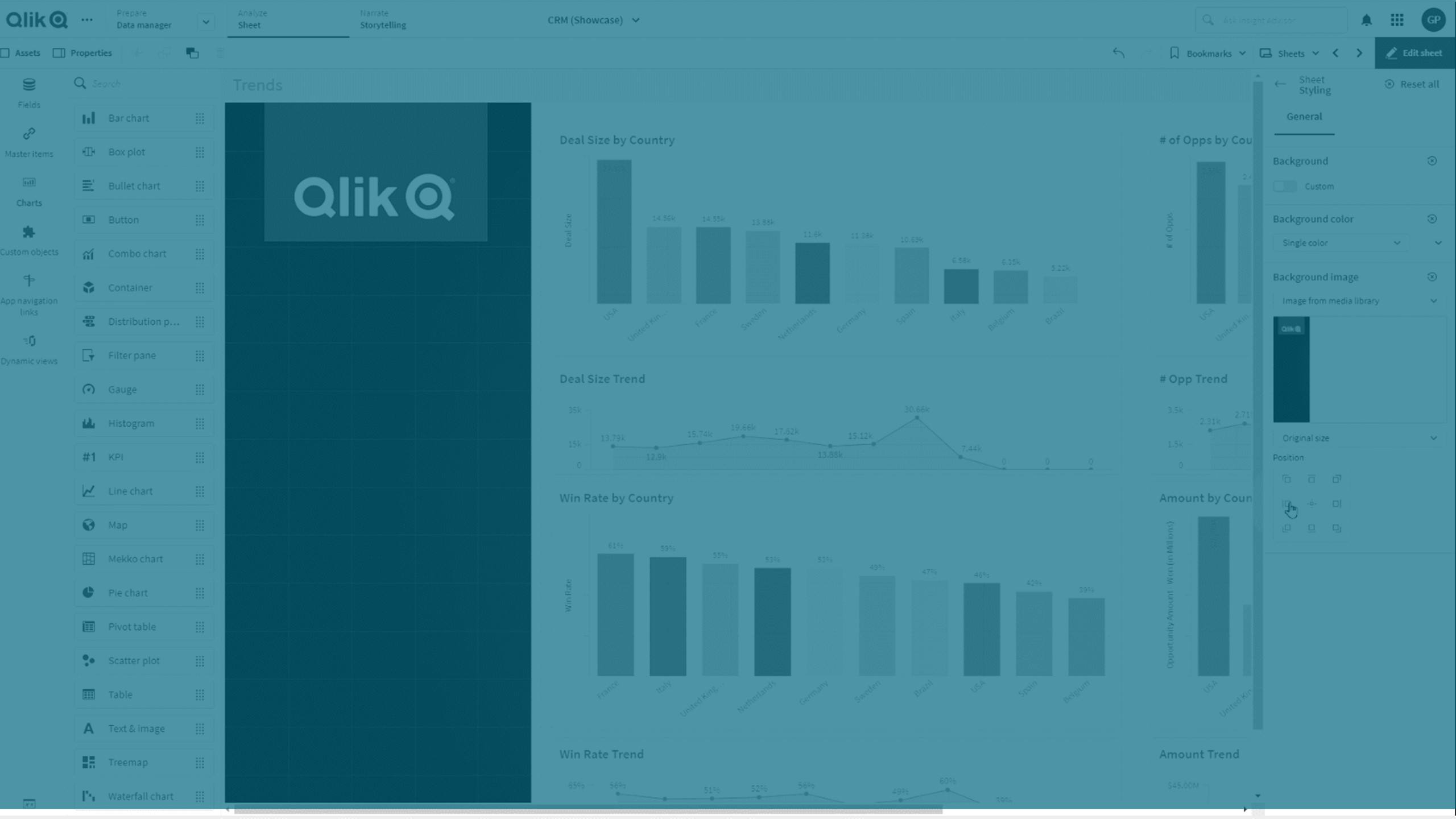
支持下列格式:.png、.jpg、.jpeg 和 .gif。如果使用 .gif,它可以是动画或静态的。
Qlik Cloud 政府 不支持工作表中的背景图像或颜色。
执行以下操作:
- 在编辑模式下打开工作表。
- 在工作表属性下,单击样式设置。
- 将背景设置为自定义。默认值为自动。
-
背景颜色:
-
单一颜色:使用颜色选择器选择一种颜色。
-
按表达式:使用用户定义的表达式设置颜色。有关更多信息,请参阅按表达式着色。
-
- 背景图像:选择来自媒体库的图像。默认值为无。
-
单击默认缩略图上的
 。
。媒体库打开。
-
选择要使用的图像,然后单击插入。
如果您想要的图像尚未在媒体库中,请单击新建上传并添加图像。
- 使用下拉菜单更改图像的大小:
- 原始大小
- 始终适应
- 适应宽度
- 适应高度
- 按比例伸展
- 始终填充
- 在位置下,可以更改图像的对齐方式。例如,图像可以位于工作表的中心或右上角。
您选择的图像和背景色当前在工作表上可见。
工作表处于编辑模式,背景图像设置在左侧
