
Working with advanced options
The advanced edit mode offers further tools for customizing your sheet, as well as alternative options for working with sheets.
If you have used previous versions of Qlik Sense, you will recognize Advanced options as the previous sheet editor. The advanced edit mode contains all the features and properties previously available when editing sheets.
Unlike standard options, the advanced edit mode offers a grid on which you can drag and drop visualizations and extensions. You can then resize the visualizations to fit the preferred number of grid squares. The advanced edit mode also supports touch-only devices, unlike standard mode.
Sheet in the advanced edit mode.

Click Advanced options to switch between standard and advanced options. This allows you to develop a hybrid approach for your sheets. If you change the layout settings in the advanced edit mode, the sheet will be locked in the standard edit mode for layout editing.
The following tasks can be done in the advanced edit mode:
-
Edit the sheet properties, such as title, description, and thumbnail.
-
Add a background color or image to a sheet.
-
Change visualization properties, such as sorting and styling.
-
Copying and pasting visualizations or visualization styling.
-
Adding multiple expressions as dimensions or measures in a visualization.
-
Add custom objects to a sheet.
-
Setting show conditions for sheets.
-
Adjust grid size and layout of a sheet.
-
Add actions to a sheet.
Some visualizations can only be added in the advanced edit mode:
-
Button
-
Text & Image
-
Container
-
Analyses
-
Custom objects, such as extensions from the Dashboard bundle or Visualization bundle.
You can perform many of the same actions in advanced edit mode as you can in the standard edit mode, although there are some differences. Some of the same actions are applied in different ways. For example, visualizations are added to sheets by dragging and dropping them onto a grid in the advanced edit mode. Some actions, like filters, can only be applied in standard mode. Some sheet properties can only be set in advanced mode.
Creating a new sheet
You can create a new sheet from the application overview or from the assets panel.
다음과 같이 하십시오.
- From the application overview, click
 to view the sheets.
 - Click
 or Create new sheet.
 - Give your sheet a title and add a description.
- Click outside the text area to save the title and description.
A new sheet is created. Your sheets are private until you make them public. For more information, see 시트, 시트 그룹, 북마크 및 스토리에 대한 액세스 권한 부여.
Setting sheet properties
You have a wide range of ways to style your sheet and change sheet behavior in advanced mode. For more information, see the following:
Creating visualizations
다음과 같이 하십시오.
-
In edit mode, drag the visualization from the assets panel onto the sheet or double-click the visualization.
-
Add dimensions and measures to the visualization.
You can add dimensions and measures using the buttons on the visualization. You can also drag a field from the Fields tab of the assets panel and then select it to use it as a dimension or measure The number of dimensions and measures that are required depends on which visualization you select.
If you want to add expressions as dimensions or measures, click in the properties panel, under Data, click add and then click
 .
. -
Adjust the presentation: for example: sorting, coloring, or labeling.
For more information, see 시각화 모양 변경.
Custom objects are added in a similar manner. You start creating a visualization by dragging a visualization extension onto the sheet. For more information, see 사용자 지정 개체를 사용하여 시각화 만들기.
You can use tab containers to save space on your dashboard, by quickly switching between tabs with different visualizations. For more information, see 탭 컨테이너.
The types of data you have in your tables and fields impacts whether they can be used as dimensions or measures.
- 차원은 시각화에서 데이터가 그룹화되는 방식을 결정합니다. 예: 국가별 총 판매액 또는 공급업체별 제품 수 For more information, see 차원으로 데이터 그룹화.
- Measures are calculations used in visualizations, typically represented on the y-axis of a bar chart or a column in a table. 측정값은 하나 이상의 필드와 결합된 Sum 또는 Max 등의 집계 함수로 구성된 표현식에서 만들어집니다. For more information, see 측정값.
Creating visualizations with analyses
Analyses allow you to build visualizations by starting with a type of analysis. You then select data for the analysis to use and then the analysis generates a chart. You can then adjust analysis-specific properties and style the visualization.
In analysis mode, analyses are identical to other visualizations.
Analyses are available from Analyses in the assets panel. For more information, see 분석 만들기 및 편집.
Creating visualizations with chart suggestions
Chart suggestions functions similarly to the autochart in the standard edit mode. You can turn on chart suggestions in the properties panel. When turned on, as you add or remove fields, the suggested visualization adjusts itself based on your changes. You can customize a suggested visualization with a focused set of properties.
For more information, see Insight Advisor 차트 제안을 사용하여 시각화 만들기.
Moving visualizations
다음과 같이 하십시오.
-
Click and drag visualizations to reposition them on the grid.
Copying visualizations
In advanced options, you can copy and paste visualizations in the following ways:
- Using the edit bar on the sheet (
 ,
,  , and
, and  ).
). - By right-clicking and selecting Cut, Copy and Paste.
- With the keyboard shortcuts Ctrl+C, Ctrl+X and Ctrl+V.
Depending on what situation you are in, different things will happen when you paste a copied visualization on a sheet while using advanced options:
- If a visualization is selected, then the selected visualization will be replaced.
- If no visualization is selected, then the pasted visualization will be placed in the largest empty space.
- If there is no empty space, then the largest visualization on the sheet will be split in half to make space for the pasted visualization.
For more information about copying and pasting visualizations, see 기존 시각화에서 시각화 복사.
Copying and pasting visualization styling
If you have applied custom styling to a visualization, you can copy its styling properties and paste them onto another visualization. For more information, see 시각화 스타일링 복사 및 붙여넣기.
Converting visualizations
You can convert visualizations by clicking and dragging them onto another visualization.
다음과 같이 하십시오.
-
While editing a sheet, drag a new chart from the assets panel onto the visualization that you want to convert.
바로 가기 메뉴가 열립니다.
-
Select the conversion option.
배경색 또는 이미지 추가
시트의 배경을 사용자 지정할 수 있습니다. 특정 배경색을 선택하거나, 표현식에 따라 색을 지정할 수 있습니다. 미디어 라이브러리의 모든 이미지를 배경으로 설정할 수 있습니다. 전체 배경을 채우지 않도록 이미지를 배치하고 크기를 조정할 수 있습니다.
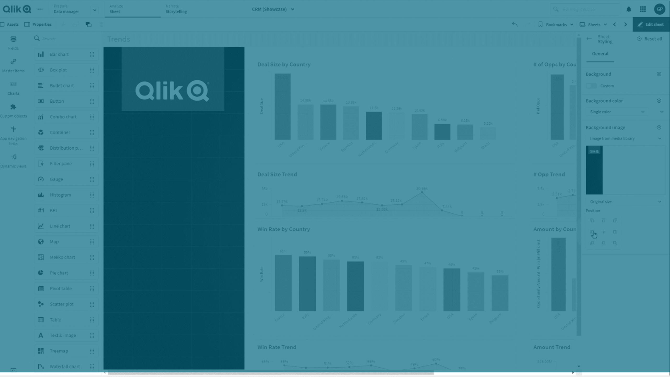
지원되는 형식은 .png, .jpg, .jpeg 및 .gif입니다. .gif를 사용하는 경우 애니메이션되거나 정적일 수 있습니다.
Qlik Cloud 정부는 시트의 배경 이미지나 색을 지원하지 않습니다.
다음과 같이 하십시오.
- 편집 모드에서 시트를 엽니다.
- 시트 속성에서 스타일링을 클릭합니다.
- 배경을 사용자 지정으로 설정합니다. 기본값은 자동입니다.
-
배경색:
-
단색: 색 선택기를 사용하여 색을 선택합니다.
-
표현식 기준: 사용자 정의 표현식을 사용하여 색을 설정합니다. 자세한 내용은 표현식 기준 색 지정을 참조하십시오.
-
- 배경 이미지: 미디어 라이브러리의 이미지를 선택합니다. 기본값은 없음입니다.
-
기본 미리 보기에서
 를 클릭합니다.
미디어 라이브러리가 열립니다.
-
사용하려는 이미지를 선택하고 삽입을 클릭합니다.
원하는 이미지가 미디어 라이브러리에 없는 경우 새 업로드를 클릭하고 이미지를 추가합니다.
- 드롭다운을 사용하여 이미지 크기를 변경합니다.
- 원본 크기
- 항상 맞춤
- 너비에 맞춤
- 높이에 맞춤
- 선택 범위에 맞게 확대
- 항상 채우기
- 위치에서 이미지 맞춤을 변경할 수 있습니다. 예를 들어, 이미지는 시트의 중앙에 위치하거나 오른쪽 상단 모서리에 위치할 수 있습니다.
이제 선택한 이미지와 배경색이 시트에 표시됩니다.
왼쪽에 배경 이미지가 설정된 편집 모드의 시트
