Application developers add visualizations and other elements to sheets in an application. Application consumers interact with the sheet for data analysis. Application developers and application consumers can interact with Insight Advisor to generate visualizations using natural language queries.
Click Sheets in the assets panel to select and open a sheet.
Develop sheets in edit mode. Interact with sheets in analysis mode. Explore your data with Insight Advisor in Insight Advisor.
Toolbar
The toolbar contains options to create and navigate in your sheet and application. Within the toolbar, the selections bar contains options to make selections in your data and to clear those selections, and to search for data. The selections tool also displays all selections that have been made. The following buttons are available in the toolbar:
-
Assets: Open or close the assets panel.
-
Sheets: Open the assets panel to Sheets.
-
Bookmarks: Open the assets panel to Bookmarks.
-
Insight Advisor: Open or close Insight Advisor.
-
Smart search (
): Search the entire dataset in your application.
-
Selection buttons:
-
Step back(
): Step back in the current selection.
-
Step forward(
): Step forward in the current selection.
-
Clear all selections (
): Clear all selections.
-
-
Selections tool (
): Open or close the selections tool
-
Edit sheet: Open or close the edit mode. If the sheet cannot be edited, click Duplicate to edit a duplicate of the sheet.
Edit
Click Edit sheet to edit a sheet.
Sheet view in edit mode
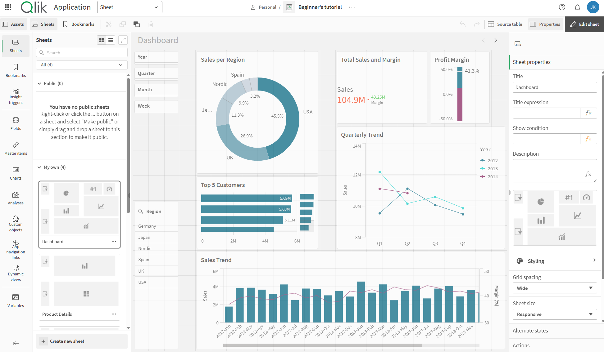
You can do the following:
-
Click Sheets to add a new sheet, or to navigate to a sheet.
-
Click Assets to open the assets panel. Add assets to your sheet. For example, you can add a visualization to a sheet.
For assisted creation of visualizations, click Use assisted explore to use Insight Advisor. See: Creating visualizations with Insight Advisor
-
Click Properties to open the properties panel. Configure the properties for a sheet or visualization. For example, you can add dimensions and measures to a visualization. See: Properties
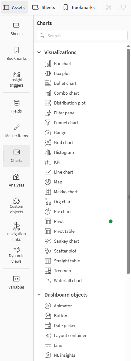
Assets panel in edit mode
In edit mode, the assets panel contains:
-
Sheets: View and edit sheets in the application.
You can view all sheets in an application, or just the public, community, or private sheets.
-
Bookmarks: View and edit bookmarks in the application.
You can view all bookmarks in an application, or just the public, community, or private bookmarks.
-
Insight triggers: Define metrics to be used for insight generation in feeds.
-
Fields: Add data to visualizations from available fields.
-
Master items: Add data to visualizations from available master items.
-
Charts: Add visualizations to the sheet.
-
Analyses: Add analyses to the sheet.
-
Custom objects: Add custom objects to the sheet.
-
App navigation links: Add links to build on-demand applications.
-
Dynamic views: Connect a base application to a template application to use master visualizations from that application as dynamic charts in your sheets.
Assets panel in edit mode
Fields
Fields represent the data that is available in your application. Drag a field under Data in Properties to add data to visualizations. Fields are marked with different icons to display what kind of data source they are classified as.
| Icon | Data type | Definition |
|---|---|---|
|
|
Numeric data | Data containing only numeric values |
|
|
Text strings | Data containing text strings |
|
|
Date and time |
All date fields are marked with See: Date & time fields |
|
|
Geographic data |
All fields recognized as geopoints or geoshapes in map visualizations are marked with |
Additionally, right-click on fields to do the following:
-
Create a new master dimension. See: Creating a master dimension from a field
-
Create a new master measure. See: Creating a master measure from a field
-
View field settings. See: Always one selected value
Master items
Create dimensions and measures as master items that can be re-used in your application.
Some master items may have associated glossary terms. You associated terms and their definition by clicking on the master item and hovering your cursor over the term. You can click on the term to view the full glossary entry for the term.
Master item with linked term
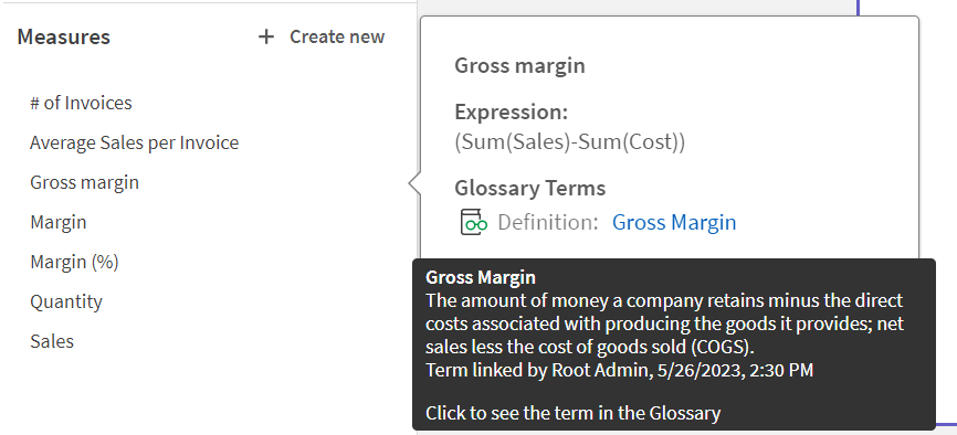
See:
Charts
Drag charts onto your sheet to create visualizations.
See: Get started with visualizations
Custom objects
Enhance your applications with custom-designed visualizations.
See: Creating a visualization using a custom object
Application navigation links
Build on-demand applications using application navigation links. On-demand applications load a subset of the data that is loaded in aggregate form by a selection application.
See: Building an on-demand application
Dynamic views
Create dynamic views to query and view relevant subsets of large data sets in charts that can be dynamically refreshed as selections are made.
See: Managing data with dynamic views
Variables
Click to open the variables dialog.
See: Variables dialog
Source table
You can preview data in the source table viewer. This allows you to view fields and values from the selected table in your application data. You can select values from the table to apply selections. You can show or hide the source table viewer by clicking Source table. You can pin it open by clicking .
Source table viewer

Properties
Configure properties for a sheet or visualization in the properties panel.
Click Properties in the toolbar of a sheet to open the properties panel. You have to be in edit mode.
Click on the sheet to view the properties for the sheet. Click on a visualization to view the properties for the visualization. The properties panel can be resized by clicking and dragging the border of the properties panel.
For sheets you can:
- Edit sheet title and description
- Add a thumbnail for a sheet
-
Add a background color or image to a sheet
- Change the grid spacing, sheet size, and layout
- Apply alternate states to the sheet
- Add actions triggered when users navigate to the sheet
Depending on the visualization that you are editing, you have different options. Typically, you can do the following:
- Add dimensions and measures and specify how they are displayed
- Set the sorting order and sorting criteria
- Change the way the visualization appears
- Configure custom tooltips
Analysis
Interact with visualizations and data in a sheet.
Sheet view in analysis mode
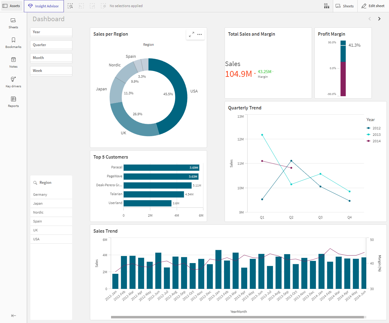
You can do the following:
-
Click Assets to create and manage assets for exploration of application content. This is a different assets panel than the one you see when you are editing a sheet. For more information about the assets panel in edit mode, see Assets panel in edit mode.
-
Make selections in a visualization to explore insights based on selections. See: Exploring with selections
-
Create bookmarks based on selections. See: Bookmarking selections
-
Search your data. See: Using smart search
-
Click
to open Insight Advisor and generate recommendations for visualizations using natural language and simple configuration options. See: Insight Advisor
| User interface item | Action |
|---|---|
|
|
Step back in selections. |
|
|
Step forward in selections. |
|
|
Clear all selections. |
|
|
Open smart search to search in the entire data set. For more information, see: Using smart search |
|
|
Open the selections tool, which is an extension of the selections bar. |
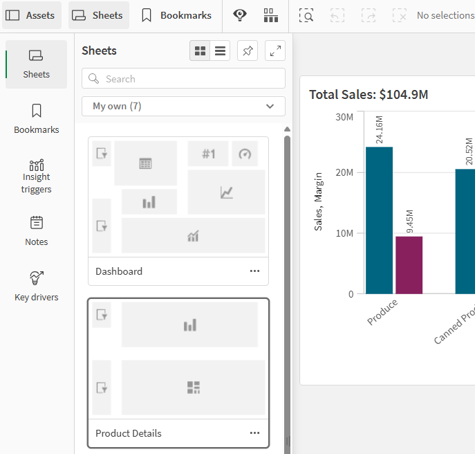
Assets panel in analysis mode
In analysis mode, click Assets to open a panel where you can create and manage the following:
-
Sheets: View and navigate sheets in the application. Create and group sheets.
You can view all sheets in an application, or just the public, community, or private sheets.
-
Bookmarks: View and navigate bookmarks in the application. Create new bookmarks.
You can view all bookmarks in an application, or just the public, community, or private bookmarks.
-
Insight triggers: Define metrics to be used for insight generation in feeds.
-
Notes: Capture and share insights.
-
Key driver analysis: Create, manage, and view key driver analyses.
Uncovering the key influencers behind your data using key driver analysis
-
Reports: Generate on-demand reports based on activated templates. This section is not visible unless at least one template has been activated for on-demand report generation.
The assets panel can be resized by clicking and dragging the border of the assets panel. To pin the assets panel open in analysis mode, click .
You can make Sheets or Bookmarks full screen by clicking .
You can view Sheets as a grid or list. Sheets can also be grouped together. For more information, see Grouping sheets.
Assets panel in analysis mode
Options menu
You can use the options menu to perform actions related to the visualization.
Options menu next to a chart
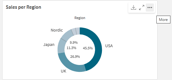
You can open the options menu by:
- Right-clicking on a chart.
- Clicking the hover menu
.
Menu options will be different depending on:
- Whether you are editing or analyzing (viewing) charts in an application.
- The chart type.
- The privileges that have been assigned to you by your administrator.
- Custom settings for visualization menus that have been configured by the application developer (see Hiding items in visualization menus).
Options menu for a chart with hover menu expanded
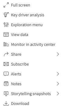
The menu looks different if you have touch screen mode enabled on a supported device. You can toggle touch support on and off by clicking or tapping the application navigation button () and using the toggle for
Touch screen mode.
Options
Some of the available actions you might see in the options menu include:
| Option | Sheet modes | Available actions |
|---|---|---|
|
|
Edit, analysis | Expand visualization to full-screen mode. |
|
|
Edit, analysis | Configure insight triggers to set calculation conditions that are evaluated when data changes. Insight triggers help to identify anomalies and changing data, presenting insights in the form of a scrollable feed. See: Working with Discovery Agent insight triggers |
|
|
Edit, analysis | Configure a key driver analysis using a measure or compatible dimension from the chart as the target. Add other dimensions and measures as features to compare their relative influence on the target. See: Uncovering the key influencers behind your data using key driver analysis |
|
|
Analysis |
Show details: See the fields and master items that make up the visualization. You can view their dependencies to see the fields that comprise them and their sources, as well as any linked glossary terms. Details can be turned on and off for visualizations in the visualization properties panel under Appearance > General > Show details. For more about Details, see Viewing details for visualizations. |
|
|
Analysis |
Change certain visualization properties, without making selections or editing the sheet. See: Visual exploration Exploration menu is not available for analyses. |
|
|
Analysis |
View the data for a visualization in a table. View data offers an accessible option for viewing information in charts that are not optimized for accessibility. For more information about accessibility, see: View data is not available for analyses. |
|
|
Analysis | Share the visualization in different ways, for example as an image, a link, or an embedded object. |
|
|
Analysis | Create an alert for the data in the visualization, or open an existing alert that is already created for it. See: Monitoring data with alerts |
|
|
Analysis | Subscribe to the visualization to receive automated reports indicating its current appearance and data. See: Scheduling reports with subscriptions |
|
|
Analysis | Add the chart to your Qlik Cloud Analytics activity center for quicker access without opening the source application. See: Monitoring visualizations |
|
|
Analysis | Access the possible actions related to notes for the visualization. Your options might include Create note with snapshot, Find notes related to this chart, and Add snapshot to note. See: Capturing and sharing insights using Notes |
|
|
Analysis | Manage the storytelling snapshots available for the chart. For example, you can Take snapshot or access the Snapshot library. See: Collecting insights for stories using snapshots |
|
|
Analysis | Download the visualization in different formats, such as an image, PDF, or data file. |
|
|
Edit | Add the visualization as a master visualization so it can be reused by you and other application developers. You can also unlink the chart from an existing master visualization. See: Reusing visualizations with a master visualization |
|
|
Edit |
Standard actions allowing copying and pasting of visualizations across sheets. Cut, Copy, Paste, and Paste and replace are not available for analyses. |
|
|
Edit | Delete the visualization from the sheet. |
|
|
Edit | Copy the custom styling for a visualization and paste it onto another visualization. See: Copying and pasting visualization styling |
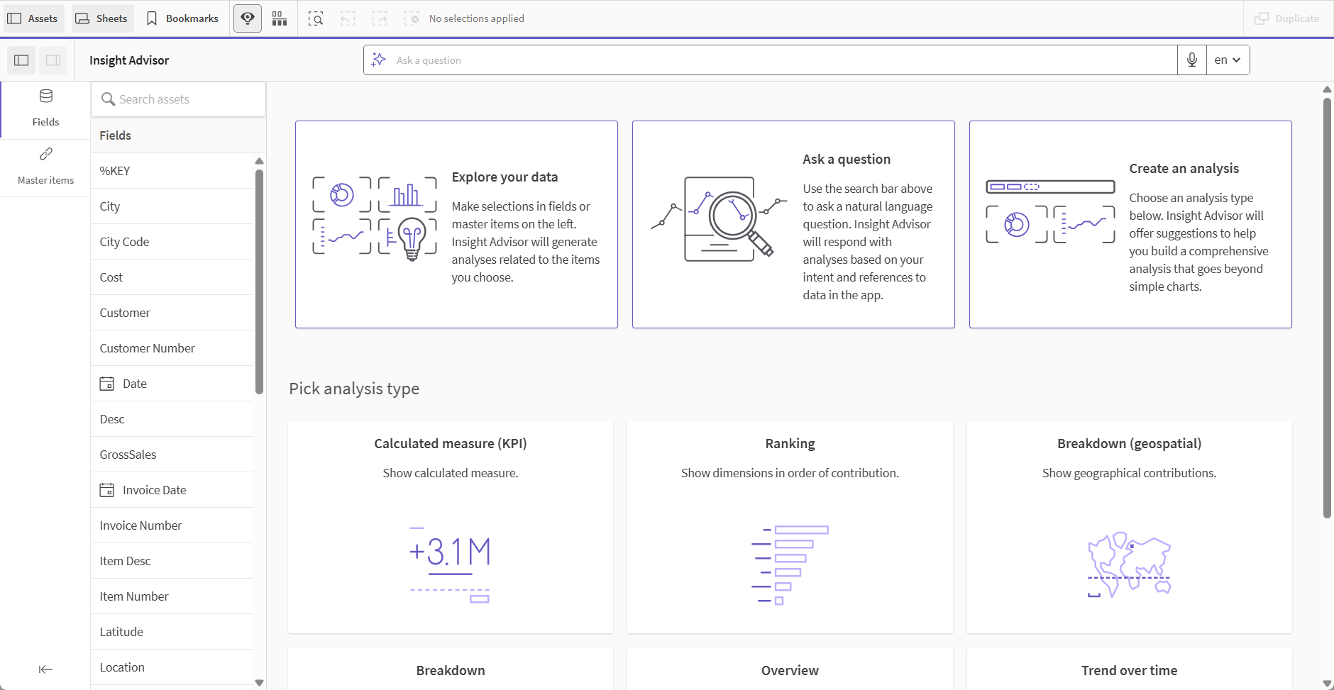
Insight Advisor
Click to access Insight Advisor Search and Insight Advisor Analysis Types. You can ask a question in the Insights search field to generate visualizations with Insight Advisor Search.
Insight Advisor
For more information, see Creating visualizations with Insight Advisor.
Touch gestures in sheet view
| Touch gesture | Action |
|---|---|
| Long-touch and release | Open the shortcut menu |
| Long-touch a visualization | Open the options menu |
| Swipe | Scroll lists and visualizations |
| Pinch | Zoom in or out on visualizations |
| Two-finger tap | Select an interval in a list, table or bar chart axis |
| Two-finger swipe | Pan a scatter plot visualization |
| Three-finger tap | Reset the zoom level of a scatter plot visualization |
