You can apply styling to customize the application based on your company standards. The selected styling will be applied to all sheets in the application.
Styling an applicationThe following styling options are available:
- Changing the direction of the characters in strings of text or numbers.
- Changing the default application theme.
- Toggling the context menu on or off for all visualizations.
- Toggling the hover menu on or off for all visualizations.
- Hiding items in visualization menus.
- Changing the sheet header styling.
- Adding and aligning an image, such as a logo.
- Toggling the toolbar and header on or off for all sheets.
- Customizing the navigation bar by adding a custom logo, removing interface elements, and changing styling.
More styling can be applied to an application by a developer through custom theme extensions.
Custom styling on individual objects override application styling.
Opening application settings
You can open application settings from anywhere in an application.
Do the following:
-
In the application navigation bar, click
and then click
Settings.
-
Click
to close application settings.
Changing the reading order
Do the following:
-
In the application navigation bar, click
and then click
Settings.
- In the menu, switch to the Appearance tab.
-
Turn Right-to-left on or off.
Changing the default application theme
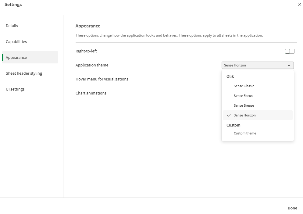
You can apply one of the default Qlik themes or any custom theme that you have created and installed.
The default Qlik themes are:
-
Sense Horizon - This is the default theme when you create a new application.
- Sense Classic - Provides a more compact view of objects, and limits the space between them.
- Sense Focus - Adjusts the padding and spacing around objects as well as provides designated spaces for titles.
- Sense Breeze - Based on Sense Focus but with different color settings.
Do the following:
-
In the application navigation bar, click
and then click
Settings.
-
In the menu, switch to the Appearance tab.
-
Select the theme to apply from the Application theme drop-down menu.
Custom themes
You can also create custom themes based on your company standards. With themes you can precisely style an application by changing the colors, adding images and backgrounds as well as specifying the fonts, font sizes, font weights and font styles on a global or granular basis throughout your application. You can also define color palettes and customize the specifications for margins, padding and spacing.
For more information, see:
Custom themes are supported when exporting sheets and charts in PDF format. This applies to manually exported PDFs, as well as to PDFs exported automatically using subscriptions or via Qlik Reporting Service. However, a PDF generated from an application that uses a custom theme may look different than seen in the application. For more information, see Custom theme JSON properties.
When you create a custom theme, you upload it into the Administration activity center as a zipped package. This package contains the JSON file and any additional resources, such as CSS files.
You can view available custom themes from the Appearance section of the application settings. Custom themes appear under Custom in the Application theme drop-down menu.
Application theme drop-down menu in application settings

Turning off the hover menu and context menu
The hover and context menus are interactive elements that are displayed when users interact with charts. Both menus provide access to the options menu, where the user can perform various actions related to a chart. See: Options menu
You can turn off one or both of these menus to customize the interactive experience for application users.
Turning off the hover menu
You can choose to turn off the hover menu that appears on visualizations when users place their cursor over them. This will affect all visualizations in the application.
Do the following:
-
In the application navigation bar, click
and then click
Settings.
- In the menu, switch to the Appearance tab.
- Turn off the Hover menu for visualizations setting.
You can turn off the hover menu for a single visualization in edit mode.
Do the following:
- In edit mode, select the visualization.
- In the properties panel, go to Appearance > General.
- Turn off the Show hover menu setting.
Turning off the context menu
The context menu is shown when a user right-clicks a chart, or when a user has activated Touch screen mode and long touches a chart. You can turn off the context menu for all visualizations.
Do the following:
-
In the application navigation bar, click
and then click
Settings.
- In the menu, switch to the Appearance tab.
- Turn off the Context menu for visualizations setting.
Hiding items in visualization menus

In analysis mode, users interact with visualizations by right-clicking them, hovering their cursor over them, or long-touching them, and then accessing an options menu (). The provided options are useful for consumption of sheet content.
By default, all available options are shown to the user. You can override this functionality and instead define specific items to include. Other items outside the context menu — for example, sheet editing options and chart-specific options— will still be available.
Do the following:
-
In the application navigation bar, click
and then click
Settings.
- In the menu, switch to the UI settings tab.
- Turn on Override default items in visualization menus.
- Turn options on and off as desired. You can configure the following options:
Download
View data
Exploration menu
Full screen
Key drivers
Monitor in activity centers
Show details
Subscribe
Alerts
Limitations:
-
Visualization menus can only be customized for the experience of viewing a sheet in analysis mode. Other experiences, such as Insight Advisor, do not support customization.
Changing the chart animations
Chart animations are the gradual transitions in a visualization from the old view to the new view when data has been changed, after for example a selection has been made.
Chart animations can be turned off in the application settings. They are available for the following chart types:
-
Bar charts
-
Bullet charts
-
Combo charts
-
Line charts
-
Pie charts
-
Scatter plots
-
Funnel charts (Visualization bundle)
-
Grid charts (Visualization bundle)
-
Sankey charts (Visualization bundle)
Do the following:
-
In the application navigation bar, click
and then click
Settings.
-
In the menu, switch to the Appearance tab.
-
Turn Chart animations on or off.
Hiding toolbar, sheet header, and application navigation bar options
You can hide the toolbar and sheet header in your application. This means that these areas will not display on any sheet, for any user, regardless of permissions. Any user with Can edit rights in the application can toggle these elements on or off. You can also hide individual elements in your application navigation bar, toolbar, and sheet header.
Toolbar
The toolbar is the area above the sheet that contains the following buttons:
-
Assets
-
Sheets
-
Bookmarks
-
Insight Advisor
-
Smart search (
)
-
Selection buttons:
-
Step back selection (
)
-
Step forward selection (
)
-
Clear all selections (
)
-
-
Selections tool (
)
-
Edit sheet
You can optionally hide Assets, Sheets, and Bookmarks buttons to the toolbar. If you remove Assets, Sheets and Bookmarks will display without the assets panel.
Do the following:
-
In the application navigation bar, click
and then click
Settings.
-
In the menu, switch to the UI settings tab.
-
Do one of the following:
- To hide the toolbar, turn off Toolbar.
- To hide Assets, under Toolbar, select Assets.
- To hide Sheets, under Toolbar, select Sheets.
- To hide Bookmarks, under Toolbar, select Bookmarks.
- Click Done.
Sheet header
The sheet header is the area on the sheet that contains the sheet title, title image, and the sheet navigation arrows.
If you hide the sheet header, the navigation arrows move to the toolbar.
You can optionally hide the sheet title.
Do the following:
-
In the application navigation bar, click
and then click
Settings.
-
In the menu, switch to the UI settings tab.
-
Do one of the following:
- To hide the sheet header, turn off Sheet header.
- To hide the sheet title, under Sheet header, select Sheet title.
- Click Done.
Application navigation bar
You can optionally hide the following options in the application navigation bar for your application:
-
Logo
-
Navigation
-
Ask Insight Advisor
-
Resource center
-
Notifications
-
Profile
Do the following:
-
In the application navigation bar, click
and then click
Settings.
-
In the menu, switch to the UI settings tab.
- Under App navigation bar, select the options you want to hide in the application navigation bar.
- Click Done.
When to hide application interface elements
Advantages
Hiding the toolbar and sheet headers creates more space for charts, filter panes, and other objects.
Turning off sheet headers means that this area will not appear when you download or share sheets, send subscriptions, or generate Qlik Automate reports. This is helpful if you are using your sheets to create PowerPoint presentations or dashboards.
Removing the toolbar means application developers have more control over which features other users can access easily. For example, hiding the Edit sheet button might discourage other application developers from editing the application.
Disadvantages
Hiding the toolbar does not completely remove capabilities such as bookmarks, notes, Insight Advisor, or sheet editing. For example, bookmarks can still be found in the application overview. However, application consumers may think that these features are no longer available.
If you hide the toolbar and sheet header, the only way to navigate between sheets is by using keyboard shortcuts or button objects. For more information, see Keyboard navigation and shortcuts in apps and Creating buttons.
If the selections area is hidden, users may not realize that selections have been applied to the application. You may need to add filter panes to your sheets or filters to individual charts. For more information, see Creating filter panes and Applying filters to visualizations.
Examples
A sheet displaying the toolbar and sheet header. The toolbar shows Notes, Insight Advisor, current selections, and more. The sheet header contains the title image, sheet title, and navigation arrows.

The same sheet as above, but the toolbar is visible and the sheet header is hidden. Users can no longer see the title image, sheet title, or navigation arrows.

The same sheet as above, but the sheet header is visible and the toolbar is hidden. Users cannot see which selections have been applied.

The same sheet as above, but the header and toolbar have both been hidden.

Adding custom logos
You can add custom logos to application navigation bars. These replace logos set in the navigation bar of tenants.
Do the following:
-
In the application navigation bar, click
and then click
Settings.
-
In the menu, switch to the UI settings tab.
-
Under App navigation bar, click
.
-
Under Logo, click
.
-
Select an existing image or upload a new image.
-
Click Insert.
Styling the application navigation bar
You can style the navigation bar in the application with custom colors.
Do the following:
-
In the application navigation bar, click
and then click
Settings.
-
In the menu, switch to the UI settings tab.
-
Under App navigation bar, click
.
-
Under Options, set the Background color and Foreground color.
-
Click Done.
Adding fields to the selections bar
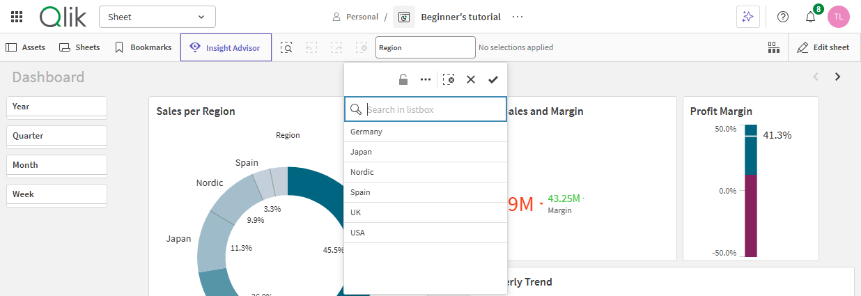
You add fields and master dimensions to the selection bars of applications so that they are easily available for your application users. This is useful when you have fields you want your application users to always have ready access to for selections. Adding fields is useful as well if you want to avoid having filter panes with the same fields repeated in every sheet.
A selections bar with a field added to it

Adding fields to the selections bar
Do the following:
-
In edit mode, open the assets panel and click Fields.
-
Right-click on a field and select Add to selection bar.
Adding master dimensions to the selections bar
Do the following:
-
In edit mode, open the assets panel and click Master items.
-
Right-click on a master items and select Add to selection bar.
Removing fields from the selections bar
Do the following:
-
In edit mode, open the assets panel and click Fields.
-
Right-click on a field in the selection bar and select Remove from selection bar.
Limitations
Adding fields to the selection bar has the following limitations:
-
You cannot add or remove fields in the selection bar in embedded sheets or mashups.
-
You cannot add master measures to the selection bar.
-
It is recommended to only add a single instance of a field to the selection bar. It is possible to add multiple instance, as a master dimension can use a field that may already be added to the selection bar.
If there are multiple instances of a field in the selection bar, they will all be available in the selection bar until a selection is made in one of the instances of the field. After that, only the instance where the selection was made will be visible.
-
Fields added to the selection bar are not available in the Qlik Analytics mobile application or the selections tool.
Changing sheet header colors
The sheet header background color can be set to a solid color or a gradient of colors by selecting two colors. The sheet header font can only be set to a solid color.
To change sheet header styling, click in the application navigation bar and then click
Settings. Sheet header options are available in the Sheet header styling tab.
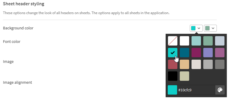
When choosing colors, you have the following options:
- Choose a color from the default color palette.
- Set a Hex color by typing 6 characters in the # input field.
- Click the palette to show more color options:
- Click the color wheel to select color.
- Drag the slider to change the color saturation.
Choosing a color from the default color palette
Do the following:
-
Click
in a color drop-down.
The dialog opens and displays the default colors.
-
Click one of the colors in the palette.
The color is selected.
-
Click outside the dialog.
The dialog is closed.
Now you have set a color by selecting in the default color palette.
Color dialog with the default color palette and a blue color selected.

Typing a Hex color
Do the following:
-
Click
in a color drop-down.
The dialog opens and displays the default colors.
-
Type 6 characters in the Hex input field #.
The color is selected in the palette.
-
Click outside the dialog.
The dialog is closed.
Now you have set a color by typing the 6 hexadecimal digits.
Using the advanced color options
Do the following:
-
Click
in a color drop-down.
The dialog opens and displays the default colors.
-
Click
at the bottom of the dialog.
The dialog changes and displays the advanced options.
-
Do one of the following:
-
Click in the color wheel.
The color changes and the Hex color code updates accordingly.
-
Drag the slider.
The saturation changes and the Hex color code updates accordingly.
Either way a color is selected.
-
-
Click outside the dialog.
The dialog is closed.
Now you have set a color by using the color wheel and/or the slider.
Color dialog with the advanced options and a blue color selected.

Adding an image
You can add an image to the sheet header, such as a logo. The following formats are supported: .png, .jpg, .jpeg, and .gif.
Do the following:
-
Click the image placeholder next to Image.
The Media library opens.
-
Select the image that you want to add to the sheet title.
A preview of the image is shown.
-
Click Insert.
The image is added.
Now you have added an image to the sheet title.
