
You can add a filter pane to control what data that is shown in the visualizations on a sheet. A filter pane can filter the data of several dimensions at once.
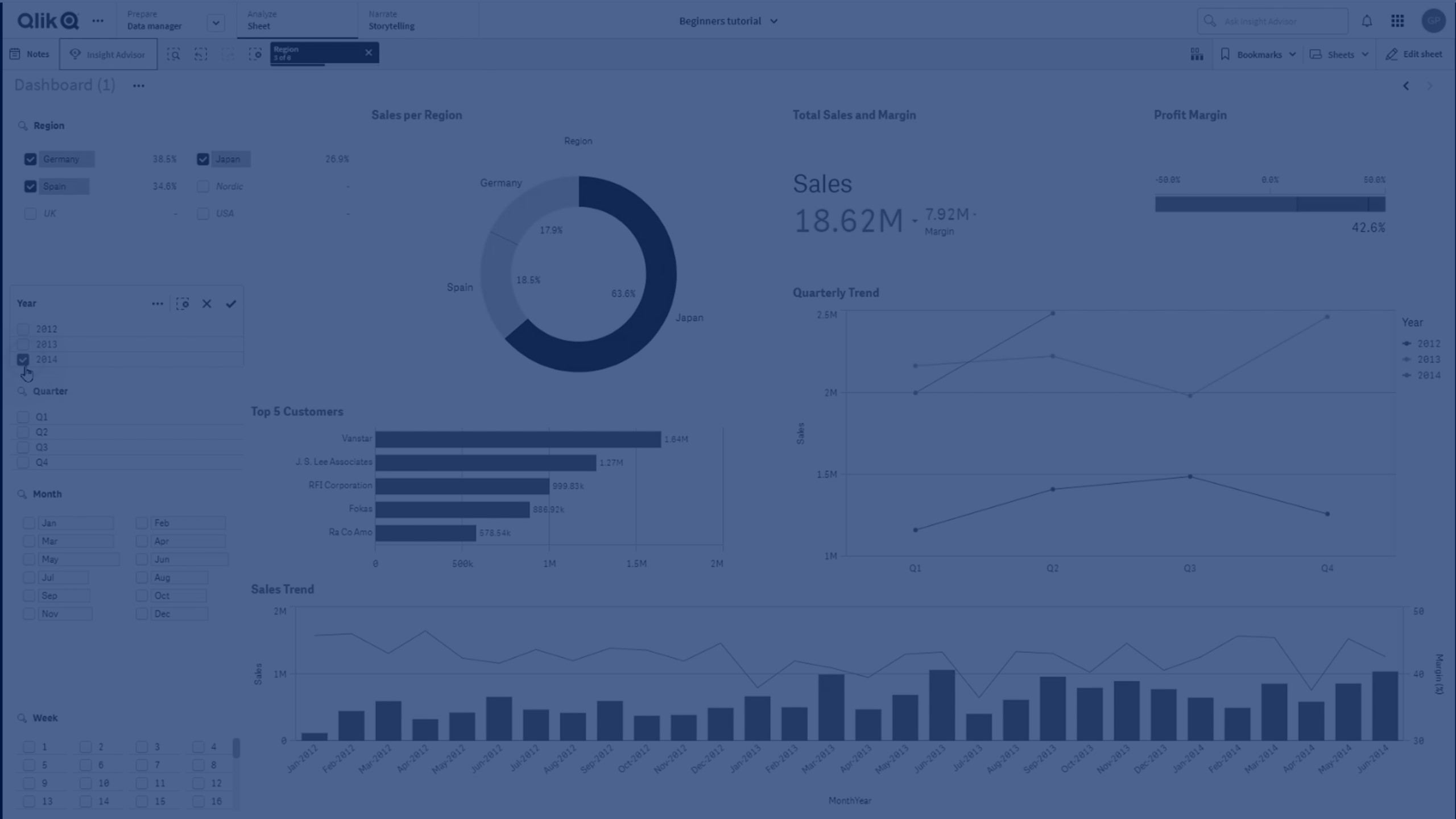
You can create a filter pane on the sheet you are editing.
In a filter pane you can use up to 1000 dimensions.
Do the following:
- In the assets panel, open Charts.
- Under Visualizations, drag an empty filter pane to the sheet.
-
Click Add dimension and select a dimension or a field.
-
If you want to add more dimensions, click Add dimension again.
When you have created the filter pane, you may want to adjust its appearance and other settings in the properties panel:
Styling the filter pane
You have a number of styling options available under Appearance in the properties panel.
Click  Styling under Appearance > Presentation to further customize the styling of the chart. The styling panel contains various sections under the Filter pane and Listboxes tabs. Settings on the Filter pane tab applies styling for the filter pane and settings on the Listboxes tab applies styling for all listboxes inside the filter pane.
You can reset your styles by clicking  next to each section. Clicking Reset all resets styles in both Filter pane and Listboxes.
For general information about styling an individual visualization, see Applying custom styling to a visualization.
Customizing the text
You can set the text for the title, subtitle, and footnote under Appearance > General. To hide these elements, turn off Show titles.
The visibility of the different labels on the chart depends on chart-specific settings and label display options. These can be configured in the properties panel.
You can style the text that appears in the chart.
Do the following:
-
In the properties panel, expand the Appearance section.
-
Under Appearance > Presentation, click
Styling. -
On the Filter pane tab, set the font, emphasis style, font size, and color for the following text elements:
-
Title
-
Subtitle
-
Footnote
-
-
On the Listboxes tab, set the font, emphasis style, font size and color for the following text elements:
-
Header: Style the text of the headers for the listboxes.
-
Content: Style the text of the listbox values.
Click the checkbox for Auto contrast color to automatically override the selected color with colors that have higher contrast with the selection state of the listbox value.
-
Customizing the background
You can customize the filter pane background, the background of the header area, as well as the background of the listboxes. The filter pane and the listbox background can be set by color and image, while the background of the header area can be set to a single color.
In the styling panel, you can configure background options.
Setting the filter pane background
The filter pane background of the chart includes the title area, as well as the filter pane itself, which is partially covered by the listboxes.
Do the following:
-
In the properties panel, expand the Appearance section.
-
Under Appearance > Presentation, click
Styling. -
On the Filter pane tab of the styling panel, you can select a background color (single color or expression). You can also set the background to an image from your media library or from a URL.
Information noteTo add a background image from a URL, the URL's origin needs to be added to the allowlist in your tenant's Content Security Policy. The origin must be added with the following Directive: img-src. This is done by a tenant administrator.
For more information, see Creating a CSP entry.
When using a background color, use the slider to adjust the opacity of the background.
When using a background image, you can adjust image sizing and position.
Setting the listbox background
You can style the background of the listboxes. This styling applies to all listboxes in the filter pane.
-
In the properties panel, expand the Appearance section.
-
Under Appearance > Presentation, click
Styling. -
On the Listboxes tab of the styling panel, you can select a background color (single color or expression), and also set the background to an image from your media library.
When using a background image, you can adjust image sizing and position.
Coloring the selection states
Each selection state of a listbox value can be assigned a specific color. This coloring is applied to the background of the listbox value.
Do the following:
-
In the properties panel, expand the Appearance section.
-
Under Appearance > Presentation, click
Styling. -
On the Listboxes tab of the styling panel, under Selection state, set colors for each of the selection states:
-
Selected
-
Alternative
-
Excluded
-
Selected excluded
-
Possible
-
Customizing the border and shadow
You can customize the border and shadow of the chart.
Do the following:
-
In the properties panel, expand the Appearance section.
-
Under Appearance > Presentation, click
Styling. -
On the Filter pane tab of the styling panel, under Border, adjust the Outline size to increase or decrease the border lines around the chart.
-
Select a color for the border.
-
Adjust the Corner radius to control the roundness of the border.
-
Under Shadow in the Filter pane tab, select a shadow size and color. Select None to remove the shadow.
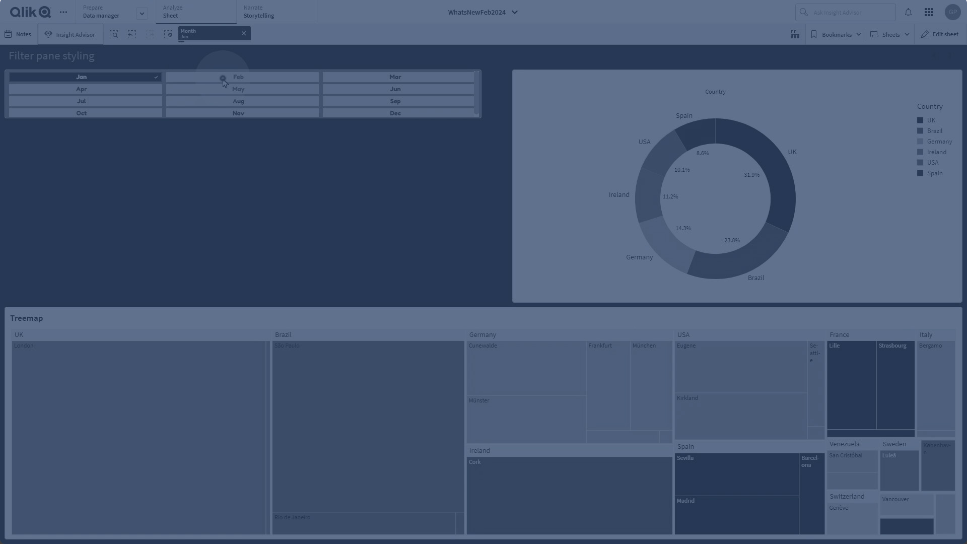
Customizing individual listboxes in a filter pane
A filter pane can contain one or more listboxes to filter dimension values over specified fields. Add fields to the filter pane, then re-arrange them in the properties panel in an order that meets your preferences.
Each field in the filter pane has its own listbox, which shows the individual field values. Each listbox in a filter pane can be customized with its own unique properties.
Do the following:
-
Create a filter pane on a sheet.
-
Add a field to the filter pane to create a new listbox for that field.
-
In the properties panel, under Data, click the field you just added.
This expands the Listbox properties panel, where you can customize the design of the listbox.
Listbox properties panel for a single listbox in a filter pane.

Configuring search options
In Listbox properties, you can choose whether or not users can search for individual field values in each listbox within the filter pane. You can also switch the default Search mode from Normal to Wildcard. Wildcard adds default wildcard symbols (*) to the search field.
Condensing information in the filter pane
There are multiple settings available in Listbox properties to help you customize how much space each listbox occupies in the filter pane.
Enabling compact view
To remove space between each dimension value, select the Compact view checkbox under Presentation.
Adjusting the collapse behavior
You can adjust whether the listbox is shown as expanded or collapsed in the filter pane. When a listbox is collapsed, you can click to expand it temporarily to view and apply selections.
Regardless of the collapse behavior selected, the exact behavior of each listbox within a filter pane depends on a number of factors. These include its configuration in relation to other listboxes in the filter pane, and available space. For more information, see Display limitations.
To adjust the collapse behavior, select an option in the Collapse listbox drop down menu. This is located under Presentation.The following options are available:
-
Auto: The listbox automatically adjusts to be expanded or collapsed, based on available space and configuration in relation to other listboxes in the filter pane. The listbox defaults to this option.
-
Always: The listbox always collapses. It might be placed inside the drop down menu for additional dimensions.
-
Never: The listbox never collapses. It might still be placed inside the drop down menu for additional dimensions.
Changing selection behavior
You can adjust several different settings in Listbox properties to customize how selections are made in the listbox.
Enabling checkbox mode
If you select Checkbox mode under Presentation in Listbox properties, the listbox switches to a view where each dimension value is represented by a checkbox. In this mode, selections are made by clicking the checkbox next to each item, rather than the default behavior allowing clicking and dragging to select multiple values at once.
If you have applied Always one selected value for the field within the assets panel, radio buttons are used instead of checkboxes. The functionality is the same.
Toggling selection toolbar
By default, a selection toolbar appears when you make selections in a listbox. This toolbar allows you to explore other options for selections, as well as clear, cancel, or confirm the selections.
In Listbox properties, the Show selection toolbar checkbox is checked by default. Clear this checkbox if you want the toolbar not to appear above the listbox when you make selections.
If you toggle this setting off, selections are confirmed when you press Enter or click outside the listbox.
Displaying dimension value frequencies
Under Presentation in Listbox properties, click the checkbox next to Histogram to display bars underneath each dimension value to represent how frequently each value appears in the data.
Switching to grid layout
By default, a listbox for a field in a filter pane is set to show data in a single column. Alternatively, you can show data in a grid layout. Under Presentation, in Listbox properties, switch the parameter for Show data in from Single column to Grid.
In the grid layout, you can also configure how the data is ordered (by Row or Column), and customize the maximum visible rows or columns in the grid.
Showing the frequency of values
You can show the frequency next to each value, either as an absolute number or as a percentage. You select this by opening Listbox properties, expanding the Presentation section, and selecting an option in Show frequency.