Get started with visualizations
Visualizations let you present data so that your applications users can interpret and explore it. For example, a bar chart that compares sales numbers for different regions, or a table with precise values for the same data. Good visualizations help you quickly and accurately interpret displayed data.
Fields
Fields contain one or more values and correspond to columns in a database table. The field data can be qualitative or quantitative.
When creating visualizations, you use fields to create your dimensions and measures. You can also use fields in different ways when you add visualizations to your application. Some visualizations, such as tables, can present fields in an unmodified state.
If you are working with fields containing date or timestamp information in your application, you can define a number of related attributes of a date, for example, year or week, and use them in your visualization.
Using data assets in visualizations
Dimensions
Dimensions determine how the data in a visualization is grouped. For example: total sales per country or number of products per supplier. You typically find a dimension as the slices in a pie chart or on the x-axis of a bar chart with vertical bars. Dimensions are created from fields in the data model tables.
When several fields form a natural hierarchy, it can make sense to create a drill-down group.
You can use expressions to create calculated dimensions. A calculated dimension consists of an expression involving one or more fields. All standard functions may be used.
Measures
Measures are calculations used in visualizations, typically represented on the y-axis of a bar chart or a column in a table. Measures are created from an expression composed of aggregation functions, such as Sum or Max, combined with one or several fields.
On some visualization types, you can use modifiers to change how the measure is calculated over the available dimensions. For example, you can have the values of a measure accumulate over one or two dimensions, or you can calculate the average of your measure over a specific number of steps.
For bar charts and line charts you also have the option to add trend lines. A trend line is a visual representation of the direction of values over a period of time.
Expressions
An expression can contain references to fields, variables and measures.
In most cases, expressions are aggregations, that is calculations that potentially can span multiple records. This means that all field references in an expression must be wrapped in an aggregation function. If no aggregation function is used, the Only() function is used.
You can build visualizations that are more dynamic and powerful by using expressions for titles, subtitles, footnotes, and even dimensions. This means, for example, that instead of the title of a visualization being static text, it can be made from an expression whose result changes depending on the selections made.
Using expressions in visualizations
Visualizations
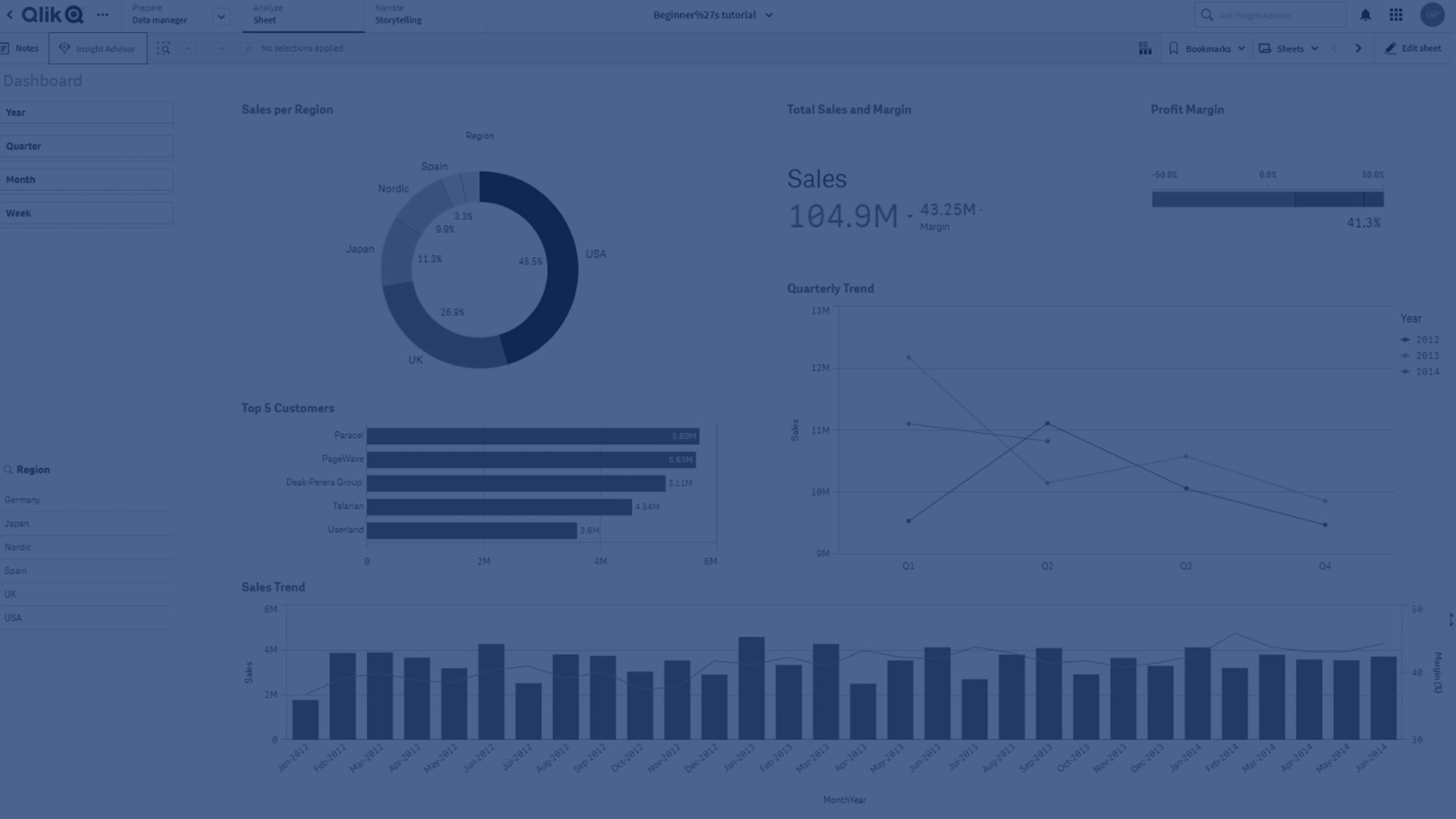
Visualizations let you present data so that your application's users can interpret and explore it. For example, a bar chart that compares sales numbers for different regions, or a table with precise values for the same data. Good visualizations help you quickly and accurately interpret displayed data.
Visualizations are easy to add and customize. They can take the form of charts, such as bar charts, pie charts, tables, gauges, or treemaps. Each chart type has unique functionality. Visualizations can also be analyses, which create charts based on the analysis type you select. Qlik Cloud automatically highlights items associated with your selections so you can drill-down and filter.
After creating a visualization, you may want to make adjustments to improve how it conveys information to users. For example, you can change the data used, or adjust the appearance of the visualization. You can add more dimensions or measures for further depth of information, or remove some to improve clarity, and streamline a visualization.
Choosing the right visualization
Best practices
Before you start creating your visualizations, consult the best practices for designing visualizations and choosing visualization types.
Best practices for choosing visualization types
Best practices for designing visualizations
Guidelines for visualizations, fields, and naming