The scatter plot presents pairs of values from two or three measures.
This is useful when you want to show data where each instance has two numbers, for example, the relationship between Sales and Quantity per Customer. In the scatter plot below, a third measure (Cost) is used to generate the bubble size.
You can create a scatter plot on the sheet you are editing.
In a scatter plot you need one dimension and at least two measures. You can have maximum one dimension and three measures, where the third measure is visualized as bubble size.
Do the following:
- In the assets panel, open Charts.
- Under Visualizations, drag an empty scatter plot to the sheet.
- Click Add dimension and select a dimension or a field.
- Click Add measure and select a measure or create a measure from a field.
- Click Add measure and select a measure or create a measure from a field.
-
Optionally, if you want bubble size to be set according to a third measure:
Click Add measure and select a measure or create a measure from a field.
When you have created the scatter plot, you might want to adjust its appearance and other settings in the properties panel. For information about styling, see Styling the scatter plot. For information about customizing other aspects of the chart's appearance, see Changing the appearance of a visualization.
Styling the scatter plot
You have a number of styling options available under Appearance in the properties panel.
Click Styling under Appearance > Presentation to further customize the styling of the chart. The styling panel contains various sections under the General and Chart tabs.
You can reset your styles by clicking next to each section. Clicking
Reset all resets styles for all available tabs in the styling panel.
For general information about styling an individual visualization, see Applying custom styling to a visualization.
Customizing the text
You can set the text for the title, subtitle, and footnote under Appearance > General. To hide these elements, turn off Show titles.
The visibility of the different labels on the chart depends on chart-specific settings and label display options. These can be configured in the properties panel.
You can style the text that appears in the chart.
Do the following:
-
In the properties panel, expand the Appearance section.
-
Under Appearance > Presentation, click
Styling.
-
On the General tab, set the font, emphasis style, font size, and color for the following text elements:
-
Title
-
Subtitle
-
Footnote
-
-
On the Chart tab, set the font, font size, and color for the following text elements:
-
Axis title: Style the titles on the axes.
-
Axis label: Style the labels on the axes.
-
Value label: Style the labels for the bubbles representing each dimension value.
-
Legend title: Style the title of the legend.
-
Legend labels: Style the labels of the individual legend items.
-
Customizing the background
You can customize the background of the chart. The background can be set by color and image.
Do the following:
-
In the properties panel, expand the Appearance section.
-
Under Appearance > Presentation, click
Styling.
-
On the General tab of the styling panel, you can select a background color (single color or expression). You can also set the background to an image from your media library or from a URL.
Information noteTo add a background image from a URL, the origin must be added to the allowlist in your tenant's Content Security Policy. Add the origin with the img-src directive. This is done in the Administration activity center by an administrator.
For more information, see Creating a CSP entry.
When using a background color, use the slider to adjust the opacity of the background.
When using a background image, you can adjust image sizing and position.
Customizing the border and shadow
You can customize the border and shadow of the chart.
Do the following:
-
In the properties panel, expand the Appearance section.
-
Under Appearance > Presentation, click
Styling.
-
On the General tab of the styling panel, under Border, adjust the Outline size to increase or decrease the border lines around the chart.
-
Select a color for the border.
-
Adjust the Corner radius to control the roundness of the border.
-
Under Shadow in the General tab, select a shadow size and color. Select None to remove the shadow.
Styling bubble outlines
The outlines of the bubbles in the scatter plot can be styled. You can change the size, color, and opacity of the outlines.
Do the following:
-
In the properties panel, expand the Appearance section.
-
Under Appearance > Presentation, click
Styling.
-
On the Chart tab, adjust the settings for Bubble outline. You can set the size, color, and opacity.
Adding reference lines
You can add reference lines to the scatter plot. Reference lines can be added on the X-axis and Y-axis.
Adding an X-axis reference line
Do the following:
-
In the properties panel, expand the Add-ons section.
-
Expand X-axis reference lines, and then click Add reference line.
-
Under Reference line expression, enter a static value or expression to define the position of the line.
-
Further customize the reference line with the following additional settings:
-
Show condition: Set whether to show or hide the line depending on a condition.
-
Label and Show label: Add a label for the line that will be shown in the chart and/or the properties panel.
-
Show value: Set whether to show the value of the expression defining the line.
-
Color: Change the color of the line.
-
Line type: Select between a solid or dashed line.
-
Colored background: Set whether the label and value bar above the chart data area is styled with a colored background.
-
Adding a Y-axis reference line
Do the following:
-
In the properties panel, expand the Add-ons section.
-
Expand Y-axis reference lines, and then click Add reference line.
-
The position of the line is defined with the equation format y=kx+m, where k is the slope and m is the y-intercept. You can define these parameters with the following settings for the newly created reference line:
-
Reference line expression: Enter a static value or expression to define the y-intercept.
-
Slope: Enter a static value or expression to define the slope.
-
-
Further customize the reference line with the following additional settings:
-
Show condition: Set whether to show or hide the line depending on a condition.
-
Label and Show label: Add a label for the line that will be shown in the chart and/or the properties panel.
-
Show value: Set whether to show the value of the expression defining the line.
-
Color: Change the color of the line.
-
Line type: Select between a solid or dashed line.
-
Colored background: Set whether the label and value bar inside the chart data area is styled with a colored background.
-
Adding shapes
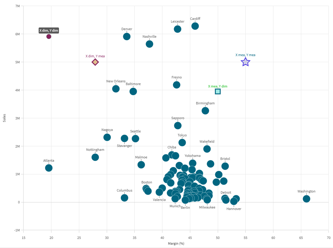
Shapes allow you to enhance your dimension and measure data with special information that helps with analysis. You can add points, lines, and polygons to the scatter plot.
Adding a point
Add single points to the chart to highlight specific information that might not be available in the data model.
For example, you could add a point to highlight a specific dimension value, or a maximum or minimum performance score.
Do the following:
-
In the properties panel, expand Add-ons > Shapes.
-
Click Add shape, and select Point.
-
Optionally, define a Label for the point using text or an expression.
-
Under X-axis input type, set whether to place the point based on a Measure value or Dimension value on the X-axis.
-
Do one of the following:
-
If you selected Measure value, set the X-axis measure value that defines where on the X-axis the point is placed.
-
If you selected Dimension value, set the X-axis dimension value that defines where on the X-axis the point is placed.
-
-
Under Y-axis input type, set whether to place the point based on a Measure value on the Y-axis, or a Y-axis measure value corresponding to a specific Dimension value.
-
Do one of the following:
-
If you selected Measure value, set the Y-axis measure value that defines where on the Y-axis the point is placed.
-
If you selected Dimension value, set the Y-axis dimension value that defines where on the Y-axis the point is placed.
-
-
Set the Symbol to use for the point. The default is Circle.
-
Adjust the Label position if needed. The label can be displayed above or below the point.
-
Set color and opacity using the following settings. You can also configure these elements to have no color.
-
Point color
-
Outline color
-
Label color
-
-
Use the Colored background check box to add a background for the label, if defined. When this option is turned on, the defined Label color is used for the background, and the label text switches to a color that best contrasts the background.
-
Use the sliders to adjust the Outline width and Data point size.
Scatter plot with additional point shapes added.
Adding a line
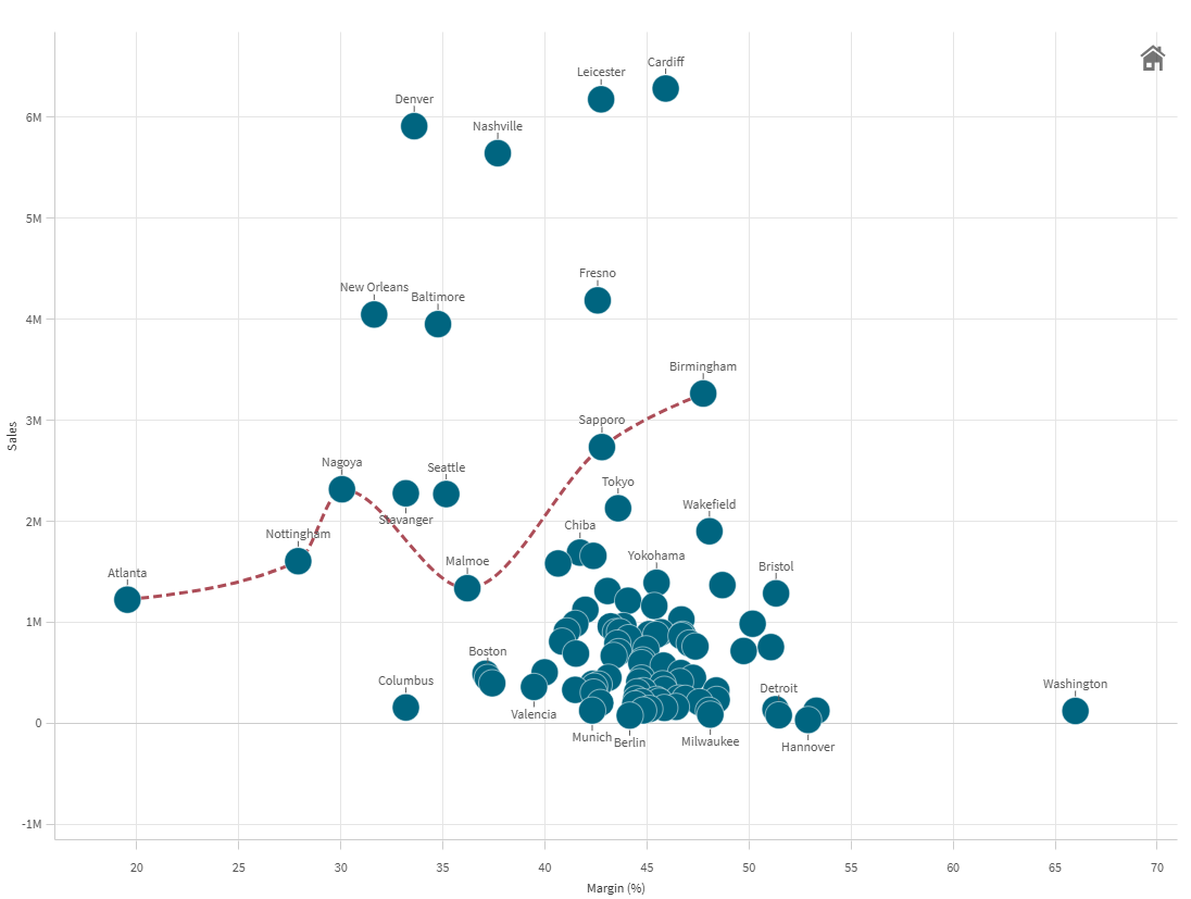
You can add a line as a series of points. The line connects each point that you define for it.
You can draw lines through data points to highlight trends, or draw lines between the highest and lowest points for a key performance indicator.
Do the following:
-
In the properties panel, expand Add-ons > Shapes.
-
Click Add shape, and select Line.
-
Optionally, define a Label for the line using text or an expression.
-
Two points are added to the line by default.
-
Under X-axis input type, set whether to place the point based on a Measure value or Dimension value on the X-axis.
-
Do one of the following:
-
If you selected Measure value, set the X-axis measure value that defines where on the X-axis the point is placed.
-
If you selected Dimension value, set the X-axis dimension value that defines where on the X-axis the point is placed.
-
-
Under Y-axis input type, set whether to place the point based on a Measure value on the Y-axis, or a Y-axis measure value corresponding to a specific Dimension value.
-
Do one of the following:
-
If you selected Measure value, set the Y-axis measure value that defines where on the Y-axis the point is placed.
-
If you selected Dimension value, set the Y-axis dimension value that defines where on the Y-axis the point is placed.
-
-
Adjust the point's appearance using the following settings. Some settings only appear when Show data points is turned on for the line.
-
Label: Set a textual label for the point.
-
Symbol: Set the shape of the point. The default is Circle.
-
Label position: Choose whether to show the label above or below the point.
-
Point color: Set the color of the point.
-
Outline color: Set the color of the point outline.
-
Label color: Set the color of the label text. If Colored background is turned on, this setting instead controls the background behind the label.
-
Outline width: Set the width of the point outline.
-
Data point size: Set the overall size of the point.
-
Colored background: Add a background for the label, if label text has been defined. When this option is turned on, the defined Label color is used for the background, and the label text switches to a color that best contrasts the background.
-
-
Configure the second point using the steps above.
-
Add additional points by clicking Add point. Configure points using the steps above.
-
Set the Line color, including opacity.
-
Use the slider to adjust the Line thickness.
-
Select the Line type, choosing between Solid or Dashed.
-
Use the Line curve drop down menu to select one of the following:
-
Linear: Each point is connected with straight lines.
-
Monotone: Each point is connected with curved lines.
-
Scatter plot with line shape added.
Adding a polygon
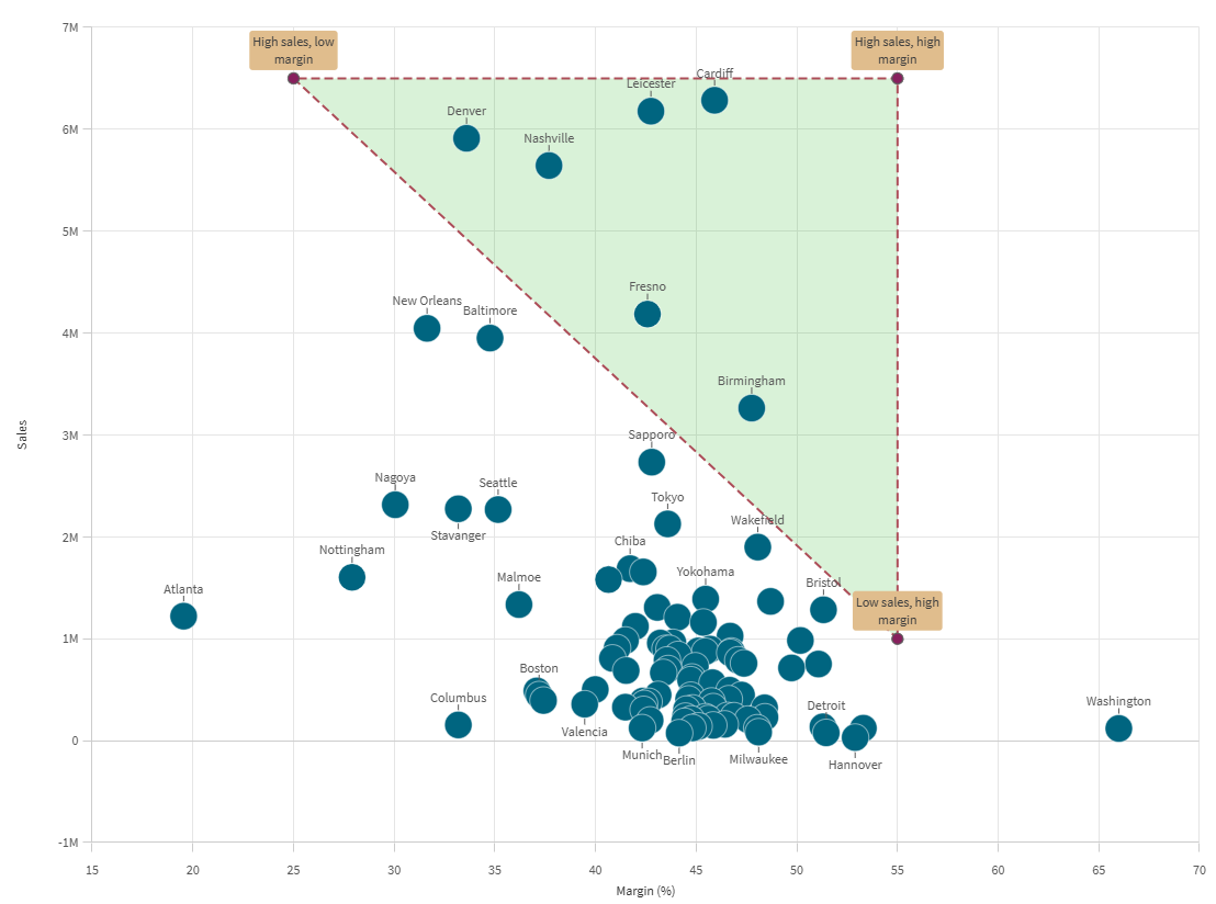
You can add polygons, shapes consisting of points that joined together to create enclosed areas in the scatter plot.
For example, you could create a three-point polygon to highlight highs and lows in margins and sales.

Do the following:
-
In the properties panel, expand Add-ons > Shapes.
-
Click Add shape, and select Polygon.
-
Optionally, define a Label for the polygon using text or an expression.
-
Three points are added to the polygon by default. To add additional points, click Add point.
-
Expand a point.
-
Under X-axis input type, set whether to place the point based on a Measure value or Dimension value on the X-axis.
-
Do one of the following:
-
If you selected Measure value, set the X-axis measure value that defines where on the X-axis the point is placed.
-
If you selected Dimension value, set the X-axis dimension value that defines where on the X-axis the point is placed.
-
-
Under Y-axis input type, set whether to place the point based on a Measure value on the Y-axis, or a Y-axis measure value corresponding to a specific Dimension value.
-
Do one of the following:
-
If you selected Measure value, set the Y-axis measure value that defines where on the Y-axis the point is placed.
-
If you selected Dimension value, set the Y-axis dimension value that defines where on the Y-axis the point is placed.
-
-
Adjust the point's appearance using the following settings. Some settings only appear when Show data points and Show lines are turned on for the polygon.
-
Label: Set a textual label for the point.
-
Symbol: Set the shape of the point. The default is Circle.
-
Label position: Choose whether to show the label above or below the point.
-
Point color: Set the color of the point.
-
Outline color: Set the color of the point outline.
-
Label color: Set the color of the label text. If Colored background is turned on, this setting instead controls the background behind the label.
-
Outline width: Set the width of the point outline.
-
Data point size: Set the overall size of the point.
-
Colored background: Add a background for the label, if label text has been defined. When this option is turned on, the defined Label color is used for the background, and the label text switches to a color that best contrasts the background.
-
-
Edit the other points as needed, using the above steps.
-
Set the Line color, including opacity.
-
Use the slider to adjust the Line thickness.
-
Select the Line type, choosing between Solid or Dashed.
-
Set the Polygon color, including opacity.
Scatter plot with polygon shape added.
Adding partitions
Partitions can augment data analysis by providing context behind specific data ranges in the chart. You can divide data into quadrants and zones based on multiple performance metrics at the same time.
You can create the following types of partitions:
-
Two zones
-
Quadrants
-
Four zones
-
Horizontal zones
Adding a two-zone partition
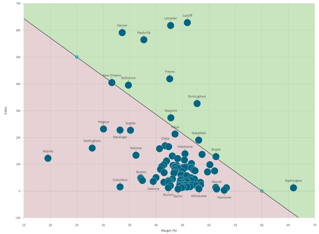
A two-zone partition is used to split data into two different categories. The two zones can be configured with any angle needed.
For example, you could separate high and lower performance for sales.
Do the following:
-
In the properties panel, expand Add-ons > Partitions.
-
Click Add partition, and select Two zones.
-
Optionally, define a Label using text or an expression.
-
Two points are added to the partition by default. These points define the angle at which the chart is partitioned.
-
Expand the first point.
-
Under X-axis input type, set whether to place the point based on a Measure value or Dimension value on the X-axis.
-
Do one of the following:
-
If you selected Measure value, set the X-axis measure value that defines where on the X-axis the point is placed.
-
If you selected Dimension value, set the X-axis dimension value that defines where on the X-axis the point is placed.
-
-
Under Y-axis input type, set whether to place the point based on a Measure value on the Y-axis, or a Y-axis measure value corresponding to a specific Dimension value.
-
Do one of the following:
-
If you selected Measure value, set the Y-axis measure value that defines where on the Y-axis the point is placed.
-
If you selected Dimension value, set the Y-axis dimension value that defines where on the Y-axis the point is placed.
-
-
Set the Symbol to use for the point. The default is Circle.
-
Set color and opacity using the following settings. You can also configure these elements to have no color.
-
Point color
-
Outline color
-
-
Use the sliders to adjust the Outline width and Data point size.
-
Expand the second point. Repeat steps 6 to 12.
-
Turn Show data points on or off depending on preference.
-
If the Show lines setting is on, you can:
-
Set the Line color, including opacity.
-
Use the slider to adjust the Line thickness.
-
Select the Line type, choosing between Solid or Dashed.
-
-
Set the Upper zone color for the top area defined by the points. You can also set the opacity.
-
Set the Lower zone color for the bottom area defined by the points. You can also set the opacity.
Scatter plot with two-zone partition.
Adding a quadrant partition
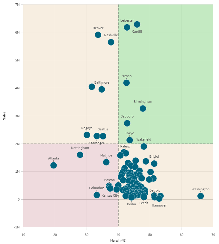
Separating data into four perpendicular quadrants is a common need, especially when you want to assess performance across two measure-based axes.
Do the following:
-
In the properties panel, expand Add-ons > Partitions.
-
Click Add partition, and select Quadrants.
-
Optionally, define a Label using text or an expression.
-
A single Origin is added to the partition by default. Expand it.
-
Under X-axis input type, set whether to place the point based on a Measure value or Dimension value on the X-axis.
-
Do one of the following:
-
If you selected Measure value, set the X-axis measure value that defines where on the X-axis the point is placed.
-
If you selected Dimension value, set the X-axis dimension value that defines where on the X-axis the point is placed.
-
-
Under Y-axis input type, set whether to place the point based on a Measure value on the Y-axis, or a Y-axis measure value corresponding to a specific Dimension value.
-
Do one of the following:
-
If you selected Measure value, set the Y-axis measure value that defines where on the Y-axis the point is placed.
-
If you selected Dimension value, set the Y-axis dimension value that defines where on the Y-axis the point is placed.
-
-
Set the Symbol to use for the point. The default is Circle.
-
Set color and opacity using the following settings. You can also configure these elements to have no color.
-
Point color
-
Outline color
-
-
Use the sliders to adjust the Outline width and Data point size.
-
Turn Show data points on or off depending on preference.
-
If the Show lines setting is on, you can:
-
Set the Line color, including opacity.
-
Use the slider to adjust the Line thickness.
-
Select the Line type, choosing between Solid or Dashed.
-
-
Set the color and opacity for each of the four quadrants.
Scatter plot with quadrant partition.
Adding a four-zone partition
Use a four-zone partition to separate data into four different areas with any angle definitions you desire.
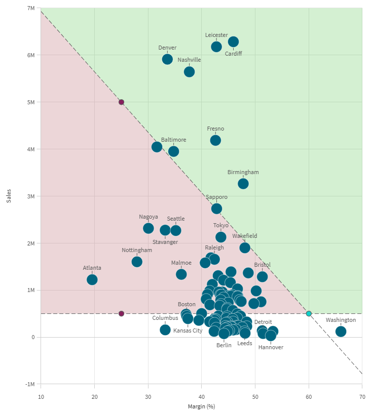
You create zones by defining the intersection point where two other points will meet, and then configuring these two points. The four zones can be configured at any angle to each other.
An example use case is using the first line to define high and low performers, and then using the second line to separate data depending on whether it meets a certain sales threshold.
Do the following:
-
In the properties panel, expand Add-ons > Partitions.
-
Click Add partition, and select Four zones.
-
Optionally, define a Label using text or an expression.
-
An Intersection point and two other points are added by default. Expand the Intersection.
-
Under X-axis input type, set whether to place the point based on a Measure value or Dimension value on the X-axis.
-
Do one of the following:
-
If you selected Measure value, set the X-axis measure value that defines where on the X-axis the point is placed.
-
If you selected Dimension value, set the X-axis dimension value that defines where on the X-axis the point is placed.
-
-
Under Y-axis input type, set whether to place the point based on a Measure value on the Y-axis, or a Y-axis measure value corresponding to a specific Dimension value.
-
Do one of the following:
-
If you selected Measure value, set the Y-axis measure value that defines where on the Y-axis the point is placed.
-
If you selected Dimension value, set the Y-axis dimension value that defines where on the Y-axis the point is placed.
-
-
Set the Symbol to use for the point. The default is Circle.
-
Set color and opacity using the following settings. You can also configure these elements to have no color.
-
Point color
-
Outline color
-
-
Use the sliders to adjust the Outline width and Data point size.
-
Repeat steps 5 to 11 for Point 1 and Point 2.
-
Turn Show data points on or off depending on preference.
-
If the Show lines setting is on, you can:
-
Set the Line color, including opacity.
-
Use the slider to adjust the Line thickness.
-
Select the Line type, choosing between Solid or Dashed.
-
-
Set the color and opacity for each of the four zones.
Scatter plot with four-zone partition.
Adding a partition with horizontal zones
You can partition charts into multiple horizontally parallel zones. A common example is to separate data into high sales, medium sales, and low sales.
Do the following:
-
In the properties panel, expand Add-ons > Partitions.
-
Click Add partition, and select Horizontal zones.
-
To add a divider, click Add limit.
-
Add additional dividers by clicking Add limit.
-
Use the slider and input box to set the numerical value of where each section starts and ends. You can also define colors for each section.
-
Turn Show lines on or off as needed.
-
If the Show lines setting is on, you can:
-
Set the Line color, including opacity.
-
Use the slider to adjust the Line thickness.
-
Select the Line type, choosing between Solid or Dashed.
-
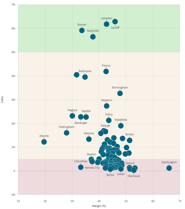
Scatter plot with horizontal zone partition.
