Org chart
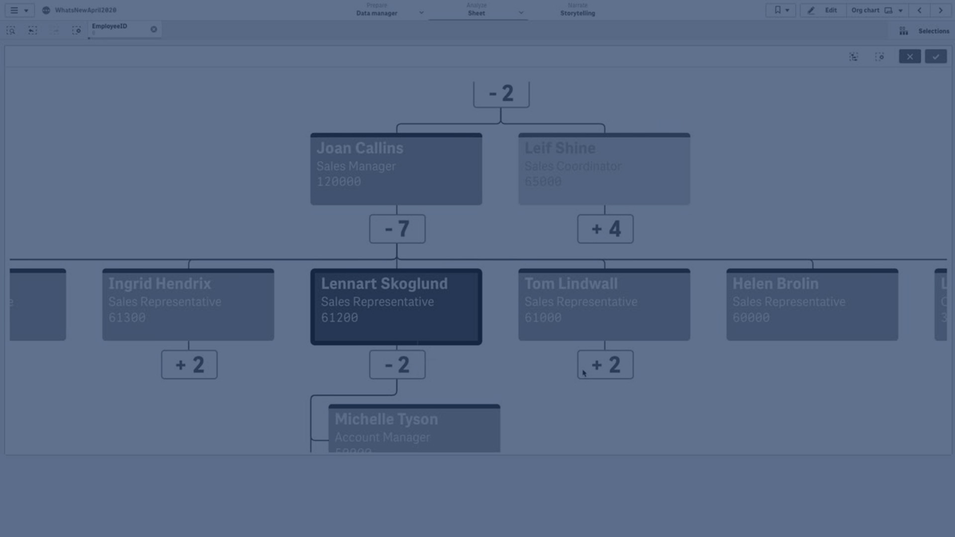
You can use the org chart (Org chart) to create organization charts from data with a tree structure. You can navigate through the hierarchy by expanding and collapsing the tree. The org chart is included in the Visualization bundle.
You need to use a data set with two dimensions that define the tree structure.
- The first dimension needs to be the ID of the node. This would typically be an employee ID in a traditional organization chart.
-
The second dimension needs to be the ID of the parent node. This would typically be the employee ID of a manager.
This connects to the first dimension to create a tree structure.
If this value is empty or points to a node that does not exist, the node becomes a root node at the top of the tree.
EmployeeID | ManagerID | Name | Title |
---|---|---|---|
A101 | Mary Bell | CEO | |
A102 | A101 | John Bialik | Executive secretary |
O101 | A101 | Lee Mayer | COO |
I101 | A101 | Wendy Sanderson | CIO |
T101 | A101 | Asim Nawrat | CTO |
T102 | T101 | Emily Diaz | VP Products |
T103 | T101 | Christine Nemic | VP R & D |
You can also add a measure that is used as a card description.
Preparing the dataset
There are some things you need to consider when preparing the dataset for an org chart.
-
You need to use a dataset with less than 33000 rows.
If you use a larger dataset, the excess rows will be ignored. This can result in a tree with incorrect structure. A message is displayed: The maximum data limit is reached. The tree may display incorrectly.
-
Make sure that the data does not contain circular references.
Circular references can result in nodes being omitted, or creation of multiple root nodes. One of these messages is displayed:
Data contains circular references, nodes are omitted.
No root node, check your data for circular references.
-
If a node has more than 99 children, the excess children nodes will not be rendered.
A message is displayed: Maximum number of child nodes reached, nodes are omitted.
- You should avoid having a large number of rows that do not have a parent node. These will be shown as root nodes. The maximum number of root nodes is 99.
Creating an org chart
You can visualize the example data set using an org chart. Every employee is shown as a card in a tree structure that you can expand and collapse.
Do the following:
- Turn on Advanced options.
- Add an Org chart to your sheet.
- Set the first dimension to be EmployeeID.
- Set the second dimension to be ManagerID.
-
Add labels to the cards. Expand the EmployeeID dimension to see the label properties.
- Set Card title to Name.
- Set Card sub-title to Title.
Changing the appearance of the chart
You can customize the appearance of your org chart.
Adding a measure to set a description
You can display a description by adding a measure. This will replace the value set in the property Card description.
Changing the presentation mode
You can set how the org chart displays in Appearance > Presentation > Presentation mode. Org charts can either display the entire tree, or they can collapse and expand. If an org chart is set to Expand/collapse, you can also set the org chat to automatically resize to fit every time it is expanded or collapsed.
Using the styling panel to further customize the appearance
With Advanced options turned on, you have a number of styling options available under Appearance in the properties panel.
Click Styling under Appearance > Presentation to further customize the styling of the chart. The styling panel contains various sections under the General and Chart tabs.
You can reset your styles by clicking next to each section. Clicking
Reset all resets styles for all available tabs in the styling panel.
For general information about styling an individual visualization, see Applying custom styling to a visualization.
Customizing the text
You can set the text for the title, subtitle, and footnote under Appearance > General. To hide these elements, turn off Show titles.
The visibility of the different labels on the chart depends on chart-specific settings and label display options. These can be configured in the properties panel.
You can style the text that appears in the chart.
Do the following:
-
Click Advanced options.
-
In the properties panel, expand the Appearance section.
-
Under Appearance > Presentation, click
Styling.
-
On the General tab, set the font, emphasis style, font size, and color for the following text elements:
-
Title
-
Subtitle
-
Footnote
-
-
Switch to the Chart tab. By default, Auto contrast is turned on under Text color. This setting automatically adjusts text color of card elements for optimum contrast. Turn the setting off to control text color for each element.
Set the font, font size, and color for the following text elements:
-
Title: Style the text of the card titles.
-
Subtitle: Style the text of the card subtitles.
-
Description: Style the text of the card descriptions.
-
Measure label: Style the text of the measure labels.
-
Measure value: Style the text of the measure values.
-
Customizing the background
Background styling options are available at both the general and card level.
Setting the general background
The general background includes the title area, as well as the chart itself, which is partially covered by the cards.
Do the following:
-
Click Advanced options.
-
In the properties panel, expand the Appearance section.
-
Under Appearance > Presentation, click
Styling.
-
On the General tab of the styling panel, you can select a background color (single color or expression). You can also set the background to an image from your media library or from a URL.
Information noteTo add a background image from a URL, the URL's origin needs to be added to the allowlist in your tenant's Content Security Policy. The origin must be added with the following Directive: img-src. This is done by a tenant administrator.
For more information, see Creating a CSP entry.
When using a background color, use the slider to adjust the opacity of the background.
When using a background image, you can adjust image sizing and position.
Setting the background of the cards
You can define the background color of the cards that appear in the chart.
Do the following:
-
Click Advanced options.
-
In the properties panel, expand the Appearance section.
-
Under Appearance > Presentation, click
Styling.
-
On the Chart tab of the styling panel, under Card background color, select the color to use for the background of the cards. You can set the color to a single color or an expression.
Setting background color of individual cards
With expressions, it is also possible to style individual cards differently than others. To do this, expand Data in the properties panel and expand the first dimension. Set an expression for Card background color. For example, it could be an conditional expression such as: =if(EmployeeID='A101', 'pink')
Customizing card appearance
You can change the background color of the cards (see Setting the background of the cards). You can also configure whether the top bar and border appear in cards, and the color to use for them.
Do the following:
-
Click Advanced options.
-
In the properties panel, expand the Appearance section.
-
Under Appearance > Presentation, click
Styling.
-
On the Chart tab of the styling panel, go to Card appearance. By default, Auto contrast is turned on. This setting automatically adjusts the color of the top bar and border. Turn the setting off to control their color.
Adjust the following settings:
-
Top bar: Choose whether a bar is added at the top of each card for visual appeal.
-
Border: Choose whether each card is surrounded by a border.
-
Border color: This setting becomes available when Auto contrast is turned off. You can set the color of the card borders to a single color, or color them by expression.
-
Customizing the card images
You can add images to the cards in the org chart (see Adding images to the org chart). After you have added images, use the styling panel to change how they are presented.
Do the following:
-
Click Advanced options.
-
In the properties panel, expand the Appearance section.
-
Under Appearance > Presentation, click
Styling.
-
On the Chart tab of the styling panel, under Image options, adjust the following settings:
-
Location: Adjust how users see the images. You can select to show images in cards only, in a tooltip when users hover over a card, or both.
-
Alignment: Choose where in the cards the images appear.
-
Shape: You can choose between a rectangular or round shape for the images.
-
Fit to shape: This setting becomes available when the Shape setting is set to Rectangle. With the setting on, each image is resized to fit the content box in which it appears. The image is then clipped.
-
Customizing the border and shadow
You can customize the border and shadow of the chart.
Do the following:
-
Click Advanced options.
-
In the properties panel, expand the Appearance section.
-
Under Appearance > Presentation, click
Styling.
-
On the General tab of the styling panel, under Border, adjust the Outline size to increase or decrease the border lines around the chart.
-
Select a color for the border.
-
Adjust the Corner radius to control the roundness of the border.
-
Under Shadow in the General tab, select a shadow size and color. Select None to remove the shadow.
Selections in the org chart
You can select cards in the org chart. Selecting a card will include all child nodes below a card in the selection.
Adding images to the org chart
You can add an image for each card in the org chart. You configure card images in the Data section of the properties panel, when configuring the first dimension.
Do the following:
-
Turn on Advanced options.
-
In the properties panel, expand Data.
-
Under Dimensions, expand the first dimension you added.
-
Under Image URL, enter the expression that defines when to use each image. For example, you could have a field named URLs in your data model that contains the URL for each card.
Information noteEach URL's origin needs to be added to the allowlist in your tenant's Content Security Policy. The origin must be added with the following Directive: img-src. This is done by a tenant administrator.
For more information, see Creating a CSP entry.
After defining the images, you can use the styling panel to adjust how they are presented. See Customizing the card images.
Limitations
For information about general limitations, see Limitations.