
The combo chart is suitable for comparing two sets of measure values that are usually hard to compare because of the differences in scale. It is basically a bar chart combined with a line chart. The combo chart can be displayed vertically or horizontally.
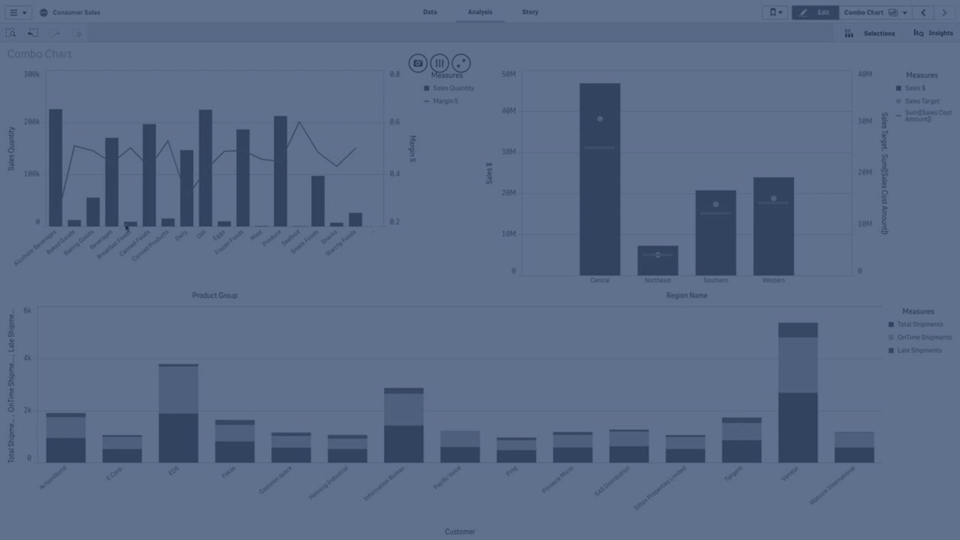
A typical example is when you have a bar chart with sales figures and want to combine these figures with the margin values (in percent). In a regular bar chart, the bars for sales would be displayed as usual, but the margin values would be almost invisible because of the very large difference between the numeric values for sales and margin.
A vertical combo chart with the margin values (in percent) and bars with sales figures.

With a combo chart you can combine these values by, for example, using bars for the sales values and a line for the margin values. By default, the bars have the measure axis on the left and the margin values have a separate axis to the right. The two measures use the same dimension (YearMonth).
If you have yet another measure, for example, gross sales, with values that are roughly in the same range as the sales values, you can add the third measure as bars and either stack or group the new measure values with the sales values. With grouped bars, you can easily compare two or more items in the same categorical group. Stacked bars combine bars of different groups on top of each other and the total height of the resulting bar represents the combined result.
A combo chart with three measures; the margin values (in percent), bars with sales figures and the measure Gross sales grouped with the sales values.

If you have yet another measure, for example, gross sales, with values that are roughly in the same range as the sales values, you can add the third measure as bars and either stack or group the new measure values with the sales values. With grouped bars, you can easily compare two or more items in the same categorical group. Stacked bars combine bars of different groups on top of each other and the total height of the resulting bar represents the combined result.
Line measures in the combo chart can be configured as lines or areas.
A combo chart with stacked bars and two lines configured as area lines.

When to use the combo chart
With the possibility to have different measure scales, one to the left and one to the right, the combo chart is ideal when you want to present measure values that are normally hard to combine because of the significant difference in value ranges.
But a combo chart can also be quite useful when comparing values of the same value range. In the image above, the combo chart only has one measure axis, but the relationship between the two categories sales and cost is clear.
Advantages
The combo chart is the best choice when combining several measures of different value ranges.
Disadvantages
The combo chart only supports one dimension, and can therefore not be used when you need to include two or more dimensions in the visualization.
Display limitations
Displaying out of range values
In the properties panel, under Appearance, you can set a limit for the measure axis range. Without a limit, the range is automatically set to include the highest positive and lowest negative value, but if you set a limit you may have values that exceed that limit. A bar that exceeds the limit will be cut diagonally to show that it is out of range. For a line data point value that is out of range, an arrow indicates the direction of the value.
Displaying large amounts of data in a combo chart
If the chart uses a continuous scale, a maximum of 2000 data points can be displayed. The actual maximum number of data points in the chart is affected by the distribution of the data. Above this actual maximum number of data points, data points are neither displayed, nor included in selections made in the chart.
To avoid displaying limited data sets, you can either make a selection, add a filter, or use dimension limits in the advanced edit mode properties panel.
Colors and legend
When coloring by dimension is used in this chart, a maximum of 100 unique dimension values and 100 unique colors can be plotted on the legend.