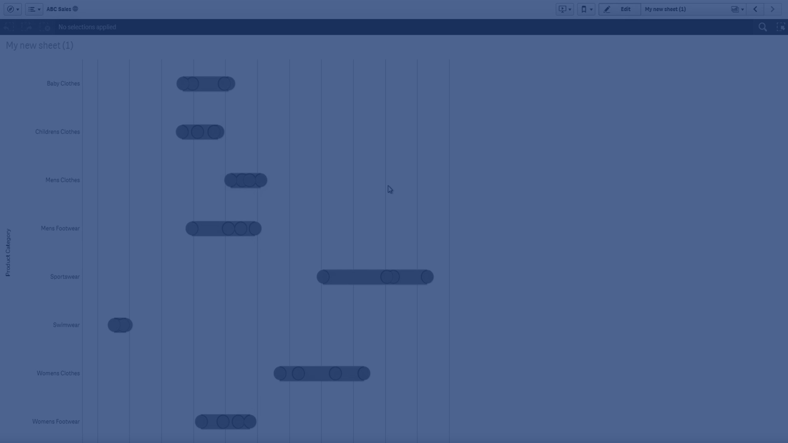
The distribution plot is suitable for comparing range and distribution for groups of numerical data. Data is plotted as value points along an axis.
You can choose to display only the value points to see the distribution of values, a bounding box to see the range of values, or a combination of both as shown here:


When to use the distribution plot
The distribution plot is suitable for comparing range and distribution for groups of numerical data.
Advantages
The distribution plot visualizes the distribution of data.
Disadvantages
The distribution plot is not relevant for detailed analysis of the data as it deals with a summary of the data distribution.
Display limitations
Displaying large amounts of data in a distribution plot
When displaying large amounts of data in a distribution plot, the message "Currently showing a limited data set." is shown to indicate that not all data is displayed.
- If the chart uses more than one dimension, 3000 data points are displayed.
Colors and legend
When coloring by dimension is used in this chart, a maximum of 100 unique dimension values and 100 unique colors can be plotted on the legend.
Other limitations
It is not possible to use calculated dimensions.
