
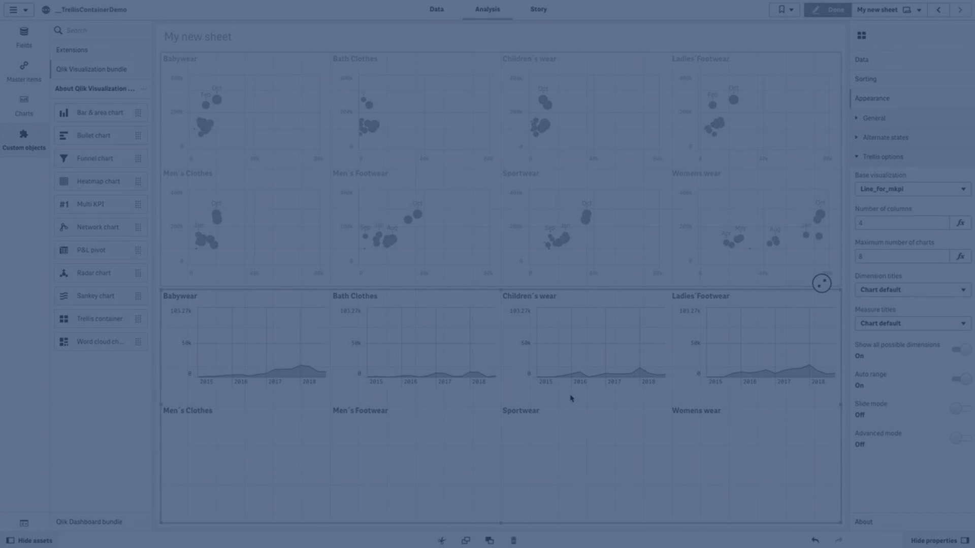
You can use the Trellis container to show a trellis chart based on a master visualization. The trellis chart shows a grid of the same chart for different dimension values. You can use the trellis chart to compare metrics for different groups of data.
Information noteTrellis container is included as a part of the Visualization bundle. Visualization bundle objects have additional limitations and may not have the same support as other visualizations. For more information, see Visualization bundle.
Trellis chart based on a bar chart of sales data, shown for different product categories

Learn more
Related learning: