
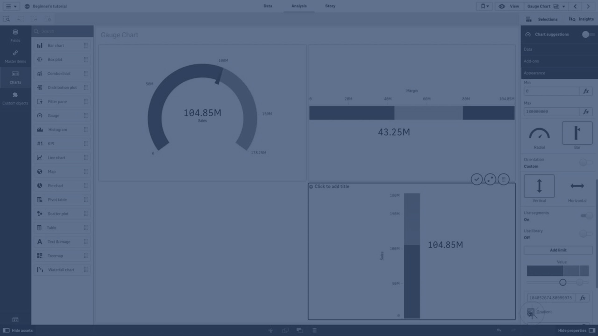
The gauge shows a single measure value and visualizes how to interpret that value.

When to use the gauge
The gauge is often used to present KPIs, for example, on an executive dashboard, and together with segmenting and color coding, it is an effective way of illustrating a performance result.
It is important to set relevant max and min values to support the interpretation of the value. You can use a reference line to provide additional context.
Advantages
A gauge is easy to read and understand and gives an instant indication of the performance within an area.
Disadvantages
The gauge is quite space-demanding in relation to the single value it visualizes.
Although visually compelling, the gauge is not always the best choice for presenting a single measure value. Problems when deciding the max and min values can indicate that some other visualization should be used.
If you only want to show a performance value, without a gauge, consider using a KPI instead.
Display limitations
When a measure value is outside the range limits, an arrow indicates whether the measure value is higher or lower than the range values.