
The bullet chart displays a gauge with extended options. Bullet charts can be used to visualize and compare performance of a measure to a target value and to a qualitative scale, such as poor, average, and good.
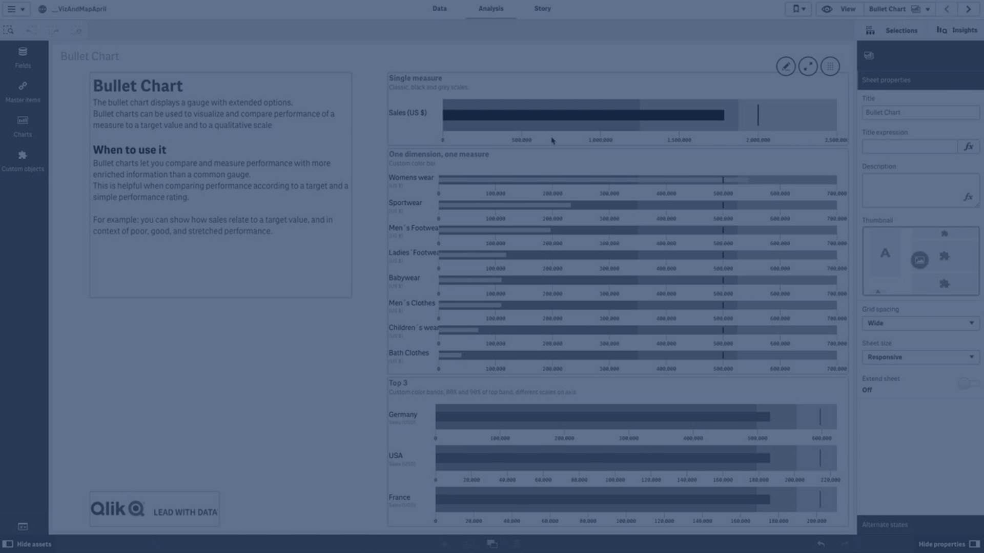
In a bullet chart you need one measure, which determines the length of the bar.
You can also add a dimension. This will show one gauge for every dimension value. If you do not define a dimension, the chart will show a single gauge.
Example:
A bullet chart showing sales performance for each value of the dimension (quarter)

The example shows a bullet chart with sales performance for each quarter. It also shows the performance relative to target and performance range, which are different for each quarter.
When to use the bullet chart
Bullet charts let you compare and measure performance with more enriched information than a common gauge. This is helpful when comparing performance according to a target and a simple performance rating. For example: you can show how sales relate to a target value, and in context of poor, good, and stretched performance.
Limitations
When coloring by dimension is used in this chart, a maximum of 100 unique dimension values and 100 unique colors can be plotted on the legend.