Skip to main content Skip to complementary content

Funnel chart

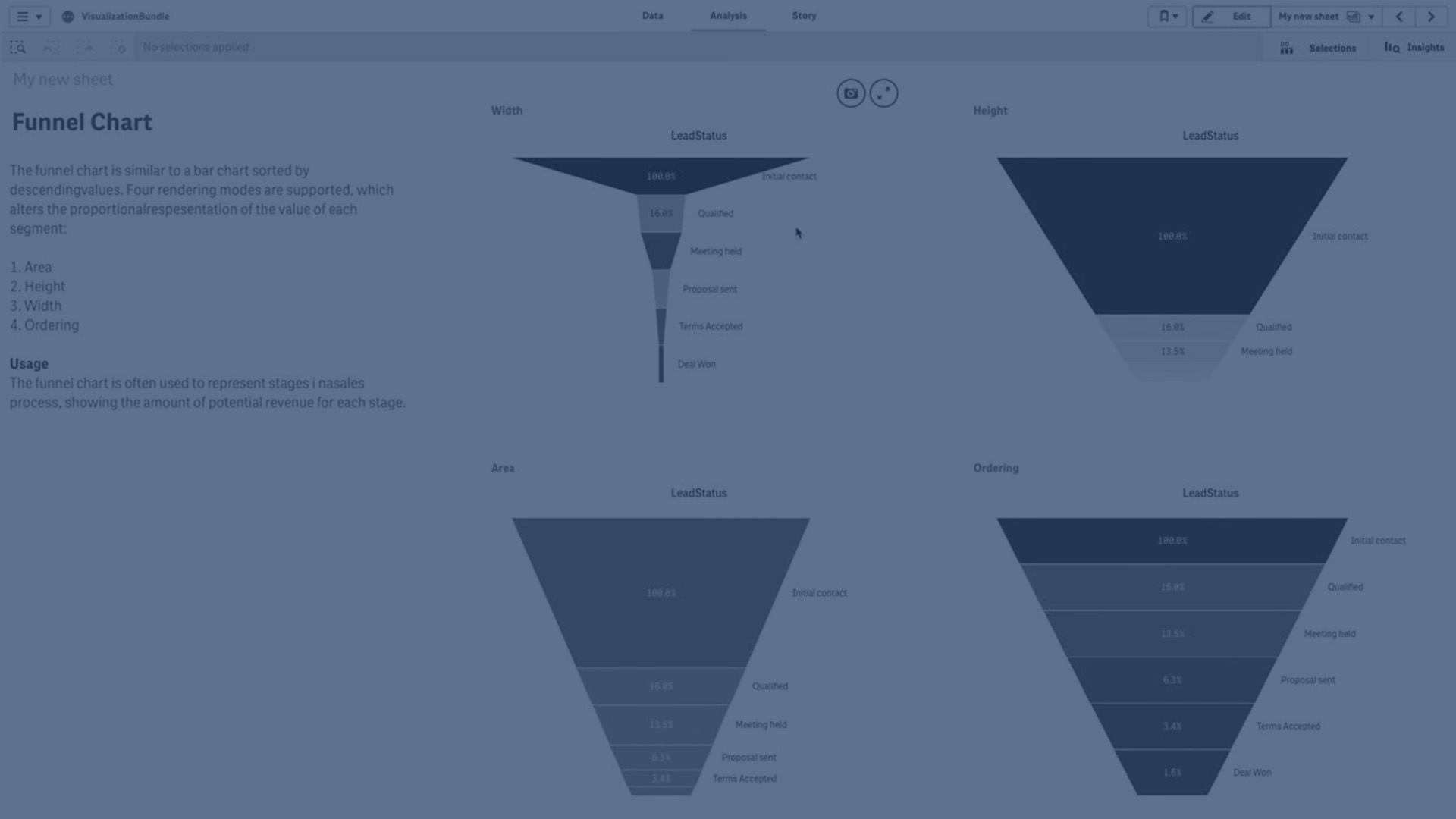
The Funnel chart (Funnel chart) lets you add a sequential chart showing the connected stages of a process. Each stage will decrease and should contain a subset of the previous stage. The decrease is gradual, giving the chart an ever narrower funnel.

A funnel chart displaying the conversion rates of prospects to customers in a sales process.

A funnel chart displaying the conversion rates of prospects to customers in a sales process.

Funnel charts show values across multiple stages in a process. They can represent anything that is decreasing in size. The funnel chart shows a process that starts at 100% and ends with a lower percentage. Each chart segment represents the value of a specific item and can influence the size of other segments. The Funnel chart is included in the Visualization bundle.

  • The chart requires one dimension and one measure.
  • Unlike bar charts, funnel chart segments are centered to create a funnel shape.
  • A chart with increasing stages instead of decreasing is a pyramid graph.

When to use it

The funnel chart is useful to illustrate the stages of a process and the overall decrease of each step, for example:

  • Represent a sales process showing the amount of potential revenue for each stage.
  • Illustrate the number of sales prospects at each stage in a sales pipeline, i.e. the process from prospective customer to made purchase.
  • Identify potential problem areas and bottlenecks of a sales process.
  • Communicate a sales process to new team members and vendors.
  • Illustrate website visitor trends – from visitor homepage hits to other areas, for example downloads, etc.
  • Show order fulfillment with initiated orders at the top, followed by for example, orders in delivery, delivered, canceled and returned.
  • Showing the flow of information from top secret to unclassified.
  • Representing knowledge areas from general knowledge to expert knowledge.

Creating a funnel chart

You can create a funnel chart on the sheet you are editing.

  • The dimension decides how it should be grouped in segments. By default, dimension values are displayed in descending order by measure value.
  • The measure is the value that decides the size of each segment.
  1. In the advanced edit mode assets panel, open Custom objects > Visualization bundle and drag a Grid chart object to the sheet.
  2. Click the top Add dimension button and select the target dimension (usually target market) of the chart.
  3. Click the Add measure button to select the measure (what is to be measured) of the chart. Once dimensions (dimension label) and measure (value label) have been selected the funnel chart displays automatically (in color) in the chart field.
  4. Click Done to revert to the main display field.
  5. Click applicable region under Region. The chart field will update displaying chosen parameters and details.

Dimension, measure and region details will continue to display in the chart field even when reverting to Edit mode.

Changing the appearance of the chart

You can customize your chart with one or more features.

Funnel mode

You can set the shape of the funnel with Appearance > Presentation > Funnel Mode.

Area

The area of each item is proportionate to the measure. Only the height of the individual segment is affected - not the overall chart or contents.

Funnel chart shaped in default funnel mode.

Height

The height of each item is proportionate to the measure. Only the height of the individual segment is affected - not the overall chart or contents.

Funnel chart shaped by measure height.

Width

The width of the upper edge is proportionate to the maximum value of the measure. The top segment is always 100% and the following segments are relative in size to the first. The lowest segment is rectangular. This affects the shape of the funnel and each segment has its individual slope.

Funnel chart shaped by measure width.

Ordering

The measure only orders the segments with largest value at the top. The ordering is fixed so the shape of the funnel is not affected.

Funnel chart shaped with largest value on top.

Colors

You can choose how to color the funnel chart by changing the Appearance > Colors setting from Auto to Custom.

Single color

You can use a single color for the entire funnel chart by selecting Single color in Colors.

Funnel chart with a single color.

Color by dimension

You can also color your entire funnel chart by dimension by selecting By dimension in Colors. There are two gradient color schemes available:

  • 12 colors
  • 100 colors

You can also select to keep persistent colors with Persistent colors.

Color by measure

You can color your funnel chart by measure by selecting By measure in Colors. The measure of the chart is selected as default, but you can change it under Select measure. This measure must be unlinked before a new can be selected. You can also change the measure using an expression in the Expression editor (Expression).

You can choose between four color schemes. It is also possible to reverse the colors.

  • Sequential gradient
  • Sequential classes
  • Diverging gradient
  • Diverging classes

You can also set a color range for your chart based on your measure by setting Range to Custom. Set the range in Range > Min and Range > Max. You can use a number or an expression that evaluates as a number.

Color by expression

You can color your funnel chart by measure by selecting By expression in Colors. You can color it in two ways.

  • The expression evaluates as a valid CSS color to color the chart. The expression is a color code should be checked.
  • The chart is colored by the expression value according to a color scheme. The expression is a color code should be unchecked.

    You can also set the range of the colors.

Sorting

Funnel chart elements are automatically sorted from largest to smallest. You can change the sort order in the properties panel. Go to Sorting, and drag your dimensions and measurements into the desired order.

Styling and formatting

The position and order of labels for dimension and measure values can be displayed in different ways. You can for example hide the dimension value or display measures as values or as a percentage.

Additionally, you configure the title label to display for the dimension under Data in the properties panel. Change the styling of these text elements in the styling panel. See Using the styling panel to further customize the appearance.

Dimension label

You can choose if you want to show the dimension title label or not with Appearance > Presentation > Dimension title

Value labels

You can choose how to show value labels for each segment by setting Appearance > Presentation > Value labels to Custom.

  • None hides the value labels.
  • Share displays the values as percentage.
  • Values displays the actual measure values.

Using the styling panel to further customize the appearance

With Advanced options turned on, you have a number of styling options available under Appearance in the properties panel.

Click Styling under Appearance > Presentation to further customize the styling of the chart. The styling panel contains various sections under the General and Chart tabs.

You can reset your styles by clicking next to each section. Clicking Reset all resets styles in both General and Chart.

For general information about styling an individual visualization, see Applying custom styling to a visualization.

Customizing the text

You can set the text for the title, subtitle, and footnote under Appearance > General. To hide these elements, turn off Show titles.

The visibility of the different labels on the chart depends on chart-specific settings and label display options. These can be configured in the properties panel.

You can style the text that appears in the chart.

  1. Click Advanced options.

  2. In the properties panel, expand the Appearance section.

  3. Under AppearancePresentation, click Styling.

  4. On the General tab, set the font, emphasis style, font size, and color for the following text elements:

    • Title

    • Subtitle

    • Footnote

  5. On the Chart tab, set the font, font size, and color for the following text elements:

    • Dimension title: Style the text of the dimension title that is displayed above the visualization.

    • Dimension value label: Style the text of the labels displaying the individual dimension values.

    • Value Label: Style the text of the measure value labels.

      Use the Auto contrast color setting to automatically override the selected value label color with a color that better contrasts the funnel colors.

Customizing the background

You can customize the background of the chart. The background can be set by color and image.

  1. Click Advanced options.

  2. In the properties panel, expand the Appearance section.

  3. Under AppearancePresentation, click Styling.

  4. On the General tab of the styling panel, you can select a background color (single color or expression), and also set the background to an image from your media library.

    When using a background color, use the slider to adjust the opacity of the background.

    When using a background image, you can adjust image sizing and position.

Customizing the border and shadow

You can customize the border and shadow of the chart.

  1. Click Advanced options.

  2. In the properties panel, expand the Appearance section.

  3. Under AppearancePresentation, click Styling.

  4. On the General tab of the styling panel, under Border, adjust the Outline size to increase or decrease the border lines around the chart.

  5. Select a color for the border.

  6. Adjust the Corner radius to control the roundness of the border.

  7. Under Shadow in the General tab, select a shadow size and color. Select None to remove the shadow.

Limitations

For information about general limitations, see Limitations.

Learn more

Did this page help you?

If you find any issues with this page or its content – a typo, a missing step, or a technical error – let us know how we can improve!