
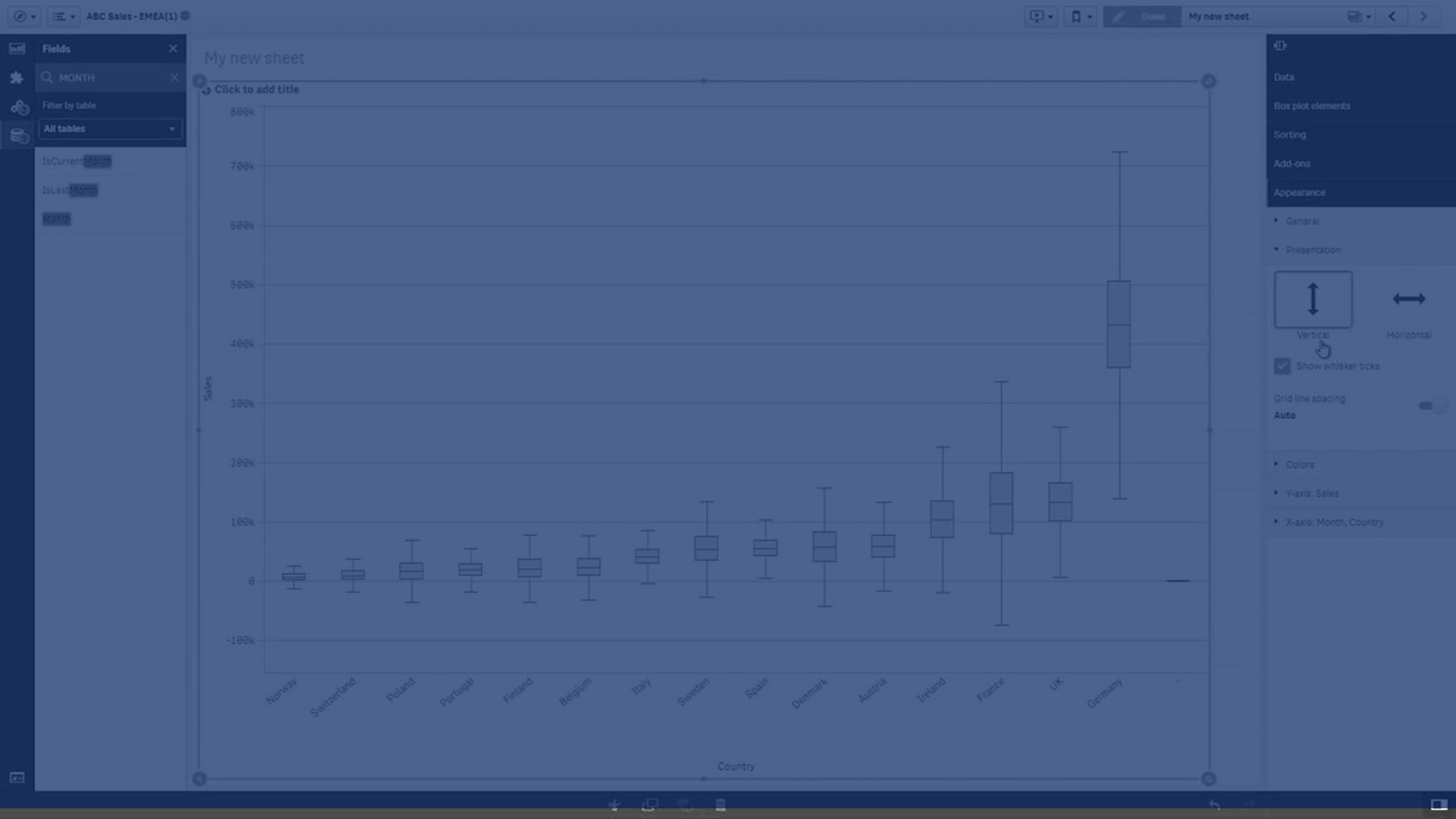
The box plot is suitable for comparing range and distribution for groups of numerical data, illustrated by a box with whiskers, and a center line in the middle. The whiskers represent high and low reference values for excluding outlier values.
You can define the box start and end points, and whiskers ranges with a few different presets, or define your own settings using expressions.

- First whisker
- Box start
- Center line
- Box end
- Last whisker
Tip noteYou can hover over a box to display a popup showing the respective values of the box plot elements.
When to use the box plot
The box plot is suitable for comparing range and distribution for groups of numerical data.
Advantages: The box plot organizes large amounts of data, and visualizes outlier values.
Disadvantages: The box plot is not relevant for detailed analysis of the data as it deals with a summary of the data distribution.
Learn more
Related learning: