The pivot table presents dimensions and measures as rows and columns in a table. In a pivot table you can analyze data by multiple measures and in multiple dimensions at the same time.
You can create a new pivot table on the sheet you are editing.
Do the following:
- In the assets panel, open Charts.
- Under Visualizations, drag an empty pivot table to the sheet.
- Click Add dimension and select a dimension or a field.
- Click Add measure and select a measure or create a measure from a field.
You can adjust appearance and other settings in the properties panel. For information about styling, see Styling the pivot table.
Styling the pivot table
You have a number of styling options available under Appearance in the properties panel.
Click Styling under Appearance > Presentation to further customize the styling of the chart. The styling panel contains various sections under the General and Chart tabs.
You can reset your styles by clicking next to each section. Clicking
Reset all resets styles for all available tabs in the styling panel.
For general information about styling an individual visualization, see Applying custom styling to a visualization.
Customizing the text
You can set the text for the title, subtitle, and footnote under Appearance > General. To hide these elements, turn off Show titles.
The visibility of the different labels on the chart depends on chart-specific settings and label display options. These can be configured in the properties panel.
You can style the text that appears in the chart.
Do the following:
-
In the properties panel, expand the Appearance section.
-
Under Appearance > Presentation, click
Styling.
-
On the General tab, set the font, emphasis style, font size, and color for the following text elements:
-
Title
-
Subtitle
-
Footnote
-
-
On the Chart tab, set the font size and color for the following text elements:
- Header: Style the text of the headers for each column to the right of the first column.
- Content: Style the text of the first column, as well as each cell in the table itself.
Additionally, you can customize how the text appears when a user hovers over a row. See Customizing the hover behavior and scrollbar.
Customizing the background
You can customize the background of the chart. The background can be set by color and image.
Do the following:
-
In the properties panel, expand the Appearance section.
-
Under Appearance > Presentation, click
Styling.
-
On the General tab of the styling panel, you can select a background color (single color or expression). You can also set the background to an image from your media library or from a URL.
Information noteTo add a background image from a URL, the origin must be added to the allowlist in your tenant's Content Security Policy. Add the origin with the img-src directive. This is done in the Administration activity center by an administrator.
For more information, see Creating a CSP entry.
When using a background color, use the slider to adjust the opacity of the background.
When using a background image, you can adjust image sizing and position.
If a cell in the pivot table has a null value, it is colored separately from the background settings applied in the styling panel (it appears in a white color).
Customizing the hover behavior and scrollbar
You can set display options for when a user hovers over a row in the table. You can also set the scrollbar size.
Do the following:
-
In the properties panel, expand the Appearance section.
-
Under Appearance > Presentation, click
Styling.
-
On the Chart tab of the styling panel, under Row hover, adjust the following settings:
-
To highlight rows in the table when a user hovers over them, set the switch to On. Switch the behavior off according to preference.
-
Row hover color: Set the color to highlight the row when a user hovers over it.
-
Row hover font color: Set the color of the text in the highlighted row when a user hovers over it.
-
-
Under Scrollbar size, set the size of the scrollbar in the chart (you can select Small, Medium, or Large).
Customizing the border and shadow
You can customize the border and shadow of the chart.
Do the following:
-
In the properties panel, expand the Appearance section.
-
Under Appearance > Presentation, click
Styling.
-
On the General tab of the styling panel, under Border, adjust the Outline size to increase or decrease the border lines around the chart.
-
Select a color for the border.
-
Adjust the Corner radius to control the roundness of the border.
-
Under Shadow in the General tab, select a shadow size and color. Select None to remove the shadow.
Pivoting your data in the properties panel
In the properties panel, you can add measures and dimensions to the pivot table, and also pivot rows or columns.
Data
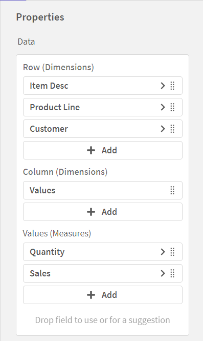
In the data pane, you can add dimensions and measures. You can move items between rows and columns. You can also change item order inside rows or columns. When you use more than one measure, they are grouped and a Values item is created.
Sorting
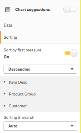
On the sorting pane in advanced properties, you can change the internal order of dimensions and measures.
Sort by first measure
If you have more than one measure, a measure group is created. Turn on Sort by first measure to sort dimension values by the numeric value of the first measure. You can choose between Ascending and Descending sort order.
This sort order will affect all dimensions, and take precedence before any other sort order defined under the dimensions.
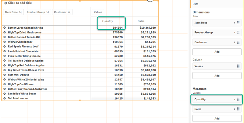
For example, you have two measures: Quantity and Sales. In the properties pane, under Data> Measures, Quantity is listed first. If you Sort by first measure in descending order, your table is sorted starting with the dimension with the highest Quantity.
If Sort by first measure is turned off, the table uses the sort order configured for the dimensions.
Pivot table in edit mode. Sort by first measure has been toggled on.
Limitations:
- This option is only supported if subtotals are calculated. You can calculate subtotals by doing one of the following:
- In the properties pane, go to Data, and click on a dimension. Toggle on Show totals.
- In the properties pane, go to Appearance > Presentation. Toggle on Indent rows.
- This option is not supported for calculated dimensions.
- This option is only supported if all dimensions are in the Row section and all measures are in the Column section.
Dimension sorting
With Sort by first measure turned off, the table can be sorted by dimension values. Each dimension can have Auto or Custom sorting. With Auto sorting, field values are sorted alphabetically and numerically in ascending order. With Custom sorting, you can turn each of the following settings on or off:
-
Sort by expression: Sorts by custom expression. Sort by expression overrides the Sort numerically and Sort alphabetically settings. This option should only be used with the first (outermost) dimension in the table.
-
Sort numerically: Sorts field values starting with a number.
-
Sort alphabetically: Sorts field values starting with a letter.
Ascending and Descending options are available for all three settings.
Sorting in search
The user can click a dimension name in the table to expand a listbox. In the listbox, the user can search and select individual dimension values. The Sorting in search setting controls the sort order of the values in a dimension listbox.
You have the following options for the listbox sort order:
-
Auto: Uses the default sort order. Numbers are sorted numerically in ascending order. Text is sorted alphabetically in ascending order.
-
Inherit from dimension: Uses the sort order defined for the individual dimension.
Global grouping
Global grouping lets you create a limited data set, and within that data set, single out values that you want to focus on. For example: the best quarters, the top sales people, or the worst selling products.
Example:
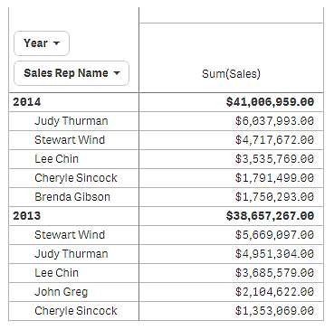
In the following pivot table, no limitation is applied. The values are sorted on Sales, descending. The list is long and the values for 2013 are not shown.
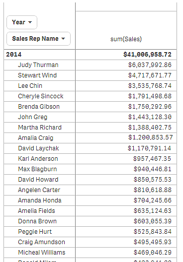
In the following pivot table, a limitation has been applied to the (inner) dimension Sales Rep Name, so that only the top five sales representatives for the years 2013 and 2014 are shown.
The next step is to select global grouping in the advanced edit mode properties panel. The option Global grouping is only available after you have applied a limitation on the dimension.
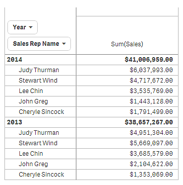
When global grouping is selected, the limitation on the top five sales representatives is applied again, but this time the dimension Year is ignored. The five sales representatives with the highest sales (either in 2013 or 2014) are the only ones that will be presented in the final pivot table.
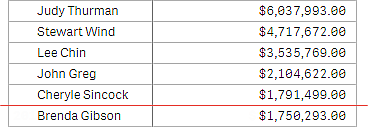
The following image shows the six highest results for 2014 and 2013. The top four results are from 2014, but the fifth (John Greg) is from 2013. Because five other sales representatives have higher sales than Brenda Gibson (who was number five in 2014), she is removed.
The following image shows the pivot table with global grouping applied. The pivot table only contains the sales results for the top five sales representatives. Even though Brenda Gibson had a better result in 2014 than John Greg, his result for 2013 qualified him for the top five list.
Configuring totals
You can choose to show numeric totals for dimensions in the pivot table. Consider the following:
-
With Indent rows turned on in Appearance > Presentation, you can show totals for any dimension other than the automatically created Values dimension.
-
With Indent rows turned off in Appearance > Presentation, you can show totals for the first Row dimension, and any Column dimension other than the automatically created Values dimension.
Do the following:
-
In the properties panel, expand the Data section.
-
Expand the dimension.
-
Set Show totals to On.
Creating a bookmark with an expanded pivot table
By default, if you create a bookmark that contains a pivot table, the pivot table will be shown collapsed. If you expanded any rows using , they will not be shown. However, you can choose to show the pivot table as expanded.
Do the following:
-
Click
in the toolbar.
-
Click Create new bookmark.
Change the name and description, if desired.
- Toggle on Save layout.
- Click Save.
