Using data in an application
To finish off this tutorial, it is time for you to put your loaded data into a visualization in your application.
Adding a chart
Now that your data is loaded, you can create some charts with the data. Charts are often also called visualizations. It is not until you have also added the required dimensions and measures that a chart is complete. You will start by adding the charts and then continue by adding dimensions and measures.
Do the following:
- Create a new sheet in your Scripting Tutorial application.
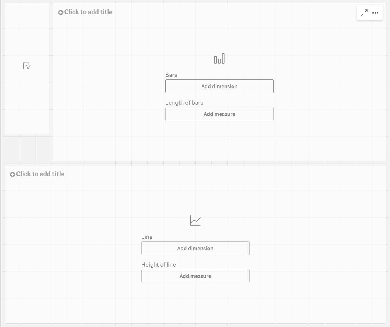
- Drag a filter pane from the Charts tab to the sheet and use the handles to resize it so that it is 3 cells wide and 4 cells tall. Place it in the top left corner of the sheet.
- Drag a bar chart to the top right corner, make it 5 cells tall and wide enough to stretch until the side of the sheet.
- Drag a line chart to the remaining space.
The icons on the sheet show what sort of chart you have added. Now you can add dimensions and measures to your charts to complete them as visualizations.
Qlik Sense sheet with empty charts
Adding dimensions and measures
The next step is to add dimensions and measures. Begin by adding time dimensions to the top left filter pane. The benefit of a filter pane is that you save space. Instead of having one filter pane each for Year, Quarter, Month, and Week, you will use only one filter pane for the same purpose.
Creating and adding dimensions
Do the following:
- Scroll down to the bottom of the list, and click the field Year. Drag it to the center of the top left filter pane.
- In the same way, add Quarter, Month and Week to the filter pane.
You have now created a filter pane with four dimensions: Year, Quarter, Month, and Week.
Creating and adding measures
Most visualizations need both dimensions and measures. A measure is the result of an aggregation expression, which is, in many cases, a common function, such as Sum, Max, Min, Avg (average), or Count.
In the bar chart you will show the sales by region.
Do the following:
- Click the field Region and drag it to the center of the bar chart area.
- Click Add "Region".
- Click the field Sales and drag it to the center of the bar chart area.
- Click Add as measure > Sum(Sales).
-
In the properties panel on the right-hand side, click Appearance and then Presentation. Select Horizontal.
The bars are now displayed horizontally.
-
In the properties panel on the right-hand side, click Sorting.
The sorting order is displayed.
- Drag Sum([Sales]) above Region so that the dimensions are sorted by Sum([Sales]) (measure value) instead of Region (dimension value, alphabetically).
- Paste the following into the title field of the bar chart:
- Press Enter.
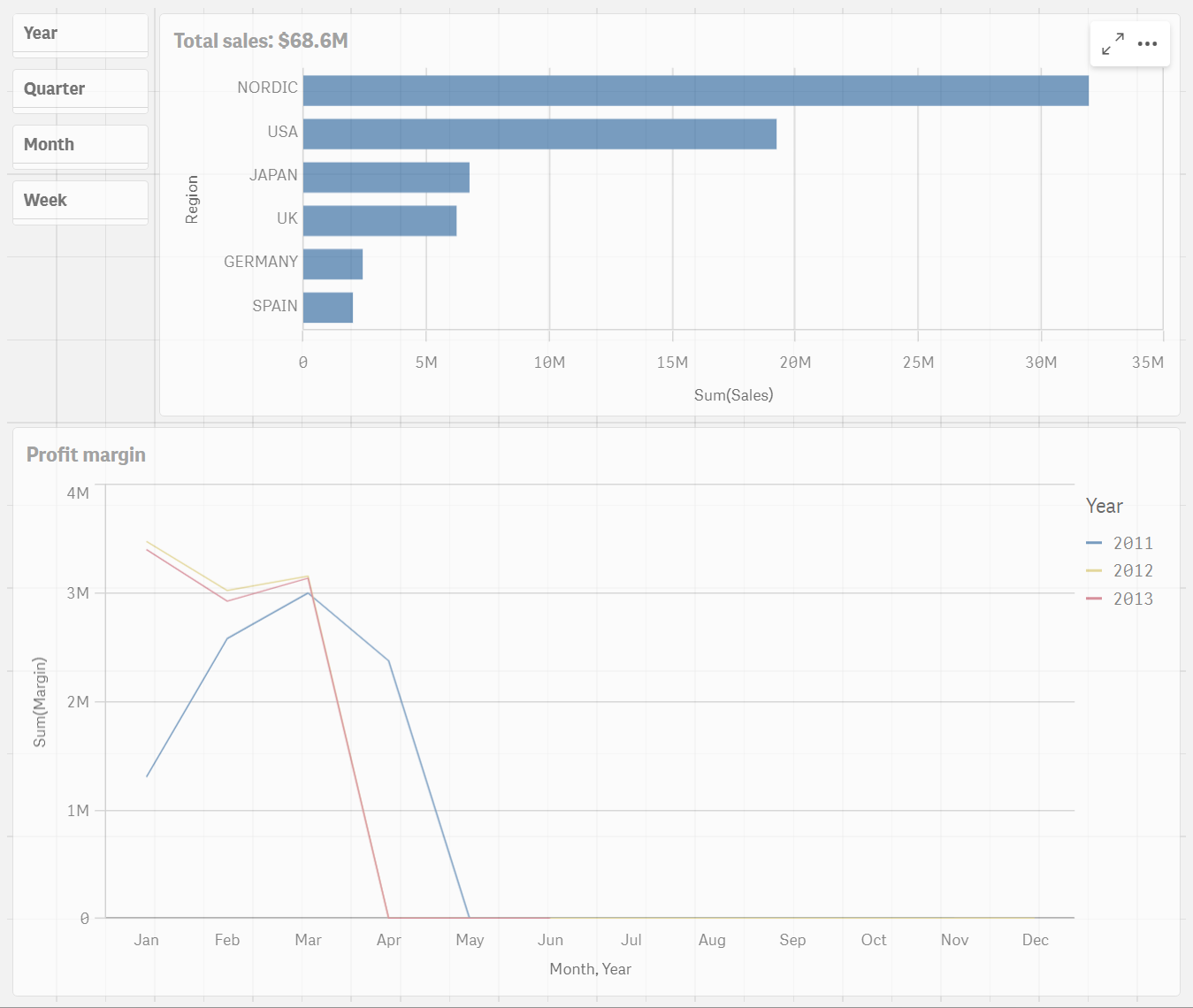
The bar chart is complete, showing the sales results for the different regions. This is a basic bar chart. There are many options to enhance it in the properties panel (to the right). Just to show you one of the possibilities, let us use the title area for something more than just a title.
='Total sales: $'& Round(Sum(Sales)/1000000, 0.1) & 'M'The final visualization on this sheet is a line chart.
Do the following:
- Click the field Month and drag it to the center of the line chart area.
- Click Add "Month".
- Click the field Year and drag it to the center of the line chart area.
- Click Add "Year".
- Click the field Margin and drag it to the center of the line chart area.
- Click Add as measure > Sum(Margin).
- Add the title Profit margin on top of the line chart.
- Stop editing the sheet.
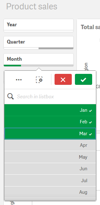
- Click the Month field in the filter box, and then select Jan, Feb, and Mar.
- Close the filter pane. The Profit margin chart shows the data for the first three months of each year.
Charts with data

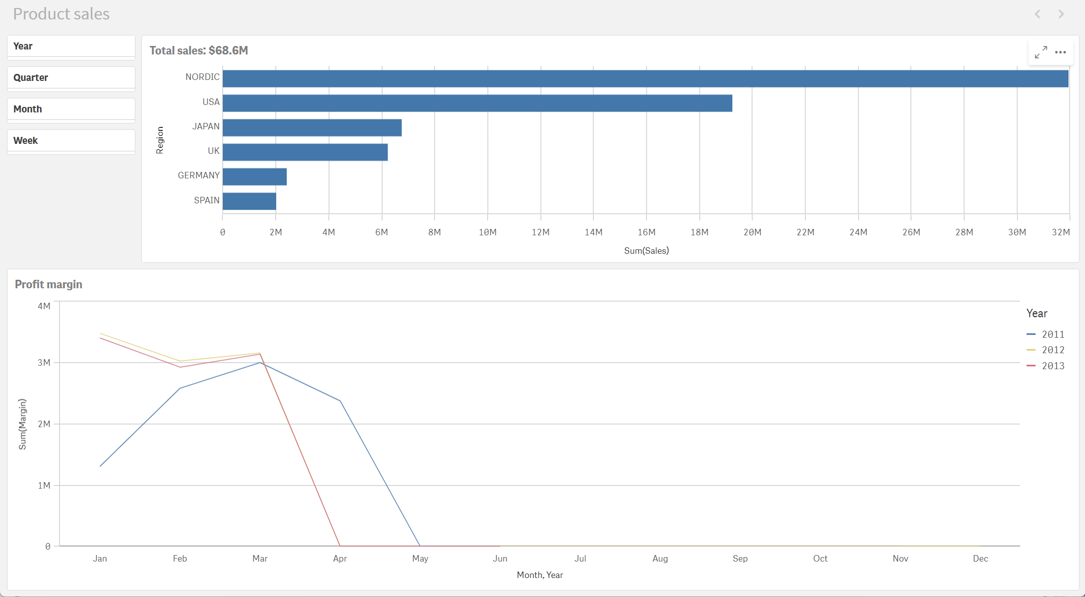
The sheet is now complete and you can begin to click around and interact with the contents of the sheet.
Completed sheet

Because we limited the amount of monthly sales data in our original Sales.xlsx file, there is little data available for our chart after the end of March for each year. You can make selections in your filter pane so that you are only comparing the first three months of each year.
Filter box

Profit margin chart updated based on selections

Thank you!
Now you have finished this tutorial, and hopefully you have gained some basic knowledge about scripting in Qlik Sense. Please visit our website for more inspiration for your applications.
