Le damos la bienvenida a Qlik Cloud
Qlik Cloud cierra la brecha entre los datos, los conocimientos y la acción, gracias a la inteligencia activa que aporta la única solución integral, de extremo a extremo, de análisis e integración de datos.
Presentamos Qlik Cloud
Qlik Cloud es una plataforma en la nube de análisis e integración de datos creada para la Inteligencia activa. Ofrece servicios de análisis e integración de datos que se pueden usar juntos o de forma independiente.

Introducción y opciones de aprendizaje
La documentación técnica de Qlik contiene ejemplos, tutoriales y guías de resolución de problemas para todos los niveles de habilidad y para cualquier etapa de su recorrido.

Vista general de la interfaz
Cuando inicie sesión en Qlik Cloud por primera vez, encontrará tutoriales y demostraciones que le ayudarán a comenzar.

Qlik Cloud Government
Qlik Cloud Government difiere de la oferta comercial Qlik Cloud de Qlik. Incluye los protocolos de seguridad requeridos para el sector público de EE. UU. y está autorizado en el nivel de impacto moderado (IL) de FedRAMP y el IL2 del Departamento de Defensa (DOD).
Analizar datos
Qlik Cloud Analytics ofrece capacidades analíticas modernas para una amplia gama de usuarios y casos de uso, desde análisis de autoservicio hasta paneles y aplicaciones interactivos, análisis conversacional, catálogo y linaje de metadatos, análisis móvil, informes y alertas.

Usar la analítica para explorar datos
Trabaje con aplicaciones y visualizaciones para obtener una visión general de sus datos. Al ver las relaciones que existen en sus datos, podrá tomar decisiones bien fundamentadas y realizar nuevos descubrimientos.

Crear análisis y visualizar datos
Cree potentes análisis y visualizaciones de datos. Las apps que crea determinan las bases sobre las que los usuarios de las apps pueden visualizar datos y hacer descubrimientos.

Carga y modelado de datos analíticos
Agregue sus fuentes de datos primero, cargue los datos en su app y empiece a modelar su modelo de datos.

Entrega de datos y linaje para el análisis
Opciones para cargar datos locales y de linaje en su espacio empresarial inquilino de Qlik Cloud.

Aprendizaje automático (Machine learning) con Qlik Predict
El aprendizaje automático o Machine Learning (ML) es un proceso automatizado que encuentra patrones en sus datos y los utiliza para predecir datos futuros.
Integrar datos
Qlik Talend Cloud ofrece movimiento de datos, transformación de datos y productos de datos en tiempo real con Qlik Talend Data Integration. Además, Qlik Talend Cloud incluye las capacidades de Talend para la administración de datos, la calidad de datos y la integración de apps, entre otras.

Introducción a la integración de datos
Cree procesos analíticos (canalizaciones) de datos para realizar diversas tareas de integración de datos en apoyo de sus requisitos de arquitectura y análisis de datos. También puede agilizar la gestión de sus datos utilizando los productos de datos.

¿Qué es Qlik Talend Cloud?
En los niveles superiores de Qlik Talend Cloud se incluyen más funciones de integración de datos de Talend. Entre estas se incluyen una mejor administración de los datos, funcionalidad de calidad de datos, integración de apps y más capacidades.

Vídeos de Integración de datos
Vea algunos de nuestros vídeos cortos para comenzar a integrar datos.
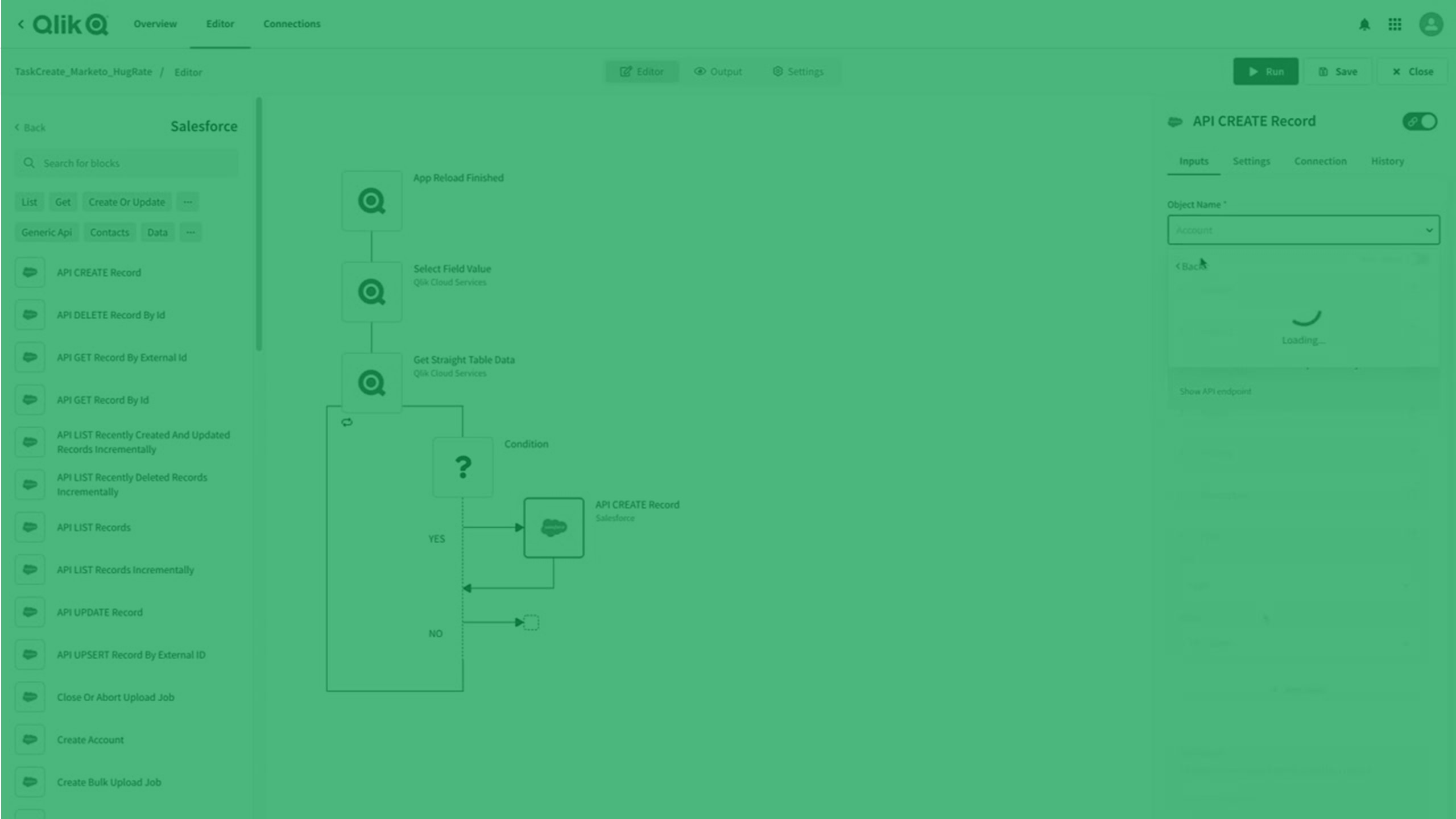
Crear automatizaciones
Qlik Automate proporciona una interfaz visual, sin código, que ayuda a crear fácilmente analítica automatizada y flujos de trabajo de datos automatizados.
Una automatización es una secuencia de acciones y desencadenantes que se ejecutan como un programa. Puede ser un flujo de trabajo simple, que recopila información de una aplicación y la traslada a otra, o puede ser un proceso integral, de extremo a extremo, que lo lleva desde los datos sin procesar hasta inteligencia activa. Qlik Automate le permite automatizar su entorno de análisis, crear flujos de trabajo basados en datos e integrar datos y análisis en sus procesos empresariales.
Administración
Los administradores se encargan de implementar, configurar y gestionar la suscripción y el entorno de Qlik Cloud. El entorno de Qlik Cloud ofrece una gestión y gobernanza centralizadas y ayuda a garantizar la adopción por parte del usuario, la precisión y la fiabilidad del sistema.

Planificar su despliegue de Qlik Cloud
Para planificar con éxito su despliegue de Qlik Cloud, deberá considerar factores como la distribución geográfica de su empresa, las implementaciones existentes, la seguridad, la capacidad y cómo desea administrar su suscripción y entorno de Qlik Sense.

Implementar Qlik Cloud
Para implementar Qlik Cloud, siga un conjunto estándar de pasos de alto nivel, incluido el registro, la configuración del sistema, la adición de usuarios y la configuración de procesos de administración.

Administrar la política Qlik Cloud
El entorno de Qlik Cloud ofrece una gestión y gobernanza centralizadas y ayuda a garantizar la adopción por parte del usuario, la precisión y la fiabilidad del sistema. La administración del espacio empresarial inquilino implica la administración de usuarios y recursos, la configuración de seguridad y la administración general del sistema.
Desarrollo de análisis e integraciones de datos.
Utilice las API y herramientas de Qlik Cloud para crear, ampliar e implementar aplicaciones personalizadas basadas en datos. También puede crear mashups, apps y visualizaciones sobre la marcha o incorporar análisis sofisticados y atractivos en las aplicaciones.
Migrar a Qlik Cloud
Visite el Centro de migración para que los usuarios y administradores se familiaricen rápidamente con Qlik Cloud. Tanto si está pasando de QlikView o Qlik Sense Enterprise Client-Managed a Qlik Cloud Analytics, como si es de Stitch a Qlik Talend Cloud, Centro de migración le ofrece orientación acerca del proceso y las mejores prácticas en la transición al nuevo entorno.
Otras soluciones de Qlik
Si está buscando ayuda con las soluciones de Qlik administradas por el cliente (en las propias instalaciones locales), aquí tiene algunos enlaces directos a otras soluciones de Qlik.
- QlikView
- Qlik Sense Enterprise on Windows (usuarios)
- Qlik Sense Enterprise on Windows (administradores) (solo en inglés)
- Qlik Sense Enterprise on Windows (desarrolladores) (solo en inglés)
- Qlik NPrinting
- Qlik Replicate (solo en inglés)
- Qlik Compose (solo en inglés)
Para revisar la documentación de las soluciones de Qlik administradas por el cliente, visite la página de inicio de la Ayuda de Qlik.