The fifth and sixth sheets: Insights sheet and Manager dashboard
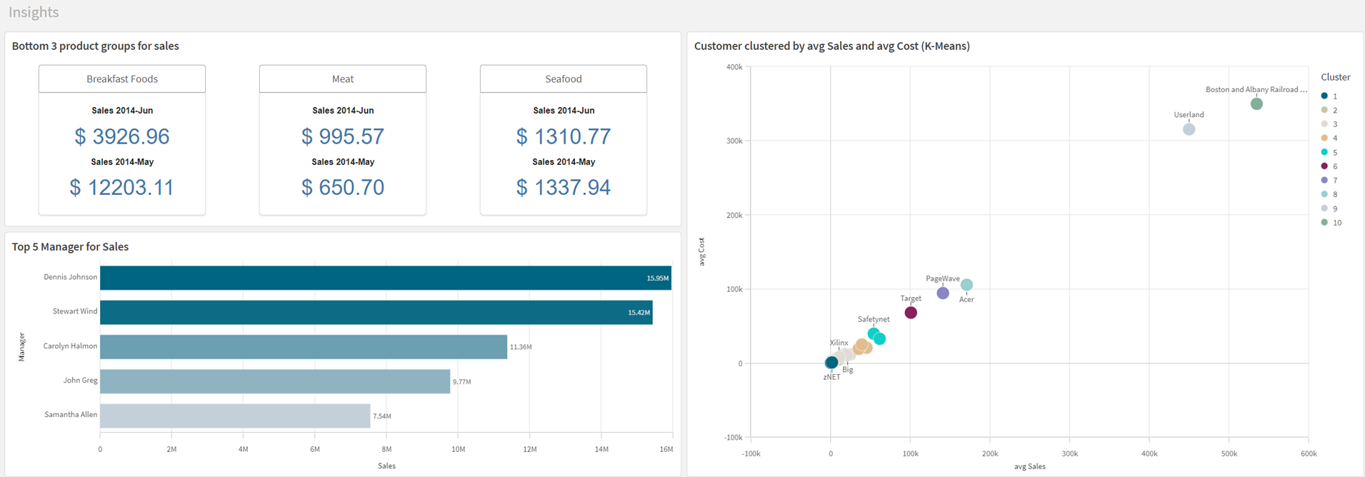
These sheets focus on alternative ways of creating visualizations with the assistance of Insight Advisor. You will auto-generate three visualizations and a new sheet by asking Insight Advisor questions.

Insight Advisor helps you quickly generate new charts or find existing charts in an application. If you are an analyst, you can extend analysis in an application to charts not currently present in an application. If you are an application creator, Insight Advisor helps you quickly build new charts and visualizations based on your specifications.
Insights sheet

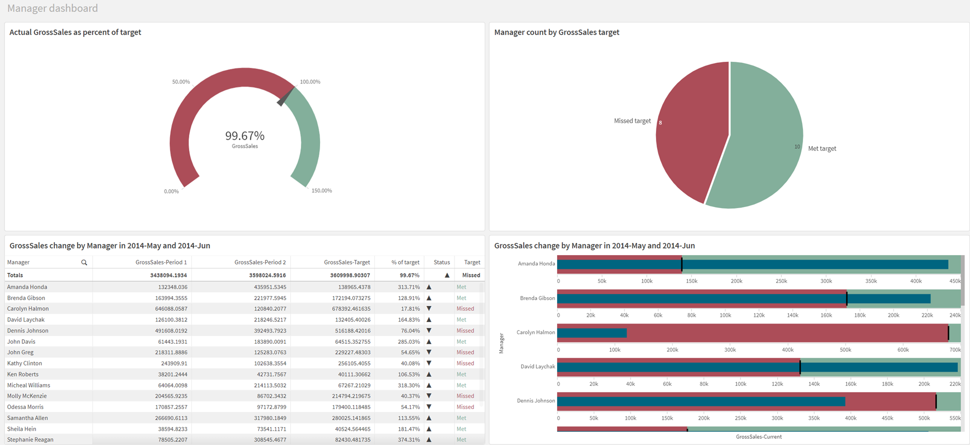
Insight Advisor can also create whole sheets containing multiple visualizations.
Manager dashboard sheet

Creating a bar chart from a search
In the sheet, there is a search field labeled Ask Insight Advisor. You can enter a question here and Insight Advisor Search looks at your data and generates charts that can answer your question.
Qlik Cloud supports several languages in Insight Advisor Search. For more information on supported languages in Insight Advisor Search, see Supported languages.
If your browser is not set to a supported language, English is used. You can change the language used by Insight Advisor by selecting a language from the Language button.
Do the following:
-
In the Ask Insight Advisor search box, enter Who are the top five Managers for Sales and click
.
-
On the generated bar chart, click Add to sheet and select Insights.
-
Click Insight Advisor to return to the sheet.
-
Click Edit sheet.
-
Select the bar chart.
-
At the top of the visualization, add the title Top 5 Managers for Sales.
-
Click Edit sheet to stop editing.
Creating a Multi KPI from a search
You can alter properties from generated insights to change the chart type. In this case, we will make a pie chart that shows the bottom 3 product groups for sales for the latest month compared to the previous month.
Do the following:
-
In the Ask Insight Advisor search box, enter what are the lowest 3 product groups for sales and click
.
-
Select the bar chart.
-
In the Analysis properties panel, click Bar chart (grouped) and select the pie chart.
-
Under Analysis period, select YearMonth-last sorted value.
-
Click Add to sheet and select Insights.
-
Click Insight Advisor to return to the sheet.
-
Click Edit sheet.
-
Select the pie chart.
-
In the properties panel, select the measure Sales 2014-Jun.
-
Under Number formatting, select Money.
-
Select the measure Sales 2014-May.
-
Under Number formatting, select Money.
-
At the top of the visualization, add the title Bottom 3 product groups for sales.
-
Click Edit sheet to stop editing.
Creating charts from analysis types
With Insight Advisor Analysis Types, you select the type of analysis and the fields to use. Insight Advisor then generates charts that provide that analysis. Analysis types range from standard analyses, such as breakdowns or trends over time, to more advanced analyses, such as calculating mutual information between datasets or k-means clustering. This helps you quickly generate visualizations, narrative interpretations, and whole dashboards.
Do the following:
-
Click
.
-
Click Create an analysis.
-
Select Clustering (k-means).
-
Select Sales and change the aggregation to avg.
-
Select Cost and change the aggregation to avg.
-
Select Customer.
-
On the generated scatter plot, click Add to sheet and select Insights.
-
Click Insight Advisor.
Feel free to move and resize the visualizations to match the screen shot above.
Create a sheet from analysis types
Some Insight Advisor analysis types, labeled as smart sheets, generate whole sheets of visualizations. Smart sheets help you quickly build dashboards for analysis. Some smart sheets require that time periods be defined in your application's load script, logical model, or autocalendar. For more information on getting started with smart sheets, see Using smart sheets in Insight Advisor for period-based analyses.
To learn more about how application logical models impact Insight Advisor, see Tutorial – Customizing how Insight Advisor interprets data.
Do the following:
-
Click
.
-
Click Create an analysis.
-
Select Period changes (detailed).
-
Select GrossSales.
-
Select Manager.
-
Select Date.
-
Click Open analysis.
-
In the analysis properties panel, under Parameters, change the almost limit to 100 and the met limit to 105.
-
Click Add to new sheet.
-
Click Insight Advisor.
-
Click Sheets and select My new sheet.
-
Click Edit sheet.
-
Rename the sheet to: Manager dashboard.
-
Click Edit sheet to stop editing.
These sheets are complete. Next, you will learn about filters. In the assets panel, click Sheets and click Create new sheet. Name the new sheet Filters and open it.
