Application design
You have loaded the data. Now it is time to create sheets and visualizations. Dashboard design involves using the right objects in the right way, and making the sheets well structured and user-friendly.

This application will be fairly simple, but you will learn some basic design principles that are good to know.
If you want to build an application of your own, and want some inspiration, you should visit the Qlik website. You can find a large number of applications serving a wide variety of purposes there. This is useful if you are looking for a template when you want to design your own application.
If you are looking for assistance in creating analyses, you can use Insight Advisor. Insight Advisor helps you create meaningful charts and analyses from your data. You can create visualizations by selecting the analysis type you want to use and then select data to include in the analysis. You can also create visualizations from your queries using search-based analytics.
Creating the sheets
The application that you are building will contain seven sheets:
-
Dashboard
-
Product Details
-
Customer Details
-
Customer Location
-
Insights
-
Manager dashboard
-
Filters
You will build five of these sheets manually. You will use Insight Advisor to build two of the sheets. You will use edit mode.
Do the following:
-
In the toolbar, open the application navigation menu and select Overview.
-
Click Create new sheet.
Information noteThe sheet templates picker might open when you create a new sheet. Sheet templates are not used for this example, so you can close the window or click Create without template.
For this tutorial, deactivate the Templates window from appearing later in the tutorial by unchecking the Show when creating a sheet setting at the top right.
To learn more about how you can use sheet templates, see Building sheets using templates.
-
This tutorial is designed to teach you how to arrange and design sheets from scratch. Deactivate the Templates window from appearing later in the tutorial by unchecking the Show when creating a sheet setting at the top right.
Tip noteYou can always open the Templates window later by clicking Show templates in an empty sheet. -
Right-click the new sheet in the Assets panel on the left. Click Rename.
-
Name the sheet Dashboard.
-
Create five more sheets and name them Product Details, Customer Details, Customer Location, Insights, and Filters.
You now have six sheets that all belong to the same application. There is no need to create a Manager dashboard sheet, because it will be auto-generated by Insight Advisor later in this tutorial.
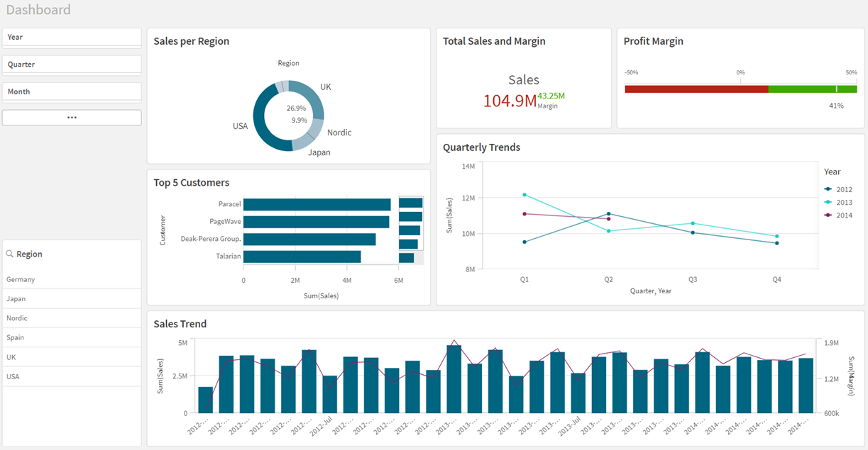
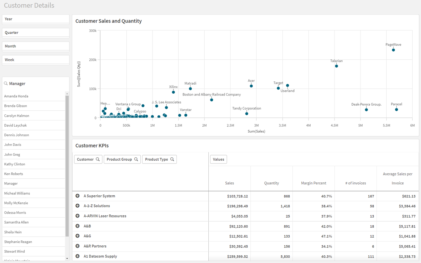
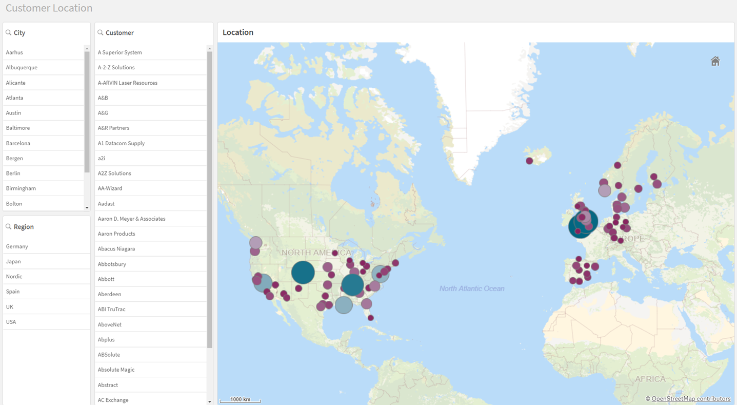
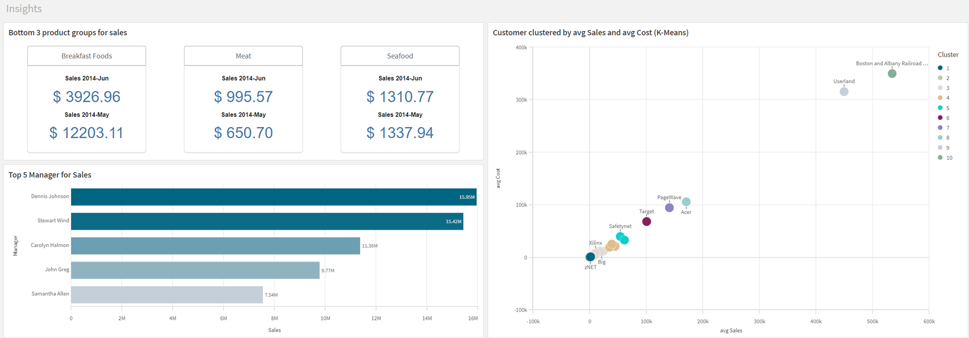
The following screen shots show how your application will appear when you complete this tutorial.
Dashboard sheet with different visualizations
Product Details sheet with different visualizations

Customer Details sheet with different visualizations
Customer Location sheet with different visualizations
Insights sheet with different visualizations
Manager dashboard sheet with different visualizations
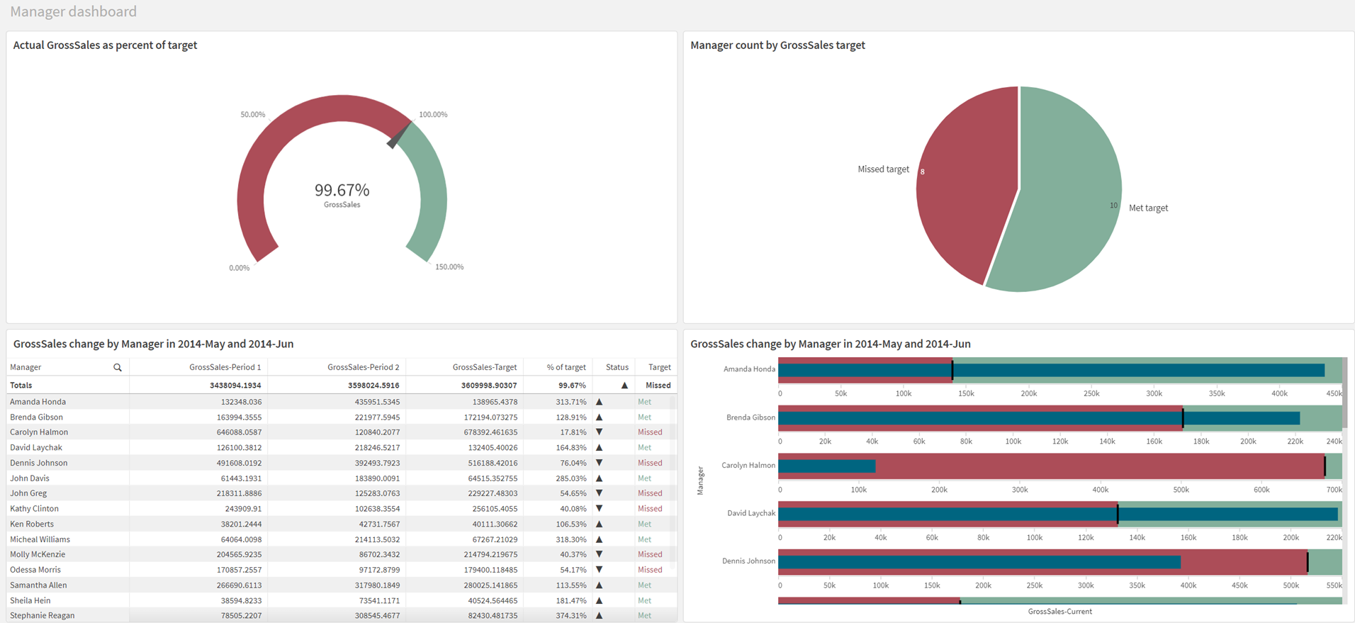
Filters

As you can see, there are similarities between the sheets. The first four all contain filter panes that are placed to the left. It is good to have consistency when you design an application. Insights and Manager dashboard break from this design as their role in this tutorial is to show different chart creation capabilities and advanced analytics available through Insight Advisor. Similarly, Filters exists to show the different filters available in chart creation to limit the scope of data.
Visualizations that are present in several sheets should have the same position in all sheets so that the user knows where to find them. There should be a logic in the design that supports the user in achieving their goal of data discovery. Placement is one aspect of the design, another is the choice of visualization.
Each visualization has its own advantages, and to be able to build an efficient and well-functioning application, you need to be aware of those advantages. To some extent the visualizations are self-explanatory.
Graphical elements are great for giving overviews and showing trends, whereas tables are economical in that they can present large amounts of data using a limited space. You get exact figures, but lose the quick and easily digestible information that is conveyed in graphical elements.
Next, you will add visualizations to your first sheet.
