Visualizing variations from a reference point in a bar chart
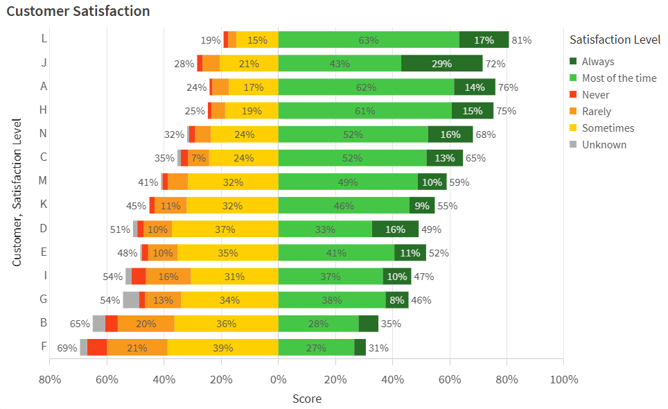
In this example, you will create a horizontal stacked bar chart to present results from a customer satisfaction survey. The goal is to visualize data as positive or negative variations from 0, the fixed reference point.
Completed bar chart displaying survey results

What you will do
In this example, you will use survey data in a bar chart to rank overall satisfaction by customer. The data shows the satisfaction levels of each customer with an organization's products and services. Data is organized by survey batch and outlines what percentage of each customer's representatives fall into each of the predefined satisfaction levels grouped by the survey:
-
Always
-
Most of the time
-
Sometimes
-
Rarely
-
Never
-
Unknown
In the data, the fixed reference point 0 is the most neutral satisfaction score. Positive and negative variations from this reference point indicate higher and lower customer satisfaction, respectively.
Preparations
Create a new application and paste the Example load script into a new section in the Data load editor. Then, load the data.
After loading the data, switch to sheet view.
Example load script
Part 1: Create a master dimension
Before creating the bar chart, add a master dimension to set the specific colors needed in the chart. The colors can range from red to green as customer satisfaction scores increase.
Do the following:
-
Click
Master items in the assets panel.
-
Click
next to Dimensions to add a master dimension.
-
Select Satisfaction_Level in the left side panel.
-
Under Name, enter Satisfaction Level.
-
Click Create.
-
Select the master dimension in the Dimensions list and click
. Click Continue.
-
In the dialog, switch to the Value colors tab.
-
In the list of field values, assign the following hex codes for each respective value:
- Always: 276e27
- Most of the time: 46c646
- Never: f93f17
- Rarely: f8981d
- Sometimes: ffcf02
- Unknown: b0afae
Part 2: Configure chart data
Do the following:
-
Drag a bar chart onto the sheet.
-
Add Customer as the first dimension.
-
Add the Satisfaction Level master dimension as the second dimension.
-
Add the following measure:
avg(Satisfaction_Value)*Satisfaction_Sign/100 -
For the measure you just added, enter Score as the Label.
Part 3: Configure sorting
Sort the data in the chart to reflect the balance between survey results and the meanings of the satisfaction ranks. Additionally, use the Satisfaction_Order field, which presents each of the satisfaction ranks in numeric order, to sort how the dimension values are stacked.
Do the following:
-
In the properties panel, expand Sorting.
-
Expand Customer.
-
Set Sorting to Custom, and check the Sort by expression checkbox.
-
Use the following Expression:
avg(Satisfaction_Value*Satisfaction_Score) -
Change the sorting to Descending.
-
Uncheck the Sort numerically and Sort alphabetically checkboxes.
-
Expand Satisfaction Level.
-
Set Sorting to Custom, and check the Sort by expression checkbox.
-
Use the following Expression:
sum(Satisfaction_Order) -
Uncheck the Sort numerically and Sort alphabetically checkboxes.
-
Expand Score.
-
Set Sorting to Custom.
-
Uncheck the Sort numerically and Sort alphabetically checkboxes.
Part 4: Configure presentation
Now that the data and sorting have been defined, adjust the presentation of the chart.
Do the following:
-
In the properties panel, expand Appearance > General.
-
Add the Title Customer Satisfaction.
-
Expand Appearance > Presentation.
-
Switch from Grouped to Stacked presentation.
-
Switch from Vertical to Horizontal orientation.
-
Turn Value labels on.
-
Turn Segment labels on.
-
Turn Total labels on.
-
Click
Styling.
-
Under General, set the Title font size to 22px.
-
Under Chart, set the following properties:
-
For Axis title, set the font size to 18px.
-
For Axis label, set the font size to 18px.
-
For Value labels, set the font size to 16px.
-
For Legend title, set the font size to 18px.
-
For Legend labels, set the font size to 16px.
-
-
Expand Appearance > Colors and legend.
-
Set Colors to Custom.
-
In the drop down menu, select By dimension and ensure the Satisfaction Level dimension is selected.
Results
The completed bar chart should look like the following.
Completed bar chart displaying survey results

