
Chart layers
A chart layer enables you to display small pie charts or bar charts over locations in your map. It uses one dimension to identify the locations and a second dimension to create the pie or bar charts.
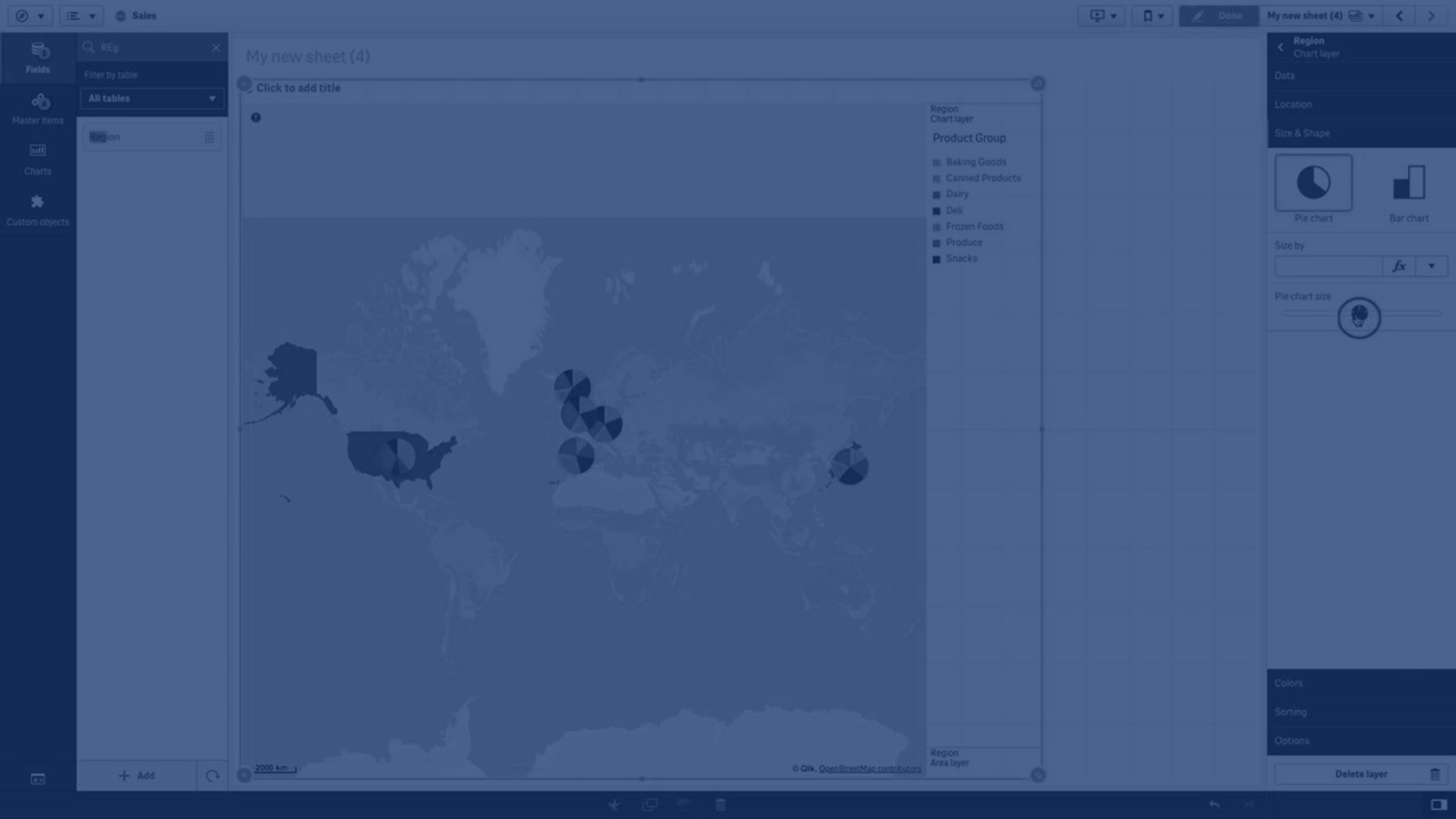
You can label the charts and use an expression to control their size. The info bubble displays useful information about the contents of the selected chart.
Map with chart layer displaying source of funds in European Union countries as pie charts. The size of each pie chart shows average absorption rate of funds.

Adding a chart layer
Do the following:
- From Layers in the properties panel, click Add layer and select Chart layer.
- In Dimensions, under Location, click Add and select a field containing point data to use as the locations on your map. Click Add and select a field containing data to use as the dimension on your charts.
- In Measures, click Add and select a field containing data to use as the measure on your charts.
-
If there are issues with the point locations, adjust the location settings in Location in the properties panel.
-
Optionally, in Options > General, after Max visible objects, set the maximum locations to display in the layer.
The maximum number of values in a map layer is 50,000. By default, layers display a maximum of 4,000 values for point layers and 1,000 for other layers.
Once the layer is added, you can adjust settings for the layer in the properties panel.