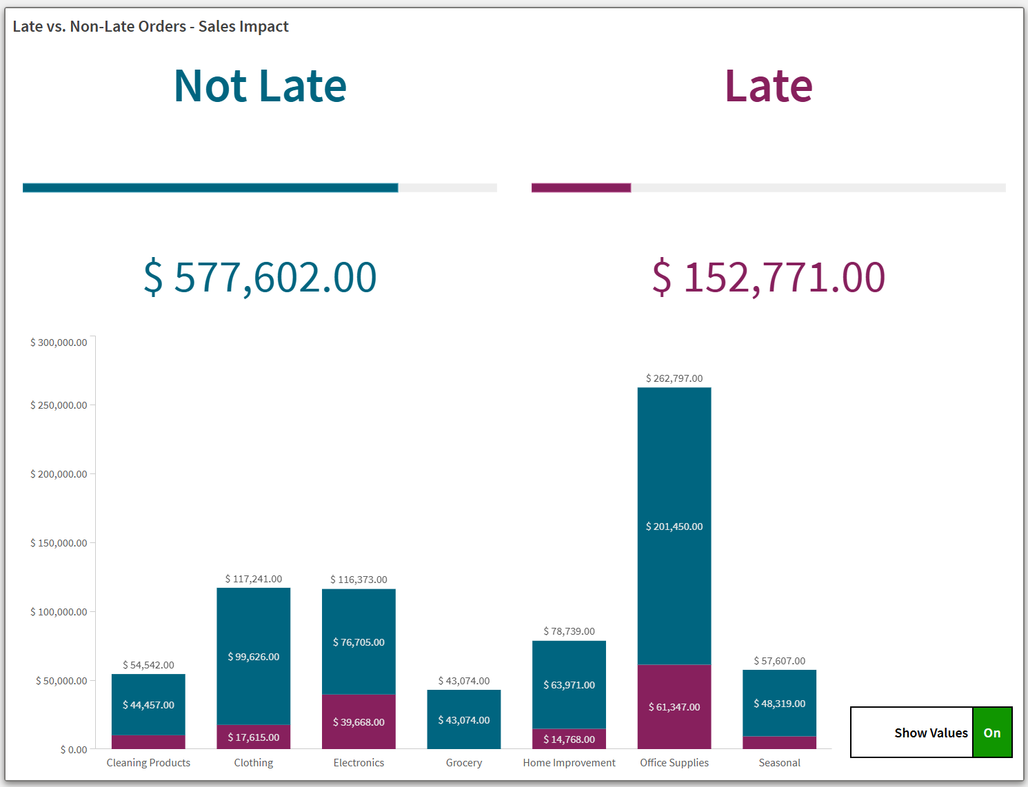
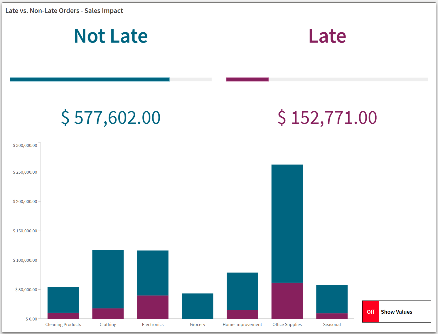
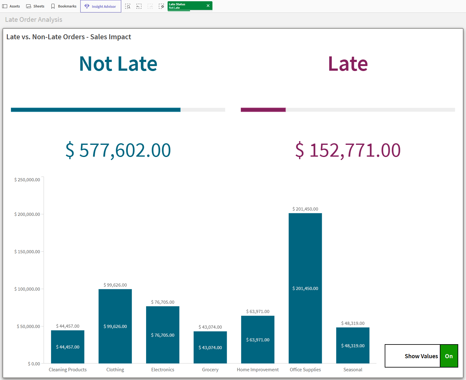
How I made this: Dynamic analysis with the layout container
This example shows you how you can make dynamic, interactive sheet content with the layout container. The layout container supports gridless design and stacked visualizations, allowing extensive control over the arrangement of your analytics content. Additionally, as with other container objects, you can dynamically present different information depending on a variety of conditions, such as variable and selection states.
This example shows you can build a layout container to present information from multiple charts as a single object. Some general design approaches include:
-
Arranging similar objects in a symmetrical fashion, using styling to distinguish different sections of data.
-
Removing borders from individual objects inside the layout container, and then adding a border around the entire object when finished.
-
Displaying different objects or data conditionally depending on user interaction—in this example, a bar chart in which the user can show or hide details.
-
Building composite elements consisting of multiple different objects placed next to each other—in this example, an interactive button that mimics an on/off switch.
-
Allowing multiple ways for users to select and filter data when they need to take a closer look.
Final result

Preparations
Create a new application and paste the Example load script into a new section in the Data load editor. Then, load the data.
After loading the data, switch to sheet view.
Example load script
SET DateFormat='M/D/YYYY';

Sales:

Load

date(Now()-Offset,'MM/DD/YYYY') as [Order Date],

* Inline [

Order ID,Offset,Product Type,Shipment Status,Fulfillment Center,Sales,Late Status,Days Late
1,30,Electronics,Delivered,10036,9950,Not Late,
2,30,Office Supplies,Delivered,10036,4412,Not Late,
3,30,Office Supplies,Delivered,10038,7480,Late,3
4,30,Home Improvement,Delivered,10035,665,Late,4
5,30,Home Improvement,Delivered,10038,594,Not Late,
6,30,Home Improvement,Stalled,10038,8267,Not Late,
7,30,Clothing,Delivered,10035,1014,Not Late,
8,30,Cleaning Products,Delivered,10036,6999,Late,1
9,30,Electronics,Delivered,10036,733,Not Late,
10,29,Office Supplies,Delivered,10036,3487,Not Late,
11,29,Office Supplies,Delivered,10035,7343,Not Late,
12,29,Office Supplies,Delivered,10036,9239,Late,14
13,27,Cleaning Products,Delivered,10037,1463,Not Late,
14,27,Cleaning Products,Stalled,10035,4688,Not Late,
15,27,Home Improvement,Delivered,10038,5539,Late,2
16,27,Clothing,Delivered,10035,8388,Not Late,
17,27,Office Supplies,Delivered,10035,7560,Not Late,
18,27,Office Supplies,Delivered,10035,5738,Not Late,
19,27,Office Supplies,Delivered,10035,5469,Not Late,
20,26,Home Improvement,Delivered,10037,1435,Not Late,
21,26,Office Supplies,Delivered,10036,5962,Late,1
22,26,Clothing,Delivered,10035,4020,Late,7
23,26,Electronics,Delivered,10036,3888,Late,5
24,25,Office Supplies,Delivered,10037,6496,Not Late,
25,25,Clothing,Delivered,10038,4215,Late,11
26,25,Home Improvement,Delivered,10036,1801,Not Late,
27,25,Grocery,Delivered,10036,6471,Not Late,
28,24,Home Improvement,In Transit,10036,4578,Not Late,
29,24,Office Supplies,Cancelled,10037,3493,Not Late,
30,24,Office Supplies,Cancelled,10035,6572,Not Late,
31,24,Electronics,In Transit,10037,6691,Not Late,
32,24,Office Supplies,In Transit,10038,2721,Late,9
33,24,Grocery,In Transit,10035,8300,Not Late,
34,23,Grocery,In Transit,10035,840,Not Late,
35,23,Office Supplies,In Transit,10036,8972,Not Late,
36,23,Cleaning Products,Stalled,10036,9474,Not Late,
37,23,Home Improvement,In Transit,10038,1935,Not Late,
38,23,Office Supplies,In Transit,10036,1748,Not Late,
39,23,Seasonal,In Transit,10037,1948,Not Late,
40,22,Office Supplies,In Transit,10035,3121,Not Late,
41,22,Electronics,In Transit,10036,7377,Not Late,
42,22,Cleaning Products,In Transit,10037,1492,Not Late,
43,22,Office Supplies,Stalled,10037,7801,Late,6
44,22,Office Supplies,In Transit,10035,4663,Not Late,
45,22,Grocery,In Transit,10035,4649,Not Late,
46,21,Seasonal,In Transit,10038,2612,Not Late,
47,20,Clothing,In Transit,10036,8880,Late,4
48,20,Office Supplies,In Transit,10036,1391,Late,8
49,20,Cleaning Products,Cancelled,10037,1307,Not Late,
50,20,Home Improvement,In Transit,10037,6424,Not Late,
51,20,Grocery,In Transit,10035,5051,Not Late,
52,20,Cleaning Products,In Transit,10035,1286,Not Late,
53,19,Cleaning Products,In Transit,10038,8719,Not Late,
54,19,Office Supplies,In Transit,10037,8576,Not Late,
55,19,Seasonal,In Transit,10038,2866,Not Late,
56,19,Electronics,Stalled,10035,5186,Late,3
57,19,Clothing,In Transit,10038,4079,Not Late,
58,19,Office Supplies,In Transit,10038,706,Not Late,
59,19,Seasonal,In Transit,10036,6111,Not Late,
60,19,Clothing,In Transit,10036,5677,Not Late,
61,19,Home Improvement,In Transit,10037,3993,Not Late,
62,19,Office Supplies,In Transit,10037,1625,Not Late,
63,19,Seasonal,In Transit,10035,5805,Not Late,
64,19,Home Improvement,In Transit,10035,4453,Not Late,
65,19,Office Supplies,In Transit,10038,2252,Not Late,
66,18,Electronics,In Transit,10038,8362,Not Late,
67,18,Clothing,In Transit,10037,4182,Not Late,
68,18,Cleaning Products,In Transit,10038,9044,Not Late,
69,18,Clothing,In Transit,10035,6531,Not Late,
70,18,Office Supplies,In Transit,10035,8408,Not Late,
71,17,Home Improvement,Stalled,10038,9629,Not Late,
72,17,Seasonal,Preparation,10035,2128,Not Late,
73,17,Home Improvement,Cancelled,10038,1024,Not Late,
74,17,Office Supplies,Preparation,10037,9684,Late,2
75,17,Electronics,Preparation,10036,6753,Late,2
76,16,Clothing,Preparation,10036,3192,Not Late,
77,16,Office Supplies,Preparation,10038,3954,Not Late,
78,16,Office Supplies,Preparation,10035,8377,Not Late,
79,16,Office Supplies,Preparation,10038,2334,Not Late,
80,15,Grocery,Preparation,10037,7178,Not Late,
81,15,Office Supplies,Preparation,10037,1188,Not Late,
82,15,Electronics,Preparation,10035,4908,Not Late,
83,15,Electronics,Preparation,10035,3552,Not Late,
84,15,Clothing,Preparation,10037,875,Not Late,
85,14,Office Supplies,Preparation,10038,7886,Late,4
86,14,Home Improvement,Cancelled,10036,2358,Late,1
87,14,Clothing,Preparation,10037,8368,Not Late,
88,14,Grocery,Preparation,10037,142,Not Late,
89,14,Office Supplies,Preparation,10037,5537,Not Late,
90,14,Home Improvement,Preparation,10035,3231,Not Late,
91,14,Clothing,Preparation,10036,2283,Not Late,
92,14,Office Supplies,Preparation,10038,5952,Not Late,
93,13,Office Supplies,Preparation,10038,5513,Not Late,
94,13,Home Improvement,Preparation,10036,5871,Not Late,
95,13,Grocery,Preparation,10038,4425,Not Late,
96,13,Clothing,Preparation,10037,500,Late,1
97,13,Electronics,Preparation,10037,9792,Not Late,
98,13,Seasonal,Preparation,10035,4576,Not Late,
99,13,Office Supplies,Preparation,10038,228,Not Late,
100,13,Cleaning Products,Preparation,10037,3086,Late,1
101,13,Office Supplies,Preparation,10038,2329,Not Late,
102,12,Home Improvement,Preparation,10036,8862,Not Late,
103,12,Office Supplies,Preparation,10037,3991,Not Late,
104,12,Office Supplies,Preparation,10037,5435,Not Late,
105,12,Grocery,Preparation,10038,2476,Not Late,
106,12,Clothing,Preparation,10037,8362,Not Late,
107,12,Seasonal,Preparation,10035,1496,Not Late,
108,12,Electronics,Preparation,10038,3210,Not Late,
109,11,Clothing,Preparation,10038,7692,Not Late,
110,11,Cleaning Products,Preparation,10037,1585,Not Late,
111,11,Home Improvement,Cancelled,10037,1874,Not Late,
112,11,Office Supplies,Preparation,10037,869,Not Late,
113,11,Office Supplies,Preparation,10036,8578,Not Late,
114,10,Office Supplies,Preparation,10036,684,Not Late,
115,10,Electronics,Preparation,10036,9889,Not Late,
116,10,Office Supplies,Preparation,10036,4256,Not Late,
117,8,Seasonal,Preparation,10038,9288,Late,7
118,8,Office Supplies,Cancelled,10038,1534,Not Late,
119,8,Seasonal,Preparation,10038,7496,Not Late,
120,8,Electronics,Preparation,10036,8454,Late,3
121,8,Office Supplies,Stalled,10038,1063,Late,
122,8,Office Supplies,Preparation,10037,5958,Not Late,
123,8,Seasonal,Preparation,10036,686,Not Late,
124,8,Grocery,Preparation,10036,1799,Not Late,
125,8,Clothing,Stalled,10036,8485,Not Late,
126,7,Office Supplies,Preparation,10036,6451,Not Late,
127,7,Office Supplies,Pending,10036,1212,Not Late,
128,7,Electronics,Pending,10037,9037,Not Late,
129,7,Electronics,Pending,10037,6522,Late,20
130,7,Electronics,Pending,10038,8865,Late,4
131,7,Clothing,Cancelled,10036,7929,Not Late,
132,6,Seasonal,Pending,10038,9082,Not Late,
133,6,Office Supplies,Pending,10037,6563,Not Late,
134,6,Seasonal,Pending,10038,3513,Not Late,
135,5,Office Supplies,Pending,10035,2340,Not Late,
136,5,Cleaning Products,Pending,10035,590,Not Late,
137,5,Office Supplies,Pending,10035,542,Not Late,
138,5,Cleaning Products,Pending,10035,4809,Not Late,
139,5,Grocery,Cancelled,10035,1743,Not Late,
140,5,Office Supplies,Pending,10035,8312,Not Late,
141,4,Clothing,Pending,10035,5895,Not Late,
142,4,Clothing,Pending,10037,4882,Not Late,
143,4,Clothing,Pending,10037,9106,Not Late,
144,3,Office Supplies,Pending,10036,7422,Late,1
145,3,Clothing,Pending,10038,2686,Not Late,
146,3,Office Supplies,Pending,10037,698,Late,3
147,3,Office Supplies,Pending,10035,9514,Not Late,
148,2,Home Improvement,Pending,10037,6206,Late,2
149,2,Office Supplies,Pending,10035,9158,Not Late,
150,1,Electronics,Cancelled,10036,3204,Not Late,

];

drop field Offset;
Part 1: Create the variable
First, create the variable. This variable is the subject of conditions that will be added later. The values of the variable will be changed during analysis by interactions with button objects.
Create the following variable. Set the Definition to =false().
-
vViewChartValues
Part 2: Create the layout container
Do the following:
-
In the assets panel, open Charts and under Dashboard objects, drag a Layout container to the sheet.
-
Resize the container so that it is 17 by 10 squares on the sheet grid.
Part 3: Add visualizations to the layout container
Next, add visualizations to the layout container.
Do the following:
-
Select the layout container.
-
In the properties panel, under Content > Charts, click Add. Select Button.
-
Expand the item. Set the Label to Button_NotLateTitle.
-
Under Size, set the following:
-
Width (%): 48
-
Height (%): 9
-
-
Under Position, set the following:
-
X-axis (%): 1
-
Y-axis (%): 1
-
-
Click Edit properties.
-
Expand Actions and navigation.
-
Click Add action.
-
For the Action, select Select values in a field.
-
For the Field, select Late Status.
-
For Value, click
.
-
Add the following:
='Not Late' -
Click Apply.
-
Expand Appearance > General.
-
Set Not Late as the Label.
-
Expand Appearance > Presentation.
-
Click
Styling.
-
Under Border, set Outline to 0 px.
-
Switch to the Chart tab. Set the following properties:
-
Layout behavior: Responsive
-
Font size: Maximum value
-
Font color > Color: #006580
-
Background options > Color used: #ffffff
-
-
Click
to exit the styling panel.
-
Click the top bar in the panel to return to the layout container.
Do the following:
-
Under Content > Charts, click Add. Select Button.
-
Expand the item. Set the Label to Button_LateTitle.
-
Under Size, set the following:
-
Width (%): 48
-
Height (%): 9
-
-
Under Position, set the following:
-
X-axis (%): 51
-
Y-axis (%): 1
-
-
Click Edit properties.
-
Expand Actions and navigation.
-
Click Add action.
-
For the Action, select Select values in a field.
-
For the Field, select Late Status.
-
For Value, click
.
-
Add the following:
='Late' -
Click Apply.
-
Expand Appearance > General.
-
Set Late as the Label.
-
Expand Appearance > Presentation.
-
Click
Styling.
-
Under Border, set Outline to 0 px.
-
Switch to the Chart tab. Set the following properties:
-
Layout behavior: Responsive
-
Font size: Maximum value
-
Font color > Color: #87205d
-
Background options > Color used: #ffffff
-
-
Click
to exit the styling panel.
-
Click the top bar in the panel to return to the layout container.
Do the following:
-
Under Content > Charts, click Add. Select Gauge.
-
Expand the item. Set the Label to Gauge_NotLate.
-
Under Size, set the following:
-
Width (%): 48
-
Height (%): 15
-
-
Under Position, set the following:
-
X-axis (%): 1
-
Y-axis (%): 11
-
-
Click Edit properties.
-
Add Sum(Sales) as a measure.
-
In the properties panel, under Data > Filters, click Add.
-
Select Late Status. Expand the filter.
-
Keep the default Values filter type, and check the Not Late checkbox. This filters visualization data to only records that contain a Late Status value of Not Late.
-
Expand Appearance > General.
-
Set Show titles to Off.
-
Expand Appearance > Presentation.
-
Under Range limits, set Max to the following:
=Sum({1} Sales) -
Change the chart configuration from Radial to Bar.
-
Change the Orientation from Auto to Custom, and make sure Horizontal is selected.
-
Turn off Use library, and set the Color to #006580.
-
Click
Styling.
-
Under Border, set Outline to 0 px.
-
Switch to the Chart tab. Set the color for the Value label to #ffffff.
-
Click
to exit the styling panel.
-
Expand Appearance > Measure axis: Sum(Sales).
-
Set Labels and title to None.
-
Click the top bar in the panel to return to the layout container.
Do the following:
-
Under Content > Charts, click Add. Select Gauge.
-
Expand the item. Set the Label to Gauge_Late.
-
Under Size, set the following:
-
Width (%): 48
-
Height (%): 15
-
-
Under Position, set the following:
-
X-axis (%): 51
-
Y-axis (%): 11
-
-
Click Edit properties.
-
Add Sum(Sales) as a measure.
-
In the properties panel, under Data > Filters, click Add.
-
Select Late Status. Expand the filter.
-
Keep the default Values filter type, and check the Late checkbox. This filters visualization data to only records that contain a Late Status value of Late.
-
Expand Appearance > General.
-
Set Show titles to Off.
-
Expand Appearance > Presentation.
-
Under Range limits, set Max to the following:
=Sum({1} Sales) -
Change the chart configuration from Radial to Bar.
-
Change the Orientation from Auto to Custom, and make sure Horizontal is selected.
-
Turn off Use library, and set the Color to #87205d.
-
Click
Styling.
-
Under Border, set Outline to 0 px.
-
Switch to the Chart tab. Set the color for the Value label to #ffffff.
-
Click
to exit the styling panel.
-
Expand Appearance > Measure axis: Sum(Sales).
-
Set Labels and title to None.
-
Click the top bar in the panel to return to the layout container.
Do the following:
-
Under Content > Charts, click Add. Select KPI.
-
Expand the item. Set the Label to KPI_NotLate.
-
Under Size, set the following:
-
Width (%): 48
-
Height (%): 9
-
-
Under Position, set the following:
-
X-axis (%): 1
-
Y-axis (%): 27
-
-
Click Edit properties.
-
Add Sum(Sales) as a measure.
-
In the properties for the measure, set Number formatting to Money.
-
Change the Format pattern to:
$ #,##0.00;-$ #,##0.00 -
In the properties panel, under Data > Filters, click Add.
-
Select Late Status. Expand the filter.
-
Keep the default Values filter type, and check the Not Late checkbox. This filters visualization data to only records that contain a Late Status value of Not Late.
-
Expand Appearance > General.
-
Set Show titles to Off.
-
Expand Appearance > Presentation.
-
Click
Styling.
-
Under Border, set Outline to 0 px.
-
Switch to the Chart tab. Set the following properties:
-
Layout behavior: Responsive
-
Font size: Maximum value
-
Turn off Show first KPI title
-
-
Click
to exit the styling panel.
-
Expand Appearance > Color.
-
Turn off Library colors. Set the color to #006580.
-
Click the top bar in the panel to return to the layout container.
Do the following:
-
Under Content > Charts, click Add. Select KPI.
-
Expand the item. Set the Label to KPI_Late.
-
Under Size, set the following:
-
Width (%): 48
-
Height (%): 9
-
-
Under Position, set the following:
-
X-axis (%): 51
-
Y-axis (%): 27
-
-
Click Edit properties.
-
Add Sum(Sales) as a measure.
-
In the properties for the measure, set Number formatting to Money.
-
Change the Format pattern to:
$ #,##0.00;-$ #,##0.00 -
In the properties panel, under Data > Filters, click Add.
-
Select Late Status. Expand the filter.
-
Keep the default Values filter type, and check the Late checkbox. This filters visualization data to only records that contain a Late Status value of Late.
-
Expand Appearance > General.
-
Set Show titles to Off.
-
Expand Appearance > Presentation.
-
Click
Styling.
-
Under Border, set Outline to 0 px.
-
Switch to the Chart tab. Set the following properties:
-
Layout behavior: Responsive
-
Font size: Maximum value
-
Turn off Show first KPI title
-
-
Click
to exit the styling panel.
-
Expand Appearance > Color.
-
Turn off Library colors. Set the color to #87205d.
-
Click the top bar in the panel to return to the layout container.
Do the following:
-
Under Content > Charts, click Add. Select Bar chart.
-
Expand the item. Set the Label to BarChart_Simple.
-
For Show condition, click
.
-
Add the following:
=vViewChartValues=false() -
Click Apply.
-
Under Size, set the following:
-
Width (%): 81
-
Height (%): 62
-
-
Under Position, set the following:
-
X-axis (%): 1
-
Y-axis (%): 37
-
-
Click Edit properties.
-
Add Product Type as a dimension.
-
Add another dimension: Late Status.
Product Type should now be listed as the Group and Late Status as the Bars.
-
Add Sum(Sales) as a measure.
-
In the properties for the measure, set Number formatting to Money.
-
Change the Format pattern to:
$ #,##0.00;-$ #,##0.00 -
Expand Appearance > General.
-
Set Show titles to Off.
-
Expand Appearance > Presentation.
-
Switch from the Grouped to the Stacked presentation.
-
Set Grid line spacing to Custom. In the dropdown, select No lines.
-
Click
Styling.
-
Under Border, set Outline to 0 px.
-
Switch to the Chart tab. Set the following properties:
-
Axis label font size: 16 px
-
-
Click
to exit the styling panel.
-
Expand Appearance > Colors and legend.
-
Set Colors to Custom > By expression. Use the following expression:
=if([Late Status]='Not Late','#006580', if([Late Status]='Late','#87205d')) -
Set Show legend to Off.
-
Expand Appearance > X-axis: Product Type, Late Status.
-
Set Labels and title to Labels only.
-
Expand Appearance > Y-axis: Sum(Sales).
-
Set Labels and title to Labels only.
-
Click the top bar in the panel to return to the layout container.
Do the following:
-
Under Content > Charts, right-click BarChart_Simple and click Duplicate.
-
Expand the item. Set the Label to BarChart_Detailed.
-
For Show condition, click
.
-
Add the following:
=vViewChartValues=true() -
Click Apply.
-
Click Edit properties.
-
Expand Appearance > Presentation.
-
Turn on Value labels.
-
Turn on Segment labels, and make sure Total labels are on.
-
Click
Styling.
-
Switch to the Chart tab. Set the following properties:
-
Axis label font size: 16 px
-
Value labels font size: 14 px
-
-
Click
to exit the styling panel.
-
Expand Appearance > Colors and legend.
-
Expand Appearance > X-axis: Product Type, Late Status.
-
Set Labels and title to Labels only.
-
Expand Appearance > Y-axis: Sum(Sales).
-
Set Labels and title to Labels only.
-
Click the top bar in the panel to return to the layout container.
Create three master visualizations that will be used to build a composite switch button in the layout container. This toggle switch will allow users to turn value labels on and off in the bar chart.
Item 1: Toggle switch base
Do the following:
-
Under Content > Charts, click Add. Select Button.
-
Expand the item. Set the Label to ToggleSwitch_Base.
-
Under Size, set the following:
-
Width (%): 16
-
Height (%): 7
-
-
Under Position, set the following:
-
X-axis (%): 83
-
Y-axis (%): 90
-
-
Click Edit properties.
-
Expand Actions and navigation.
-
Click Add action.
-
For the Action, select Set variable value.
-
For Variable, select vViewChartValues.
-
For Value, click
.
-
Add the following expression:
=if(vViewChartValues=false(),true(),if(vViewChartValues=true(),false())) -
Click Apply.
-
Expand Appearance > General.
-
Set Show Values as the Label.
-
Expand Appearance > Presentation.
-
Click
Styling.
-
Under Border, set Outline to 2 px.
-
Set the Border color to #000000.
-
Set the Corner radius for the Border to 0 px.
-
Switch to the Chart tab. Set the following properties:
-
Layout behavior: Responsive
-
Font size: 0.5
-
Font color > Color: #000000
-
Background options > Color used: #ffffff
-
-
Click
to exit the styling panel.
-
Click the top bar in the panel to return to the layout container.
Item 2: Button portion representing ON state
Do the following:
-
Under Content > Charts, click Add. Select Button.
-
Expand the item. Set the Label to ToggleSwitch_ON.
-
For Show condition, click
.
-
Add the following:
=vViewChartValues=true() -
Click Apply.
-
Under Size, set the following:
-
Width (%): 4
-
Height (%): 7
-
-
Under Position, set the following:
-
X-axis (%): 95
-
Y-axis (%): 90
-
-
Click Edit properties.
-
Expand Actions and navigation.
-
Click Add action.
-
For the Action, select Set variable value.
-
For Variable, select vViewChartValues.
-
For Value, click
.
-
Add the following expression:
=false() -
Click Apply.
-
Expand Appearance > General.
-
Set On as the Label.
-
Expand Appearance > Presentation.
-
Click
Styling.
-
Under Border, set Outline to 2 px.
-
Set the Border color to #000000.
-
Set the Corner radius for the Border to 0 px.
-
Switch to the Chart tab. Set the following properties:
-
Layout behavior: Responsive
-
Font size: 0.5
-
Font color > Color: #ffffff
-
Background options > Color used: #109600
-
-
Click
to exit the styling panel.
-
Click the top bar in the panel to return to the layout container.
Item 3: Button portion representing OFF state
Do the following:
-
Under Content > Charts, click Add. Select Button.
-
Expand the item. Set the Label to ToggleSwitch_ON.
-
For Show condition, click
.
-
Add the following:
=vViewChartValues=false() -
Click Apply.
-
Under Size, set the following:
-
Width (%): 4
-
Height (%): 7
-
-
Under Position, set the following:
-
X-axis (%): 83
-
Y-axis (%): 90
-
-
Click Edit properties.
-
Expand Actions and navigation.
-
Click Add action.
-
For the Action, select Set variable value.
-
For Variable, select vViewChartValues.
-
For Value, click
.
-
Add the following expression:
=true() -
Click Apply.
-
Expand Appearance > General.
-
Set Off as the Label.
-
Expand Appearance > Presentation.
-
Click
Styling.
-
Under Border, set Outline to 2 px.
-
Set the Border color to #000000.
-
Set the Corner radius for the Border to 0 px.
-
Switch to the Chart tab. Set the following properties:
-
Layout behavior: Responsive
-
Font size: 0.5
-
Font color > Color: #ffffff
-
Background options > Color used: #ff001e
-
-
Click
to exit the styling panel.
-
Click the top bar in the panel to return to the layout container.
Part 4: Finalize presentation
Finalize the layout container by adding a title and border.
Do the following:
-
In the properties panel, expand Appearance > General.
-
Set the Title to Late vs. Non-Late Orders - Sales Impact.
-
Expand Appearance > Presentation.
-
Turn on Keep charts inside.
-
Click
Styling.
-
Set the following properties for Border:
-
Outline: 2 px
-
Color: #7b7a78
-
-
Set the following properties for Shadow:
-
Medium size
-
Color: #7b7a78
-
Results
Exit sheet edit mode. Click the toggle switch button to alternate between the simple and detailed bar chart.
Layout container with Show values switched off

Layout container with Show values switched on

Click on the Not Late and Late titles at the top of the chart. Notice that clicking these elements selects the corresponding values in the application.
Layout container with selection Not Late in field Late Status.

