Welcome to Qlik Cloud
Qlik Cloud closes the gaps between data, insights, and action with active intelligence delivered by the only end-to-end solution for data integration and analytics.
Introducing Qlik Cloud
Qlik Cloud is a data integration and analytics cloud platform built for Active Intelligence. It offers data integration and analytics services that can be used together or independently.

Getting started and learning options
Qlik technical documentation contains examples, tutorials, and troubleshooting for all skill levels for any stage of your journey.

Interface overview
When you log into Qlik Cloud for the first time, you will find tutorials, demos to help you get started.

Qlik Cloud Government
Qlik Cloud Government differs from Qlik’s commercial Qlik Cloud offering. It includes security protocols required to support the U.S. public sector, and is authorized at the FedRAMP Moderate Impact Level (IL) and Department of Defense (DOD) IL2.
Analyzing data
Qlik Cloud Analytics offers modern analytics capabilities across a full range of users and use cases - from self-service analytics to interactive dashboards and applications, conversational analytics, metadata catalog and lineage, mobile analytics, reporting and alerting.

Using analytics to explore data
Work with applications and visualizations to get an overview of your data. You can make informed decisions and discoveries by seeing the relationships in your data.

Creating analytics and visualizing data
Create powerful analytics and data visualizations. The applications you build set the foundation on which application users can visualize data and make discoveries.

Loading and modeling analytics data
Add your data sources first, load the data into your application and start modeling your data model.

Delivering data and lineage for analytics
Options to load lineage and on-premises data into your Qlik Cloud tenant.

Machine learning with Qlik Predict
Automated machine learning finds patterns in your data and uses them to predict future data.
Integrating data
Qlik Talend Cloud offers real-time data movement, transformation, and data products with Qlik Talend Data Integration. Additionally, Qlik Talend Cloud includes Talend capabilities for data stewardship, data quality, application integration, and more capabilities.

Introducing data integration
Create data pipelines to perform a variety of data integration tasks in support of your data architecture and analytics requirements. You can also streamline your data management using data products.

What is Qlik Talend Cloud
More data integration capabilities from Talend are included in the higher tiers of Qlik Talend Cloud. This includes enhanced data stewardship, data quality, application integration, and more capabilities.

Data Integration videos
Watch some short videos to get off to a good start with integrating data.
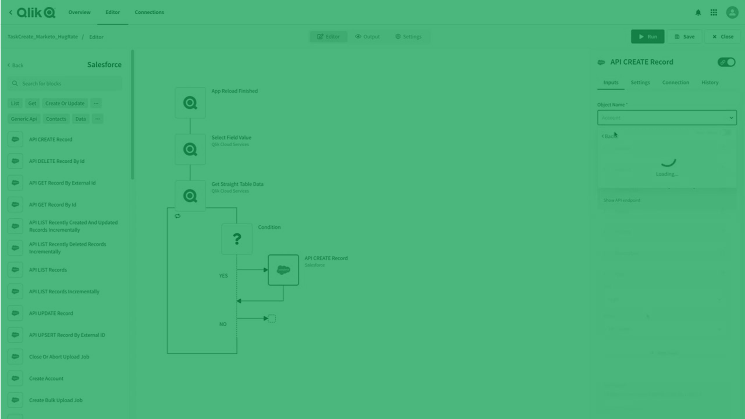
Building automations
Qlik Automate provides a no-code visual interface that helps you easily build automated analytics and data workflows.
An automation is a sequence of actions and triggers that runs like a program. It can be a simple workflow that collects information from one application and passes it to another, or it can be an end-to-end pipeline that takes you from raw data to active intelligence. Qlik Automate lets you automate your analytics environment, create data-driven workflows, and embed data and analytics into your business processes.
Administration
Administrators are responsible for deploying, configuring, and managing the Qlik Cloud subscription and environment. The Qlik Cloud environment offers centralized management and governance and helps to ensure user adoption, accuracy, and system reliability.

Planning your Qlik Cloud deployment
To successfully plan your Qlik Cloud deployment you will need to consider factors like your company's geographical distribution, existing deployments, security, capacity, and how you wish to manage your Qlik Sense subscription and environment.

Deploying Qlik Cloud
To deploy Qlik Cloud, follow a standard set of high-level steps, including registering, configuring the system, adding users, and setting up management processes.

Managing Qlik Cloud
The Qlik Cloud environment offers centralized management and governance and helps to ensure user adoption, accuracy, and system reliability. Administering the tenant involves managing users and resources, security settings, and general system administration.
Developing analytics and data integrations
Use Qlik Cloud APIs and tools to build, extend and deploy custom data-driven applications. You can also build mashups, create applications and visualizations on the fly, or embed rich and engaging analytics into your applications.
Migrating to Qlik Cloud
Visit the Migration Center to quickly get users and administrators up to speed with Qlik Cloud. Whether you're moving from QlikView or Qlik Sense Enterprise Client-Managed to Qlik Cloud Analytics, or from Stitch to Qlik Talend Cloud, the Migration Center provides guidance on the process and best practices when transitioning to the new environment.
Other Qlik solutions
If you’re looking for assistance with Qlik client-managed solutions (on-premises), here are some direct links to other Qlik help systems.
- QlikView
- Qlik Sense Enterprise on Windows (users)
- Qlik Sense Enterprise on Windows (administrators)
- Qlik Sense Enterprise on Windows (developers)
- Qlik NPrinting
- Qlik Replicate
- Qlik Compose
To review the documentation for Qlik client-managed solutions, visit the Qlik Help home page.