
Qlik Sense automatically colors visualizations as they are added to your sheets. You can manually set the colors in your visualizations to meet your requirements or preferences.
Color options for most visualizations are set in the properties panel, in Appearance > Colors and legend. By selecting Custom, you can manually apply colors to your visualizations using the following methods:
- Color by single color
- Color by multiple colors
-
Color by dimension
Dimension fields can also be dragged and dropped from the assets panel onto a visualization to color the visualization by dimension (if supported by the visualization type).
-
Color by measure
Measure fields can also be dragged and dropped from the assets panel onto a visualization to color the visualization by measure (if supported by the visualization type).
- Color by expression
Tables and pivot tables can only be colored by expression. Options for coloring tables and pivot tables are found in the properties panel in Data.
If you want to keep colors consistent for dimensions or measures between different visualizations, you can assign specific colors to master items in your library. Most visualizations will use any colors assigned to master items automatically. In cases where a visualization uses both a master dimension and a master measure with assigned colors, the color assigned to the master dimension is used by default. You can select which master item color to use or disable master item colors entirely.
For more information, see Assigning colors to master items.
You can also assign colors to individual master dimension values to ensure the colors of different values are consistent across visualizations.
For more information, see Assigning colors to master dimension values.
To keep visualizations clear when you manually set colors, you should select colors for accessibility and only use different colors when they serve a purpose.
Color by single color
When you color by single color, one color is used for all objects in the chart. Coloring by a single color is best used for visualizations, such as bar or line charts, with a single dimension and measure.
If you have a master dimension or master measure that has a color assigned to it, you can color the visualization by that single color. In cases where a visualization uses both a master dimension and a master measure with assigned colors, the color assigned to the master dimension is used by default. You can select which master item color to use or disable master item colors entirely.
The following options are available when Single color is selected from Colors in Appearance > Colors and legend:
| Option | Description |
|---|---|
| Use library colors |
Select to use master item colors. In cases where a visualization has both a master dimension and a master measure that have colors assigned to them, you can select which to use in the visualization. This option is available when a master dimension or master measure used in the visualization has a color assigned to it. |
| Color | Select a color using the color picker. You can select a color from the default palette, enter a hex value for a color, or select a color from a color wheel. |
Color by multiple colors
When you have multiple measures in a visualization, you can select Multicolor to color each measure with a different color. Qlik Sense offers a 12 color and a 100 color palette to apply to the visualization. By default, 12 colors is selected as the color scheme dimensions.
When you have multiple measures in a visualization, you can select Multicolored to color each measure with a different color. Qlik Sense offers a 12 color and a 100 color palette to apply to the visualization. By default, 12 colors is selected as the color scheme dimensions, but you can change this in the advanced edit mode.
If you are using master measures in your visualization, you can also choose to use them in your visualization. When a visualization is colored by master measures, master measures will use their assigned colors and any other measures are assigned colors from the 12 colors scheme.
The following options are available when Multicolored is selected from Color:
| Option | Description |
|---|---|
| Use library colors |
Select to use master item colors. In cases where a visualization has both a master dimension and a master measure that have colors assigned to them, you can select which to use in the visualization. This option is available when a master dimension or master measure used in the visualization has a color assigned to it. |
The following options are available when Multicolor is selected from Colors in Appearance > Colors and legend:
| Option | Description |
|---|---|
|
Use library colors |
Select to use master item colors. In cases where a visualization has both a master dimension and a master measure that have colors assigned to them, you can select which to use in the visualization. This option is available when a master dimension or master measure used in the visualization has a color assigned to it. |
|
Color scheme |
Select the color scheme used in the visualization. The following schemes are available: 12 colors: The colors are reused when there are more than 12 values. The 12 colors in this color scheme can all be distinguished by people with a color vision deficiency. 100 colors: The colors are reused when there are more than 100 values. Not all of the 100 colors can be distinguished by people with a color vision deficiency. |
Color by dimension
When you color a visualization by a dimension, all values in the visualization are colored by the corresponding values in the dimension field selected. By default, the visualization is colored by the primary dimension of the visualization, but you can select other dimensions. Qlik Sense offers a 12 color and a 100 color palette. By default, 12 colors is set as the palette for color by dimensions.
If you are using a master dimension, you can color the visualization using the colors assigned to the distinct values of that dimension.
Coloring by dimension is useful when you want to keep track of related information in your visualizations, such as coloring multiple charts by the dimension of Region to clearly see the values related to each region in each chart.
The following options are available when By dimension is selected from Colors in Appearance > Colors and legend:
| Option | Description |
|---|---|
|
Select Dimension |
Select the dimension used to color this visualization with this field. By default, if you have already selected a dimension for the visualization, it
is set with that dimension. Click |
|
Persistent colors |
When selected, colors persist between selection states. If cleared, colors will be changed and reassigned for different dimension values as selections are made in the visualization. |
|
Color scheme |
Select the color scheme used in the visualization. The following schemes are available: 12 colors: The colors are reused when there are more than 12 values. The 12 colors in this color scheme can all be distinguished by people with color vision deficiency. 100 colors: The colors are reused when there are more than 100 values. Not all of the 100 colors can be distinguished by people with color vision deficiency. |
| Library colors |
Select to use master dimension color values. This option is available when a master dimension is used in the visualization. |
Color by measure
When you color a visualization by a measure, all values in the visualization are colored by a gradient or class based on the values in the selected measure. By default, the visualization is colored by the primary measure of the visualization, but you can select another measure. There are four available color schemes.
Coloring by measure is useful when you want to clearly see objects colored by their corresponding measure value.
The following options are available when By measure is selected from Colors in Appearance > Colors and legend:
| UI item | Description |
|---|---|
|
Select Measure |
Select the measure used to color this visualization. By default, if a measure has been added to the visualization, that measure is selected. Click |
|
Color scheme |
Select the color scheme used in the visualization. The following schemes are available: Sequential gradient: The transition between the different color groups is made using different shades of colors. High measure values have darker hues. Sequential classes: The transition between the different color groups is made using distinctly different colors. Diverging gradient: Used when working with data that is ordered from low to high, for instance, to show the relationship between different areas on a map. Low and high values have dark colors, mid-range colors are light. Diverging classes: Can be seen as two sequential classes combined, with the mid-range shared. The two extremes, high and low, are emphasized with dark colors with contrasting hues, and the mid-range critical values are emphasized with light colors. |
|
Reverse colors |
Select this option to switch which colors are used for low values and which colors are used for high values in the selected color scheme. |
|
Range |
Set the measure value ranges used to color the visualization. When set to Auto, Qlik Sense creates ranges based on the detected minimum and maximum values. When set to Custom, Qlik Sense automatically creates ranges
based on user-defined minimum and maximum values. You must enter values or
expressions that calculate those values in the fields Min and Max. You can
enter an expression by clicking |
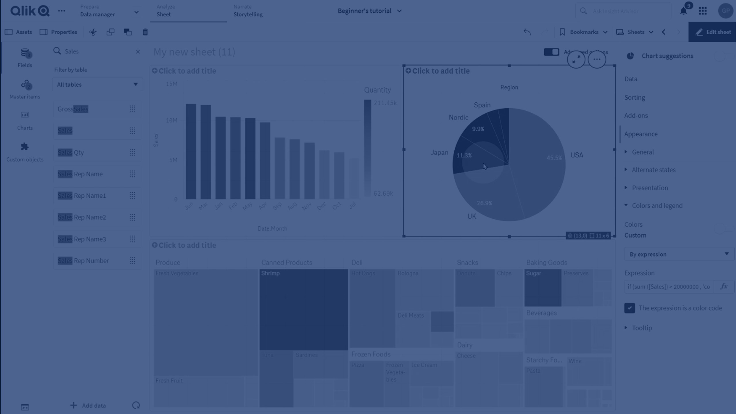
Color by expression
Coloring by expression applies colors to a visualization based on a user-defined expression. This enables you to use expressions to define both the colors used and the values upon which the colors are applied in a visualization. You could, for example, use an expression to set conditional colors in a chart.
The following options are available when By expression is selected from Colors in Appearance > Colors and legend:
| UI item | Description |
|---|---|
|
Expression |
Enter an expression by clicking For more information, see Color by expression. |
|
The expression is a color code |
Selected by default. In most cases, it is best to keep this setting. When the selection is cleared, the expression evaluates to a number, which in turn is plotted against one of the chart gradients. |
|
Label |
Enter the label to appear for the legend. This expression is a color code must be cleared. |
|
Color scheme |
Color scheme sets the colors used in the visualization. The following color schemes are available: Sequential gradient: The transition between the different color groups is made using different shades of colors. High measure values have darker hues. Sequential classes: The transition between the different color groups is made using distinctly different colors. Diverging gradient: Used when working with data that is ordered from low to high, for instance, to show the relationship between different areas on a map. Low and high values have dark colors, mid-range colors are light. Diverging classes: Can be seen as two sequential classes combined, with the mid-range shared. The two extremes, high and low, are emphasized with dark colors with contrasting hues, and the mid-range critical values are emphasized with light colors. This expression is a color code must be cleared. |
|
Reverse colors |
When selected, the color scheme is reversed. This expression is a color code must be cleared. |
|
Range |
This setting sets the value ranges for coloring results in the visualization. Auto: Qlik Sense creates ranges based on the detected minimum and maximum values. Custom: Qlik Sense automatically creates ranges
based on user-defined minimum and maximum values. You must enter values or
expressions that calculate those values in the fields Min and Max. You can
enter an expression by clicking This expression is a color code must be cleared. |
Color by expression in table visualizations
Expressions can be used to color table and pivot table backgrounds and text. This enables you to use expressions to define both the colors used and the conditional values upon which the colors are applied in a visualization. You could, for example, use expressions to change text and background colors depending on the values within different table cells.
The following options are available in Data for coloring table and pivot table visualizations:
| UI item | Description |
|---|---|
| Background color expression |
Enter an expression by clicking For more information, see Color by expression. |
| Text color expression |
Enter an expression by clicking For more information, see Color by expression. |