Reviewing the time series models
After the first version of the model training is finished, analyze the resulting model metrics and recommended models.
When you run the experiment version, you are taken to the Models tab, where you can start analyzing the resulting model metrics. You can access Schema view and Data view by returning to the Data tab. More granular analysis can be performed in the Compare and Analyze tabs.
Models tab in the time series experiment.
Analyzing the Model metrics table
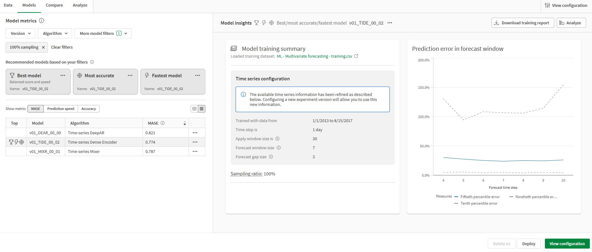
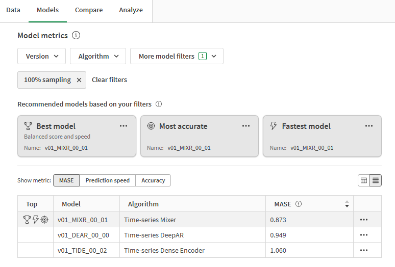
You are now on the Models tab. In the Model metrics section, recommended models are highlighted based on common quality requirements. The best model has been selected automatically for analysis.
Three recommendations are provided from the models trained in the experiment. A single model can be represented in more than one recommendation. The recommendations are:
-
Best model: The model best balances top-performing accuracy metrics and prediction speed.
-
Most accurate: The model scores the highest in balanced and raw accuracy metrics.
-
Fastest model: The model has the fastest prediction speed, in addition to strong accuracy-related metrics.
It is important to choose the model that is best suited to your use case. In most cases, the Best model is the most favorable option. However, your predictive use case might require particular prediction speeds or accuracy metrics.
For an in-depth overview of how the top model types are determined, see Selecting the best model for you.
Model metrics table presenting scores and recommended models.
Analyzing the Model training summary
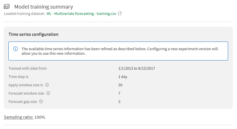
Shift your focus to the Model training summary on the right side of the interface. For time series experiments, the model training summary provides details about the time series configuration you have created. In particular, you can see that the maximum forecast window has now been confirmed and is no longer an estimate.
Model training summary showing details about the configured time series problem.
Analyzing the Prediction error in forecast window chart
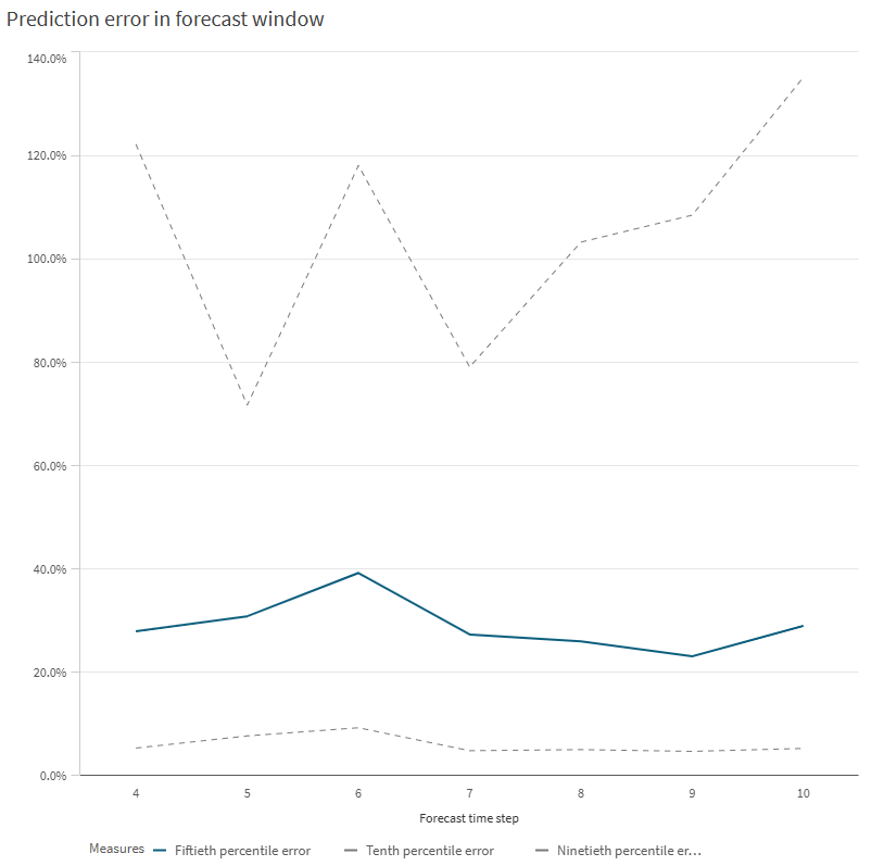
The Prediction error in forecast window chart is an autogenerated visualization that allows you to gain quick insight into the rate at which the selected model is predicting incorrect values. You can view the tenth, fiftieth, and ninetieth percentile error.
Prediction error in forecast window chart for the selected model.
Compare and Analyze tabs
In the Compare and Analyze tabs, you can use embedded analytics to further evaluate analyze model metrics in greater detail.
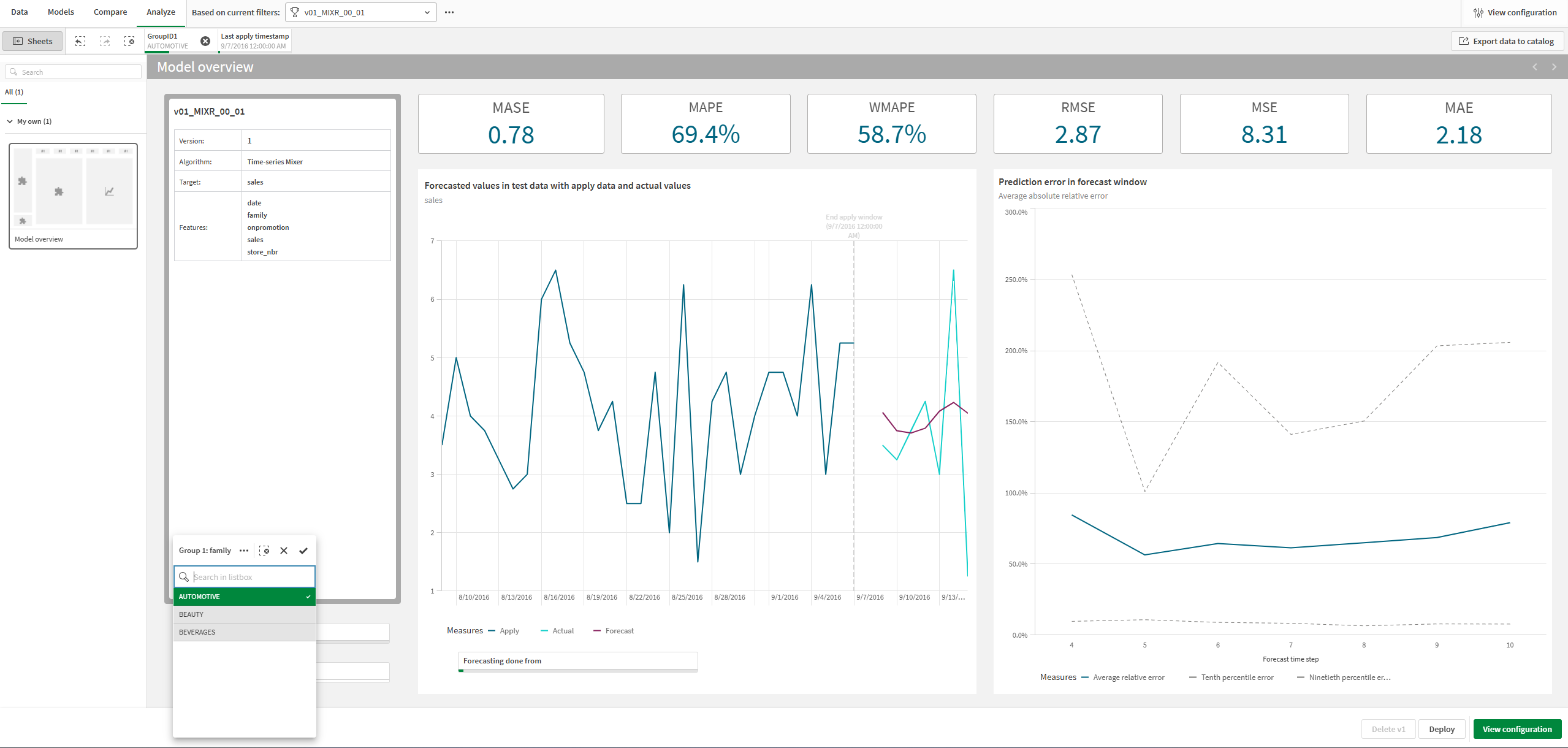
The Analyze tab allows you to evaluate the model in detail. You can view the predictions for each group individually. This tab displays predicted versus actual values for the test set, per group.
Analyze tab in the time series experiment, showing actual versus forecasted values for a single value in group 1.
For more information, see:
Next steps
In this tutorial, you will proceed to deploying the Best model identified from v1 of the training. Move to the next section about deploying your time series model.
