Performing detailed model analysis
In the Analyze tab of the experiment, you can focus on a single model for in-depth analysis of its predictive performance. Detailed analysis is performed using embedded analytics.
After training finishes, select a model. Next, open the Analyze tab to view more information about the accuracy of the model predictions, what is influencing trends in the data, and other information. The data shown in the Analyze tab is based on predictions the model generates against the holdout data.
You can easily switch between models using the drop down menu in the toolbar. The drop down menu is responsive to the filters you have applied in the Models tab, allowing you to focus on the main models that are candidates for deployment.
Analyze tab in ML experiment
Some of the main benefits of detailed model analysis include:
-
Interactive interface where you can refine and customize visualization data as needed.
-
A close-up look at the predictions made on the holdout data, alongside feature importance statistics.
Analysis workflow
For a complete understanding of the model training results, it is recommended that you complete quick analysis, then proceed with the additional options in the Compare and Analyze tabs. Quick analysis provides a Model training summary showing which features have been dropped during the intelligent optimization process, and also provides a number of auto-generated visualizations for quick consumption. The Compare and Analyze tabs do not show the Model training summary, but let you drill down deeper into the model metrics to better understand the quality of your models.
For more information about the other analysis options, see:
Understanding the concepts
It can be helpful to have a basic understanding of the concepts behind model analysis before you start evaluating your models. For more information, see Understanding model review concepts.
Impact of optimization settings on analysis
For classification and regression experiments, your analysis experience can be slightly different depending on whether or not you have used intelligent model optimization. Intelligent model optimization is turned on by default for new classification and regression experiments.
Analyzing models trained with intelligent optimization
By default, new classification and regression experiments run with intelligent model optimization.
Intelligent model optimization provides a more robust training process that ideally creates a model that is ready to deploy with little to no further refinement. The performance of these models when deployed for production use cases is still dependent on training them with a high-quality dataset that includes relevant features and data.
If your version was trained with intelligent model optimization, consider the following:
-
Each model in the version can have different feature selection depending on how the algorithm analyzed the data.
-
From the Models tab, read the Model training summary for the model before diving into specific analysis. The Model training summary shows a summary of how Qlik Predict automatically optimized the model through iterating on feature selection and applying advanced transformations.
For more information about intelligent model optimization, see Intelligent model optimization.
Analyzing models trained without intelligent optimization
Alternatively, you might have turned off intelligent model optimization for the version of the training. Manual optimization of models can be helpful if you need more control over the training process.
If you used manual optimization, all models in the version will have the same feature selection, so a Model training summary is not needed.
Inspecting the configuration
During preprocessing, features might have been excluded from being used in the training. This typically happens because more information is known about the data as training progresses than before you run the version.
After reviewing the Model training summary (only shown with intelligent optimization), you can take a closer look at the experiment configuration if you need to check for these other changes.
Do the following:
-
In the experiment, switch to the Data tab.
-
Ensure you are in
Schema view.
-
Use the drop down menu in the toolbar to select a model from the version.
-
Analyze the model schema. You might want to focus on the Insights and Feature type columns to see if certain features are dropped or have been transformed to a different feature type.
For example, it is possible that a feature initially marked as Possible free text has been excluded after you ran the version.
For more information about what each of the insights means, see Interpreting dataset insights.
Note that if you ran the version with the default intelligent optimization option, each model in the version could have different feature selection due to automatic refinement. If the version was run without intelligent optimization, the feature selection will be the same for all models in the version. For more information about intelligent model optimization, see Intelligent model optimization.
Based on what you find in this configuration, you might need to return to the dataset preparation stage to improve your feature data.
Launching a detailed analysis
There are a number of ways in which you can launch a detailed analysis of a specific model:
-
Select a model in the Data or Models tab, click
next to the model, and then click
Analyze.
-
Click the Analyze tab when you have a model selected.
-
If you are already viewing a details analysis for a model, use the drop down menu in the toolbar to select a different model. Models are presented for filters you have applied in the Models tab. Top model recommendations are highlighted with
(best overall),
(most accurate), and
(fastest) icons. If desired, you can filter models in the Models tab to refine detailed model list that appears in this drop down menu.
The analytics content depends on the model type, as defined by the experiment target. Different metrics will be available for different model types.
Models that were trained with a sampling ratio of less than 100% cannot be opened in the Analyze tab.
Navigating embedded analytics
Use the interactive interface to analyze the model with embedded analytics.
Switching between sheets
The Sheets panel lets you switch between the sheets in the analysis. Each sheet has a specific focus. The panel can be expanded and collapsed as needed.
Making selections
Use selections to refine the data. You can select features and drill down into specific values and ranges. This allows you to take a closer look if needed. In some cases, you might need to make one or more selections for visualizations to be displayed. Click data values in visualizations and filter panes to make selections.
You can work with selections by:
-
Select values by clicking content, defining ranges, and drawing.
-
Search within charts to select values.
-
Click a selected field in the toolbar at the top of the embedded analysis. This allows you to search in existing selections, lock or unlock them, and further modify them.
-
In the toolbar at the top of the embedded analysis, click
to remove a selection. Clear all selections by clicking the
icon.
-
Step forward and backward in your selections by clicking
and
.
The analysis contain filter panes to make it easier to refine the data. In a filter pane, click the check box for a value to make a selection. If the filter pane contains multiple listboxes, click a listbox to expand it then make any desired selections.
Exporting data to catalog
You can export the data used in the detailed analysis to the catalog. Data is exported to a space in Qlik Cloud Analytics. You can use the exported data to create your own Qlik Sense applications for custom analysis.
For more information, see Exporting model training data.
Analyzing prediction accuracy
How you interpret the accuracy of the predictions will depend on the structure of your training dataset and your machine learning use case. Additionally, the interpretation of these visualizations depends on the model type. More information is provided for each model type in the sections below.
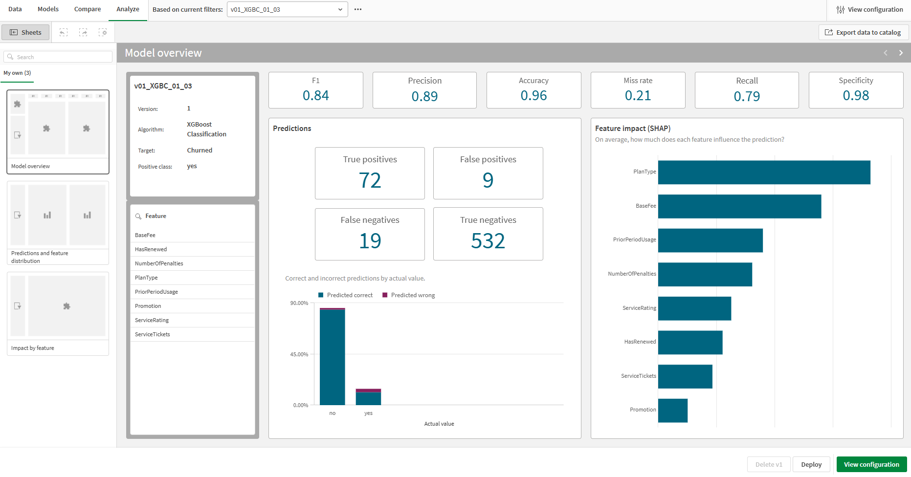
The Predictions section of the Model overview sheet provides an aggregated overview of how many predictions the model is making correctly and incorrectly.
Using the Predictions and feature distribution sheet, focus on a specific feature to analyze the nature of the prediction inaccuracies. Select a single feature in the filter pane on the left side of the sheet. For all model types, this sheet shows prediction inaccuracies and actual value distribution side-by-side to help put the data into perspective.
Binary classification models
Analyzing the entire model
In the Predictions section of the Model overview sheet, the raw data defined in the confusion matrix is shown. This includes true and false positives, and true and false negatives. These values are presented as static totals so they do not respond to selections. To learn more about what these values mean, see Confusion matrix.
Viewing aggregated overview of prediction performance in the Analyze tab for a binary classification model

Analyzing subsets of the data
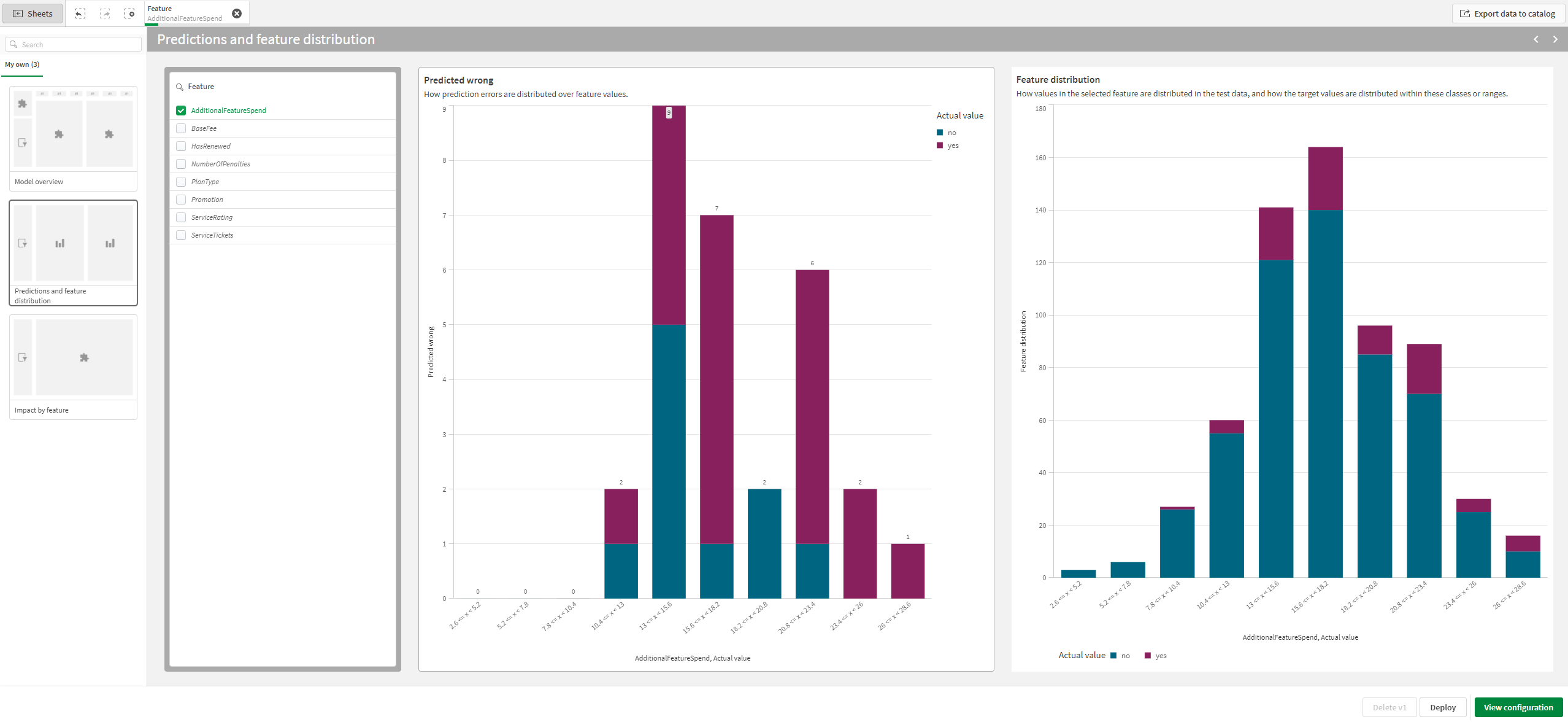
In the Predictions and feature distribution sheet, the Predicted wrong chart shows a bar for each possible feature value or range in the feature, with the height of the bar corresponding to how many incorrect predictions the model made. Each color in the bar corresponds to each of the actual target values. Select a single feature, and values from any other desired fields, to view how the prediction accuracy changes for different data subsets.
Analyzing prediction inaccuracies alongside value distribution for a selected feature. This image shows the analysis view for a binary classification model.
Multiclass classification models
Analyzing the entire model
In the Predictions section of the Model overview sheet, a bar chart is shown with a bar for each of the actual target values. The height of each color of a bar corresponds to how many times a specific class is predicted by the model. In addition to this chart, the Predictions section also shows a breakdown of correct versus incorrect predictions.
Viewing aggregated overview of prediction performance in the Analyze tab for a multiclass classification model

Analyzing subsets of the data
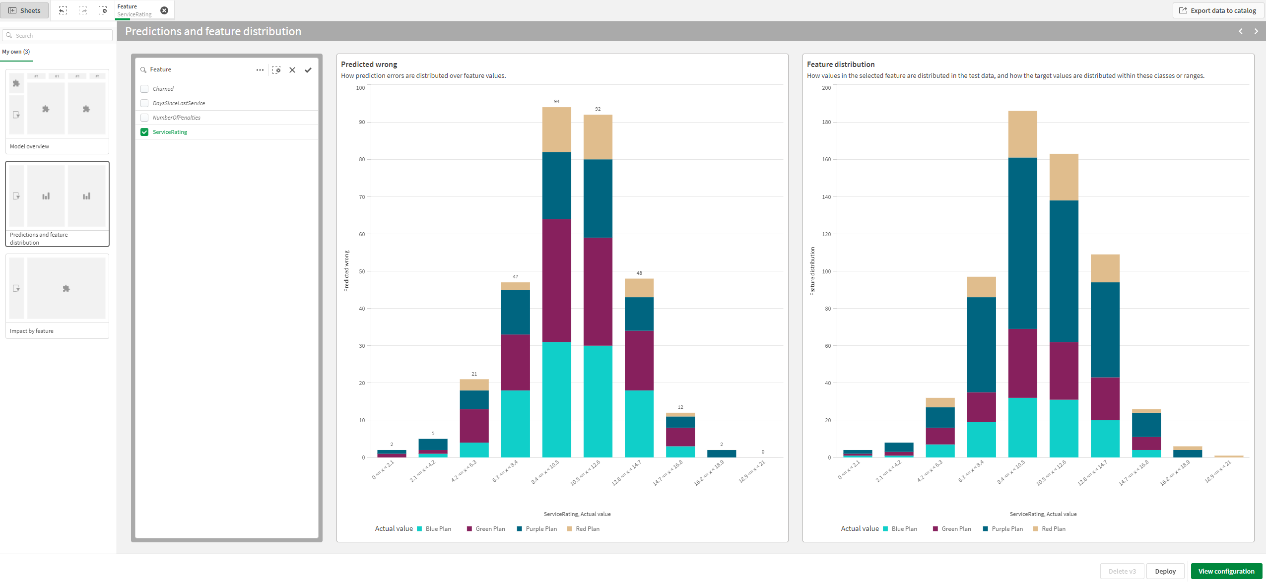
In the Predictions and feature distribution sheet, the Predicted wrong chart shows a bar for each possible value or range in the feature, with the height of the bar corresponding to how many incorrect predictions the model made. Each color in the bar corresponds to each of the actual target values.
Analyzing prediction inaccuracies alongside value distribution for a selected feature. This image shows the analysis view for a multiclass classification model.
Regression models
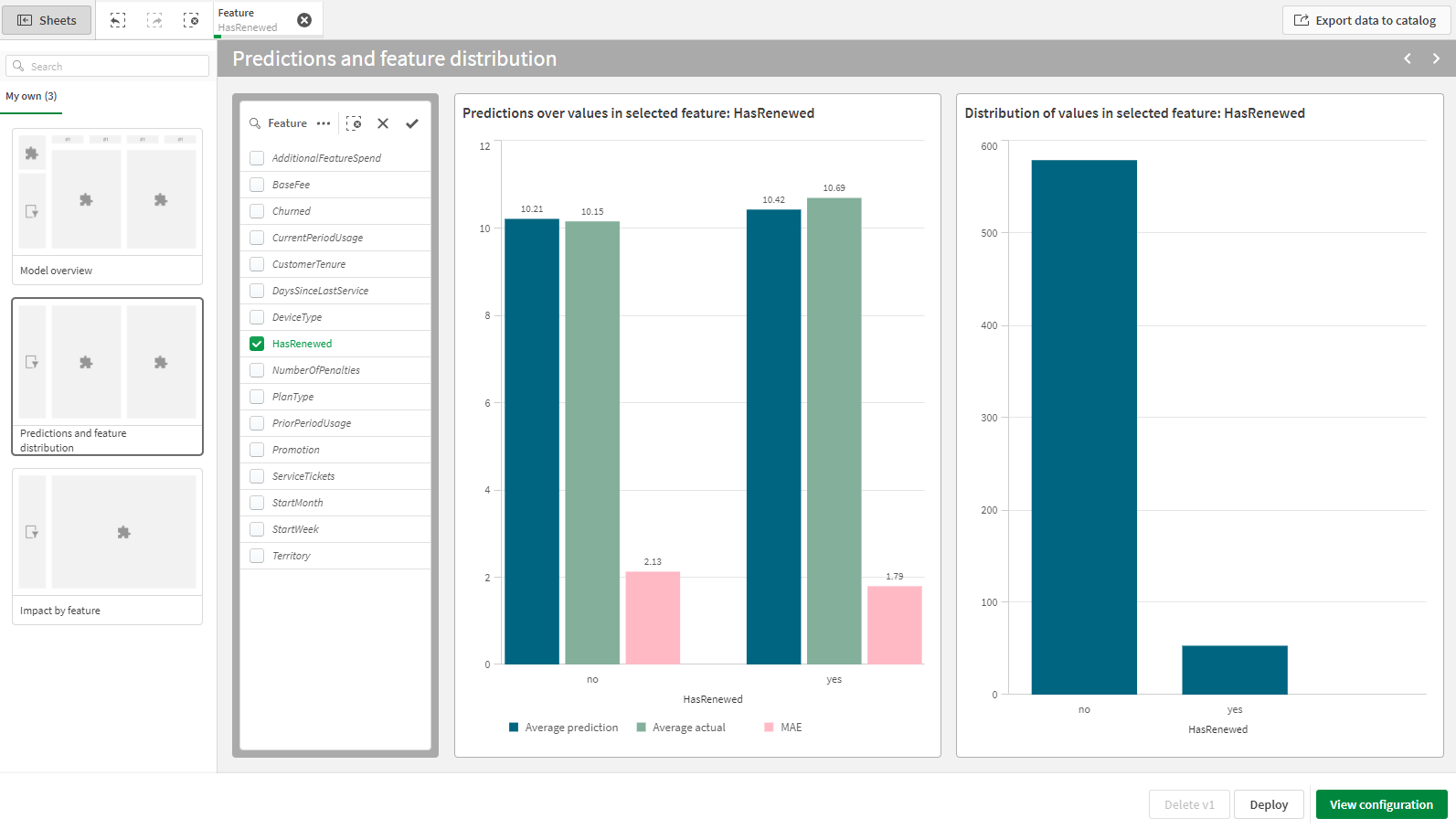
For regression models, you can view the following information at both the model and feature level:
-
Average predicted value for the target
-
Actual target value
-
Ninetieth and tenth percentile prediction ranges. These lines show the ranges in which you can expect the model to predict a value. The ninetieth percentile line will always be the line with the larger values.
-
Mean absolute error (MAE)
For both the model-wide and feature-specific visualizations, analyze the metrics alongside the actual value distribution for the feature.
Analyzing prediction inaccuracies alongside value distribution for a selected feature. This image shows the analysis view for a regression model.
Time series models
For time series models, you can analyze the following:
-
Key model metrics for time series forecasting
-
Details about the model configuration
-
Comparisons of forecasted values across different time windows (both actual and forecasted)
-
Prediction error in forecast window
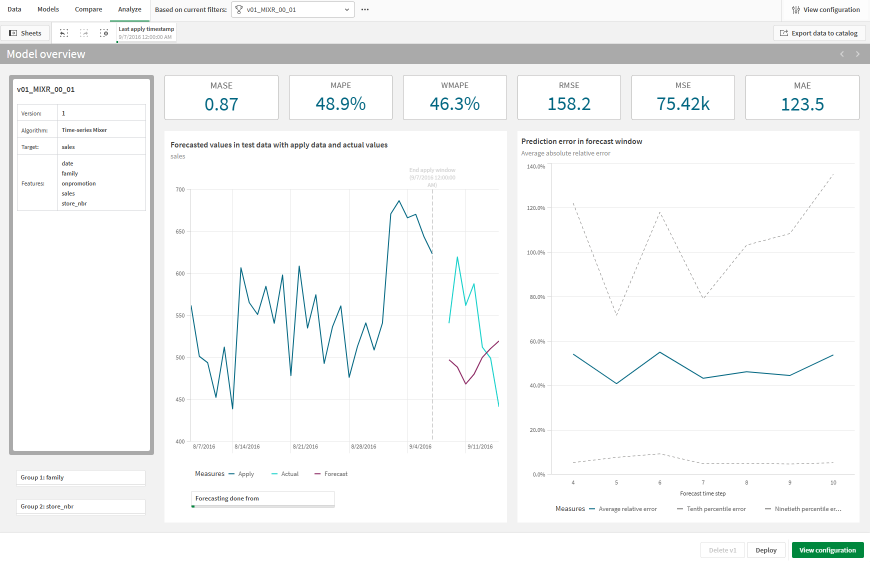
Model metrics can be viewed at the top of the sheet. For more information about each metric, refer to Scoring time series models.
On the left side of the sheet, you can view important details about the model, such as experiment version, algorithm, and features.
The main line chart on the left allows you to compare forecasted values across the apply window, actual data, and forecast window. At the bottom of the chart, you can select alternative (earlier) start dates for the forecasts, allowing reflections on what-if scenarios and deeper understanding of the patterns. For experiments with groups, use the group filter panes below the model details to select specific grouping values, focusing your analysis on specific cohorts of data.
The main line chart on the right shows the prediction error in the forecast window. This chart allows you to compare the average relative error, tenth percentile error, and ninetieth percentile error for the model.
Analyzing a time series model using embedded analytics. This particular model is a multivariate model, which means that subsets of the data from the groups can be selected for refined analysis.
Analyzing feature importance
Accessing an overview
Analyzing feature importance gives you an indication of how each feature is influencing predictions relative to the other features.
The Feature impact section of the Model overview sheet provides an aggregated overview of the average absolute SHAP values. This chart looks the same as the SHAP importance chart in the Models tab. The chart updates based on selections you make. When you select a single feature, you can drill down into its specific values and ranges for further detail.
Aggregated comparison of SHAP values with a single feature selected

Analyzing SHAP distribution
You can also open the Impact by feature sheet to get a more comprehensive view of the SHAP values for each feature value or range. The SHAP values are presented with direction, rather than as absolute values.
This analysis can help you identify patterns in specific cohorts, as well as find outliers in the data. Make selections of values or ranges in the chart to filter the data for more granular analysis.
The chart's appearance and type depends on what type of feature you select.
Categorical features
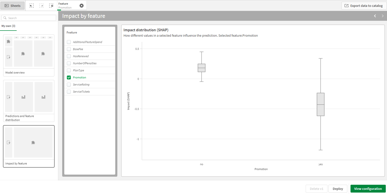
Categorical features are visualized as a box plot. The box plot helps you see the distribution of SHAP values for each categorical value. The box plot has the following configuration:
-
Shows average SHAP values.
-
The Standard (Tukey) configuration is used:
-
The box for a value is defined by the first quartile (lower end) and third quartile (upper end).
-
The median is the horizontal line inside the box.
-
-
The upper and lower whiskers correspond to the upper and lower limits of the 1.5 interquartile range.
-
Outlier values are not shown.
Box plot for analysis of SHAP value distribution for a categorical feature
Numeric features
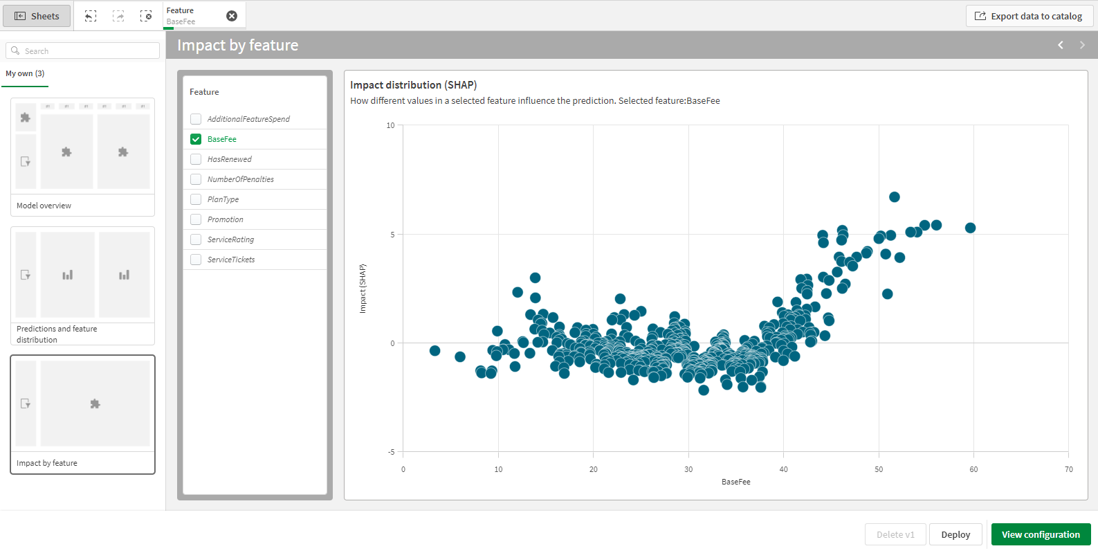
For numeric features, SHAP values are visualized as a scatter plot. The scatter plot has the following configuration:
-
SHAP values for the selected sample are shown.
-
The look and feel of the scatter plot depends on the number of data points to display. For charts with a lower number of data points, individual bubbles are shown. For charts with a large number of data points, bubbles are collected into blocks, with coloring to indicate how many data points are within each block.
In the scatter plot, make selections of specific values or ranges for closer examination.
Scatter plot for analysis of SHAP value distribution for a numeric feature
Analyzing bias detection results
If any features in the version were activated for bias detection, you can view the Bias sheet for granular analysis of specific metrics for each included feature.
For more information, see Detailed analysis of bias results.
Limitations
Dataset column names containing any of the following characters are not shown in the Analyze tab:
-
[
-
]
To view these items in the Analyze tab, you must remove these characters from the column names prior to training.
