Date range picker
The date range picker (Date picker) lets you select a single date or a range of dates from a calendar. It is included in Dashboard bundle.
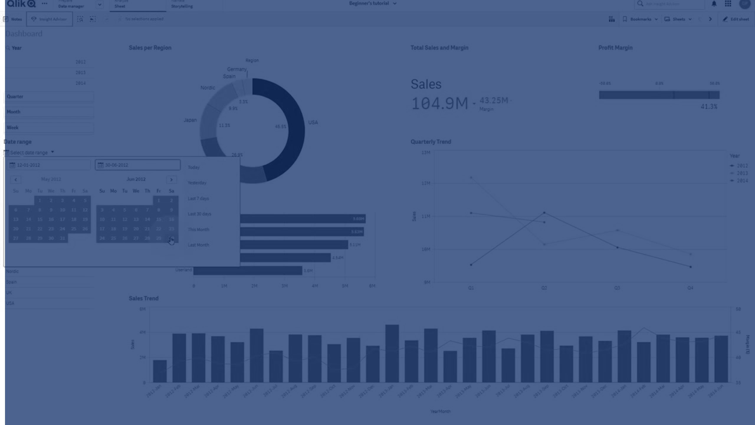
Date picker has two modes:
- In single date mode, you select from a simple calendar.
- In date interval mode, you can select a range from the calendar, or any of the predefined ranges that are available.
Dates associated to data appear in black in the calendar. Dates with no associated data appear in grey. Users can select any date.
When to use it
The date range picker is useful when you have one or more date fields that you need to use to filter your selections. Unlike a filter pane, a date range picker will only display date fields.
Creating a date range picker
You can create a date range picker on the sheet you are editing.
Do the following:
- In the advanced edit mode assets panel, open Custom objects > Dashboard bundle and drag a Date picker object to the sheet.
-
Select the date field to use as filter in Date field.
The list contains only fields that are recognized as a date field by Qlik Sense.
Tip noteIf you want to use a timestamp field, you need to convert it to a date. Use the expression =date(floor(myTimeStamp_Field)) instead of myTimeStamp_Field. -
Select if you want to be able to pick a single date or a date interval in Single date / interval.
Date interval lets you pick a range of dates.
Single date lets you pick a single date only.
When you have created the date range picker, you may want to adjust its appearance and other settings.
Setting the available date range
You can set the range of dates available to pick by setting the option Advanced setup to On. You can use expressions or explicit date values. The expressions used below refer to a field named DateField.
-
Set the first date of the calendar with Min date.
Default value is =Min( {1} [DateField]). This expression returns the first date in DateField in the full data set.
-
Set the last date of the calendar with Max date.
Default value is =Max( {1} [DateField]). This expression returns the last date in DateField in the full data set.
-
Set the date to show when the date range picker is opened with Start date.
Default value is =Min([DateField]). This expression returns the first date in DateField in the current selection.
Setting locale of the calendar
You can set the locale of the calendar to get local names for days and months. Change the setting Locale under Calendar Settings > Language and labels to the two-letter code of the locale you want to use. For example, you can change the default value of en for English to de for German.
Using predefined ranges
In date interval mode there are a number of predefined ranges available to pick if Show predefined ranges is set to On. You can customize the text labels for the predefined range selections with the settings under Calendar Settings > Predefined ranges:
- Custom Range represents the option where you select a date interval freely from the calendar. Default value is Range.
- Today represents the date value of today. Default value is Today.
- Yesterday represents the date value of yesterday. Default value is Yesterday.
- Last $ days represents the two options for showing the last 7 or 30 days. $ is replaced by 7 or 30 in the string. Default value is Last $ days.
- This represents the current period. By default Month is selected. You can select:
- Day
- Month
- Quarter
- Year
- None
-
Last represents the previous period. By default Month is selected. You can select:
- Day
- Month
- Quarter
- Year
- None
You can specify how many of the previous periods to include in Last number of.
You can include the current period by selecting Include current.
Customizing text labels
You can customize the text labels that are shown when the date range picker is used.
You change the text prompt shown when the date range picker is minimized with the setting Default Text under Calendar Settings > Language and labels. The default setting is 'Select date range'.
Customizing styling
With Advanced options turned on, you have a number of styling options available under Appearance in the properties panel.
Click Styling under Appearance > Presentation to further customize the styling of the chart. You can reset your styles by clicking next to each section. Clicking Reset all resets styles for all available tabs in the styling panel.
For general information about styling an individual visualization, see Applying custom styling to a visualization.
Customizing the text
You can set the text for the title, subtitle, and footnote under Appearance > General. To hide these elements, turn off Show titles.
The visibility of the different labels on the chart depends on chart-specific settings and label display options. These can be configured in the properties panel.
You can style the text that appears in the chart.
Do the following:
-
Click Advanced options.
-
In the properties panel, expand the Appearance section.
-
Under Appearance > Presentation, click Styling.
-
On the General tab, set the font, emphasis style, font size, and color for the following text elements:
-
Title
-
Subtitle
-
Footnote
-
Customizing the background
You can customize the background of the chart. The background can be set by color and image.
Do the following:
-
Click Advanced options.
-
In the properties panel, expand the Appearance section.
-
Under Appearance > Presentation, click Styling.
-
On the General tab of the styling panel, you can select a background color (single color or expression). You can also set the background to an image from your media library or from a URL.
Information noteTo add a background image from a URL, the URL's origin needs to be added to the allowlist in your tenant's Content Security Policy. The origin must be added with the following Directive: img-src. This is done by a tenant administrator.
For more information, see Creating a CSP entry.
When using a background color, use the slider to adjust the opacity of the background.
When using a background image, you can adjust image sizing and position.
Customizing the border and shadow
You can customize the border and shadow of the chart.
Do the following:
-
Click Advanced options.
-
In the properties panel, expand the Appearance section.
-
Under Appearance > Presentation, click Styling.
-
On the General tab of the styling panel, under Border, adjust the Outline size to increase or decrease the border lines around the chart.
-
Select a color for the border.
-
Adjust the Corner radius to control the roundness of the border.
-
Under Shadow in the General tab, select a shadow size and color. Select None to remove the shadow.
Limitations
The date range picker cannot filter date ranges greater than 28 years or that contain 10,000 or more values. If your date range contains a large number of dates, use another object such as a line chart.
For information about general limitations, see Limitations.