Next, you will review the hierarchies in your logical model. Hierarchies is an optional business logic feature. It defines drill-down relationships between groups.
When you enable business logic, some hierarchies may be automatically created by Qlik Sense from your data model. If you navigate to Hierarchies, you can see that business logic has created two hierarchies.
Hierarchies indicate groups that can be used to break each other down in analysis. For example, the two hierarchies created by Qlik Sense correctly identify two drill-down relationships in our logical model:
The data in the Category fields can be broken down into the data in the Products fields.
The data in the Suppliers fields can be broken down into the data in the Products fields.
If you navigate to Sheet, click Insight Advisor, and select CategoryName, Insight Advisor includes a treemap that breaks down CategoryName by ProductName.
Tip noteHierarchies do not enable drill-down selections in the generated charts. That requires drill-down dimensionmaster items. For example, if you want map charts that drill-down from to cities after a country is selected, you need to create a corresponding drill-down dimension master item.
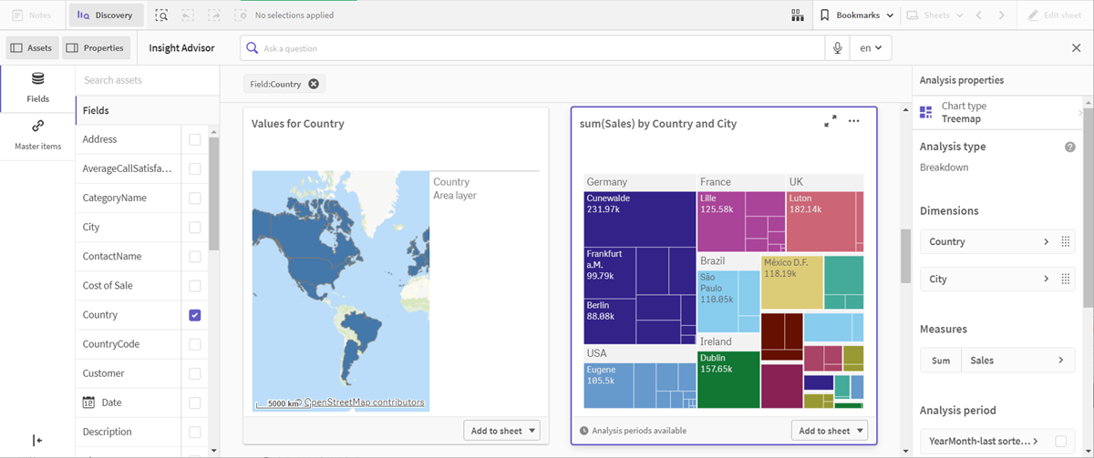
In addition to defined hierarchies, the logical model can contain learned hierarchies. These are learned automatically from how fields are used and defined in the data model. For example, navigate to Sheet and click Insight Advisor. From the assets panel, select Country. You now have results that reflect a City-Country hierarchy, including a treemap that shows sum(Sales) by Country and City. This hierarchy is a learned hierarchy detected from the data model.
Logical model
The logical model is the underlying data model that tells Insight Advisor how to use data when generating visualizations.
Selections are values selected by a user in visualizations in an app used to filter data. When a selection is made, all associated visualizations are updated to reflect the selection. Selections can be saved as bookmarks, and shared with other users.
Charts are objects where calculations, aggregations, and groupings can be made. Graphical visualizations, such as bar charts and pie charts are common examples, but also non-graphical objects such as pivot tables are charts.
A chart consists of dimensions and measures, where the measures are calculated once per dimensional value. If the chart contains multiple dimensions, the measures are calculated once per combination of dimensional values.
A dimension is an entity used to categorize data in a chart. For example, the slices in a pie chart or the bars of a bar chart represent individual values in a dimension. Dimensions are often a single field with discrete values, but can also be calculated in an expression.
A dimension is a dataset in a data mart that forms part of the star schema. Dimension datasets hold the descriptive information for all related fields that are included in the fact table’s records. A few common examples of dimension datasets are Customer and Product. Since the data in a dimension dataset is often denormalized, dimension datasets have a large number of columns.
Master items are dimension, measures, or visualizations that have been saved so they can be reused in other visualizations or sheets. You can then make changes or updates to the master item in a single place and have it impact all objects that use the master item.