Pivot table
The pivot table (Pivot) presents dimensions and measures as rows and columns in a table. In a pivot table you can analyze data by multiple measures and in multiple dimensions at the same time.
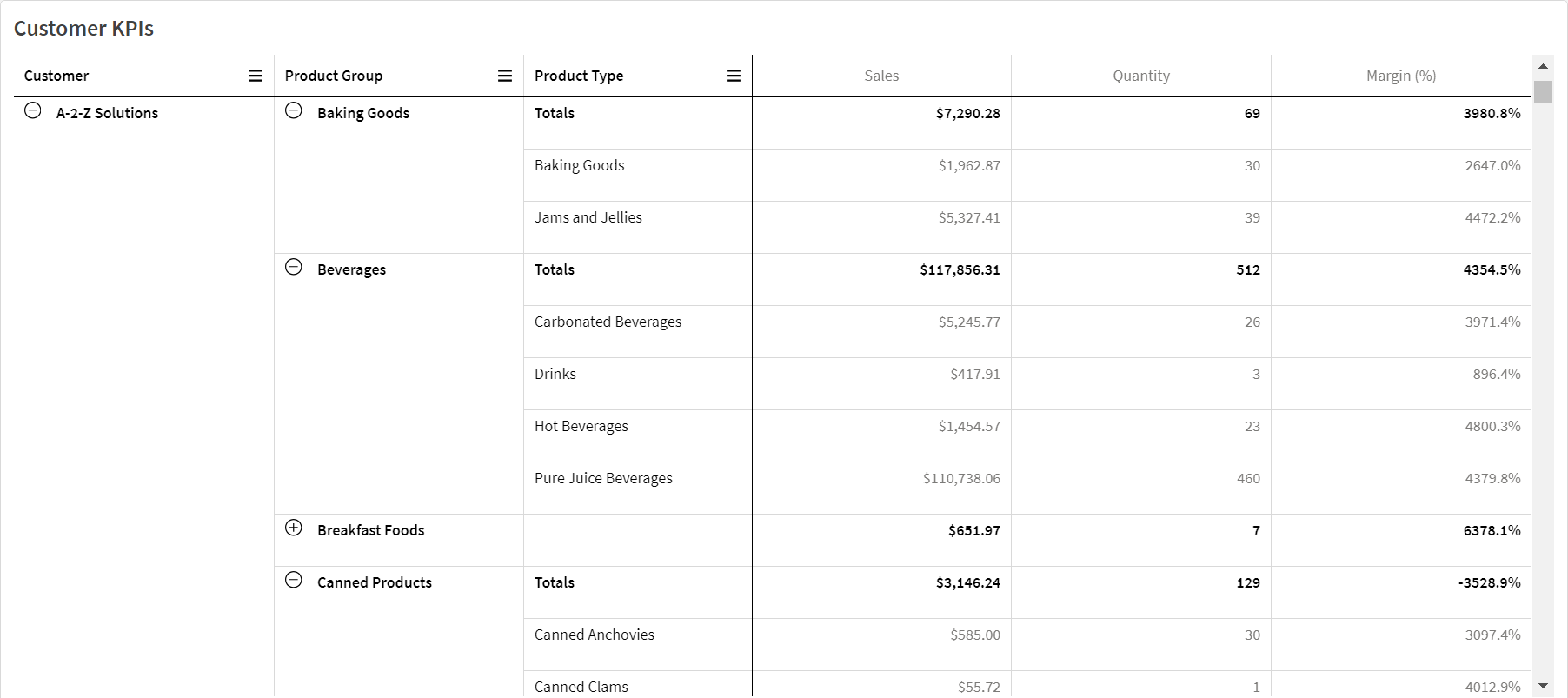
Pivot table, with expansions

When to use it
Pivot tables are useful when you want to include several dimensions or measures in a single table, and then want to reorganize them to see different subtotals. The Qlik Visualization bundle pivot table offers several different layout and styling options than the pivot table visualization, including:
-
Headers for all dimensions
-
Header menu options for all dimensions
-
Custom null representation
-
Customizable column widths by pixel or percentage
-
Adjust column widths using mouse
-
Totals at top or bottom
Creating pivot tables
Gehen Sie folgendermaßen vor:
- In the assets panel, open Custom objects > Visualization bundle and drag Pivot to the sheet.
-
Click Add and select a field or master dimension for the row dimension.
Optionally, add more dimensions as rows. The pivot table drills down rows in the order they are added. You can click and drag the dimensions to reorder them.
-
Click Add and select a field or master measure for the measure.
Optionally, add more measures.
You can adjust appearance and other settings in the advanced properties panel.
Pivoting your data in the properties panel
In the properties panel, you can add measures and dimensions to the pivot table, as well as pivot rows or columns.
Data
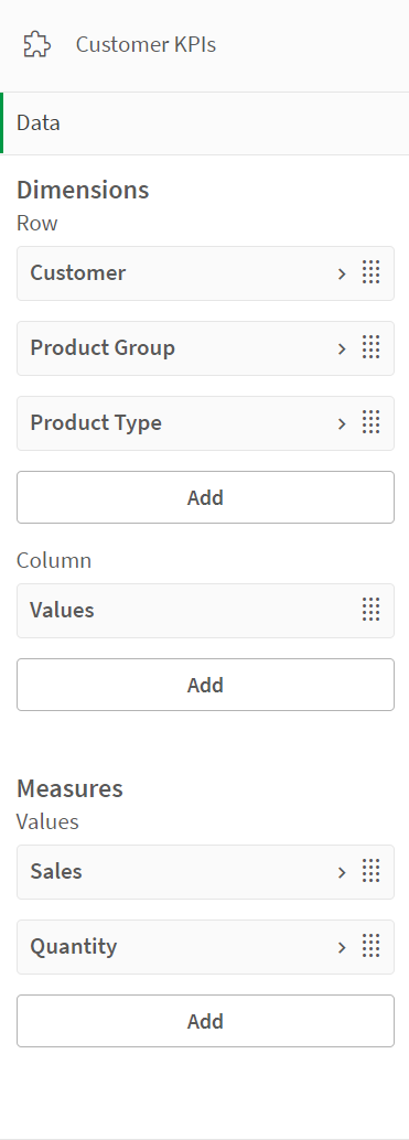
In the data pane, you can add dimensions and measures. You can move items between rows and columns. You can also change item order inside rows or columns. When you use more than one measure, they are grouped and a Values item is created.

Sorting
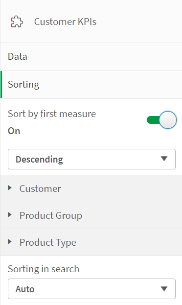
On the sorting pane in advanced properties, you can change the internal order of dimensions and measures.

Sort by first measure
If you have more than one measure, a measure group is created. Sort by first measure will sort dimension values by the numeric value of the first measure. This sort order will affect all dimensions and take precedence before any other sort order defined under the dimensions.
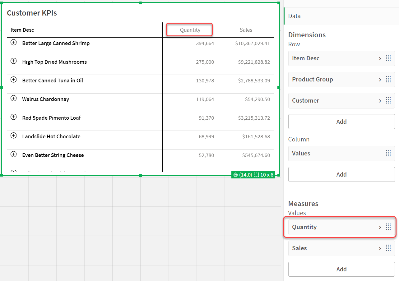
For example, you have two measures: Quantity and Sales. In the properties pane, under Data> Measures, Quantity is listed first. If you Sort by first measure in descending order, your table is sorted starting with the dimension with the highest Quantity.
If Sort by first measure is turned off, the table uses the sort order configured for the dimensions.
Pivot table in Edit mode. Sort by first measure has been toggled on.

Limitations:
- This option is only supported if subtotals are calculated. You can calculate subtotals by doing one of the following:
- In the properties pane, go to Data, and click on a dimension. Toggle on Show totals.
- In the properties pane, go to Appearance > Presentation. Toggle on Indent rows.
- This option is not supported for calculated dimensions.
- This option is only supported if all dimensions are in the Row section and all measures are in the Column section.
Dimension sorting
With Sort by first measure turned off, the table can be sorted by dimension values. Each dimension can have Auto or Custom sorting. With Auto sorting, field values are sorted alphabetically and numerically in ascending order. With Custom sorting, you can turn each of the following settings on or off:
-
Sort by expression: Sorts by custom expression. Sort by expression overrides the Sort numerically and Sort alphabetically settings. This option should only be used with the first (outermost) dimension in the table.
-
Sort numerically: Sorts field values starting with a number.
-
Sort alphabetically: Sorts field values starting with a letter.
Ascending and Descending options are available for all three settings.
Sorting in search
The user can click a dimension name in the table to expand a listbox. In the listbox, the user can search and select individual dimension values. The Sorting in search setting controls the sort order of the values in a dimension listbox.
You have the following options for the listbox sort order:
-
Auto: Uses the default sort order. Numbers are sorted numerically in ascending order. Text is sorted alphabetically in ascending order.
-
Inherit from dimension: Uses the sort order defined for the individual dimension.
Formatting dimension and measure columns
You can format your dimension and measure columns with additional options. You can:
-
Limit displayed dimensions
-
Format dimension representation
-
Format measure numbers
-
Create conditional columns
-
Set background color of cells using expressions
-
Set text color with expressions
-
Setting column width
Limiting displayed dimensions
Limit the number of displayed values for a dimension. When you set a limitation, the only dimensions displayed are those where the measure value meets the limitation criterion.
Gehen Sie folgendermaßen vor:
-
Under Data, select a dimension and expand the properties.
-
Under Limitation, select one of the following limitations:
-
No limitation: The default value.
-
Fixed number: Select to display the top or bottom values. Set the number of values. You can also use an expression to set the number. Klicken Sie zum Öffnen des Formel-Editors auf
.
-
Exact value: Use the operators and set the exact limit value. You can also use an expression to set the number. Klicken Sie zum Öffnen des Formel-Editors auf
.
-
Relative value: Use the operators and set the relative limit value in percent. You can also use an expression to set the number. Klicken Sie zum Öffnen des Formel-Editors auf
.
-
Formatting dimension representation
You can format dimension columns to show values, links, or images using Representation in the properties panel. You can select the following representations:
- Text: Displays the dimension values as text. This is the default value.
-
Link: Displays values as clickable links. Either the dimension value is used or the URL or you can add other URLs to the displayed dimension values.
-
Image: Displays values that contain an absolute URL to an image display as images.
Formatting links
The character ; is not supported as a query parameter separator in a URL.
Gehen Sie folgendermaßen vor:
-
Under Data, select a dimension and expand the properties.
-
Under Representation, select Link.
-
Under Link setting, select one of the following:
-
Add label: The dimension contains the destination URL in either the dimension expression or the data table. The links are displayed and ordered by destination URL expression.
Under Link label, enter a descriptive text label for the destination URL. Click
to open the expression editor.
-
Add URL: The dimension values become selectable text links that are labels for the URLs.
Under Link URL, enter the destination URL expression. Click
to open the expression editor.
-
Formatting images
Images in pivot tables are only accessible from servers and domains that have been safe-listed. Administrators make these resources available in the Management Console by adding Content-Security-Policies (CSP) for each server or domain. CSP helps to prevent cross-site scripting attacks by controlling what resources a browser can request from a server.
The character ; is not supported as a query parameter separator in a URL.
Gehen Sie folgendermaßen vor:
-
Under Data, select a dimension and expand the properties.
-
Under Representation, select Image.
-
Under Image setting, select one of the following:
-
Add label: The dimension contains the absolute URL to the image in either the dimension expression or the data table. The links are displayed and ordered by the URL expression.
Under Image label, enter a descriptive text label for the image that displays as alternative text when the image is hovered over. Click
to open the expression editor.
-
Add URL: The dimension values become labels for the alternative text that displays when the image is hovered over.
Under Image URL, enter the destination URL expression. Click
to open the expression editor.
-
-
Under Sizing, select one of the following sizing options:
-
Always fit
-
Fit to width
-
Fit to height
-
Stretch to fit
-
Original size
-
-
Under Position, select the image position within the cell.
Formatting measure numbers
You can format measure numbers under Number formatting in the properties panel.
If you want to change the number format at app level, and not just for a single measure, it is better to do that in the regional settings in the SET statements at the beginning of the script in the data load editor.
Gehen Sie folgendermaßen vor:
-
Under Data, select a measure and expand the properties.
-
Under Number formatting, select the format:
-
Auto: Qlik Sense automatically sets a number formatting based on the source data.
To represent numeric abbreviations, the international SI units are used, such as k (thousand), M (million), and G (billion).
-
Number: By default, the formatting is set to Simple, and you can select the formatting from the options in the list. Change to Custom to and enter the format pattern under Format pattern.
Beispiele:
- # ##0 liefert eine ganze Zahl mit einem Tausendertrennzeichen. In diesem Beispiel wird „.“ als Tausendertrennzeichen verwendet.
- ###0 describes the number as an integer without a thousands separator.
- 0000 describes the number as an integer with at least four digits. For example, the number 123 will be shown as 0123.
- 0.000 liefert eine Zahl mit drei Dezimalstellen. In diesem Beispiel wird „.“ als Dezimaltrennzeichen verwendet.
If you add the percent sign (%) to the format pattern, the measure values are automatically multiplied by 100.
- Money: By default, the format pattern used for money is the same as set up in the operating system. Use Format pattern to change the format pattern.
- Date: By default, the formatting is set to Simple, and you can select the formatting from the options in the list. Change to Custom to and enter the format pattern under Format pattern.
- Duration: By default, the format pattern used for duration is the same as set up in the operating system. Duration can be formatted as days, or as a combination of days, hours, minutes, seconds and fractions of seconds. Use Format pattern to change the format pattern.
- Custom: By default, the format pattern used for custom is the same as set up in the operating system. Use Format pattern to change the format pattern.
-
Creating conditional columns
Columns can be conditional, so that they only appear when certain conditions are met.
Gehen Sie folgendermaßen vor:
-
Under Data, select a dimension or measure and expand the properties.
-
Under Show column if, click
to open the expression editor.
-
Enter the expression to determine the conditions for the column to appear.
-
Click Apply.
Example
Angenommen, Sie haben eine Pivottabelle oder ein Pivot-Objekt, das Folgendes enthält:
-
Die Dimensionen sind Product Type und Product Name.
-
Die Kennzahlen sind Sum(Sales) und Count (distinct InvoiceNumber).
-
Die Elemente unter Spalten sind Werte (Standard) und das Feld Quarter.
Part 1: Conditional column based on user selections
You might have a large number of years of data in your app, so you do not want to add too much clutter to the visualization. At the same time, you want to encourage granular and interactive analysis.
For the Quarter column, you could add the following expression for Show column if:
GetSelectedCount(Year)=1With this expression, if the user selects a single year in the app, the pivot table breaks down each measure by quarter. If not, the total measure values are shown.
Part 2: Conditional columns using variables
You can use variables to encourage interactive analysis. Suppose you also create a variable vUserInteraction with a blank definition. Then, you create two Button charts on your sheet, configured with the Set variable value action:
-
Show more detail: Clicking this button sets vUserInteraction to a value of ='Yes'.
-
Show less detail: Clicking this button sets vUserInteraction to a value of ='No'.
In your pivot table, you could add a number of additional measures to the chart, such as Count(Quantity) and Sum(Cost). Then, configure each measure column to have the following value for Show column if:
'$(Reference)'='Yes'This allows the chart to adapt to whether or not the user wants additional information. If the user clicks the Show more detail button, additional measures are added to the table. If not, or if they click Show less detail, the additional measures are removed.
-
Show more detail: Clicking this button sets vUserInteraction to a value of ='Yes'.
-
Show less detail: Clicking this button sets vUserInteraction to a value of ='No'.
In your pivot table, you could add a number of additional measures to the chart, such as Count(Quantity) and Sum(Cost). Then, configure each measure column to have the following value for Show column if:
'$(Reference)'='Yes'This allows the chart to adapt to whether or not the user wants additional information. If the user clicks the Show more detail button, additional measures are added to the table. If not, or if they click Show less detail, the additional measures are removed.
Setting background color with expressions
You can define the background color for a column using expressions. For example, you can have cells in the column change background color depending on the values in the column cell. The text color automatically changes to white when a dark background color is used.
Gehen Sie folgendermaßen vor:
-
Under Data, select a dimension or measure and expand the properties.
-
Under Background color expression, click
to open the expression editor.
-
Enter the expression to determine the conditions for the column to appear.
-
Click Apply.
Setting text color with expressions
You can define the text color for a column using expressions. For example, you can have cells in the column change text color depending on the values in the column cell.
Gehen Sie folgendermaßen vor:
-
Under Data, select a dimension or measure and expand the properties.
-
Under Text color expression, click
to open the expression editor.
-
Enter the expression to determine the conditions for the column to appear.
-
Click Apply.
Setting column width
By default, column width is automatically set. You can manually set column width by:
-
Content
-
Pixels
-
Percentage
You can also manually size the columns by dragging the header borders.
Gehen Sie folgendermaßen vor:
-
Under Data, select a dimension or measure and expand the properties.
-
Under Column width, select how you want to set column width:
-
Fit to content: Columns are sized by the width of the content in the column.
-
Pixels: Set the width of the column in pixels.
-
Percentage: Set the width of the column by percent.
-
Auto: Automatically set the column width with Qlik Sense.
-
Customizing styling
Unter Darstellung im Eigenschaftsfenster sind mehrere Designoptionen verfügbar.
Klicken Sie auf Design unter Darstellung > Präsentation, um das Design des Diagramms weiter anzupassen. Das Designfenster enthält mehrere Abschnitte auf den Registerkarten Allgemein und Diagramm.
Sie können Ihre Designs zurücksetzen, indem Sie auf neben den einzelnen Abschnitten klicken. Wenn Sie auf
Alle zurücksetzen klicken, werden die Designs für alle verfügbaren Registerkarten im Designfenster zurückgesetzt.
Anpassen des Texts
Sie können den Text für Titel, Untertitel und Fußnoten unter Darstellung > Allgemein festlegen. Um diese Elemente auszublenden, deaktivieren Sie Titel anzeigen
Die Sichtbarkeit der verschiedenen Bezeichnungen des Diagramms hängt von den diagrammspezifischen Einstellungen und den Anzeigeoptionen der Bezeichnungen ab. Diese können im Eigenschaftsfenster konfiguriert werden.
Sie können das Design des im Diagramm angezeigten Texts ändern.
Gehen Sie folgendermaßen vor:
-
In the properties panel, expand the Appearance section.
-
Under Appearance > Presentation, click
Styling.
-
Legen Sie auf der Registerkarte Allgemein die Schriftart, den Hervorhebungsstil, die Schriftgröße und die Farbe der folgenden Textelemente fest:
-
Titel
-
Untertitel
-
Fußnote
-
-
On the Chart tab, set the font, emphasis style, font size, and color for the following text elements:
- Header: Style the text of the headers for all dimensions.
- Dimension values: Style the text dimension values.
- Measure values: Style the text of the measure values.
- Measure labels: Style the text of the measure headers.
- Total values: Style the text of the totals.
- Null values: Style the text of the null values.
Customizing the background
You can customize the background of the chart. You can also color individual dimensions or measures by expression.
Gehen Sie folgendermaßen vor:
-
In the properties panel, expand the Appearance section.
-
Under Appearance > Presentation, click
Styling.
-
On the General tab of the styling panel, you can select a background color (single color or expression). You can also set the background to an image from your media library or from a URL.
When using a background color, use the slider to adjust the opacity of the background.
When using a background image, you can adjust image sizing and position.
-
On the Chart tab, customize the background color for the following elements:
- Header
- Dimension values
- Measure values
- Measure labels
- Total values
- Null values
Customizing the grid
You can customize the pivot table grid.
Gehen Sie folgendermaßen vor:
-
In the properties panel, expand the Appearance section.
-
Under Appearance > Presentation, click
Styling.
-
On the Chart tab, customize the grid with the following elements:
-
Row height: Set the height of rows in lines.
-
Border: Set the color of the cell borders.
-
Divider: Set the color of the divider between that divides both dimensions and measures as well as header and rows.
-
Background: Set the color of the empty area created when you have dimensions in Column.
-
Customizing null values
You can change how null values are represented in the pivot table.
Gehen Sie folgendermaßen vor:
-
Click Appearance > Presentation in the properties panel.
-
Under Null value text, enter the text you want to replace null values with.
Expanding the pivot table fully
You can set the pivot table to always be fully expanded.
Gehen Sie folgendermaßen vor:
-
Click Appearance > Presentation in the properties panel.
-
Select Fully expanded.
Customizing the border and shadow
You can customize the border and shadow of the chart.
Gehen Sie folgendermaßen vor:
-
In the properties panel, expand the Appearance section.
-
Under Appearance > Presentation, click
Styling.
-
On the General tab of the styling panel, under Border, adjust the Outline size to increase or decrease the border lines around the chart.
-
Select a color for the border.
-
Adjust the Corner radius to control the roundness of the border.
-
Under Shadow in the General tab, select a shadow size and color. Select None to remove the shadow.
Limitations
Pivot tables have the following limitations:
-
You cannot pivot data in your Visualization bundle pivot table when your sheet is in analysis mode as you can with the visualization pivot table.
