
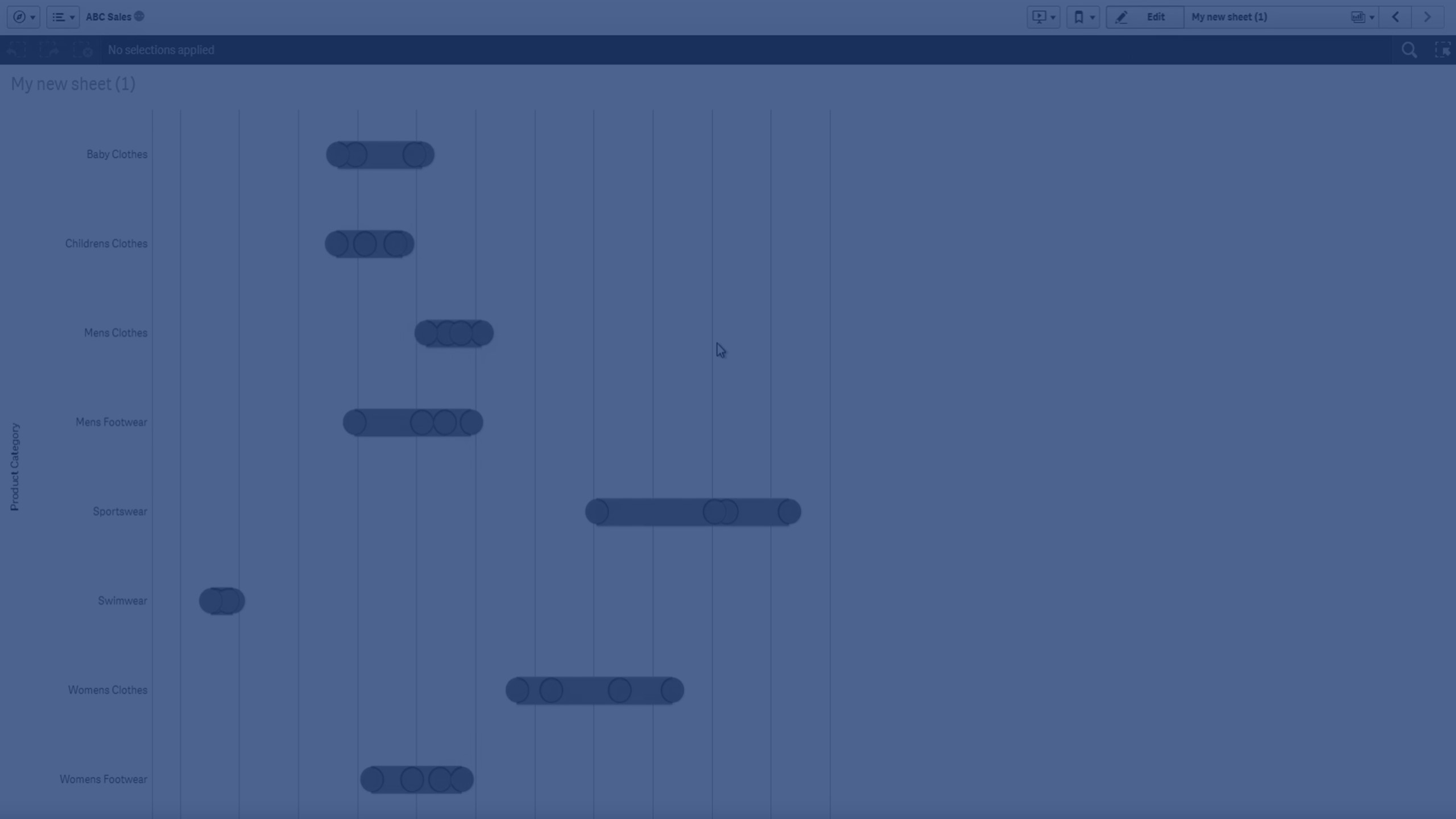
The distribution plot is suitable for comparing range and distribution for groups of numerical data. Data is plotted as value points along an axis.
You can choose to display only the value points to see the distribution of values, a bounding box to see the range of values, or a combination of both as shown here:

When to use it
The distribution plot is suitable for comparing range and distribution for groups of numerical data.
Advantages
The distribution plot visualizes the distribution of data.
Disadvantages
The distribution plot is not relevant for detailed analysis of the data as it deals with a summary of the data distribution.
Creating a distribution plot
You can create a distribution plot on the sheet you are editing.
In a distribution plot you need to use one or two dimensions, and one measure. If you use a single dimension you will receive a single line visualization. If you use two dimensions, you will get one line for each value of the second, or outer, dimension.
Gehen Sie folgendermaßen vor:
- From the assets panel, drag an empty distribution plot to the sheet.
-
Add the first dimension.
This is the inner dimension, which defines the value points.
-
Add a second dimension.
This is the outer dimension, which defines the groups of value points shown on the dimension axis.
-
Click Add measure and create a measure from a field.
Anzeige der Verteilung von Kennzahlwerten in einer Dimension mit einem Verteilungsdiagramm
When you have created the distribution plot, you might want to adjust its appearance and other settings in the properties panel. For information about styling, see Styling the distribution plot. For information about customizing other aspects of the chart's appearance, see Changing the appearance of a visualization.
Styling the distribution plot
Unter Darstellung im Eigenschaftsfenster sind mehrere Designoptionen verfügbar.
Klicken Sie auf ![]() Design unter Darstellung > Präsentation, um das Design des Diagramms weiter anzupassen. Das Designfenster enthält mehrere Abschnitte auf den Registerkarten Allgemein und Diagramm.
Design unter Darstellung > Präsentation, um das Design des Diagramms weiter anzupassen. Das Designfenster enthält mehrere Abschnitte auf den Registerkarten Allgemein und Diagramm.
Sie können Ihre Designs zurücksetzen, indem Sie auf ![]() neben den einzelnen Abschnitten klicken. Wenn Sie auf
neben den einzelnen Abschnitten klicken. Wenn Sie auf ![]() Alle zurücksetzen klicken, werden die Designs für alle verfügbaren Registerkarten im Designfenster zurückgesetzt.
Alle zurücksetzen klicken, werden die Designs für alle verfügbaren Registerkarten im Designfenster zurückgesetzt.
For general information about styling an individual visualization, see Applying custom styling to a visualization.
Anpassen des Texts
Sie können den Text für Titel, Untertitel und Fußnoten unter Darstellung > Allgemein festlegen. Um diese Elemente auszublenden, deaktivieren Sie Titel anzeigen
Die Sichtbarkeit der verschiedenen Bezeichnungen des Diagramms hängt von den diagrammspezifischen Einstellungen und den Anzeigeoptionen der Bezeichnungen ab. Diese können im Eigenschaftsfenster konfiguriert werden.
Sie können das Design des im Diagramm angezeigten Texts ändern.
Gehen Sie folgendermaßen vor:
-
In the properties panel, expand the Appearance section.
-
Under Appearance > Presentation, click
 Styling.
 -
Legen Sie auf der Registerkarte Allgemein die Schriftart, den Hervorhebungsstil, die Schriftgröße und die Farbe der folgenden Textelemente fest:
-
Titel
-
Untertitel
-
Fußnote
-
-
On the Chart tab, set the font, font size, and color for the following text elements:
-
Achsentitel: Legen Sie das Design der Titel auf den Achsen fest.
-
Achsenbeschriftung: Legen Sie das Design der Beschriftungen auf den Achsen fest.
-
Legendentitel: Legen Sie das Design des Legendentitels fest.
-
Legendenbezeichnungen: Legen Sie das Design der Bezeichnungen für die einzelnen Legendenelemente fest.
-
Customizing the background
You can customize the background of the chart. The background can be set by color and image.
Gehen Sie folgendermaßen vor:
-
In the properties panel, expand the Appearance section.
-
Under Appearance > Presentation, click
Styling. -
On the General tab of the styling panel, you can select a background color (single color or expression). You can also set the background to an image from your media library or from a URL.
When using a background color, use the slider to adjust the opacity of the background.
When using a background image, you can adjust image sizing and position.
Customizing the border and shadow
You can customize the border and shadow of the chart.
Gehen Sie folgendermaßen vor:
-
In the properties panel, expand the Appearance section.
-
Under Appearance > Presentation, click
Styling. -
On the General tab of the styling panel, under Border, adjust the Outline size to increase or decrease the border lines around the chart.
-
Select a color for the border.
-
Adjust the Corner radius to control the roundness of the border.
-
Under Shadow in the General tab, select a shadow size and color. Select None to remove the shadow.
Display limitations
Displaying large amounts of data in a distribution plot
When displaying large amounts of data in a distribution plot, the message "Currently showing a limited data set." is shown to indicate that not all data is displayed.
- If the chart uses more than one dimension, 3000 data points are displayed.
Colors and legend
Wenn Einfärbung nach Dimension in diesem Diagramm verwendet wird, können maximal 100 eindeutige Dimensionswerte und 100 eindeutige Farben auf der Legende aufgetragen werden.