The Word cloud chart (Word cloud) lets you visualize text data. Text values are displayed with their size based on a measure value. The measure can be anything you want to measure against, for example: times used, alphabetically, by importance, or by context. You can customize your chart with different shapes, fonts, layouts, and color schemes.
Information noteWord cloud is included as a part of the Visualization bundle. Visualization bundle objects have additional limitations and may not have the same support as other visualizations. For more information, see Visualization bundle.
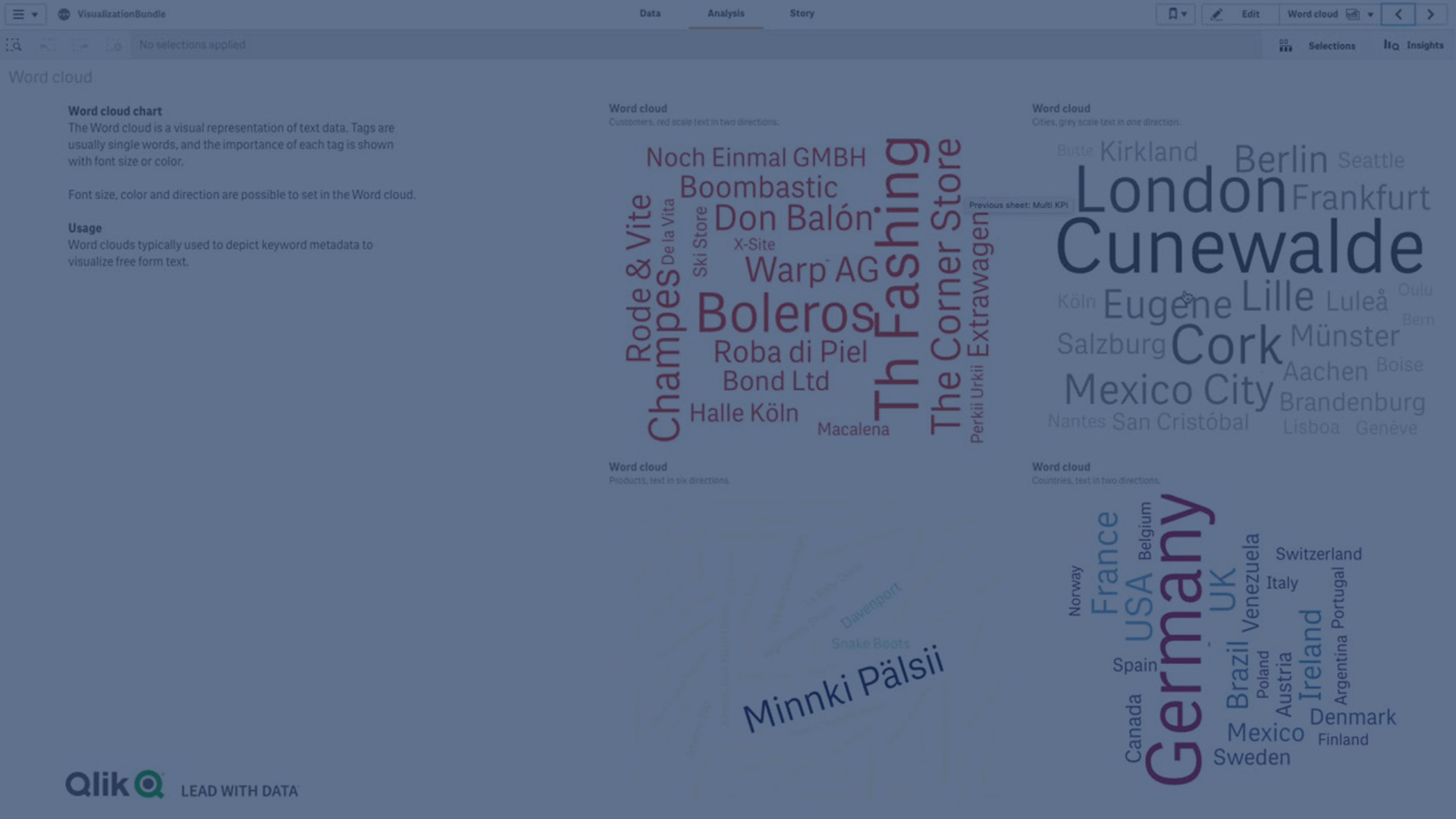
A word cloud chart displaying food items in different sizes and colors.
A word cloud chart lets you visualize and identify the importance of a value against a measure. The more important the value is against the measure, the larger it displays in the cloud.
Limitations
For information about general limitations, see Limitations.
The word cloud chart can handle maximum of 100 words per entry.
Words that take up more space than the chart are not displayed. You can adjust the font size to show more values, but we do not recommend that you use fields with long text values.
Word cloud charts cannot be used in Qlik NPrinting reports.
A measure is a calculation base on one ore more aggregations. For example, the sum of sales is a single aggregation, while the sum of sales divided by the count of customers is a measure based on two aggregations.
Charts are objects where calculations, aggregations, and groupings can be made. Graphical visualizations, such as bar charts and pie charts are common examples, but also non-graphical objects such as pivot tables are charts.
A chart consists of dimensions and measures, where the measures are calculated once per dimensional value. If the chart contains multiple dimensions, the measures are calculated once per combination of dimensional values.
A dimension is an entity used to categorize data in a chart. For example, the slices in a pie chart or the bars of a bar chart represent individual values in a dimension. Dimensions are often a single field with discrete values, but can also be calculated in an expression.
A dimension is a dataset in a data mart that forms part of the star schema. Dimension datasets hold the descriptive information for all related fields that are included in the fact table’s records. A few common examples of dimension datasets are Customer and Product. Since the data in a dimension dataset is often denormalized, dimension datasets have a large number of columns.