
Making selections
When you use an application, you make selections to reduce the data set, so that you can focus on particular values. You can make selections in almost all visualizations, and in most cases in many different ways.
You either click or draw to make a selection. When you click, you select one value at a time, when you draw, you select many values at a time. All selection methods are not available for all visualizations, but the variety of options ensures that you always find a smooth way of making selections.
Click selection
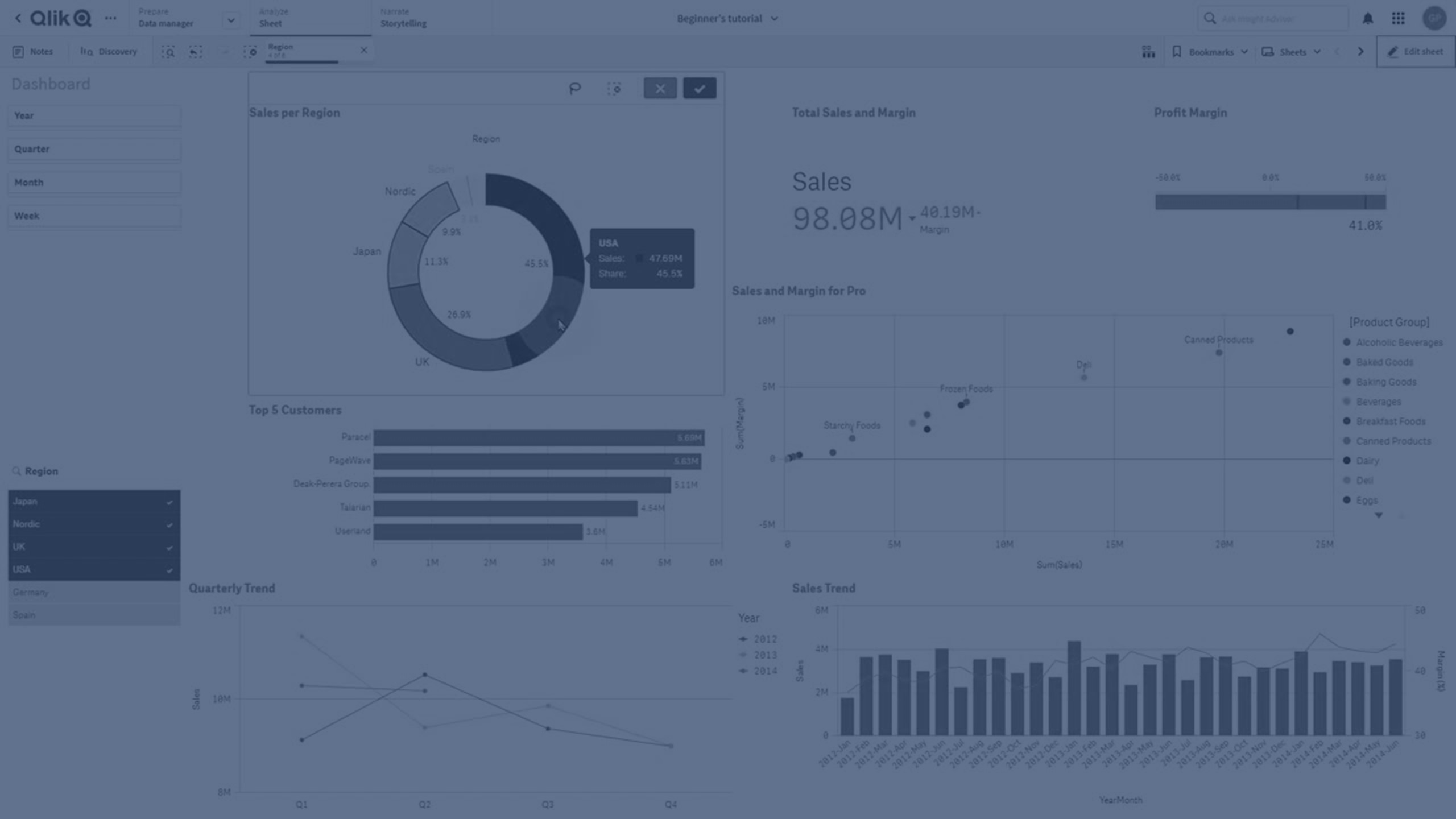
In the following pie chart, the sector Nordic has been clicked and is thereby selected. The other values are dimmed. You can confirm the selection by clicking ![]() or by clicking outside the visualization.
or by clicking outside the visualization.
The sector Nordic has been selected

Draw selection
You can draw a freehand line to select several values at a time. To deselect values, you click them one at a time. To activate draw selection, either click inside the visualization and then click ![]() , or hold down Shift while you make your selection.
, or hold down Shift while you make your selection.
Bar chart with Nordic, USA and Japan selected

In lists and tables, you can draw across several values to select them.
Region filter pane with Germany, Japan and Nordic selected

Range selection
You can make a selection by drawing along the y-axis or the x-axis, just outside the chart. For an axis showing measure values, you are also able to click on the range bubble to enter a specific numeric value.
Combo chart with selections made with range selection

Line chart with selections made with range selection

Lasso selection
You can draw a freehand circle to capture and select data points. To deselect values, you click them one at a time. To activate the lasso selection, either click inside the visualization and then click ![]() , or hold down Shift while you make your selection.
, or hold down Shift while you make your selection.
Selection of values made in a scatter plot using lasso selection

Legend selection
You can click the legend items to select the values.
Pie chart with sectors Nordic, Germany and UK selected

Label selection
You can click the dimension labels (in this example, 2012, 2013, and 2014) to select the corresponding value. In the example, the dimension values are grouped so that clicking one of the years for a country automatically selects all the values for that country.
Bar chart with label selection of 2011, 2012, and 2013. Clicking any of the years selects the whole group.
