Performing quick model analysis
When models finish training for an experiment version, perform analysis of the most important model metrics and access a summary of how the training data was processed. Quick analysis is performed in the Data and Models tabs.
Use the Models tab for an overview of your training results. When you run an experiment version, you are automatically switched to the Models tab. It is also recommended that you revisit the Data tab to inspect how the data was preprocessed and handled.
Models tab for a binary classification experiment

Additional options are available for further evaluation of models. You can compare additional metrics and hyperparameters between models, or focus on a specific model for granular analysis. These options are available in the Compare and Analyze tabs. For more information, see:
Understanding the concepts
It can be helpful to have a basic understanding of the concepts behind model analysis before you start evaluating your models. For more information, see Understanding model review concepts.
Impact of optimization settings on analysis
For classification and regression experiments, your analysis experience can be slightly different depending on whether or not you have used intelligent model optimization. Intelligent model optimization is turned on by default for new classification and regression experiments.
Analyzing models trained with intelligent optimization
By default, new classification and regression experiments run with intelligent model optimization.
Intelligent model optimization provides a more robust training process that ideally creates a model that is ready to deploy with little to no further refinement. The performance of these models when deployed for production use cases is still dependent on training them with a high-quality dataset that includes relevant features and data.
If your version was trained with intelligent model optimization, consider the following:
-
Each model in the version can have different feature selection depending on how the algorithm analyzed the data.
-
From the Models tab, read the Model training summary for the model before diving into specific analysis. The Model training summary shows a summary of how Qlik Predict automatically optimized the model through iterating on feature selection and applying advanced transformations.
For more information about intelligent model optimization, see Intelligent model optimization.
Analyzing models trained without intelligent optimization
Alternatively, you might have turned off intelligent model optimization for the version of the training. Manual optimization of models can be helpful if you need more control over the training process.
If you used manual optimization, all models in the version will have the same feature selection, so a Model training summary is not needed.
Inspecting the configuration
During preprocessing, features might have been excluded from being used in the training. This typically happens because more information is known about the data as training progresses than before you run the version.
After reviewing the Model training summary (only shown with intelligent optimization), you can take a closer look at the experiment configuration if you need to check for these other changes.
Do the following:
-
In the experiment, switch to the Data tab.
-
Ensure you are in
Schema view.
-
Use the drop down menu in the toolbar to select a model from the version.
-
Analyze the model schema. You might want to focus on the Insights and Feature type columns to see if certain features are dropped or have been transformed to a different feature type.
For example, it is possible that a feature initially marked as Possible free text has been excluded after you ran the version.
For more information about what each of the insights means, see Interpreting dataset insights.
Note that if you ran the version with the default intelligent optimization option, each model in the version could have different feature selection due to automatic refinement. If the version was run without intelligent optimization, the feature selection will be the same for all models in the version. For more information about intelligent model optimization, see Intelligent model optimization.
Based on what you find in this configuration, you might need to return to the dataset preparation stage to improve your feature data.
With intelligent model optimization turned off, you will not see a Model training summary as part of your quick analysis experience. Additionally, all the models from an experiment version will use the same feature combinations, while models trained with intelligent optimization can have different feature combinations.
Selecting a model
When the training completes, the recommended model is automatically selected for analysis, and the metrics for that model are displayed.
Switch between models to compare the differences in metrics and configuration. If you are on the Data tab, use the drop down menu in the toolbar to pick a model. If you are on the Models tab, click a model in the Model metrics table to pick a model.
Analyzing the training summary
Intelligent model optimization
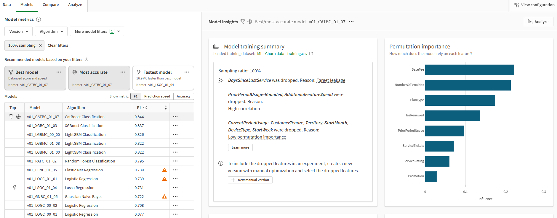
For models trained with intelligent model optimization, the Model training summary outlines key information about what happened during training. This summary includes:
-
The sampling ratio for the model.
-
A list of features that were automatically dropped as a result of intelligent optimization. This list varies depending on the select model.
-
A summary of any advanced transformations that were applied when training the model.
-
A link to the training dataset.
The Model training summary is not shown if you are optimizing your models manually.
For more information about intelligent model optimization, see Intelligent model optimization.
Model training summary chart for a model, shown in the Models tab

The model training summary does not list features that were dropped during the preprocessing stage. To check for this information, return to the Data tab of the experiment. See: Inspecting the configuration
Do the following:
-
In the experiment, switch to the Models tab.
-
Confirm you have selected the model you want to analyze.
-
In the Model insights section on the right side of the page, look at the Model training summary.
Time series experiments
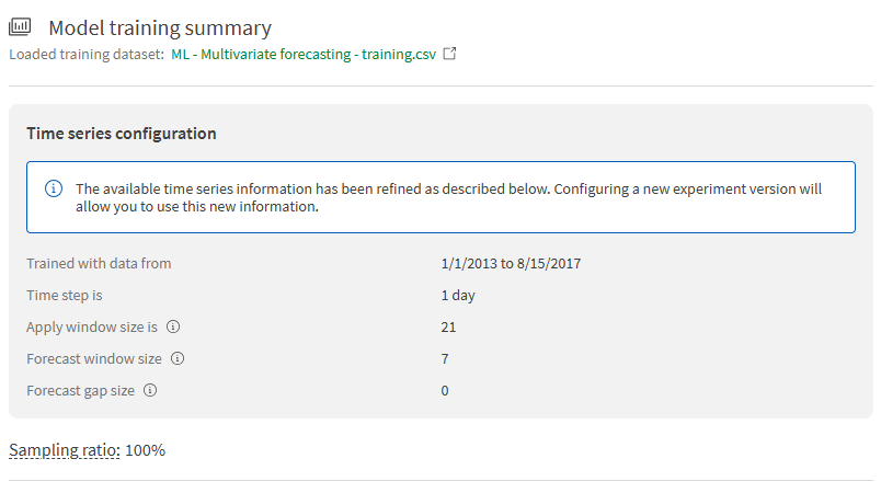
In time series experiments, the Model training summary shows the configuration settings for the time series forecasting problem, as defined by your dataset and training settings. Some of these details were estimated before training began, but now they are confirmed with certainty after the entire dataset has been analyzed. You can view:
-
The date range of the data used to train the model
-
The time step
-
The apply window size
-
The maximum forecast
-
The forecast window and gap sizes
Model training summary chart for a model in a time series experiment

Analyzing the model metrics table
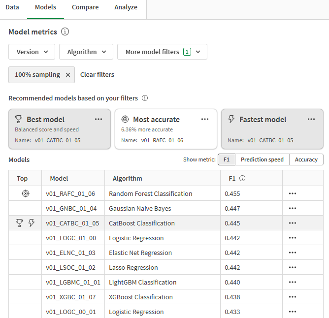
The Model metrics table provides high-level information about the performance of each model in the experiment. Recommended models from this list are presented above the table.
Model metrics table with recommended models and filters

The table shows:
-
Whether the model is a top model with respect to the top model types. See: Finding the top models
-
The name of each model (This can be edited for convenience. See: Editing model details)
-
The algorithm used to the train the model
-
Key metrics related to model performance. You can switch between:
-
Common metrics for evaluating predictive potential, as per the model type. For binary classification models, this is F1. For multiclass classification models, this is F1 Macro. For regression models, this is R2.
-
Prediction speed.
-
Accuracy. For classification models, this is the metric named accuracy. For regression models, this is MAE (mean absolute error).
-
Finding the top models
The best and top-performing models are determined based on the filters you have applied. They are presented as recommendations above the model metrics table, and are also highlighted within the table.
The Best model is selected by default. This model is marked with a icon. The best model is determined based on a balanced calculation that takes both accuracy and prediction speed into account.
Depending on your use case, you might also be interested in analyzing specific performance markers individually. Other top-performing models are highlighted with the following markers:
-
Most accurate: The model displays the highest accuracy based on the applicable scoring metrics for the problem type.
-
Fastest model: The model delivers the fastest prediction speeds. Accuracy is also taken into account.
You can also select top-performing models directly from the recommendations above the Model metrics table.
For a full overview of how each type of recommended model is determined, see Selecting the best model for you.
Filtering models in the table
The model metrics table can be filtered to show only the models you want to compare.
The following filters are available, and can be combined as needed:
-
Version: Select one or more experiment versions.
-
Algorithm: Select one or more algorithms.
-
100% sampling: This filter is applied by default. It can be removed if desired. The filter shows models that used the entire training dataset to complete the training and cross-validation process. Found under More model filters.
-
Deployed: Show models that have been deployed into ML deployments. Found under More model filters.
After you have applied your desired filters, the top-performing models are automatically re-calculated based on the filtered items. Your recommended models are then updated.
Interpreting feature importance visualizations
In the Models tab, scroll down to view the feature importance visualizations. These will be Permutation importance and SHAP importance.
Feature importance visualization in Models tab

Permutation importance chart
The Permutation importance chart shows the importance of each feature to the overall prediction of the model. What you see in the Permutation importance chart can help you understand how to refine your models.
Common insights you can gain by analyzing this chart include:
-
If one feature is consuming almost all of the importance, this is likely a sign of target leakage. The feature needs to be removed. If this is caused by data quality issues, those need to be addressed as well.
-
Some features might have very little to no impact on the model predictions. Features with extremely low permutation importance can be considered statistical noise and should be removed.
If intelligent model optimization was used to train the version, some of the common issues noted above might have been automatically addressed by dropping these features.
For more information about permutation importance, see Understanding permutation importance.
SHAP importance chart
The SHAP importance chart provides another way to analyze the influence that each feature in the experiment is having on the predictions from each model. This can give you early insight into what features are significant, or if you need to re-configure the training. For more information, see Understanding SHAP importance in experiment training.
Interpreting model scoring visualizations
For some model types, additional visualizations are available to show an overview of how well the model performs.
Binary classification
If your experiment is a binary classification problem, a number of additional visualizations are auto-generated for quick consumption. These visualizations give you more insight into how well the model is predicting the positive and negative classes.
For more information about these visualizations, see Scoring binary classification models.
Confusion matrix
The Confusion matrix chart shows the accuracy of the predictions created by the model. The predictions are performed on the automatic holdout data.
ROC curve
The ROC curve chart describes how good the model is at predicting the positive class when the actual outcome is positive.
For an indication of what an ideal ROC curve looks like, see AUC and ROC curve.
Time series
For time series models, the Prediction error in forecast window chart is auto-generated to provide insight into prediction accuracy. You can view the rate of prediction error for each time step in the forecast window. The error rates are broken down into fiftieth, tenth, and ninetieth percentile.
Analyzing bias detection results
If any features in the version were activated for bias detection, you can gain quick insights into which features were identified to have data and model bias.
Not all metrics and groups are shown in this condensed view due to limited space. For example, only minimums and maximums might be shown if the bias detection metric is calculated based on these statistics. You can switch to the Analyze tab to view comprehensive details about bias results for each selected feature.
For more information, see Quick analysis of bias results.
