During analysis, your selections are displayed above the sheet.
Each selection item has a small bar at the bottom that reflects the selection states for that dimension. Three states are displayed in the bars: selected (green), alternative (light gray), and excluded (dark gray). Locked values are indicated by a lock icon.
Selections bar with the selections Year, Product Group and Region made. Region is locked.

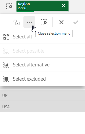
When you click a selection item, a pop-up appears. This lets you view, edit, or clear that selection. You can also search for dimension values or lock the selection. In the following image the selection menu is open. Some options may not be available, depending on what selections were made previously.
Selection Region with selection pop-up menu.

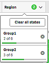
If you use alternate states in the app, you can see selections that are made in the states in the selection bar. The field that is used in the state is displayed with the number of alternate states. You can click on the field to show the states, and then click on a state to see the selections. You can also clear the selections of a state or clear all selections.
For more information, see Using alternate states for comparative analysis.
Selection Region with alternate state pop-up menu for the states Group1 and Group2.

Sheets can have actions that trigger when you navigate to the sheet. Actions can change your selections or states. For more information, see Adding actions to sheets.
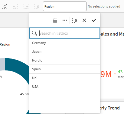
Some fields may be added to the selection bar by the app creator so that they are always available.
Field added to the selection bar

Selection options
Select all
All values are selected (marked ). Alternative values change state to selected (green). Excluded values change state to selected excluded. They are still dark gray, but are now selected (marked
). If you clear the selections that made these values excluded, they will change state to selected (green).
Select possible
All possible values (white) are selected. This option is never available in the selections item, because when a selection is made, the other values are either alternative or excluded. In a filter pane, however, you can have possible values as a result of another selection.
Select alternative
When a selection has already been made in a field, alternative values, when present, have a light gray color. These are values that would have been possible values (white), if a selection had not already been made in that field.
By selecting alternative values, the values that previously were selected become alternative.
Select excluded
If there are alternative values, they will be selected (green) and the values that previously were selected will change state to alternative. Excluded values will change state to excluded.
If there are no alternative values, the excluded values are selected (green), and the previously selected values change state to alternative.
Labels in selection bar
If a master dimension exists in the asset library for the corresponding selection, then the label for that master dimension will be displayed in the selection bar.
Custom themes and selection state colors
The colors used in the selection bar, and for each selection state, can be modified with a custom theme. If you are working with an application that uses a custom theme, you might notice that your selections do not display with the same colors that are described in this help topic.
