
Network chart
The network chart (network chart) lets you draw a network of connected nodes and edges from a data set to a sheet. A network chart shows how information flows, how components interact, and where components exist in the network. The network chart is included in the Visualization bundle.
A network chart can provide a broad overview or be very detailed. Nodes represent system components, and edges show the movement of information from one component to another. Network nodes are connected to the nodes they interact with the most. This visualization uses different styles, colors, sizes, and images to represent different levels of a network.
What it contains
You need to define three dimensions, with a fourth optional dimension:
- Node identifier: This dimension controls which nodes are presented in the chart.
- Node label: This dimension sets the label of each node.
- Node parent: This dimension sets the parent of a node, and controls the relationships between nodes. It needs to contain the value of the node identifier of the parent to connect to.
- Node group (optional): You can use this dimension to group nodes. All nodes in the same group will have the same color.
You can use up to three measures to enhance the diagram. All measures are optional, but you need to add them in the following order:
- Tooltip: You can set a measure value that is displayed in a tooltip when hovering over a node.
- Node size: You can set the size of the node according to a measure.
- Edge size: You can set the width of the lines between nodes according to a measure.
When to use it
Network chart diagrams can illustrate computer or telecommunications networks. They show the components of a network and how they interact. For example, a group of connected computers, printers, modems, hubs, and routers. This type of chart is helpful when:
- Planning the structure of a network.
- Coordinating updates to an existing network.
- Reporting and troubleshooting network problems .
- Keeping track of components.
- Documenting detailed network documentation.
Formatting your data
A network chart requires data that is structured consistently according to a network data model where each record can have multiple parents and children. Each record needs to contain at least:
- A field that identifies the node, the node identifier. Node identifier values must be integer values, starting from 0 and in sequential order.
- A field with the name of the node.
- A field that defines the parent node. This value needs to be the node identifier of another node. If this field is empty, and no other record refers to this node, a disconnected node is created.
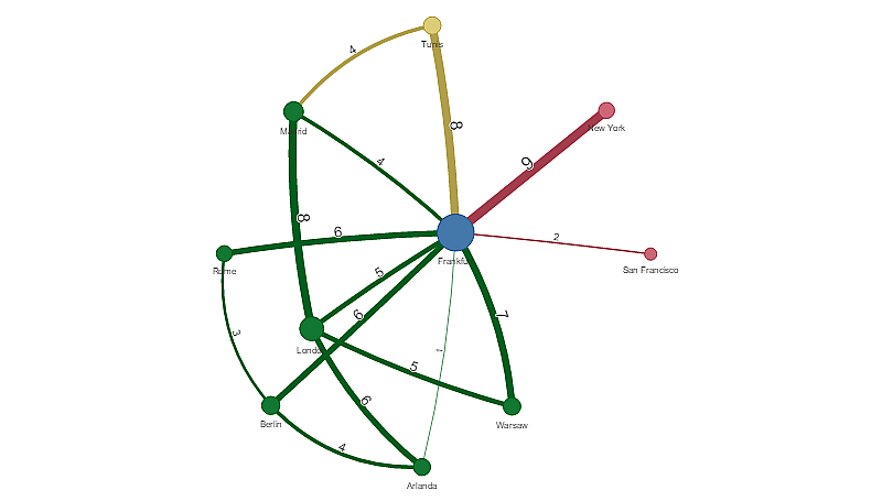
Here is some example data that you can save in a text editor and load in a new app. You need to load both example files. The example shows passenger flows between different airports.
- ID is the identifier of an airport node.
- Name is the name of an airport node. This is used as label of the node.
- LinkTo contains the node identifier of the parent node.
- Group states the group of a node. This can be used to color the nodes according to group.
- Volume is the passenger flow volume between ID and LinkTo. This can be used as a measure in edge size.
- NodeVolume is the total passenger flow volume for a node. This is loaded in a separate table as the chart cannot aggregate the volumes automatically.
Example 1: Airports1.csv
Example 2: Airports2.csv
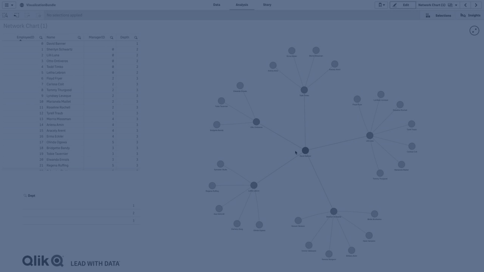
Creating a network chart
This example of a network chart illustrates how different airports are connected worldwide based on base data set. It uses the example data set from Formatting your data. Prepare by saving the example data set in a text file, creating a new app and loading the example data set.
Do the following:
- In the assets panel, open Custom objects > Visualization bundle and drag a Network chart object to the sheet.
- Click the top Add dimension button and select ID as the node identifier.
- Click the second Add dimension button and select Name as the node label.
- Click the third Add dimension button and select LinkTo as the parent node.
- Click Data in the properties panel. Click the Add button under Node group and select Group as the group dimension.
- Under Measure, click the Add button under Tooltip, and select Volume > Sum(NodeVolume).
- Click the Add button under Node size, and select Volume > Sum(NodeVolume).
-
Click the Add button under Edge size, and select Volume > Sum(Volume).
The chart displays:
Changing the appearance of the chart
You can customize your chart with one or more features.
Configuring edge type
You can configure the shape of the curve between chart nodes under Settings > Edge Type in the properties panel. Select the shape option of the chart curves from the menu.
Examples:
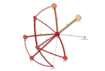
The same chart with curved CW edges.

Toggling edge value
The edge value represents value of the curves between chart nodes and their width. This option hides the numerical value of each curve. To hide the value move the slide button under Settings > Display edge value in the properties panel to the left to turn the option off.
Configuring edge label
The edge label value is the numerical value of each chart curve. You can change the position of these or hide the labels.
-
Hide edge label value: This option hides the edge label of the network chart. Toggle the slide button under Settings > Display edge value in the properties panel.
-
Edge label position: This option decides where on each chart curve the edge value displays, for example: above or below. Select applicable option from the menu.
Configuring node shape
You can customize the shape of the nodes, for example: dot, square, diamond, or triangle. Go to Settings > Node shape in the properties panel, and select the node shape from the menu.
Toggling shadow option
This option lets you turn off the shadow effects behind chart curves and nodes (used to highlight background). Toggle the slide button under Settings > Display shadow in the properties panel.
Sorting
Sorting is set to Auto with the system choosing the sorting order as the default (under Sorting > chosen dimension or measure in the properties panel) for all dimensions and measures. You can change them individually by expression.
Do the following:
- Open the dimension or measure menu under Sorting in the properties panel.
- Move Sorting slide button to the left to turn the option from Auto to Custom.
- Click the Sort by expression check box.
- Enter an order string under Expression and press Enter. You can also change the color using an expression in the Expression editor (
 ).
). - Choose start order by selecting Ascending or Descending for the menu below.
Number formatting
It is possible to format the measure value. Different formatting can be applied to the same value, for example: money, data,or duration. The chart updates to reflect the changed number type.
Do the following:
- Click Data > Measures in the properties panel and click chosen measure.
- Select applicable number formatting form the Number formatting menu.
- Enter details in the panel fields. These display when choosing an option other than Auto when to configuring the chart.
Limitations
For information about general limitations, see Limitations.
- Network chart visualizations cannot be used in Qlik NPrinting reports.
-
The maximum size of the data set displayed in the network chart is 1400 rows. If the selected data set is larger, nodes and links can be omitted from the chart.
Use a smaller data set or employ selections to limit the data set.