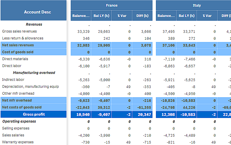
P&L pivot chart
You can use the P&L pivot chart to create a pivot table with a layout for profit and loss reporting. You can color cells according to performance and style the chart with custom fonts and alternating row colors. You can also download the chart to Excel including formatting. The P&L pivot chart is included in the Visualization bundle.

| Dimensions | Measures | Result |
|---|---|---|
| 1 dimension | up to 9 measures | A table with one row for each dimension value and one column for each measure. |
| 2 dimensions | up to 8 measures | A pivot table with one row for each value of the first dimension and one column for each measure pivoted using the second dimension. |
Coloring cells to show performance
You can color cells to show performance according to a scale of Poor, Fair and Good. All rows and columns are colored by default, but you can choose which columns and rows to color if you want to.
Do the following:
- Make sure that Enabled is set to On under Appearance > Color by condition.
-
Select which rows to color by performance.
Set Color all rows by condition to Specified rows.
Add rows to color by name (dimension value) with Add row to color.
-
Select which measures to color by performance.
Set Color all measures to Specified measures.
Add a list of measures by number in Measure indices with the first measure of the chart numbered zero. Separate the measures with a comma.
Example: Color the first, third, and fifth measure.
0,2,4
-
Set performance limits and colors.
You can set the range limits for Poor and Fair.
- All cells with a value lower than the Poor range limit are displayed with the background color and text color set for Poor.
- All cells with a value lower than the Fair range limit, but higher than Poor, are displayed with the background color and text color set for Fair. You should set the Fair range limit higher than Poor.
- All other cells are displayed with the background color and text color set for Good.
Styling the chart using a style template
You can create a layout for the chart, for example to show a profit and loss report, using a style template.
Do the following:
- Create a style template as a CSV file. Use the style template format described below.
- Load the style template to your app as one field. When you add the file, do not use semicolon as field separator, each row should be loaded as one field.
- Set Style template field under Appearance > Table format to the name of the template field you added.
You can load several style templates in your app, and change the layout with Style template field.
Style template format
The style template is created as a comma separated text file (CSV) using UTF-8 encoding.
The style template rows need to align to the data in your first dimension. You need to refer to a dimension value in the template. The dimension value should be first in every row. You do not need to specify all rows/dimension values in the template. The style template can contain maximum 5000 rows.
Each row in the template should be in the following format. It is not required to use a header row.
-
DimensionValue
The dimension value of the row that you want to style.
-
Bold
Set to <bold> if you want bold text.
-
Background
Set a background color. You can use <dark>, <night>, <soft>, <red>, <orange>, <violete>, <blue>, <green> or a color code in RGB format, for example rgb(183,219,255). The default background color is white.
-
FontStyle
You can set the font style to <italic> or <oblique>.
-
TextColor
You can set the color of the text to <white>. The default background color is black.
-
Align
You can center align the text with <center>. The default alignment is left for text and right for numeric values.
-
FontSize
You can set the font size to <large>, <medium> (default) or <small>.
-
Comment
You can use the <comment> tag to replace all zero values with a space. This is useful when you want to include a sub header row. without values.
You can also use the style tags in any order, and exclude tags that are not used. These rows will give the same result:
Style template example for profit and loss reporting
To use this template, you need a data file where the first dimension contains values that correspond to the first item of each row, for example Cost of goods sold.

Limitations
For information about general limitations, see Limitations.
-
There is a limitation for data transfer between Qlik Engine and P&L pivot. This limits each request for data to 10000 elements, for example, 1000 rows and 10 columns. P&L pivot can make automatic requests for more data using pagination.
You can set the limit of how much data to request with Pagination > Max pagination loops. The default value is 20000 elements (20k cells) and the maximum value is 40000 elements.
You can also modify the error message displayed to the user when the data limit is exceeded. The recommended workaround when the data limit is exceeded is to apply filters to the data to limit the data transfer.
- It is not possible to convert a P&L pivot chart to another visualization or convert another visualization to a P&L pivot chart.

