Variance waterfall chart
You can use the variance waterfall chart (Variance waterfall) to show the variance between two measures over the different values of a dimension. The variance waterfall chart is included in the Visualization bundle.
You need to use two measures, start value and end value, and one bridge dimension.

Creating a variance waterfall chart
You can create a variance waterfall chart on the sheet you are editing.
Do the following:
- In the assets panel, open Custom objects > Visualization bundle and drag a Variance waterfall object to the sheet.
-
Click the Add dimension button to select the bridge dimension.
- Click the first Add measure button to select the measure to use as start value.
- Click the second Add measure button to select the measure to use as end value.
The variance waterfall chart is now displayed with one bar for the start value measure and one bar for the end value measure. Between the measure bars you will see the variance for each value of the bridge dimension.
Changing the appearance of the chart
You can customize the appearance of your chart.
Labels
You can turn off value labels by setting Appearance > Presentation > Value labels to Off.
Legend
You can customize the legend labels by setting Appearance > Presentation > Labels to Custom. You can set a custom text for the following legend labels:
- Start value (Start value)
- End value (End value)
- Positive variance (Positive label)
- Negative variance (Negative label)
You can also hide the legend by setting Appearance > Colors and legend > Show legend to Off or change the position of the legend with Appearance > Colors and legend > Legend position.
Example of a variance waterfall chart
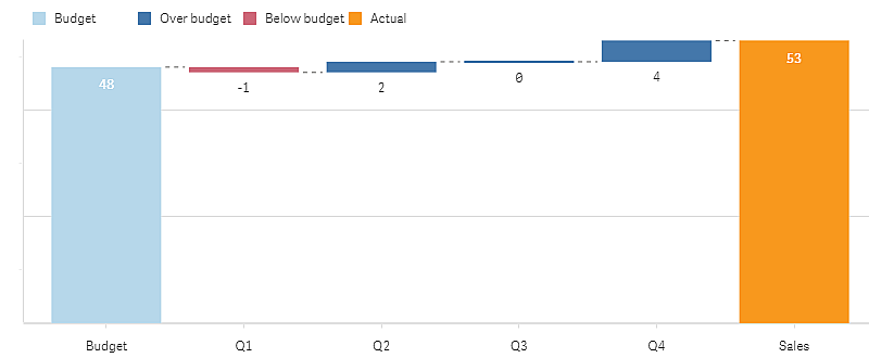
In this simple example we will show how quarterly sales numbers contribute to sales compared to budget.
Dataset
The dataset we use contains sales numbers and budgeted sales for each quarter. You can paste it into a text file and load it in Qlik Sense.
Quarter,Sales,Budget
Q1,9,10
Q2,14,12
Q3,12,12
Q4,18,14Visualization
You can now create a variance waterfall chart.
- Add Quarter as dimension.
- Add Sum(Budget) as the first measure.
- Add Sum(Sales) as the second measure.
The variance waterfall chart is created. We have adjusted the labels and colors in the example.
You can clearly see that Q1 had sales below budget, but the year ended with sales over budget, and that Q4 was the largest contribution.

Limitations
For information about general limitations, see Limitations.
- It is not possible to use a variance waterfall chart in a Trellis container.
- You need to use the same number format for both measures to get correct number format for the dimension variance bars.
