
Sankey chart
The Sankey chart (Sankey chart) lets you add a specific type of flow chart to the sheet you are editing. The chart visually emphasizes major transfers or flows within defined system boundaries. The width of the chart arrows is shown proportionally to the flow quantity. The Sankey chart is included in the Visualization bundle.
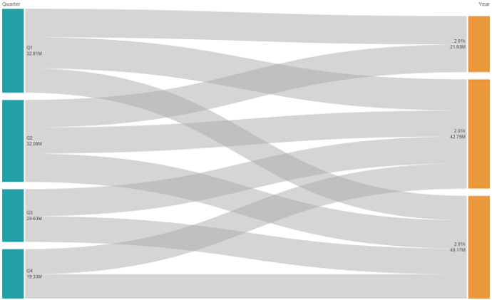
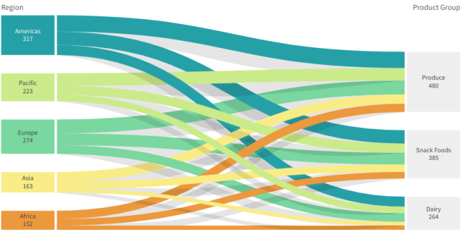
- A minimum of two dimensions and one measure is required. You can use up to five dimensions, but only one measure.
-
The dimensions do not need to be of equal size on each side of the diagram.
- You can use the dimension values to set the color of the flows in the chart.
- Link colors can be based on source or target anchor.

When to use it
The sankey chart is useful when you want to locate the most significant contributions to an overall flow. The chart is also helpful when you want to show specific quantities maintained within set system boundaries.
Creating a sankey chart diagram
You can create a sankey chart on the sheet you are editing.
Do the following:
- In the assets panel, open Custom objects > Visualization bundle and drag a Sankey chart object to the sheet.
- Click the top Add dimension button and select the source dimension for the flow of the chart (appears to the left).
- Click the second Add dimension button to select the target dimension for the flow of the chart (appears to the right).
- Click the Add measure button to select the measure of the chart.
Once dimensions and measure have been selected the sankey chart diagram displays automatically (in color) in the chart field.
Adding additional dimensions
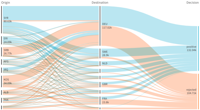
You can add up to five dimensions to your chart in property panel under Data > Dimensions. The chart updates to reflect the added dimensions. The dimensions are displayed from left to right, with the first entered dimension always being the source dimension. The target dimension is always displayed to the to the right. When you add more dimensions, they are added to the right in the order they are entered.
A chart with three dimensions: the source dimension (Origin), the target dimension (Decision) and one additional (Destination).
Sorting
Sankey chart elements are automatically sorted from largest to smallest flow. You can change the sort order in the property pane.
Do the following:
- Click Sorting under Appearance in the property panel.
- Toggle Sorting from Auto to Custom.
- You can toggle Sort numerically:
- Toggle on: Sort numerically by Ascending or Descending.
- Toggle off: Drag your dimensions and measurements into the desired order.
Changing the appearance of the chart
You can customize your chart with one or more features. Your chart automatically updates.
Link colors
The colors of chart links are based on either the source or target anchors. To apply the source or target anchor color to chart links either use the string ='SOURCE' or ='TARGET'. You can also select a separate color by entering a color code string. The color should be a valid CSS color.
Do the following:
- Click Presentation under Appearance in the property panel.
- Enter the applicable string under Link color.
- Press Enter and the chart updates.
You can also change the link colors using an expression in the Expression editor (![]() ). It is also possible to color a link that has its intensity based on the Margin % of the dimension values it represents.
). It is also possible to color a link that has its intensity based on the Margin % of the dimension values it represents.
Example:
Enter the string =rgb(round(Avg ([Margin %])*255), 100, 100) where Margin % is a value between 0-1 and the link will display as red in the chart.
Link opacity
You can adjust link opacity by moving the slide button of the link opacity slider under Appearance > Link opacity in the property panel. Also, setting opacity to 1 (furthest right) allows the setting to drop a shadow, giving links a more individually distinct appearance.
Node colors
You can change the node colors of each dimension value. The color should be a valid CSScolor.
Do the following:
- Select applicable dimension under Data > Dimensions in the property panel.
-
Enter the color code string under Node color and press Enter. The chart will update.
For example: To use the color Aqua (#00ffff) set the color code string to ='#00ffff'. You can also set the node colors using an expression in the Expression editor (
 ).
).
Node padding and width
You can set both the vertical distance between nodes ("node padding") and the horizontal width of chart nodes ("node width").
Do the following:
- Click Presentation under Appearance in the property panel.
- Move applicable slide button of the Node padding and/or Node width sliders to adjust node settings.
Limitations
For information about general limitations, see Limitations.