
Heatmap chart
A Heatmap chart (Heatmap chart) displays comparative data where the values are represented as color patterns in a chart. You can convey information instantly by combining elements from several sources into one. It is included in the Visualization bundle.
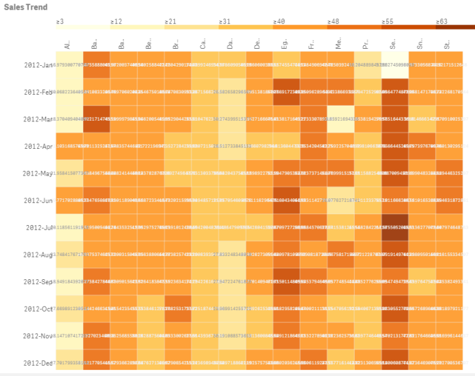
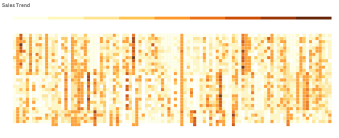
A heatmap can display large amounts of data in their entirety because values are replaced by colors. This condensed color-coded format provides an easy-to-understand overview of data.
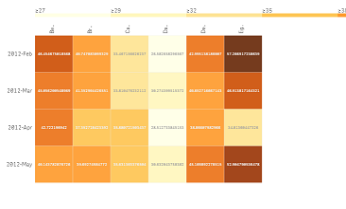
Heatmaps require two dimensions and one measure. A second measure is optional. The chart displays in a tabular format with color-coded tiles. The highest and lowest values show in each dimension column. The values in between are shown in a color gradient, centered upon the average.
When to use it
A heatmap chart displays a visual summary of large amounts of comparative data. The information is presented in color patterns, and is communicated almost instantly in a single chart. A heatmap is useful when:
- Comparing performance between companies, markets, or investments.
- Identifying the level of performance between departments of a business.
- Setting investment priorities and highlighting areas of concern.
- Presenting vast statistical data and data sets.
- Measuring user interaction with websites.
- Rating and categorizing places, people, performances, or jobs.
Creating a heatmap chart
You can create a heatmap chart on the sheet you are editing.
Do the following:
- In the assets panel, open Custom objects > Visualization bundle and drag a Grid chart object to the sheet.
- From the assets panel, under Custom objects > Visualization bundle drag a Heatmap chart object to the sheet.
- Click the top Add dimension button and select dimension.
- Click the lower Add dimension button and select second dimension variable.
-
Click the Add measure button to select the measure of the chart.
Changing the appearance of the chart
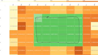
Using the lasso selection tool
The lasso selection tool lets you make a two-dimensional selection of a specific area you want to take a closer look at, by tracing a border around it.
That outline then disappears and you can trace another lasso in the desired area.
Do the following:
- Open your heat map in the main display field. If you are working in edit mode, click Done.
- Click the cursor on a tile and, while pressing the mouse button down, outline of the area of the chart you want to take a close look at.
- End your outline where it began. The chart will automatically zoom in and display only the outlined area.
Examples:
Using dimension selection option
You can select a column or row of tiles for either dimension by clicking on the dimension label, or a selection of two dimensions by clicking on a tile. Once selected, only the chosen row, column or tile displays in the chart.
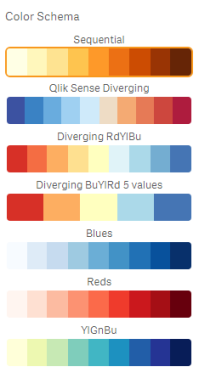
Changing the color scheme
You can change color scheme of your chart.
Do the following:
- Click Appearance > Design in the property panel.
-
Select a color scheme under Color schema.
Changing label colors
You can set your own label color under Appearance > Label color in the properties panel. Click the label color box and select a color from the gradient color circle. You can also click the easel symbol below the color circle, and select color or enter a color code string in the field next to the easel symbol. The colors should be valid CSScolors.
Toggling the legend
The legend provides a thin gradient line of color description at the top of the chart. You can hide the legend by turning off Appearance > Design > Legend in the properties panel.
Adjusting tile opacity
You can adjust tile opacity by moving the slide button of the tile opacity slider under Appearance > Design > Tile opacity in the properties panel. Setting opacity to 1 allows the setting to show colors clearly, giving tiles a more individually distinct appearance.
Using a mean in color scale
In a heatmap you can calculate and display the mean of data set. It is used as middle value in a color scale. You can toggle this feature on or off under Appearance > Options > Use mean in scale in the properties panel.
Enter a scale value by expression for mean value. This allows the system to choose color range that defines a median color scale. You can also insert a scale string into the expression in the Expression editor (![]() ) under Appearance > Options > Mean scale value in the properties panel. When no mean is used, the mean scale value should be set to 0.
) under Appearance > Options > Mean scale value in the properties panel. When no mean is used, the mean scale value should be set to 0.
Setting a fixed scale
You can set minimum, maximum,and mean values to define a fixed color scale independent from a data set. To do this, move the Fixed scales slide button to the right under Appearance > Options > Fixed scale in the properties panel. Then enter a minimum value under Min scale value, a maximum value under Max scale value, and a mean value under Mean scale value. You can also insert a scale string into the expression in the Expression editor (![]() ).
).
Toggling titles
This option hides the name of the heatmap chart. Click Appearance > General in the properties panel, and toggle the Show titles slide button.
Changing label sizes on chart axes
You can also customize the size of the labels on both the y-axis and the x-axis of the chart. Click Appearance in the properties panel, and enter the label size you want under Y-axis label size and under X-axis label size.
Setting minimum horizontal size
You can set a minimum size of how the chart displays horizontally with Appearance > Options > Minimum horizontal size in the properties panel. You can also insert a string into the expression in the Expression editor (![]() ).
).
Limitations
For information about general limitations, see Limitations.
-
The heatmap does not support sorting by expression.