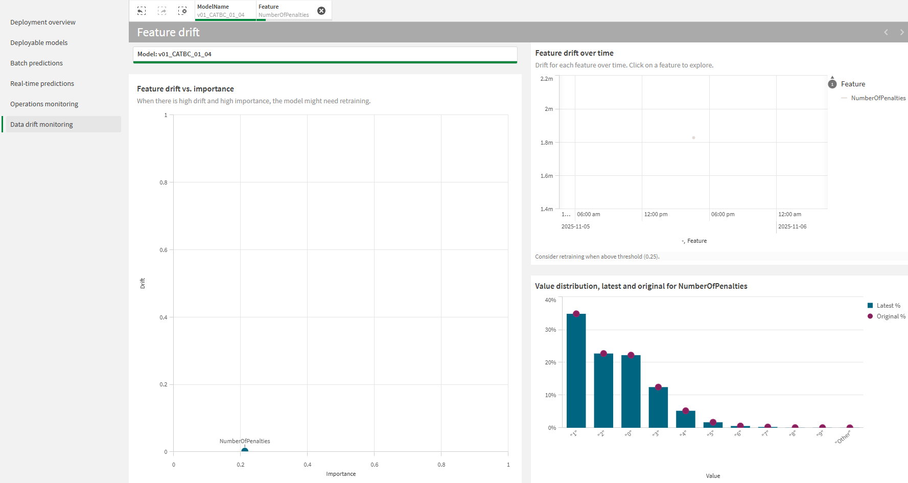
Monitoring data drift in deployed models
In the Data drift monitoring pane in your ML deployment, you can analyze data drift for the source deployed model. Data drift monitoring allows you to identify changes to the distributions of one or more features used to train the model.
When the calculated drift for a feature surpasses a value of 0.25, it is recommended that you re-train the model with the most recent data, or configure a new model if the original machine learning question has changed significantly.
Data drift analysis in Qlik Predict

Data drift calculations in Qlik Predict
In Qlik Predict, data drift is calculated as the population stability index (PSI).
You can identify significant data drift for a feature by looking at its PSI value. If the PSI value is greater than or equal to 0.25, consider re-training the model or creating a new experiment.
| PSI value | Description |
|---|---|
| Below 0.1 | Low drift |
| Greater than 0.1 but less than 0.25 | Minor drift |
| Greater than or equal to 0.25 | Significant drift |
Launching a data drift analysis
Do the following:
-
Open an ML deployment.
-
From the left panel, select Data drift monitoring.
An embedded analysis is generated.
Availability of the analysis
New calculations for data drift are not generated immediately when you open an analysis. Data drift calculations are generated once daily at 4:30 PM UTC.
Navigating embedded analytics
Use the interactive interface to analyze the deployed model with embedded analytics.
Making selections
Use selections to refine the data. You can select features and their specific values or ranges, and filter for specific dates and importance ranges. In some cases, you might need to make one or more selections for visualizations to be displayed. Click data values in visualizations to make selections.
You can work with selections by:
-
Select values by clicking content, defining ranges, and drawing.
-
Search within charts to select values.
-
Click a selected field in the toolbar at the top of the embedded analysis. This allows you to search in existing selections, lock or unlock them, and further modify them.
-
In the toolbar at the top of the embedded analysis, click
to remove a selection. Clear all selections by clicking the
icon.
-
Step forward and backward in your selections by clicking
and
.
Analyzing feature drift alongside importance
Use the Feature drift vs. importance chart to analyze feature drift and permutation importance together. You can identify when changes in drift are happening in parallel with changing patterns in importance. Viewing these two metrics together, you can uncover newly emerging patterns and develop a deeper understanding of the trends affecting your data.
To understand what the drift scores mean for your model's performance, see Data drift calculations in Qlik Predict.
Monitoring feature drift over time
In the Feature drift over time chart, view the timeline for each drift calculation and analyze changes that have been happening over time as new predictions are generated.
A reference line has been added at a PSI value of 0.25 to indicate when a feature is demonstrating significant drift. To learn more about what the drift scores mean for your model's performance, see Data drift calculations in Qlik Predict.
Viewing feature distribution
The Value distribution chart is helpful for comparing the value distribution for a feature between the training dataset and the dataset used for latest prediction generated with the model. You can identify which ranges in a feature are affected most, and least, by drift.
The blue bars indicate the percentage of values in the latest apply dataset that fall within each range. The purple circle-shaped markers show the percentage of values in the training dataset that fall within each range. If you notice a large difference between the height of the bars and the position of the markers, it is likely that the range is affected by drift.
Limitations
Data drift monitoring is not available for time series models.
