Mekko Chart
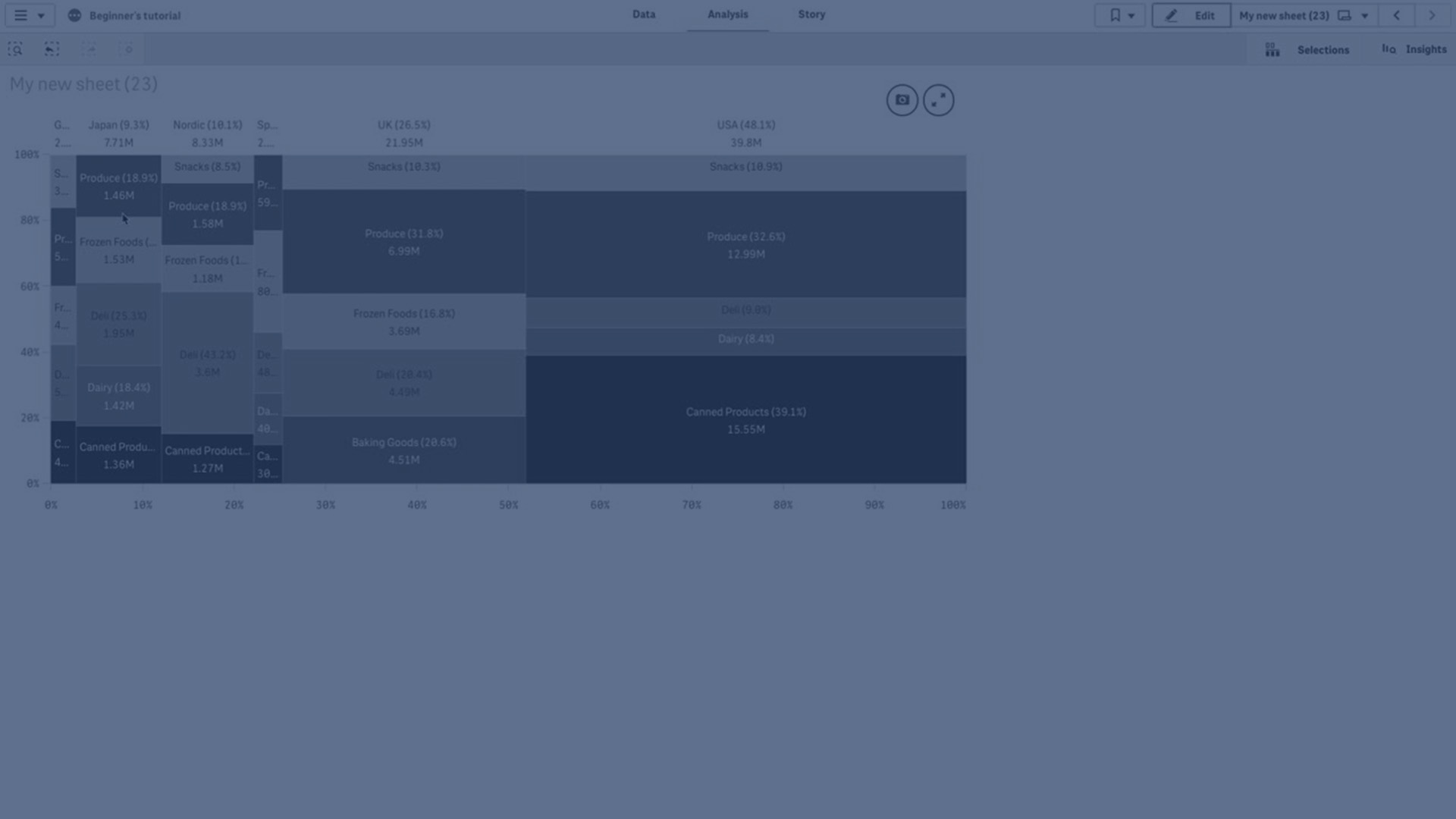
In this tutorial, you'll learn how to craft Mekko charts within Qlik Cloud, a powerful tool for comparative analysis of groups and their respective category items. Mekko charts excel in illustrating comparisons between groups while offering insights into the distribution of category items within these groups. The dimension axis elegantly presents the groups, while the measure axis showcases the normalized percentage value for each category item. Additionally, the size of each group visually represents its value, enhancing clarity and understanding of the data.