Using conditional colors in KPIs
Learn how to apply conditional colors to KPIs in Qlik Sense for better visual cues and faster insights. This example demonstrates creating multiple KPI charts with limits, colors, gradients, and icons to represent different performance thresholds.
This video covers:
- Creating KPI charts and adding measures
- Applying conditional colors with limits
- Using gradients and icons for visual emphasis
- Testing KPIs with filter selections
💡 00:09 – Overview: Applying Conditional Colors to KPIs
📊 00:19 – Creating the First KPI with Profit Expression
🎨 00:48 – Setting Conditional Colors and Limits
➕ 01:15 – Adding the Second KPI (Sales Amount) with Custom Colors
🌈 02:01 – Using Gradients in KPI Colors
📌 02:04 – Creating the Third KPI (Cost of Sales) with Icons & Alerts
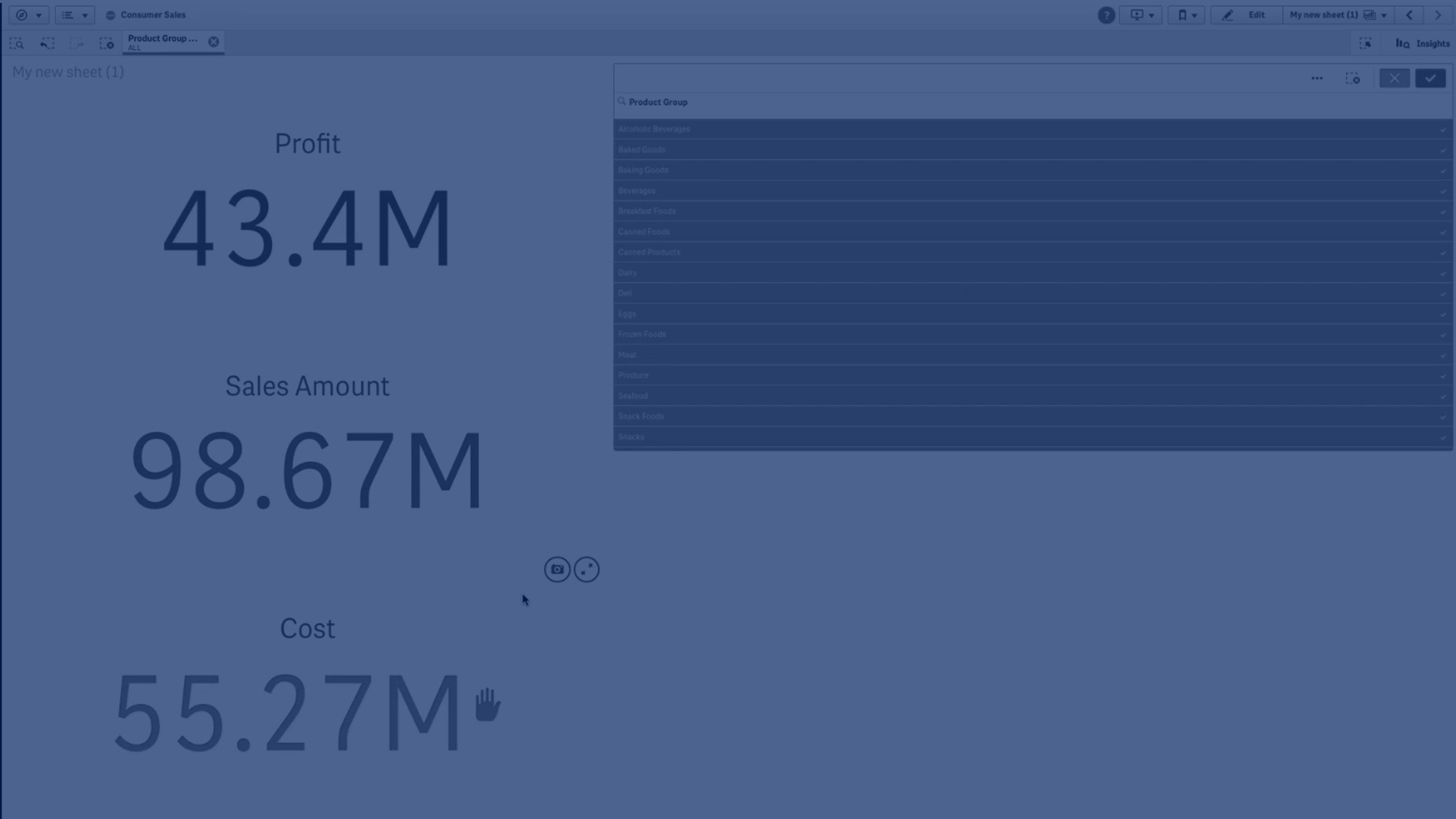
🔍 02:52 – Adding a Filter Pane to Test KPIs
👀 03:13 – Viewing Conditional Color Changes in Action
🎬 03:28 – Conclusion
To learn more about Qlik Sense visit the http://help.qlik.com/"