Assigning colors to master measures values
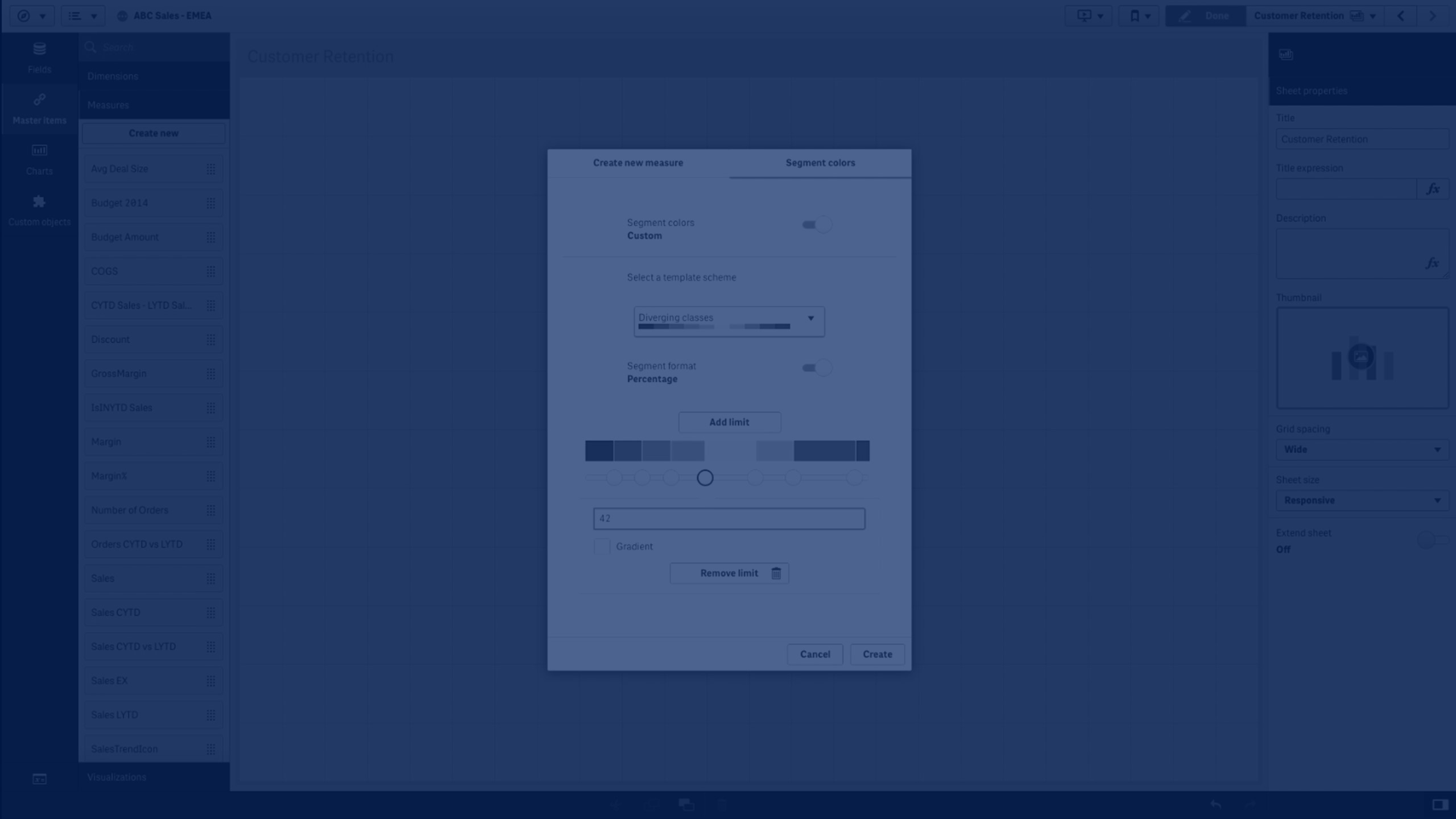
Learn how to color visualizations by master measure in Qlik Sense using custom segment colors or gradients. This tutorial demonstrates how to move beyond default color schemes to highlight data more effectively.
You’ll learn how to:
- Assign color gradients or segment schemes to master measures
- Apply colors to existing or new master measures
- Configure segment formats: fixed values or percentages
- Adjust segment limits and gradients for smooth color transitions
- Use custom-colored measures in visualizations like bar charts
Edit and customize visualizations for clarity and impact
🎨 00:10 – Introduction: Coloring by Measure
🖌️ 00:22 – Enabling Segment Colors for Master Measures
⚙️ 00:29 – Editing Segment Colors in Edit Mode
📋 00:38 – Using Template Schemes and Default Gradients
🔢 00:45 – Segment Formats: Fixed Value vs Percentage
➕ 01:05 – Adding, Removing, and Editing Segment Limits
🌈 01:20 – Applying Gradient Colors Between Segments
✅ 01:27 – Creating and Using Custom Master Measure
📊 01:35 – Example: Coloring a Bar Chart by Measure
✏️ 01:50 – Reducing Data & Editing Visualization
🎨 02:02 – Result: Bar Chart Colored by Measure
🏁 02:14 – Conclusion
Perfect for analysts and developers who want more control over color in Qlik Sense dashboards.