Adding dimensional reference lines
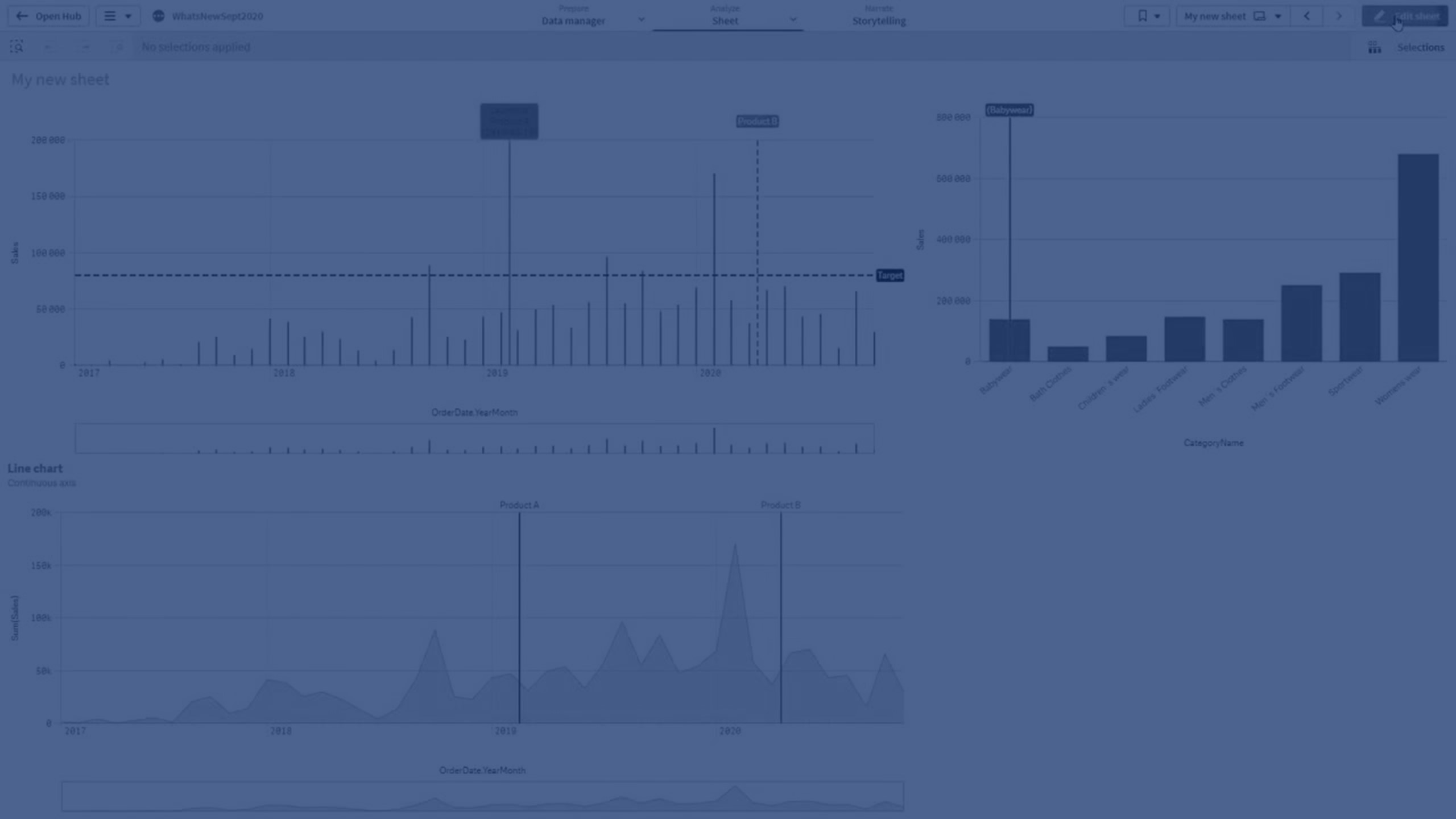
Learn how to add dimensional reference lines to bar and line charts in Qlik Sense to highlight specific time points or categories. This tutorial covers customizing line style, color, and labels for better data storytelling.
📊 00:08 – Adding Dimensional Reference Lines
📅 00:16 – Bar Chart Setup (Year-Month & Sales)
⚙️ 00:29 – Continuous Scale on X-axis
➕ 00:42 – Adding a Reference Line (Expression & Label)
🎨 01:01 – Customizing Line Style & Label Background
📐 01:12 – Adding Dimension-based Reference Lines
🛠️ 01:41 – Second Reference Line Example (Product B)
📈 02:10 – Applying to Line Charts
🏷️ 02:30 – Highlighting a Specific Product (Babywear)
🎬 02:53 – Conclusion