Visualizing the prediction data in a Qlik Sense application
The final step in the process is to create a Qlik Sense analytics application to visualize the predictions data you have generated.
Alternative workflow: Upload pre-configured application
Rather than following the remaining steps in this topic, you can upload the Customer churn predictions.qvf application, which you downloaded at the start of this tutorial, into the Analytics activity center.
The remaining sections on this page guide you through the creation of a similar application. There will be some differences between the prediction data in the application, and your own prediction data.
The downloadable application contains an additional sheet titled Individual Customer Analysis, which uses conditional expressions to encourage granular analysis of a single customer account at a time.
Getting started
From the Analytics activity center, go to the Create page and click Analytics app. Select a space for the application, and name it Customer churn predictions.
Click Create.
Creating the data model
Selecting your data
You need to add the necessary data into your application. This consists of the apply dataset (uploaded at the start of the tutorial) and the two datasets generated from the prediction.
Do the following:
-
In the new application, click to add data from Data catalog.
-
In Data catalog, click the checkboxes next to the following three datasets:
-
Apply dataset: ML - Churn data - apply.csv or ML - Churn data - apply.qvd
-
Prediction dataset: ML - Prediction output.parquet
-
Coordinate SHAP dataset: ML - Prediction output_Coordinate_SHAP.parquet
-
-
Click Next.
-
A summary panel appears. Click the ML - Churn data - apply dataset to expand the available fields to load.
-
Click the
icon next to any features that were deselected during model training. You need to keep AccountID in the list because it is a key field. For reference, return to the prediction configuration you created and compare the model and apply dataset schemas (For general help, see Editing prediction configurations.).
-
Click Load into app.
Associating the data
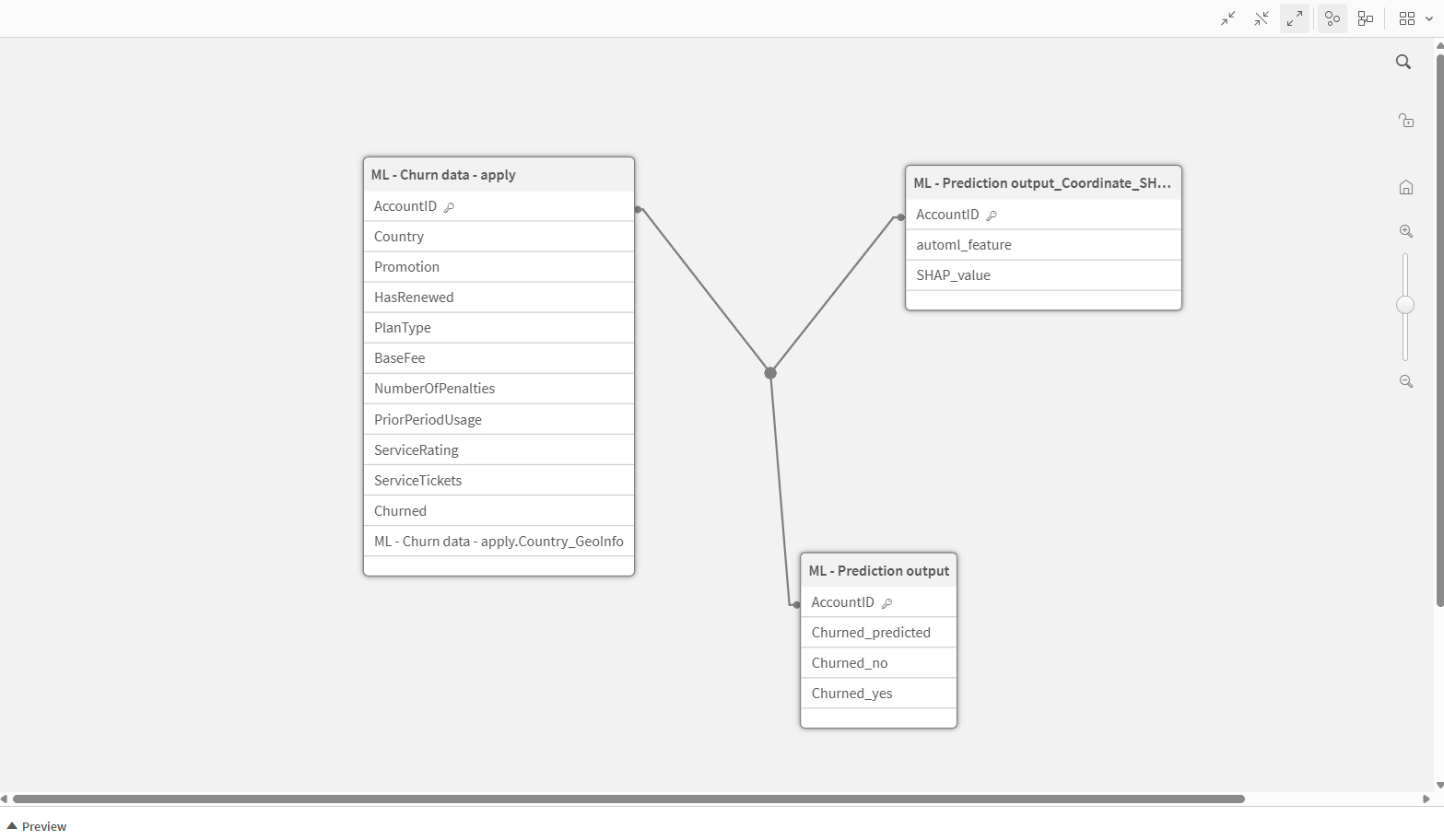
At this point, you have added the data to the application, but a connected data model is not constructed until you associate the datasets together. In this case, the AccountID field will be the index linking the datasets together.
In your application, Data manager is now opened. You will see the three datasets, but they are shown as separate entities that are not connected.
Do the following:
-
In your application, Data manager is now opened. You will see the three datasets, but they are shown as separate entities that are not connected.
-
In the right-hand pane of Data manager, find the AccountID association suggestion.
-
Click Apply. The tables should now be connected together.
-
Click Load data.
Checking your associations in Data model viewer
Before building any visualizations in the application, you should verify that the data has been associated properly.
Do the following:
-
In the navigation bar at the top of the interface, open the application navigation menu and select Data model viewer.
-
Check that the three datasets have been connected properly. The AccountID field should be acting as a key across all three datasets. The application's data model should look like the following image.
Data model viewer showing the data model of the predictions application

You are now ready to start building analytics content. Click Sheet within the Analyze tab in the navigation bar.
First sheet: Aggregated predictions dashboard
The first sheet will focus on analysis of the predictions in aggregated form.
Do the following:
-
You should now be in sheet edit mode.
-
Right-click any existing visualization in the sheet, and delete it. This is a chart suggestion feature that we will not be using for this tutorial.
-
Give the sheet a title, for example, Aggregated Predictions. To do this, click anywhere in the blank sheet to open Sheet properties on the right-hand side of the interface. Under Title, type a name for the sheet.
Pie chart
A pie chart lets you easily visualize the proportional breakdown of your data. In this case, it makes sense to break down the data by the predicted outcomes (yes or no).
Do the following:
-
Drag a pie chart to the sheet.
-
Add Churned_predicted as a dimension.
-
Add the following measure:
Count(AccountID) -
If desired, turn off Dimension label under Appearance > Presentation in the properties panel.
-
Expand the dimension under Data in the properties panel, and modify the Label for the dimension to Predicted to Churn.
The label updates in the legend.
Filter pane
This dashboard will be for broad analysis of the entire data model. However, it will almost certainly be important to be able to quickly filter the data across various dimensions to analyze specific cohorts.
Create a filter pane with multiple listboxes. Each listbox allows selections of values within a single dimension.
Do the following:
-
Drag a filter pane to the sheet.
-
Add fields to the filter pane. These could be dimensions you expect to be significant to the predicted outcomes.
-
Modify each listbox as need by clicking the field under Data in the properties panel. This opens the Listbox properties.
For example, you might want to change the field label, and set Collapse listbox to Always to save sheet space.
Resize the filter pane so that it appears as a panel on one side of the sheet.
KPI objects
KPIs are a great way to display a single value for a particularly important analysis of your data. Here, we will create three KPI charts.
Do the following:
-
Create a blank KPI chart. Add the following measure:
=Count(Churned_predicted)This will calculate the total number of customers for whom we have generated churn predictions.
-
Label the measure Total # of Customers.
-
Set Number Formatting to Number and present the values in the 1,000 format (without decimals or percentage values).
-
Create another blank KPI chart. Add the following measure:
=Count({<Churned_predicted={"yes"}>}(Churned_predicted))This is a set expression calculating the number of times the value of yes was displayed in the Churned_predicted field.
-
Label the measure Predicted to Churn.
-
Configure the number formatting of the chart with the same settings as the first KPI.
-
Create a third blank KPI chart. Add the following measure:
=Count({<Churned_predicted={"no"}>}(Churned_predicted))This calculates the number of times the value of no was displayed in the Churned_predicted field.
-
Label the measure Predicted to Stay.
Histogram
You can visualize the distribution of prediction probability values with a histogram.
Drag a histogram to the sheet and give it a title. Add Churned_yes as the dimension.
Stacked bar charts
To analyze predictions by a categorical field, such as plan type, you can create a bar chart with individual set analyses stacked on top of one another.
Do the following:
-
Drag a bar chart onto the sheet and title it Churn Predictions by Plan Type.
-
Add PlanType as a dimension. Label it Plan Type.
-
Add the following measure:
=Count({<Churned_predicted={"no"}>}(Churned_predicted))Label the measure Predicted to Stay.
-
Add the following measure:
=Count({<Churned_predicted={"yes"}>}(Churned_predicted))Label the measure Predicted to Churn.
-
Under Appearance > Presentation, change the layout from Grouped to Stacked.
-
Remove the scrollbar and set Value labels to On.
-
Configure Segment labels and Total labels to Auto.
When done, you can create a similar bar chart with the same two measures, but with a different categorical dimension, such as NumberOfPenalties.
Distribution plot to analyze individual numeric field values
A distribution plot can be used to present predictions data by a measure with diverse numeric values. In this section, you will create a chart to display churn predictions by base fee, with distinct groupings for the customer's service rating.
Do the following:
-
Drag a distribution plot onto the sheet and title it Churn Predictions by Base Fee and Service Rating.
-
Add AccountID as the dimension for the points.
-
Add the following measure on the x-axis:
=Avg(BaseFee) -
Add the following calculated dimension on the y-axis:
=Round(ServiceRating,2)This creates groupings along the y-axis for approximate ServiceRating values. The higher the value, the higher the customer has rated the quality of their service.
-
Under Appearance > Presentation, reduce the Bubble size to 20 and turn on Jitter points.
-
In Colors and legend, set Colors to Custom.
-
Select the option to color the data by the following dimension:
=Churned_predictedThis will assign one color for each of the values in the Churned_predicted field. In this case, there will be two colors displayed.
-
Add labels to the dimension and the measure, and add the following label to the custom color setting: Predicted to Churn.
Similar charts can be created for analyses of different numeric fields by substituting other field aggregations in the place of the BaseFee measure.
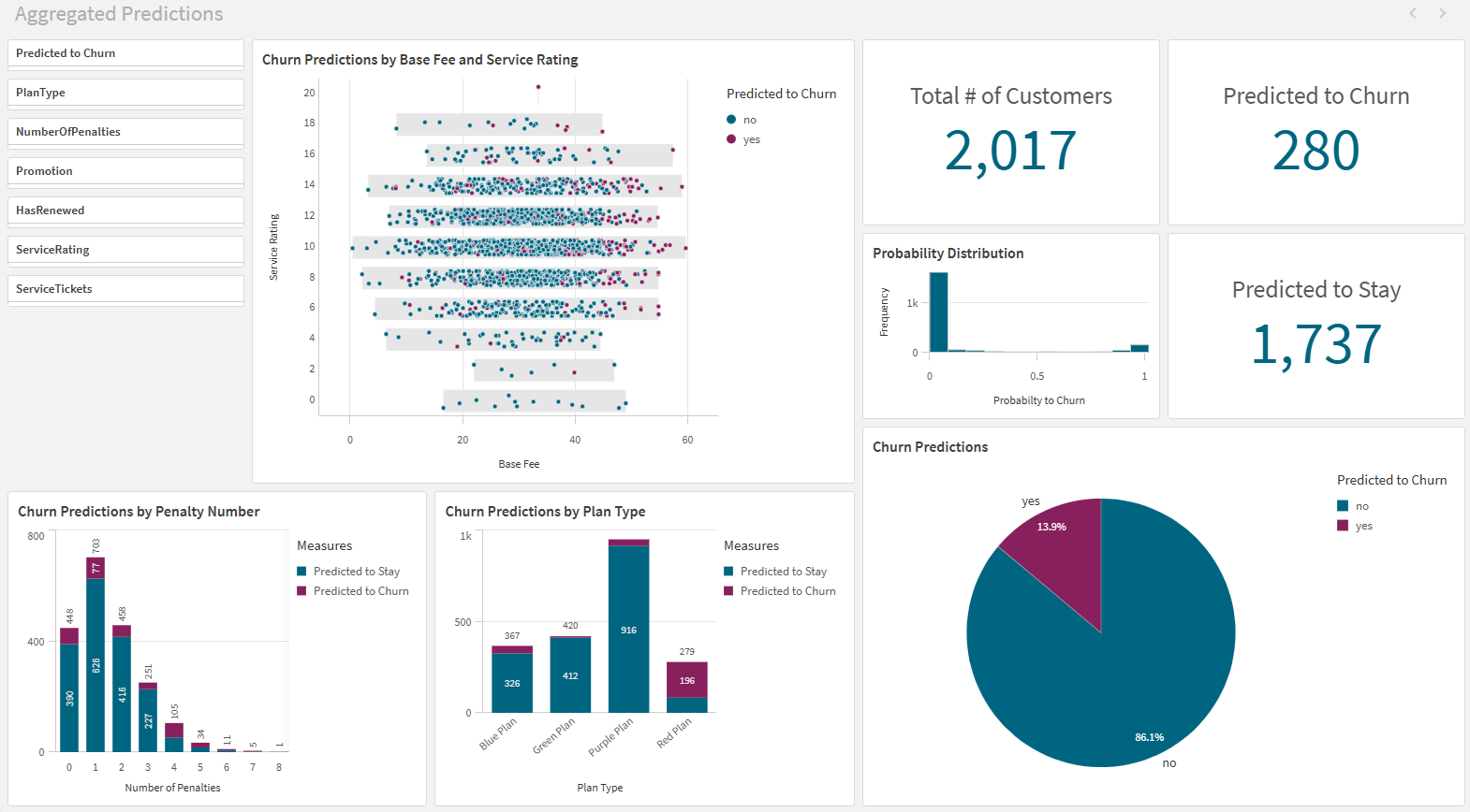
Configure the visualizations on the sheet to look similar to the image below.
Predictions analysis sheet

Second sheet: Aggregated SHAP dashboard
Next, create a sheet dedicated to analyzing the aggregated SHAP values.
Do the following:
-
Create a new sheet.
-
Give the sheet a title (for example, Aggregated SHAP).
SHAP importance ranking
This type of chart is similar to the autogenerated one you might have seen when configuring your experiment versions. Here, we will make one for the predicted dataset.
The purpose of this type of chart is to show the features that contribute most to the outcome seen in the Churned column. We need to be aware that since we will use absolute values, the SHAP results could be either positive (value of yes) or negative (value of no). If you prefer, you can also use an expression that does not calculate the absolute value.
Do the following:
-
Drag a bar chart onto the empty sheet.
-
Title the chart SHAP Importance by Feature.
-
Add automl_feature as a dimension, and label it Feature.
This allows you to present the aggregated data across all included features.
-
Add the following calculated measure:
=fabs(Avg(SHAP_value)) -
Under Label, type Average Absolute SHAP.
-
In the properties panel, under Appearance > Presentation, remove the scrollbar if present, and set the chart orientation from Vertical to Horizontal.
-
Under Sorting, drag the measure above the dimension if not done already. Leave the sorting of each field to Auto.
This sorts the chart by measure values in a descending pattern.
Trellis container
You can make a Trellis container to filter data for specific field values within a dimension. In this case, we can break down the SHAP values for each of the four plan types offered to customers.
To create a Trellis object, you need to specify a dimension and a master visualization. We will convert the SHAP importance ranking that we just created into a master visualization.
Do the following:
- Right-click the Average Absolute SHAP chart in the sheet, and then select
Add to master items.
- Keep the default name and click Add.
-
Under Custom objects > Qlik Visualization bundle in the assets panel, drag a Trellis container onto the sheet.
-
Add PlanType as a dimension.
-
Click Add master visualization inside the chart, and then add the Average Absolute SHAP chart.
-
Under Appearance > General in the properties panel, turn on Show titles and title the chart SHAP Importance by Plan Type.
-
Resize the Trellis container so that it is wide enough to display the names of features in the charts. If all labels do not display, adjust the zoom in the browser window.
Alternatively, you could display this data by creating individual charts with set expressions for each dimension value you are looking to analyze. In this case, you could create a separate chart for each of the four plan types.
Reusing the filter pane
The filter pane you created on the first sheet can be re-used on this sheet. In sheet edit mode, right-click the filter pane and copy it. Paste it into the Aggregated SHAP sheet.
Treemap
You can also visualize the breakdown of the SHAP values with a treemap. Drag a treemap onto the sheet and add the same dimension and measure that you used in the SHAP importance ranking.
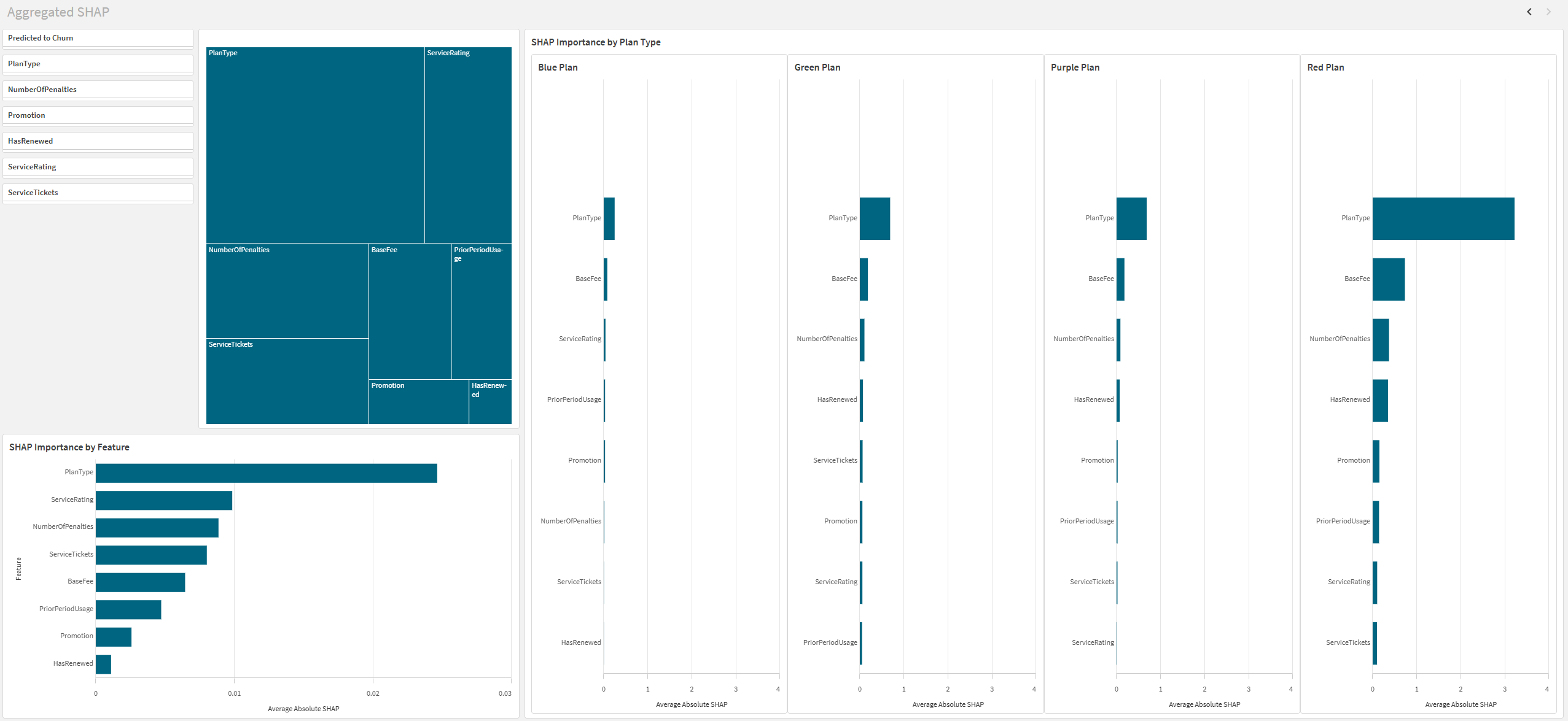
Configure the visualizations on the sheet to look similar to the image below.
Aggregated SHAP sheet in analysis mode

Using the application
After you have finished building the application, it is ready to be used for data analysis.
Click Edit sheet to switch to analysis mode. In this view, you can make selections (in the filter panes or elsewhere in the sheet) to filter the data for specific analysis of subsets of the data. For example, you might want to analyze a specific customer plan type or region, and compare the findings with other subsets of data.
Thank you!
You have reached the end of this tutorial. We hope that you have learned a few things and realized that automated machine learning is a fast and easy way to generate predictive models. Qlik Sense is a powerful tool that makes it easy to visualize your predictions data and give meaningful insights into your data.
