Combo Chart
In this video, we'll guide you through creating a combo chart in Qlik Cloud.
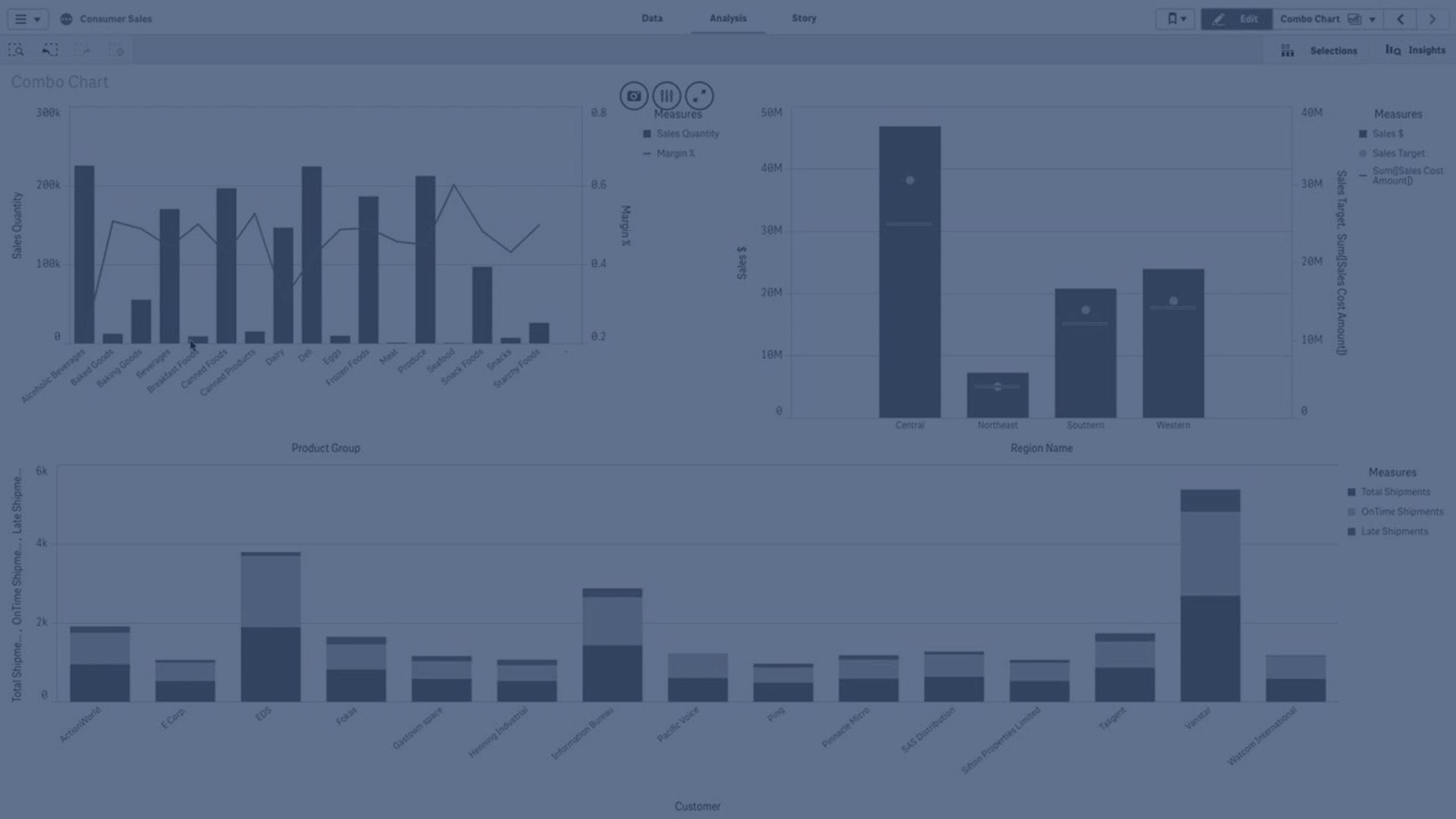
Combo charts are perfect for comparing two sets of measure values that are traditionally challenging to compare due to differences in scale. For instance, imagine you're analyzing sales figures alongside margin percentages. While a regular bar chart might obscure margin values due to their significantly smaller scale compared to sales figures, a combo chart elegantly presents both datasets for clear and insightful analysis. Join us as we unlock the potential of combo charts and enhance your data visualization skills in Qlik Cloud.