Waterfall Chart
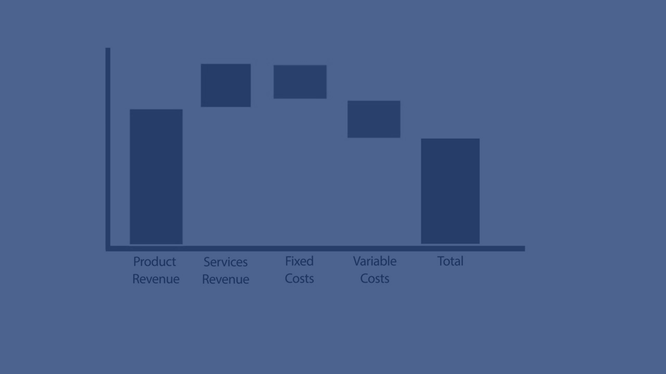
In this tutorial, you’ll learn how to create and customize a Waterfall Chart in Qlik Sense. See how to illustrate the transition from an initial value to a final result by showing positive and negative contributions along the way. From adding measures like sales, expenses, and taxes, to calculating subtotals and customizing colors, this video walks you through step-by-step. Ideal for analysts and developers using Qlik Sense to explain financial flows, variances, or step-based contributions in data.
💧 00:07 – Introduction to Waterfall Charts
📊 00:10 – How Waterfall Charts Work (Start, Intermediate & End Values)
🧱 00:25 – Creating a Waterfall Chart in Qlik Sense
➕ 00:33 – Adding the First Measure (Total Sales)
➖ 00:39 – Adding Expenses as a Negative Contribution
💰 00:50 – Adding Taxes & Subtracting from Total
📑 01:00 – Adding Subtotals (Gross & Net Income)
📉 01:15 – Visualizing Gross vs Net Income
🎨 01:28 – Customizing Colors & Chart Properties
⚡ 01:47 – Why Use Waterfall Charts?
🚫 02:07 – Limitations of Waterfall Charts
✅ 02:15 – Conclusion & Next Steps